For all your design needs.
Specializing in PageMaker – to – InDesign Conversions
Don't miss the extensive BLOG section on typography!
BEAUTY IS IN the eye of the beholder. This often quoted line, sometimes attributed to Margaret Wolfe Hungerford in the 1878 novel Molly Brown, suggests that beauty is a subjective quality with differing opinions as to what is beautiful. What is often termed “ugly” is beautiful to someone else. Philosophically, many have grappled with whether beauty is subjective or objective. In the field of typography from a Christian point of view, differing typographic periods both reveal and test what is considered beautiful.
We believe beauty in this world comes from the presence of God in creation and life. We are made by our Creator to be “sensory-rich,” and our typographic history unfolds this in stunning and diverse ways. As one writer has so eloquently said
“Holy Scripture calls us to inhabit an ordered world of creation and providence that is sensory rich, but we suffer what we may regard as spiritual sensory deprivation. And the more we discover the depth, scope and lush richness of the divinely ordered real world, the more we discover the impoverishment of the modern condition.” (Mark Garcia, Westminster Theological Seminary)
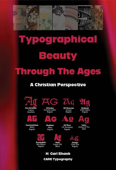
Typographical Beauty Through The Ages
NOW available at www.theologyoftype.org
Available at Lulu.com at their Bookstore
GO TO http://bit.ly/462rzBs
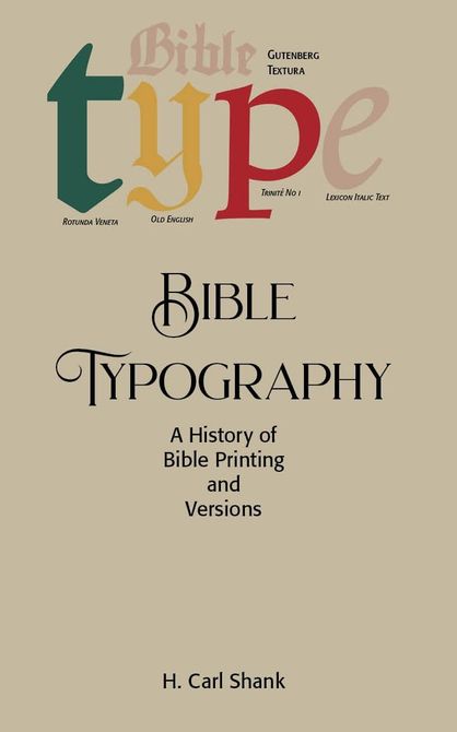
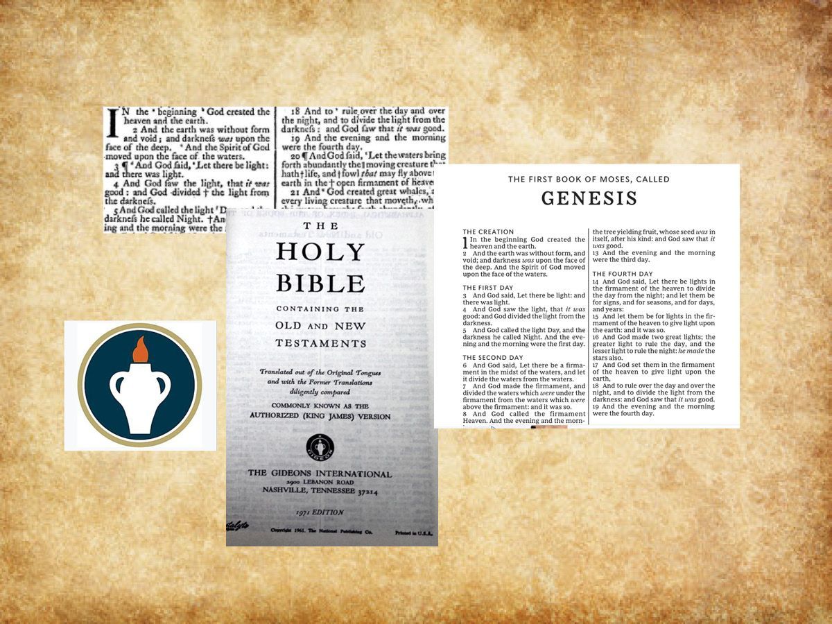
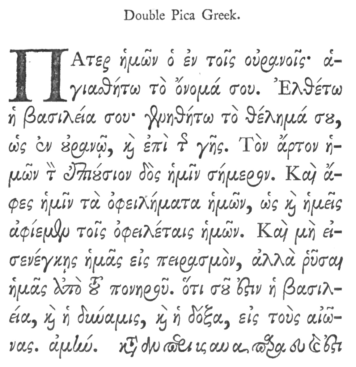
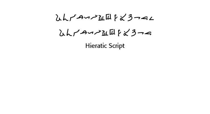
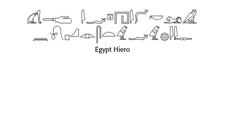
THE MOST PRINTED book in the world is the Bible. Even before the press work of Gutenberg in the 1400s, handwritten manuscripts by dedicated religious monks brought the Word of God to written light. Centuries earlier than these dedicated transcribers of Scripture, ancient Hebrew and Greek writings began the journey of Bible typography.
William Skeen in his 1872 Early Typography celebrated what he called “The Art Sublime” referring to typography and its use for divine illumination —
“That all aright the men may know
To whom Typography we owe;
The men whose names immortal ring,
Whose gifts transcendent blessings bring,
Whose monuments in every land
By wisdom rear’d, heart-honor’d stand,
Inscribed in tongues of every clime —
“Inventors of the Art Sublime!”
This little book investigates the history of Bible typography, the “art sublime,” from ancient roots to modern examples. An Appendix of older typographic fonts, many of them hand written and digitized for modern use, is also offered.
Available from Lulu Press at
Lulu.com at their Bookstore
Go To http://bit.ly/462s1Qa
TYPOGRAPHY FOR TYPISTS. I admire and value what professional typists do, whether they be document processors, or administrative assistants or data crunchers. Theirs is an often underrated and overlooked job when talking about the actual type they use and how they use it.
As also a pastor and theologian, I have worked with a number of church secretaries and administrative assistants who produce regular newsletters along with massive amounts of correspondence. What I have noticed as a typographer is the lack of knowledge of basic typographic principles used in such materials. This has led to this little book on typography for typists.
My hope and desire is that this book is an encouragement to all those typists seeking to produce accurate and good-looking documents in today’s world.
This book can be purchased directly from Lulu.com at

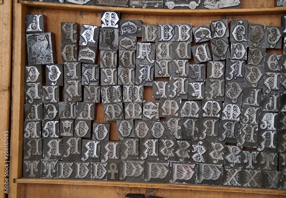
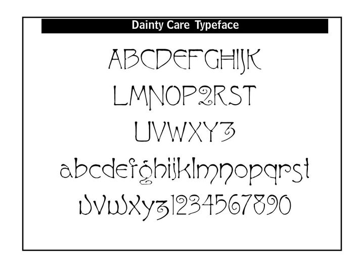
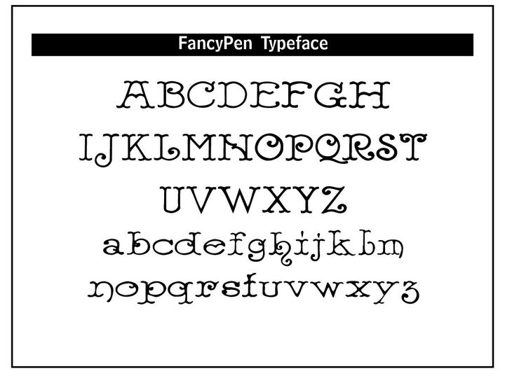
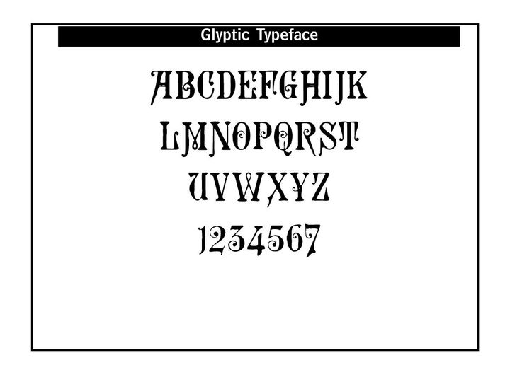
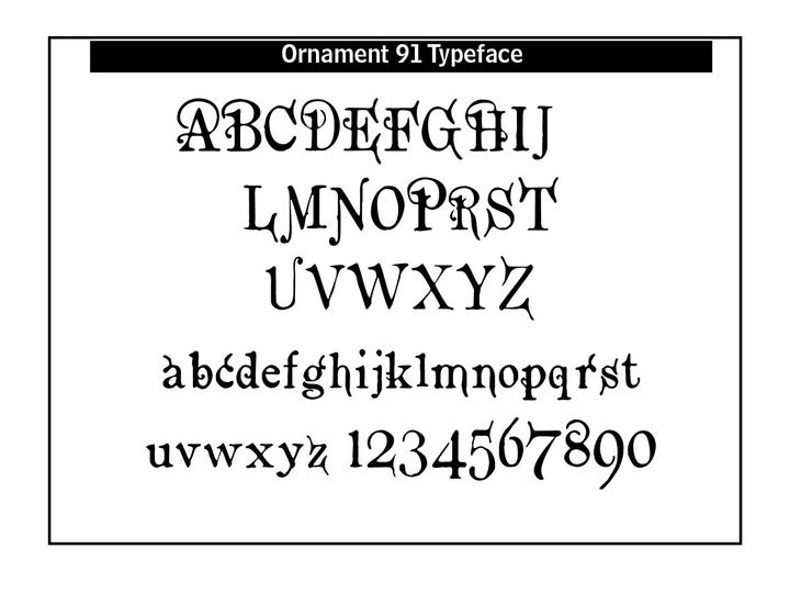
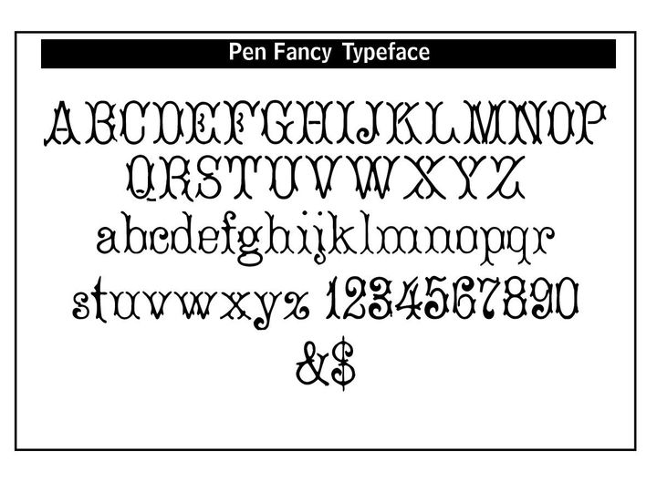
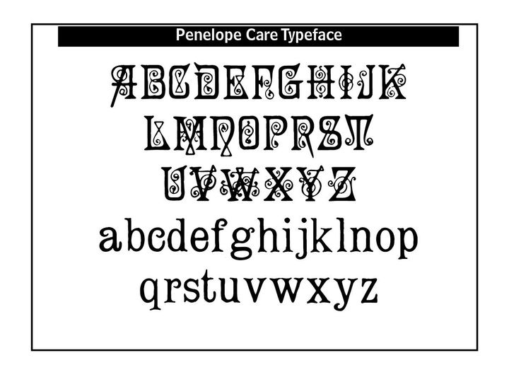
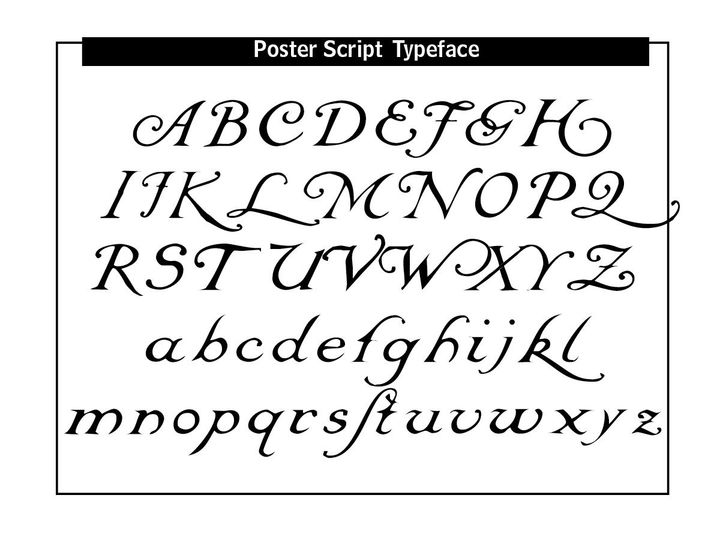
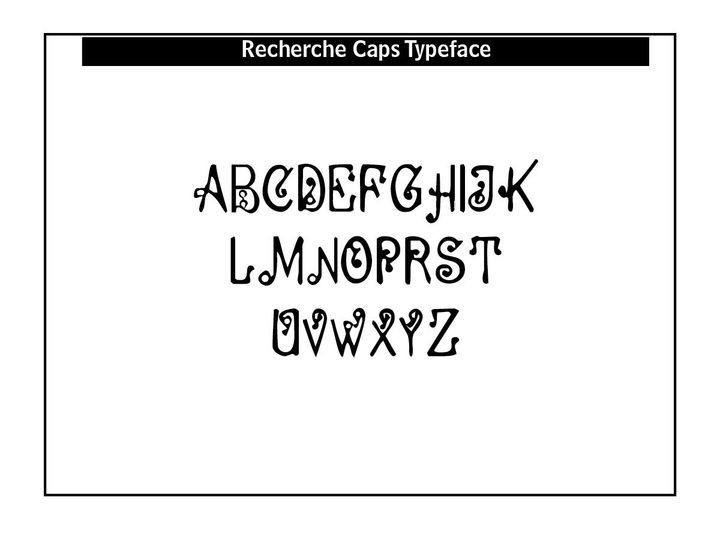
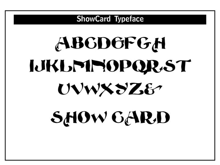
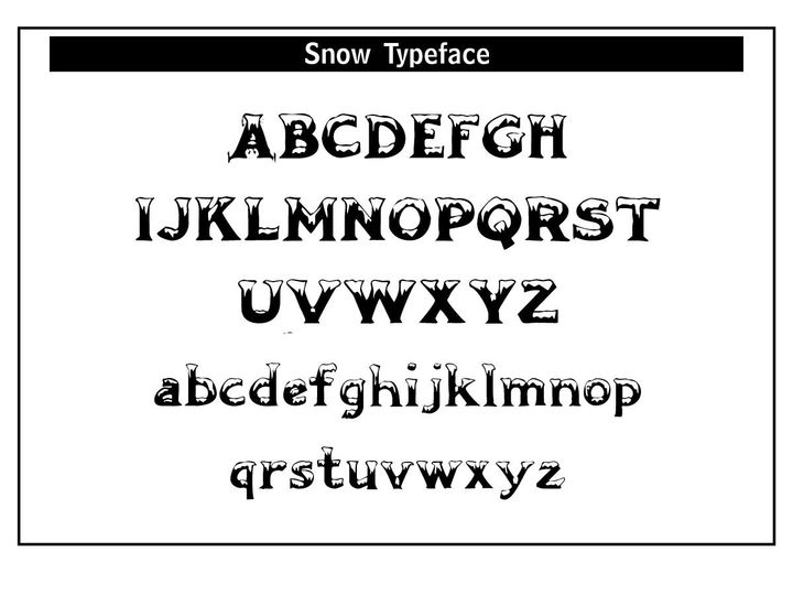
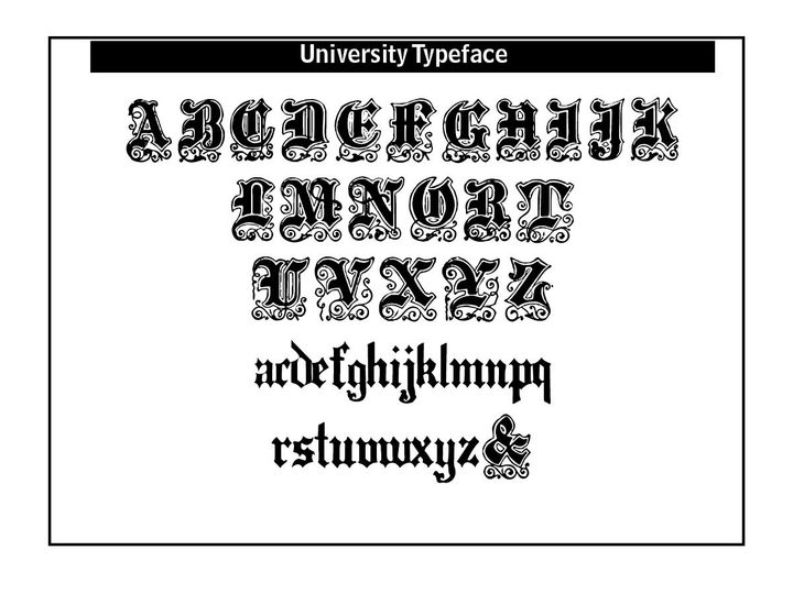
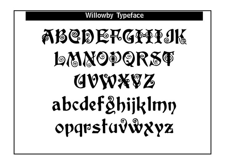
CARE Typography Fonts
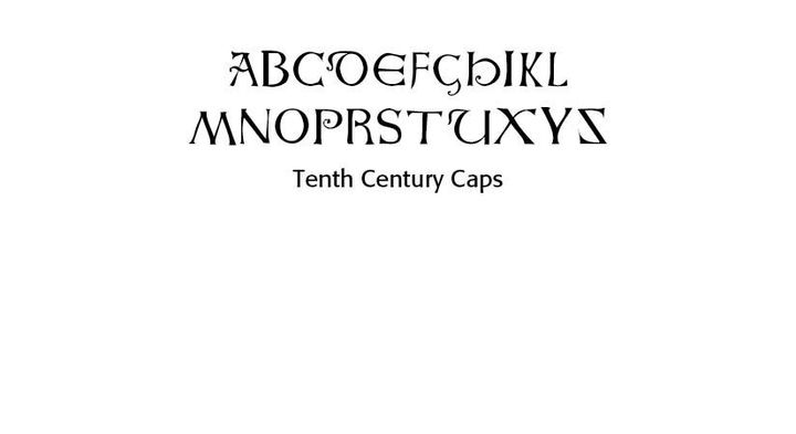
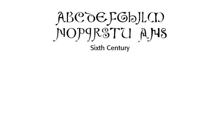
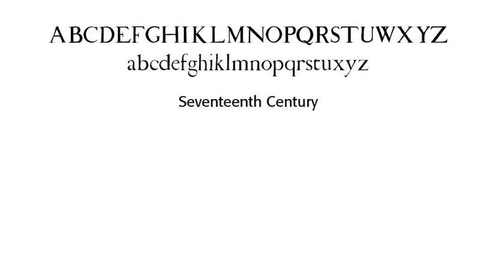
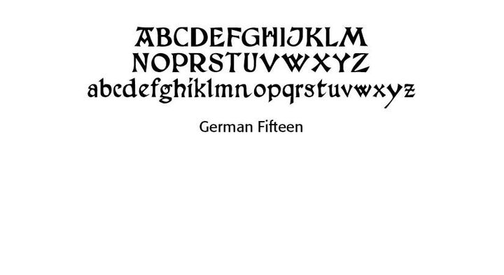
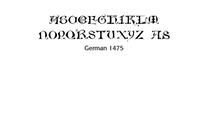
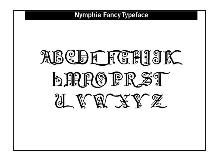
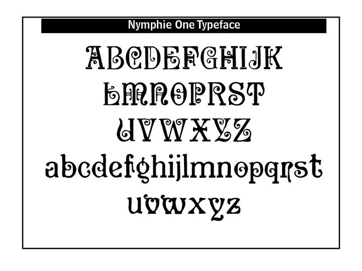
CARE Typography has crafted with the help of public domain materials and Lewis F. Day's Alphabets Old and New (London, 1910) a number of specialty fonts for sale to the public. Many of these fonts are uncials, or capital letters, suitable for invitations or chapter openings in books and other manuals.
Your first three choices are FREE to you. Ordering more than three selections are on a sliding scale of cost. An order form is attached. Payment via PayPal upfront. Enjoy!


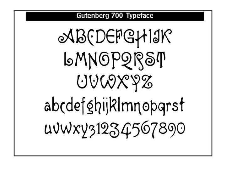
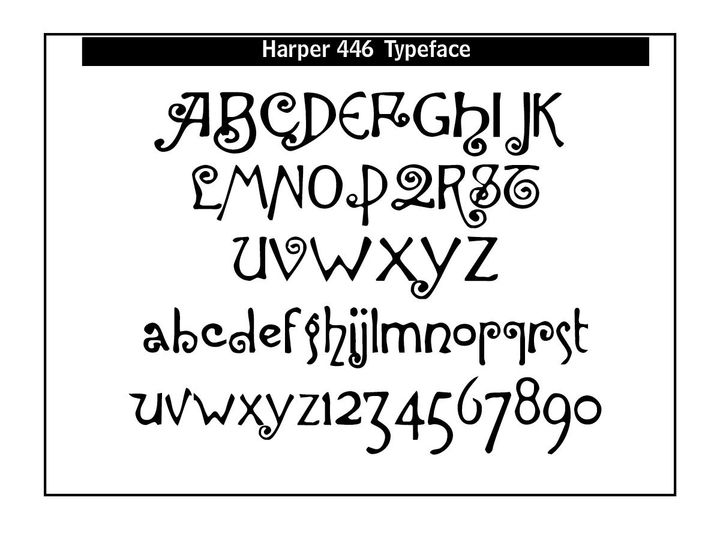
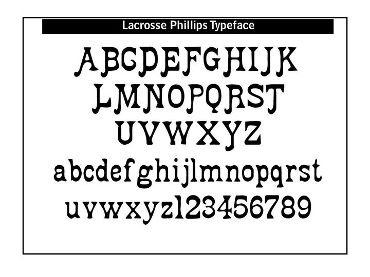
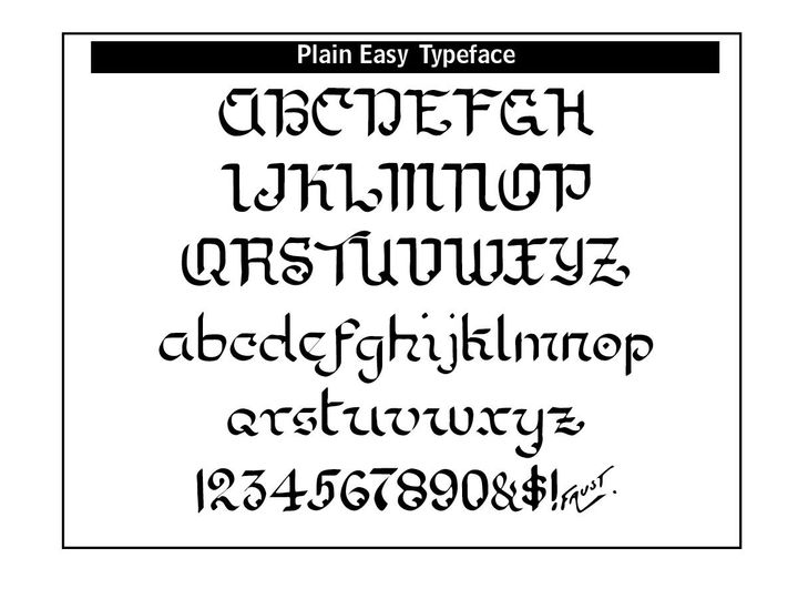
Font Revivals
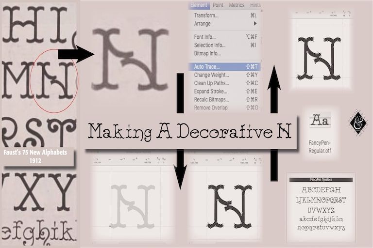
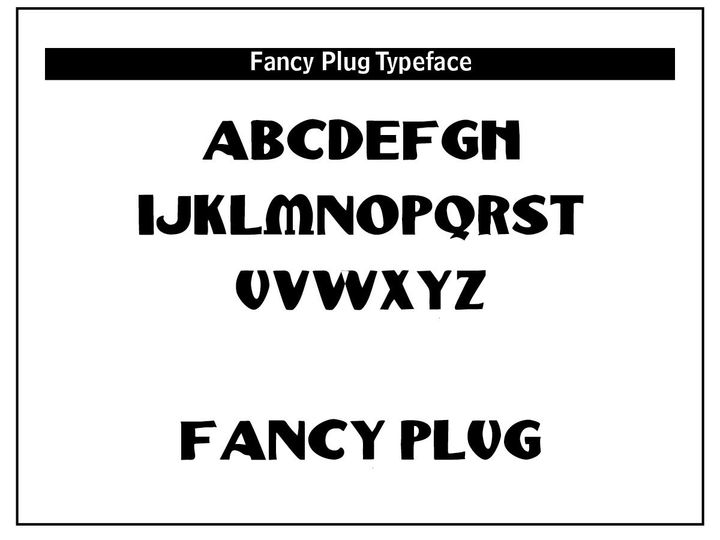
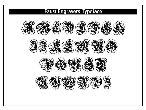
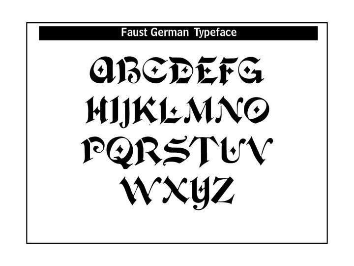
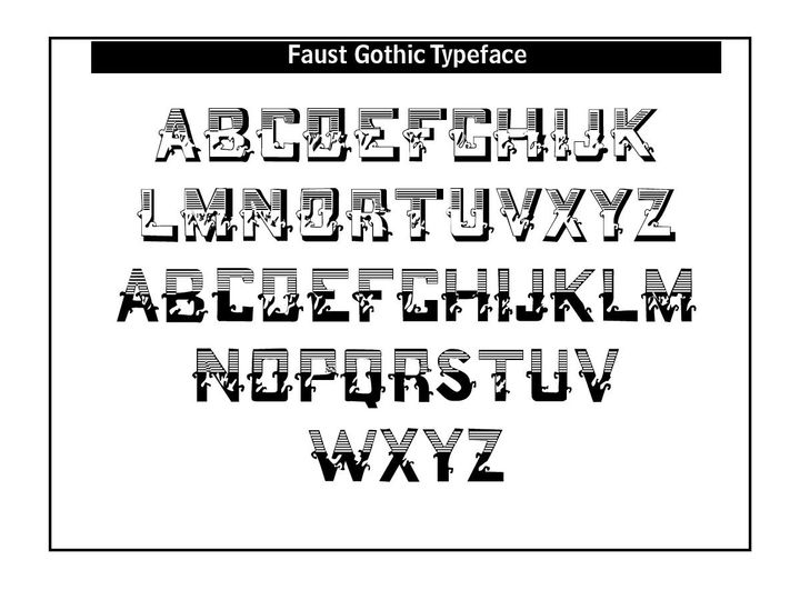
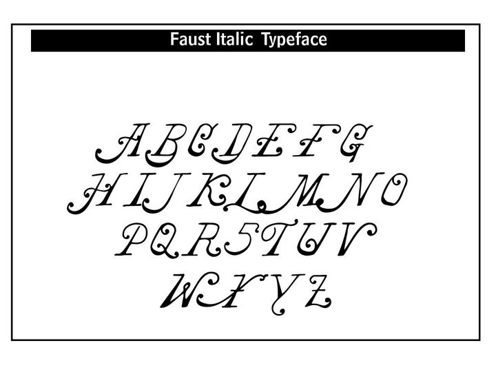
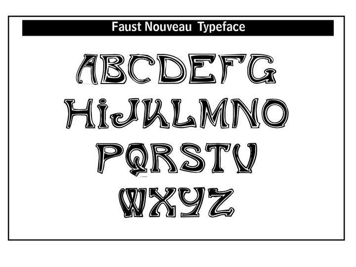
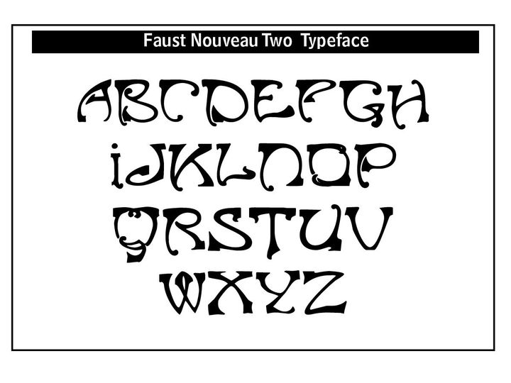
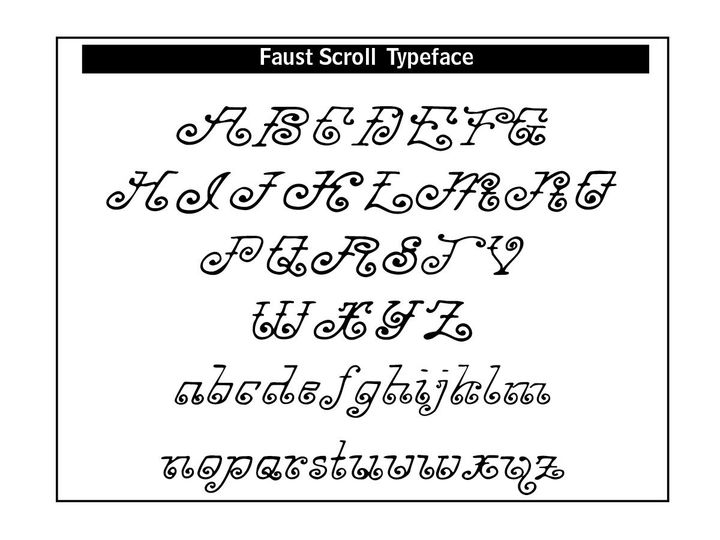
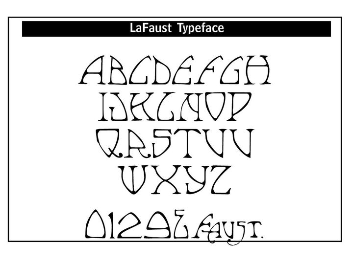
These newly digitized fonts are from C.A. Faust and Frederick Nelson Phillips. Charles Ayers Faust (1860–?) was an American calligrapher and typographic designer known primarily for his 1912 compendium Faust’s 75 New Alphabets, a richly illustrated manual of lettering techniques. Published in Chicago by the C. W. Braithewait Company.
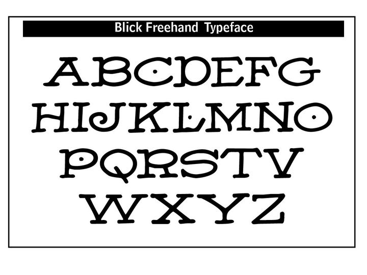
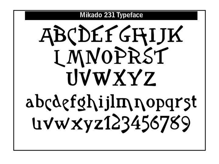
Phillips Old Fashioned Type Book (New York, 1945) provides type styles that have not been seen or used for quite some time. CARE Typography has digitized many of these classic typefaces for your enjoyment and use. Contact us for ordering and prices.
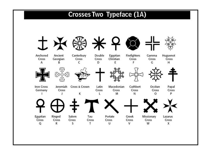
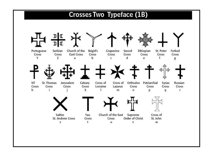
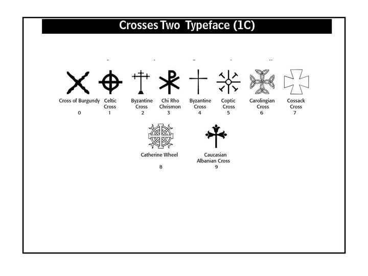
The Crosses Two Typeface has been gathered and digitized from a number of sources. This font is FREE to use in any commercial or non-profit venue.
About Me
Hi, I'm Carl Shank.
I'm a layout, font designer and consultant specializing in typographical work in the restoration of older typefaces for modern use.
Let’s Talk
Do you have a project or layout challenge that needs help?
Perhaps it is a special logo or letterhead design or typeface that needs a facelift. Perhaps it is a wider ministry issue.
Whatever the design or consulting needs, we can help your ministry or business process.
Contact Us
Recent Blogs