Do's and Don't's in Using Type

Carl Shank • March 23, 2021

From The Elements of Typographic Style

 In the world of precise and well-defined typography, there is probably no more useful and thorough work than Robert Bringhurst's The Elements of Typographic Style. Although casual writers and office personnel pay little attention to such things, glaring examples of misused typefaces and writing can be found everywhere. A cure to such ignorance and oversight can be found in this 255 page masterpiece on what characters to use when and how. One commentator notes that "it may be hard to imagine that one could write 600 words about the 'lowly' hyphen, but Bringhurst does so, and makes reading it interesting." (Harry Edwards, Review of Bringhurst, March-April, 1993 in Aldus Magazine)


The key to excellent and well-defined typography is Bringhurst's principle that "Typography exists to honor content." Chapters on "Rhythm and Proportion," "Harmony and Counterpoint, "Shaping the Page" and so forth give time honored  attention to what most casual writers ignore and of which they are unaware. Some examples and some words of advice can enhance and make your writing and posts and newsletters much more readable and professional.


Example #1 — The Widow and Orphan. Orphans are created when you have isolated lines of multi-line paragraphs ending a page. "The stub ends left when paragraphs end on the first line of a page are called widows." (41)  Giving such lines at least one additional line or by exporting or importing single lines from the preceding or following spreads can avoid widows and complement forlorn isolated lines at the end of a page. This typographic rule is broken unabashedly and incessantly by even many well-trained journalists and newspapers. Spending more time rewriting the text so that orphans and widows don't exist is the solution, though it may be time-consuming to quick turnaround jobs.


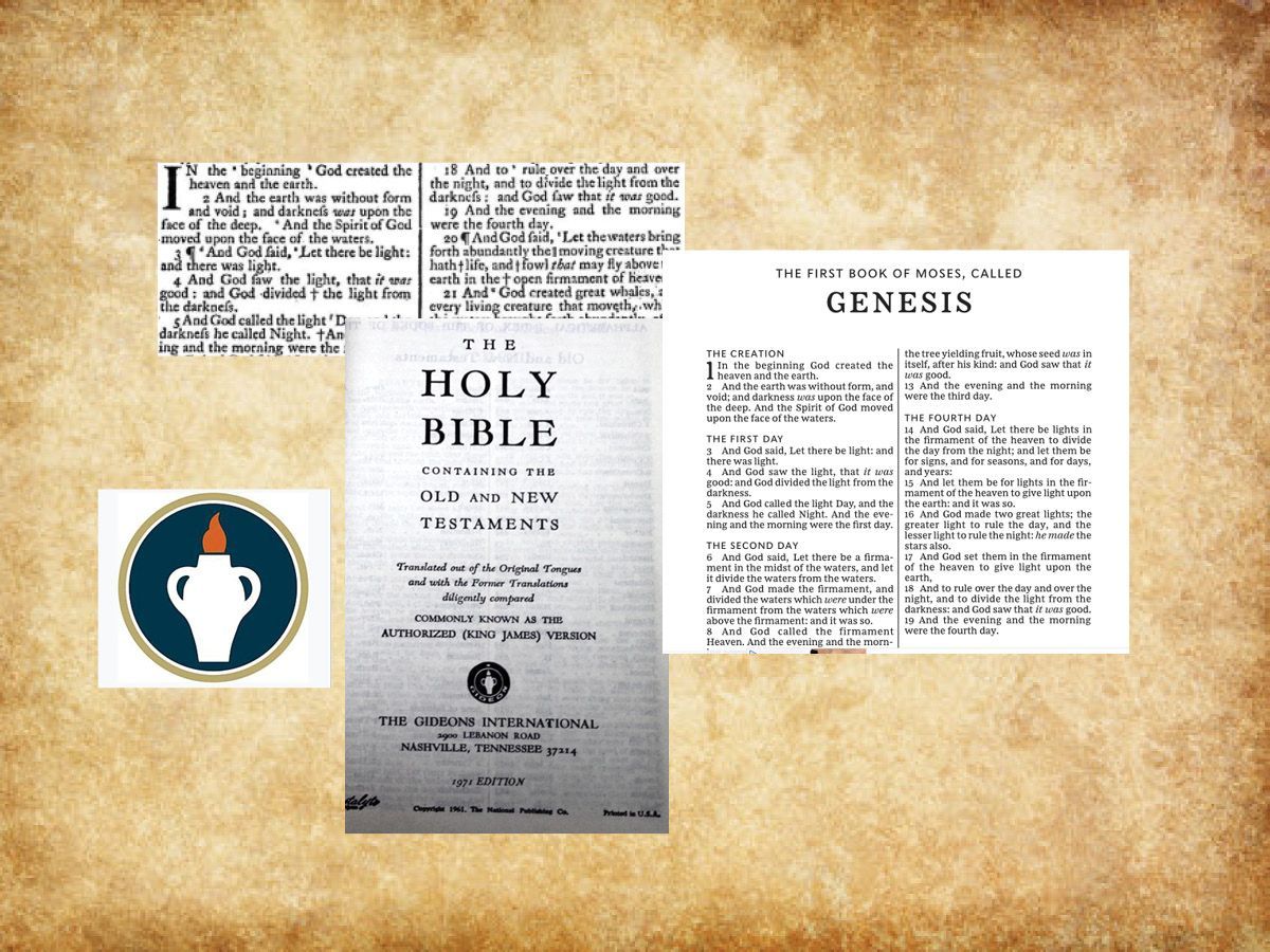
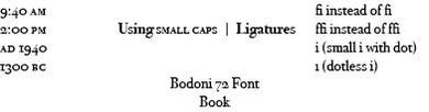
Example #2 — The use of AM, am, PM, pm, or A.M. or P.M. or a.m. or p.m. and such should be discontinued. Instead, spaced small caps should be used as in 42 bc and ad 200 or 3:00 pm or 9:00 am. But regular caps are used for JFK or H.C. Shank, and note there is no space between the H. and the C. (And there should be a small space between the small caps that cannot be written in this digital post, but see the examples below.) Bringhurst points out that "The better digital foundries now offer a wide selection of fonts with text figures and small caps. These are often sold separately [but not soon anymore due to Adobe's new typeface developments — See last post] and involve extra expense, but they are essential to good typography. It is better to have one good face with all its parts, including text figures and small caps, than fifty faces without." (45)


Example #3 —  The use of slanted italics instead of true italics, or digitized bold for true bold. Cheaper faces, and often sans serif faces, have what are called "slanted" figures for italics, such as Arial Italic, which is just a slanted face instead of true italics. So, for instance, you will see text emphasized like this, when the typeface used should be emphasized like this. The difference is amazing and outstanding. Again, this requires a font with true italics included in the font itself, rather than a digitized slant produced by electronic means. Such constraints should also be used for true Bold instead of just digitized bold in font use. So, for instance, the Brisco Pro Typeface uses Brisco Pro Regular, Brisco Pro Light, Brisco Pro Italic, Brisco Pro Bold and Bold Italic, Brisco Pro SemiBold, SemiBold Italic, and Brisco Pro Medium and Medium Italic. Again, one may wonder why this is important. It is where function defines form in typography. If I want something to stand out, I might use an Ultra Bold font, like Gill Sans Ultra Bold, instead of regular Gil Sans Bold. See the difference?! An Ultra Bold font, however, is an extra face usually not available in the regular four-face series of regular, italic, bold and bold italic.


Example #4 — The use of overlapping letters rather than normally accepted ligatures. Modern typesetting and even modern word processors have ably given writers what are called ligatures — the proper combination of letters in words like f plus f, and f plus i, and f plus l, and f plus f plus i, and f plus f plus l. Most fonts include such ligature automatically, but if they do not, you can have overlapping and confusing letters giving different meanings to different words. Bringhurst mentions that "in Turkish, i with a dot and i without, are two different letters. A typeface whose lowercase f disguises the difference between the two forms of i is therefore, for Turkish, an unacceptable design." (48) See example below.


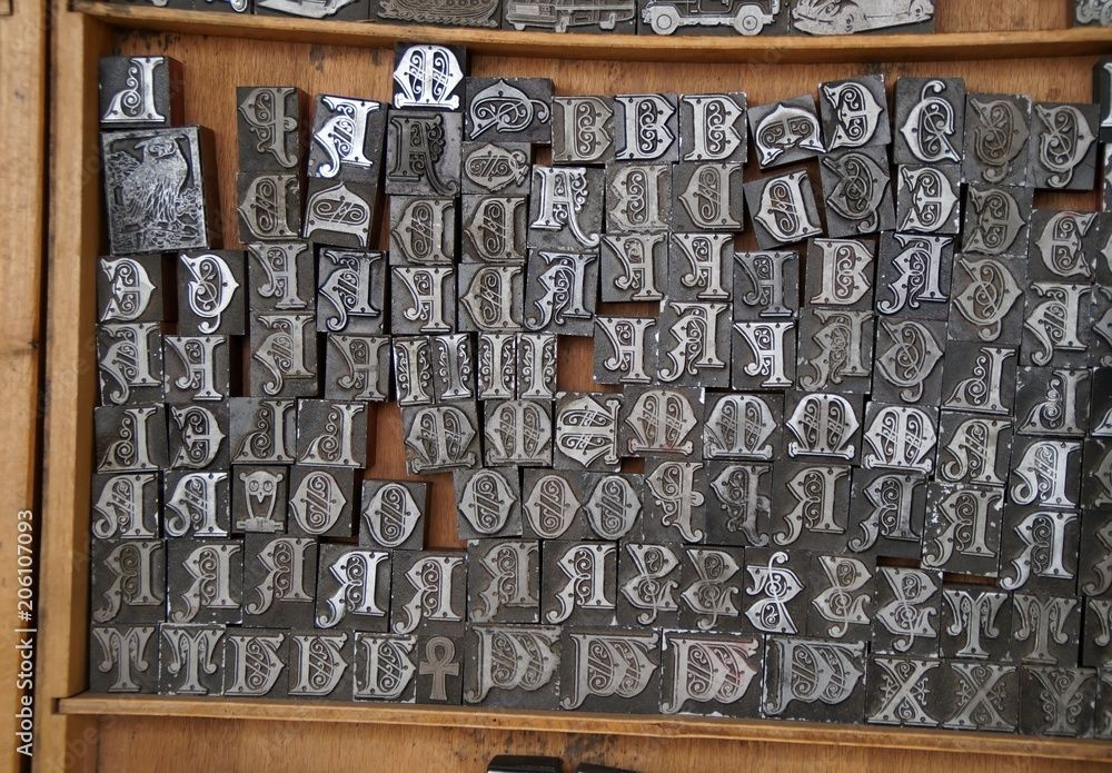
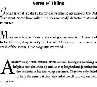
Example #5 — Drop Caps, Fleurons and Opening Paragraphs. At chapter beginnings, drop caps are often used to introduce and draw the reader into the text — "But the most traditional method of marking the start of the text, inherited from ancient scribal practice, is a large initial capital or versal." (61) They can be indented, centered, or flush left with the rest of the text. They can hang in the left margin. "They can be set in the same face as the text or in something outlandishly different." (61) Or in older texts a "fleuron" or typographical ornament can be used to draw attention to the text — such as sdhj (International Font). Sometimes they are in a different color than the regular text, such as traditional red — sdhj. Bringhurst provides a page of examples (62) of various titling and drop caps. Care Typography has a specialized set of typographical ornaments, especially designed for churches and ministries. See sample below. Page layout programs, like Adobe's InDesign, provide a convenient and trouble free way to use drop caps or titling caps in an opening paragraph.


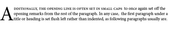
Additionally, often the opening sentence or a few words will be set in small caps to once again set off the opening remarks from the rest of the paragraph. In any case,  the first paragraph under a title or heading is set flush left rather than indented, as following paragraphs usually are.

Successful Layout & Design

By Carl Shank February 12, 2026
Free Fonts: A Deal or Trouble? The latest Google estimate of available fonts is over 300,000 and counting. Other estimates have catalogued over 550,000 fonts. There are over 36,000 font families, over 4,000 type designers and over 2,700 professional font foundries, not counting smaller font entrepreneurs like CARE Typography, which provides restored fonts from yesteryear. (Quora source https://www.quora.com/How-many-fonts-are-there-in-existence-Does-any-group-attempt-to-keep-a-record-of-all-the-fonts-that-exist ) There are commercial fonts from sources like Adobe and MyFonts (Monotype) which require payment for their use in various platforms. Both provide a subscription service, which usually requires a substantial monthly or yearly fee to download and use their fonts. When I began using Apple Macintoshes in the 1980s, font manufacturers like Adobe and Monotype would “sell” the right to use a number of their fonts for thousands of dollars. And, by the way, you never really “own” the font. You have paid only for the use of the font for a specific purpose or machine. Moreover, the price varies for print use, or web use, or a digital ad use. Even today, the font Trinité Titling by Bram de Does, used in a number of Bibles and biblical studies, costs over $4,000 for the use on a single computer and much more for a number of computer users. Individual users of such fonts are mostly priced out of their budget. Why the seemingly extravagant cost? We had a valve on one of our household plumbing lines go bad. I called the plumber, and he replaced the valve — at a cost of several hundred dollars, while the valve itself cost only a few dollars. Was that fair? Yes, because I was paying for the time and training and effort going into replacing that valve in my house. The same holds true for professional font designers. They spend hundreds, sometimes thousands, of hours in font development. We are paying for their livelihood. Font licenses cover four basic parameters around font usage — “The What: The weight and style of the typeface; The Where: Literally where you’ll use the font – a website, digital ad, or in print; The Who: The number times a font can be installed on a computer (aka the number of people who can use it); The How many: For example, web font licenses describe the number of allotted page views, and app and digital marketing licenses set similar parameters.” (Monotype Report) Companies like Monotype are rarely concerning with an individual using a font for a home, individualized project, but rather an entire design company or printer using that font for commercial gain and advertising dollars. There are fonts available “for personal use only,” prohibiting their use for commercial or money-making projects. There are what have been called “shareware” fonts, fonts with a minimal cost which require attribution of the type designer or provider on projects. Most fonts provide a EULA, or font license, which outlines and determines the legal restrictions and ramifications for their use. What about free fonts? Monotype warns against using unlicensed or what are called “free” fonts for several valid reasons, but, in my opinion, this is an obvious ploy to get the user to buy or subscribe to their font services. One Monotype report cites six issues associated with what are deemed “free” fonts. Free fonts may pop up in similar ads or designs to industry competition, perhaps prompting a lawsuit or cease-and-desist actions. Free fonts often have the inability to scale, add special characters, or even different alphabets. Free fonts have limited creative scope. They may be saddled with malware or software viruses. Poor font design can be a problem with such fonts. A sixth problem with so-called free fonts is that they can be actually “pirated” fonts, copied from legitimately designed fonts. “Aside from branding issues, free fonts also suffer from a whole host of performance issues. Fonts are software files that interact with applications and the operating system on which it’s installed; without the guidance of a skilled font engineer, rendering issues may arise from crashing glyphs, or a lack of proper kerning (the space between glyphs) text in certain scenarios. A free font downloaded from a random website might not support a broad range of languages and or complex scripts (e.g., Japanese or Arabic), or basic diatrics to cover commonly used Latin languages.” (Monotype Report) Monotype maintains that free fonts won’t give a company the individual style it deserves to help it stand out in the marketplace. They also point to the legal ramifications involved with font licensing, not a glamorous subject but one in which company attorneys are hired to examine for possible litigation. Types of Free Fonts There are four sources of free fonts — Open Source fonts with an SIL Open Font License (SEE https://openfontlicense.org ); OS fonts, fonts that come with your operating system and hardware; Subscription add-on fonts that come as an add-on to a subscription service; and, advertised free fonts by independent font designers, such as CARE Typography. Many or most of such free fonts come from freeware, shareware, public domain or demo fonts downloaded or reconstructed from an archive or library, like Internet Archive. Companies such as Website Planet offer free “commercial” fonts, fonts that can be used in business and corporate applications. See https://www.websiteplanet.com/blog/best-free-fonts/. Several cautions, however, are still in order here. First, a font that “looks like” a standard, business font is not the same thing as its “older brother.” An example is Website Planet’s Playfair Display font, both a variable and static font designed by Claus Eggers Sørensen licensed under the SIL Open Font License agreement. Yet, this font looks a lot like the standard Bodoni font, created by Giambattista Bodoni in 1767 and revived by Morris Fuller Benton in 1911 under Linotype’s commercial license.
By Carl Shank December 23, 2025
More on the Greek font. In a previous post ( It's Greek To Me! March 18, 2023) we noted that Cursive Greek type appeared as a chancery script by Francesco Griffo in 1502 and lasted two hundred years. Robert Bringhurst notes that "chancery Greeks were cut by many artists from Garamond to Cason, but Neoclassical and Romantic designers . . . all returned to simpler cursive forms . . . in the English speaking world the cursive Greek most often seen is the one designed in 1806 by Richard Porson." This face has been the "standard Greek face for the Oxford Classical Texts for over a century." ( Robert Bringhurst, The Elements of Typographic Style, Hartley & Marks, Version 3.1, 2005 , pp. 274, 278) In fact, asking Google for the best Greek face to use, it points us to Porson Greek. Porson is a beautiful Unicode Font for Greek. It's not stiff, like many of the cleaner fonts, which are usually san serif. It is bold and easy to read and seems to more closely match the orthography in newer textbooks. (Jan 8, 2004) 
Show More