Kern, Kern, Kern
The Importance of Kerning. Do you recall the song, "Turn, Turn, Turn" written by Pete Seeger in 1959 and sung by The Byrds? Perhaps not, depending on your age and music likes and dislikes, but another "song" for typographers is "Kern, Kern, Kern," initially written by Gene Gable in Publish magazine in December 1993. He advances the cause of kerning type for a smooth and even look, especially at very large sizes of font use in advertising and posters.
First things first, however. Perhaps you know there is an invisible space between characters, an invisible box. In original days of printing presses, typographers would look at this space and, if too much space occurred between letters, they would cut notches in wooden blocks to help letters fit together more evenly and aesthetically. As typesetting advanced into phototypesetting, the space around each character would be altered by moving a prism along a track. From this practice, we get tracking of type.
Sometimes the difference between kerning and tracking of type is not known. Tracking involves the spacing between all characters in a given section of text or headline. Tracking affects the overall "color" or character density within a given block of text. Tracking is also know as "letterspacing," and refers to the visual "looseness" or "tightness" of text in a block. Kerning, on the other hand, refers to pairs of letters that are supposed to fit together in a pleasing way. Awkward looking gaps between letters, at whatever point size, are to be dealt with by "kerning" letters. In the old days of printing presses, typographers would fix this problem by cutting notches in the wooden blocks to help the letters fit closer together in a more visually pleasing way.
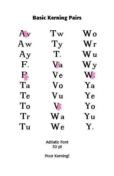
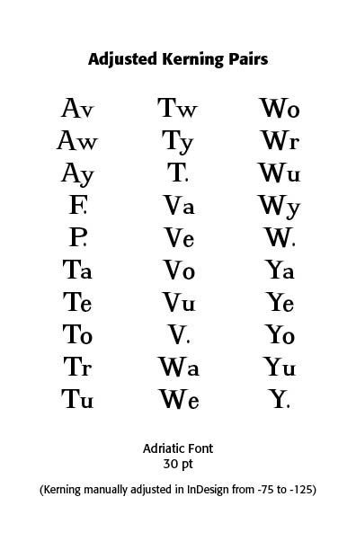
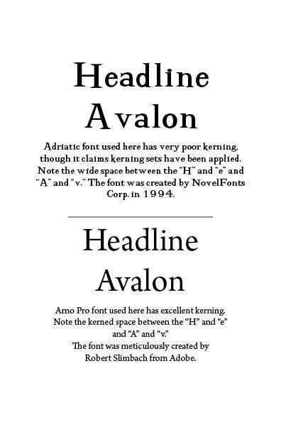
Kerning is a subjective art. Not enough, perhaps, is said about this aspect of pairs of letters and how they look to observers. How you "see" something has to be taken into account in talking about kerning. Does this look like enough space? Does it look like too much? Are the letters too tight or too loose? You need both readability and legibility, with legibility referring to the finer details of typography. Readability refers to a reader being able to absorb the body of your text. You need to watch out for certain letter combinations, like the slanted letters, A, K, V, W, Y, letters with arms or cross strokes: F, L, T, and letter combinations: W or V + A (any order); T or F + a lowercase vowel or a period or comma. The Adriatic font below shows how such combinations can look bad, even with a decent formed font design.
Lower case letters need special attention, as well, with two straight letters needing the most space, a straight and a round letter needing less space and two round letters even less space. While the letters viewed on their own may look evenly spaced, it is the letter combinations that tell if proper kerning has taken place. Point sizes of letters need special attention, with larger sizes in posters, or ads, or logos needing manual kerning. Kerning mistakes will be glaring while working with large, highly visible letters. Special attention needs to be given to text that is tightly spaced, especially in combinations like "r" plus "n," where they may indeed run together.
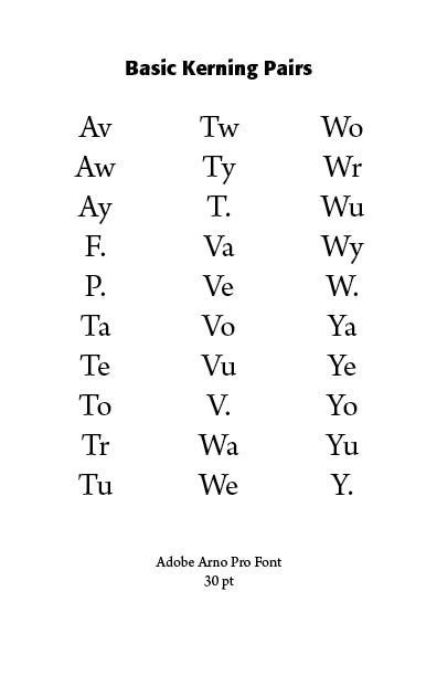
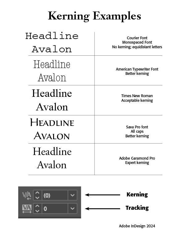
Use kerning strategically. While most major typographers offer from a minimum of 4oo pairs to over 1,000 pairs, there are actually over 30,000 possible letter combinations that could concern the typographer. Expert type has been set by people with outstanding kerning skills and meticulous care. Thus, Sumner Stone from Adobe suggests that some typographers overdo tightness. Use H and O as reference characters, both a flat and a curved edge. Best yet, use a well-designed typeface, such as the Arno Pro face shown in the example below. Take the font x-height into account for readability, with the knowledge that typefaces with large x-heights are generally more readable at smaller sizes. get creative with manual kerning in posters and logos. Take FedEx, for instance, with negative space between the letters forming the well-known arrow of the company.
Some suggestions for proper kerning would be: (1) Get a good layout program like Adobe InDesign for special type projects use. Microsoft Word simply does not cut it here; (2) Use commercially produced fonts made by reputable typographic companies, like Adobe; (3) Break down your work, especially larger pieces, like posters, into two letter pairs to spot where adjustments need to be made; (4) Get outside input and comment on your type designs and the use. See what others see; (5) Turn your work upside down and note the spaces between the letters for a different, maybe more revealing look; (6) Print your work out in different sizes and adjust kerning where needed; (7) Be careful of capital letters followed by punctuation or small letters, especially with a serif font; (8) Practice kerning using an online tool such as Kern Type.
Adobe writers note that "Practice and exposure are the key ingredients to fine-tuning your kerning expertise. Now that you have these tips and tricks in your back pocket, it’s time for you to put your kerning know-how into practice." (https://www.adobe.com/creativecloud/design/discover/kerning.html—ContributorsMadeline DeCotes, Nick Escobar, Robin Casey)
Successful Layout & Design


