Page Composition

Carl Shank • September 2, 2022

Guidelines for Good Layout*

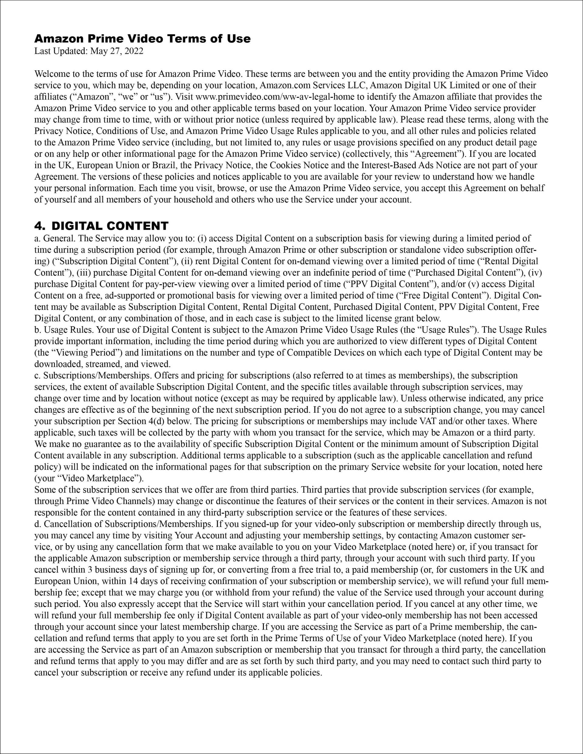
If you ever read any of these disclosure and privacy agreements that you agree to, although written in plain English, they are dense and difficult to fathom.Even if they are on the internet and if given to you in paper form, they give a visual impression that can render a subscriber or applicant frustrated, suspicious and defensive. Take a look at the sample on the top below. To be honest, most of the time we simply don't bother to read the agreements. The problems come when we have an issue with the service or product that requires us to search through these massive and poorly composed pieces.


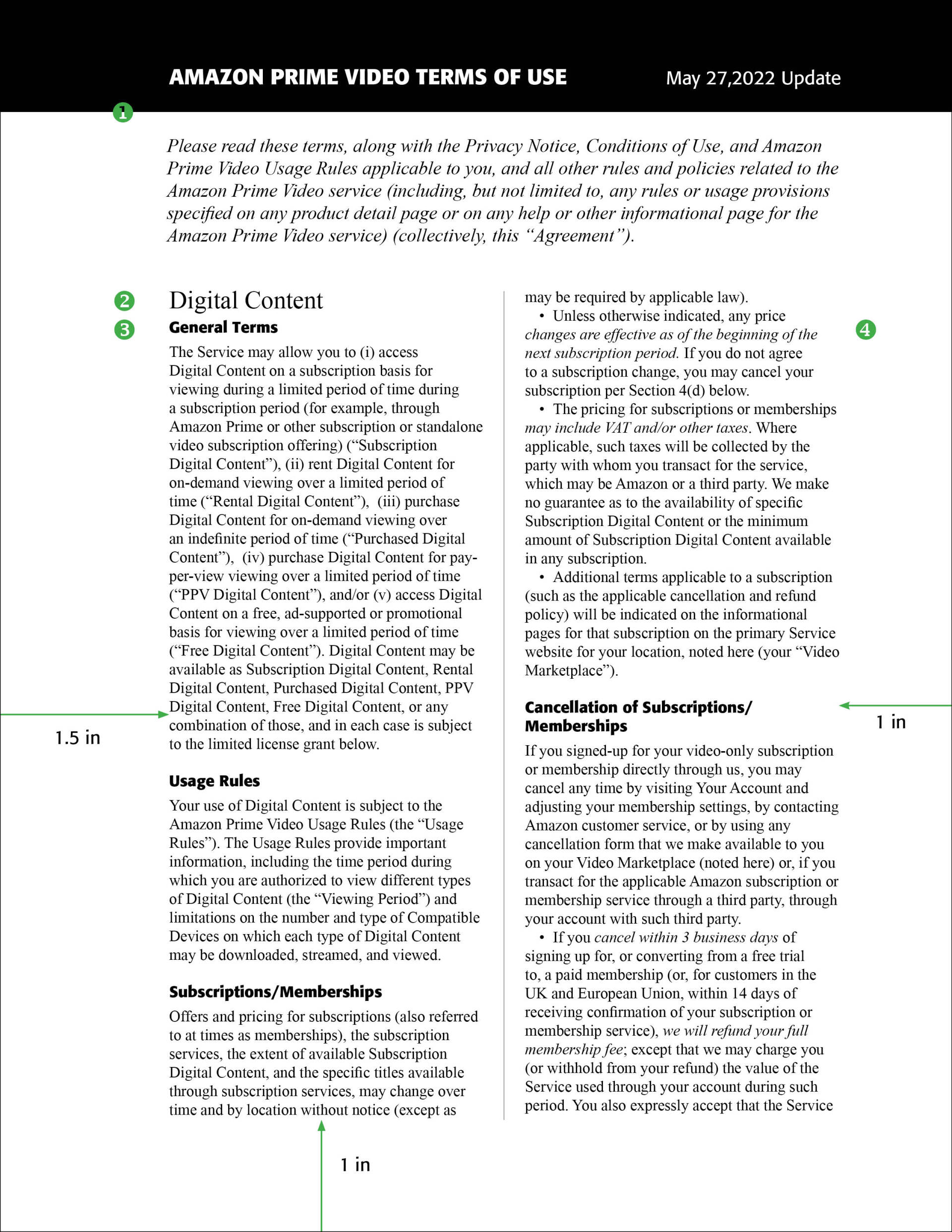
In real life, we use gestures, body language, tonal changes, and emotive elements that allow the message to get across accurately yet kindly to those who agree to the terms stated. This is done with composition and changes in type style, spacing, weight and size. It might be argued that such agreements and notices are written the way they are to save space or paper or internet usage. However, if we REALLY want the customer or subscriber to read these agreements, there is another and better way to go. This is the composition seen on the bottom below.


Type makes the message visible. The sample text is divided into conversation size pieces. Several techniques are used: (1) an obvious and strong header and beginning; (2) clear topic markers; (3) bold section markers that are easily identified; (4) visual shifts in direction using italicized type. What's changed? Text size and leading are the same (10/12) but everything else is new:


Wide margins. White space is often unused and underrated in such publications. Wide margins, according to John McWade (from which I borrowed and adapted this piece of page composition) are like "fresh linen; they set an open, inviting table." Margins are set at 1 inch all around with 1.5 inches on the left, in case the customer wants to do a three-holed punch and put them in a permanent binder (remember those?).


Medium length lines. They are the easiest to read and usually go about 5o characters or so per line.


Typographic contrasts.  Two type families are used here. Select a bold sans-serif (without feet) font for the vivid flags that point to each section. Here I am using a font called Formata, but any strong bold font will do. This conveys the authority of prominence without shouting (all CAPS type) or closing with the subheads. Notice that the numbers are also gone in these headers. The text is still Times New Roman. Italics are used to change your emphasis or tone of voice. Set each section apart from the rest using eye-pleasing space between the headers and textual elements.


*Adapted from "Guidelines for Good Layout," John McWade, Before & After, Vol. 4, No. 3, 1994, p. 7

Successful Layout & Design

By Carl Shank September 6, 2025
Art Nouveau fonts grew out of the late 19th-century Art Nouveau movement (c. 1890–1910), which sought to break away from academic, historicist styles and create a new art for the modern age. The style flourished across Europe and America in architecture, furniture, illustration, and typography. In lettering, Art Nouveau embraced organic forms, flowing curves, floral motifs, and asymmetry, reflecting the movement’s fascination with natural growth and hand-drawn ornament. Art Nouveau took its name from the Maison de l'Art Nouveau, a Parisian gallery that exhibited the works of artists and designers who were associated with the movement. The style was characterized by flowing, curvilinear forms inspired by natural shapes and motifs such as flowers, vines, and insects. It also incorporated elements from other artistic traditions, such as Japanese art and the Arts and Crafts movement. Art Nouveau was particularly popular in Europe, where it influenced a wide range of artistic disciplines, including architecture, interior design, furniture, jewelry, and graphic design. Some of the most notable Art Nouveau architects included Hector Guimard, Antoni Gaudí, and Victor Horta, while artists such as Alphonse Mucha, Aubrey Beardsley, and Gustav Klimt were celebrated for their decorative and ornamental works. Art Nouveau declined in popularity after World War I, as artists and designers began to embrace new, more modernist styles. However, its influence can still be seen in many aspects of contemporary design, and it remains an important and influential movement in the history of art and design. 
By Carl Shank August 30, 2025
Gothics History. Gothic typefaces are a broad group of styles rooted in medieval calligraphy and evolved into distinct print types during and after the invention of movable type via Gutenberg in the 15th century. They are sometimes confusingly named. In Europe “Gothic” usually refers to blackletter (medieval scripts), while in the U.S. “Gothic” often refers to sans-serif typefaces since the 1830s. Gothic script is a broad term for the entire family of medieval European scripts that developed from Carolingian minuscule around the twelfth century. “Minuscules” are lower case letters as distinct from capital letters, or uncials. Type developed in the sixth through tenth centuries with modern lettering evolving from Carolingian scripts. The Emperor Charlemagne used these letters as an educational standard. These densely packed scripts featured tall, narrow letterforms, strong vertical emphasis, sharp, angular connections, a dramatic thick/thin contrast and minimal spacing between letters. Gothic-inspired fonts create immediate medieval impact and work beautifully for titles, logos, and short display text. They are used today in Fantasy Gaming, Historical Projects, Themed Entertainment (like the Renaissance Fair), Book Design, Certificates, Breweries and Distilleries. Jack Nolan, a professional graphics designer, has provided a fetching display of such faces in his "33 Medieval Fonts Perfect for ‘Ye Olde’ Designs in 2025."(1)
Show More