A Kittl Remake
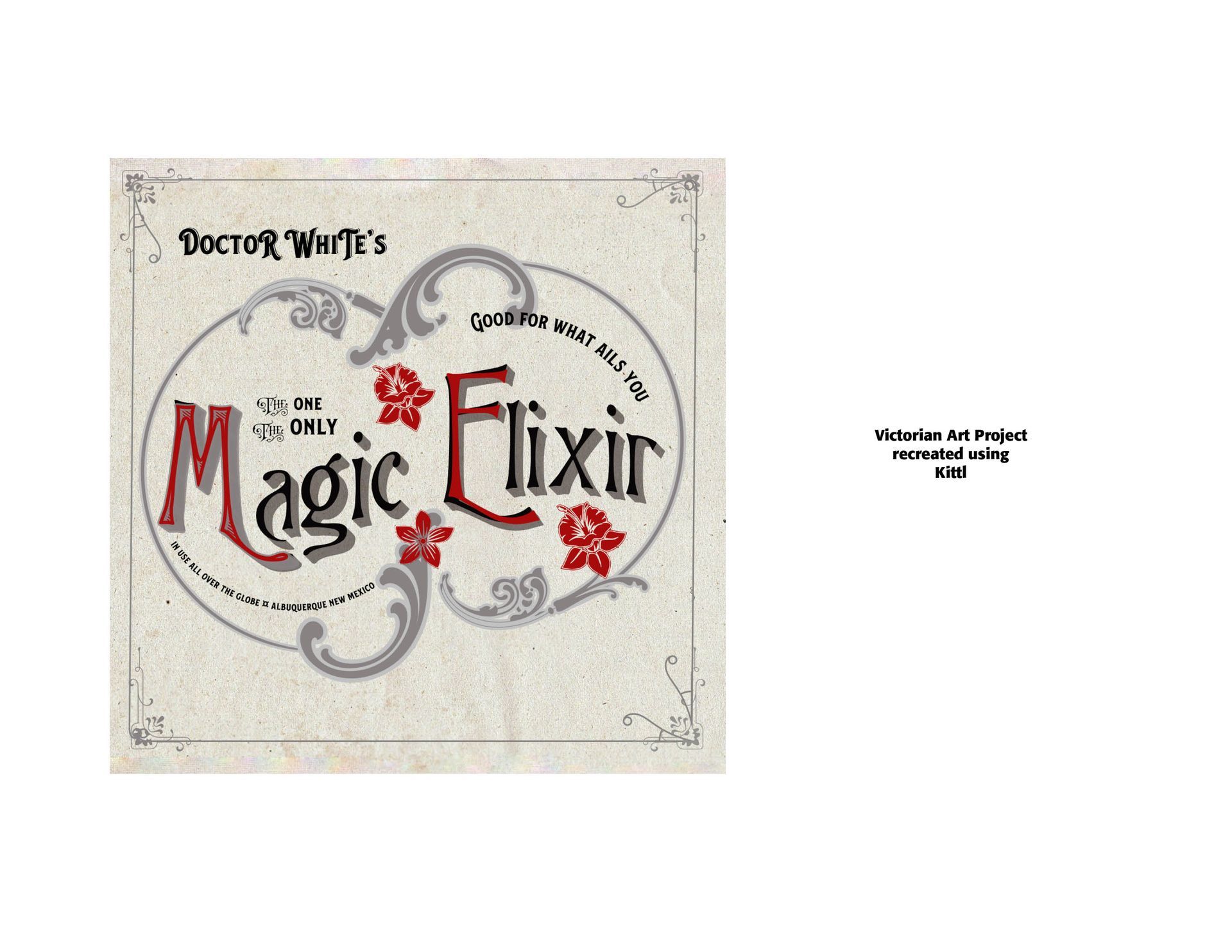
A Kittl Remake. One of the claims of the graphical design program, Kittl, is that it saves loads of time and performs admirably well and is easy to navigate. It especially does well with Victorian art, so it claims. I took an idea from The Type Project Book by Nigel French & Hugh D'Andrade in Victorian art and sought to duplicate what I could in Kittl. The results are below. Some explanatory notes are in order.
First, I could have used Adobe Illustrator (which crafted the original piece in The Type Project Book), but I wanted to see how well and how superbly the Kittl program handled the sample piece. I also wanted to see how long it would take me to actually craft the piece in Kittl. While I appreciated the Kittl ease of use, I had to import a lot of the typefaces and elements into the Kittl program to complete the project, and even then there was not a one-to-one match. What Kittl did was allowed me to warp the type easily and quickly, but the real challenges came with the fills and shading requirements. I still was not able to exactly duplicate the Illustrator crafted piece in The Type Project Book. And, it took me a lot of time and effort to actually complete the project in Kittl.
I had to import the typefaces, P22 Victorian Swash, Gothic and Belford. They were not available in Kittl. I also had to import the flowers used in the original project, since they were not exactly available in Kittl. More than that, I had to copy and re-fill the elements used for the flowers from the vintage ornaments package from the Heritage Type Co. What Kittle did do for me is eliminate any background to the imported elements and allow me to vectorize them and then re-color them to match the red colors of the project.
The ornamental swashes were taken directly from Kittl's library, which is fairly extensive, but not exactly like the original ornamentations. All in all I believe the final product looks Victorian and images the original project in The Type Project Book. However, the ability to do in Adobe Illustrator still outshines Kittl in preciseness and adaptability. This result mirrors what I found in an earlier blog ("Digitizing the Past") – closeness but not exact duplication.
See the results below.

Successful Layout & Design


