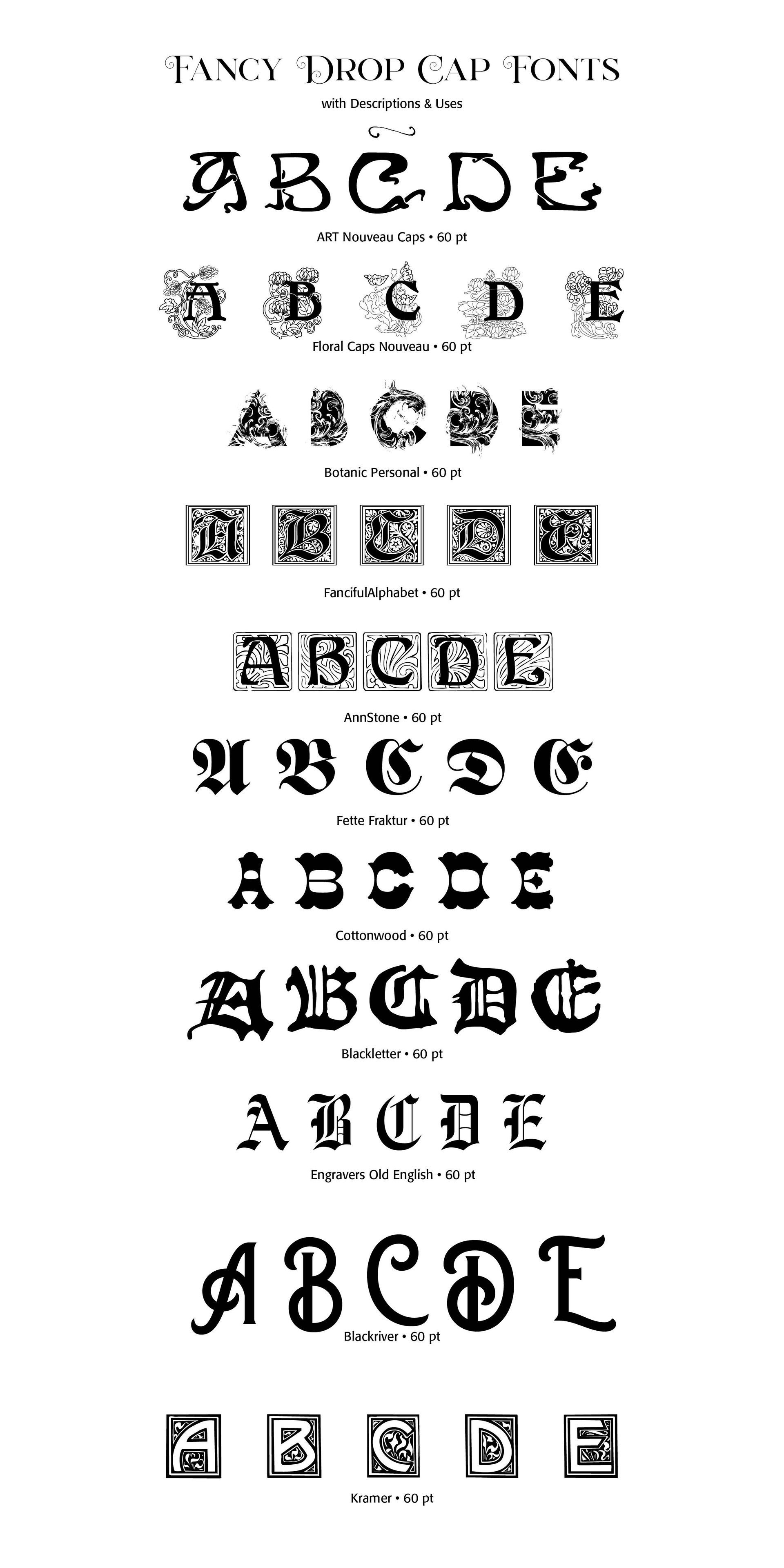
Fancy Drop Caps

Carl Shank • May 13, 2023

Fancy Drop Caps. Drop caps, or technically, versals, are larger letters that mark the start of a major text block. They are often larger than the surrounding text and visibly show off the start of a major textual work. Typographers use drop caps, often for fun and visual appeal, to show off their skill and visual intuition. Drop caps herald back to letterpress and scribal tradition, with many of them coming from calligraphy.


The practice of using drop caps dates back to the medieval times when scribes would embellish the first letter of a manuscript to make it stand out and emphasize its importance. In the early days of printing, drop caps were used primarily for their aesthetic value. Printers would carve elaborate woodcut or metal typefaces to create intricate and ornate drop caps that would catch the reader's eye and add visual interest to the page. Drop caps were often used in religious texts, where they were seen as a way to honor the divine word.


Over time, drop caps became more standardized and simpler in design, but they continued to be used as a way to add visual interest and hierarchy to the page. They were commonly used in books, newspapers, and magazines to indicate the beginning of a new section or chapter, or to draw attention to a particularly important paragraph or quote. In the digital age, drop caps have remained popular and are used in a wide range of documents, including books, magazines, newsletters, and websites. While digital drop caps lack the intricate detail and texture of their printed counterparts, they can still be effective in adding visual interest and emphasis.


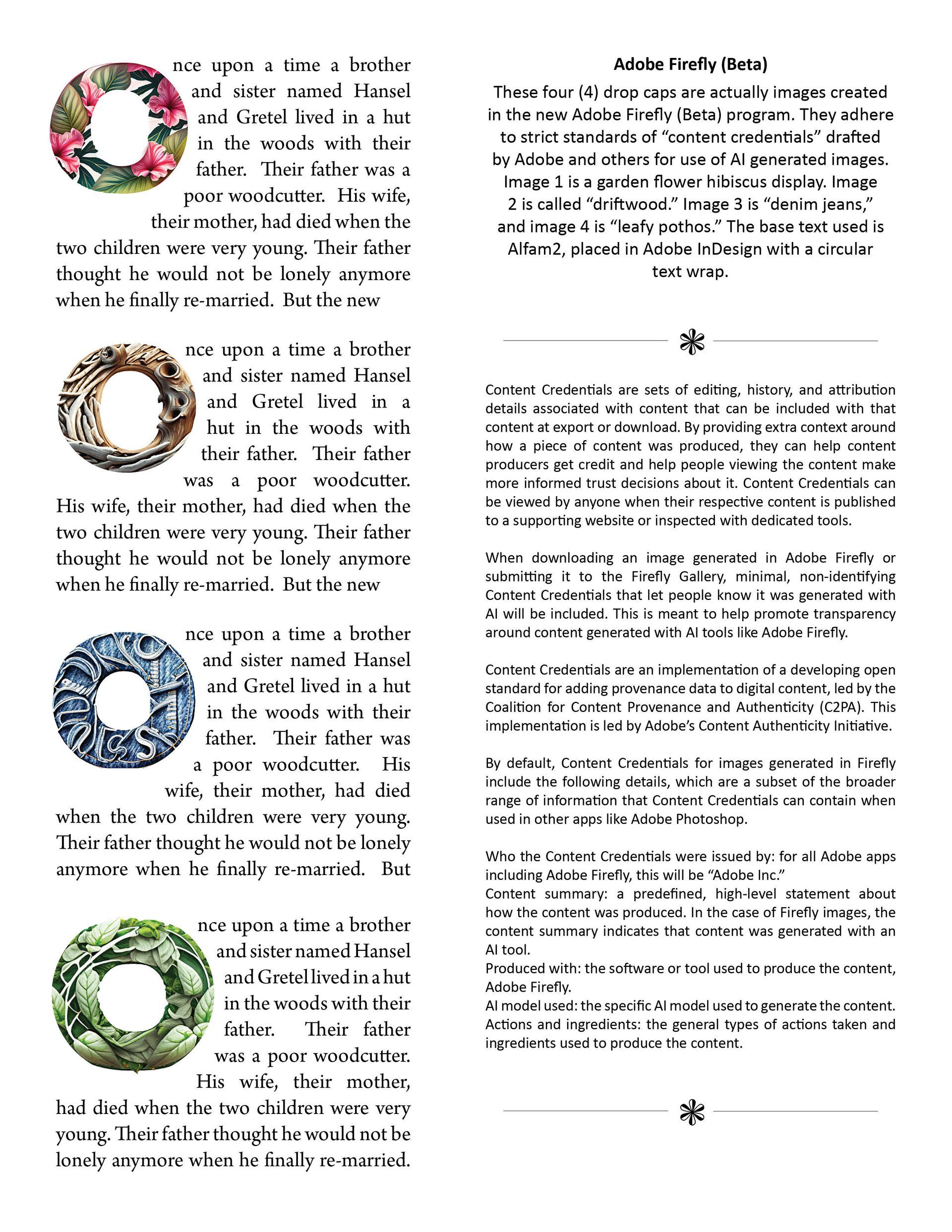
Adobe has a new program for creating text based images, called Adobe Firefly (beta). The final display below is a sampling of text made into complex images using this new program. It is an exciting program for graphic artists and designers and even typographers looking for eye-catching display.


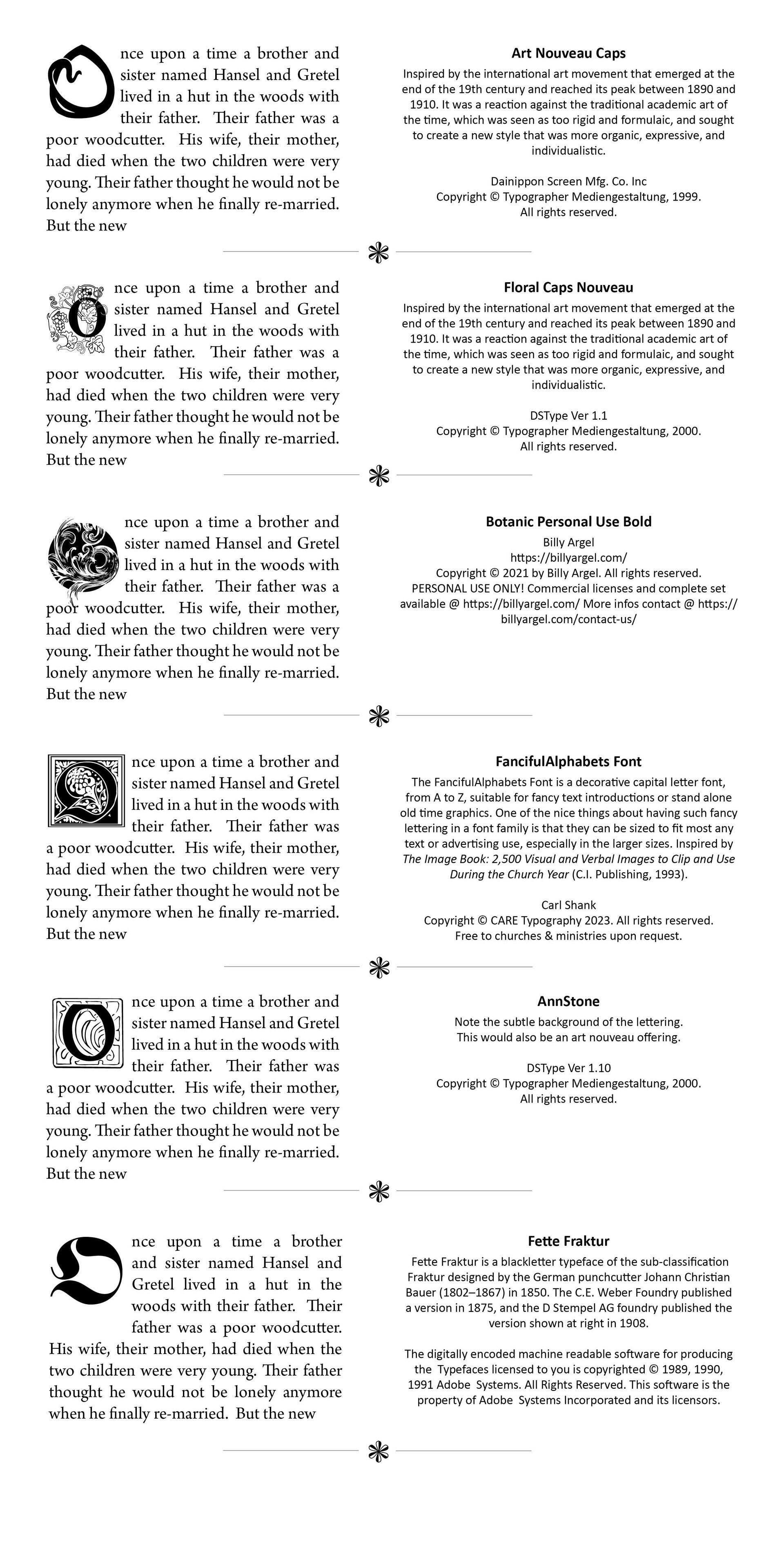
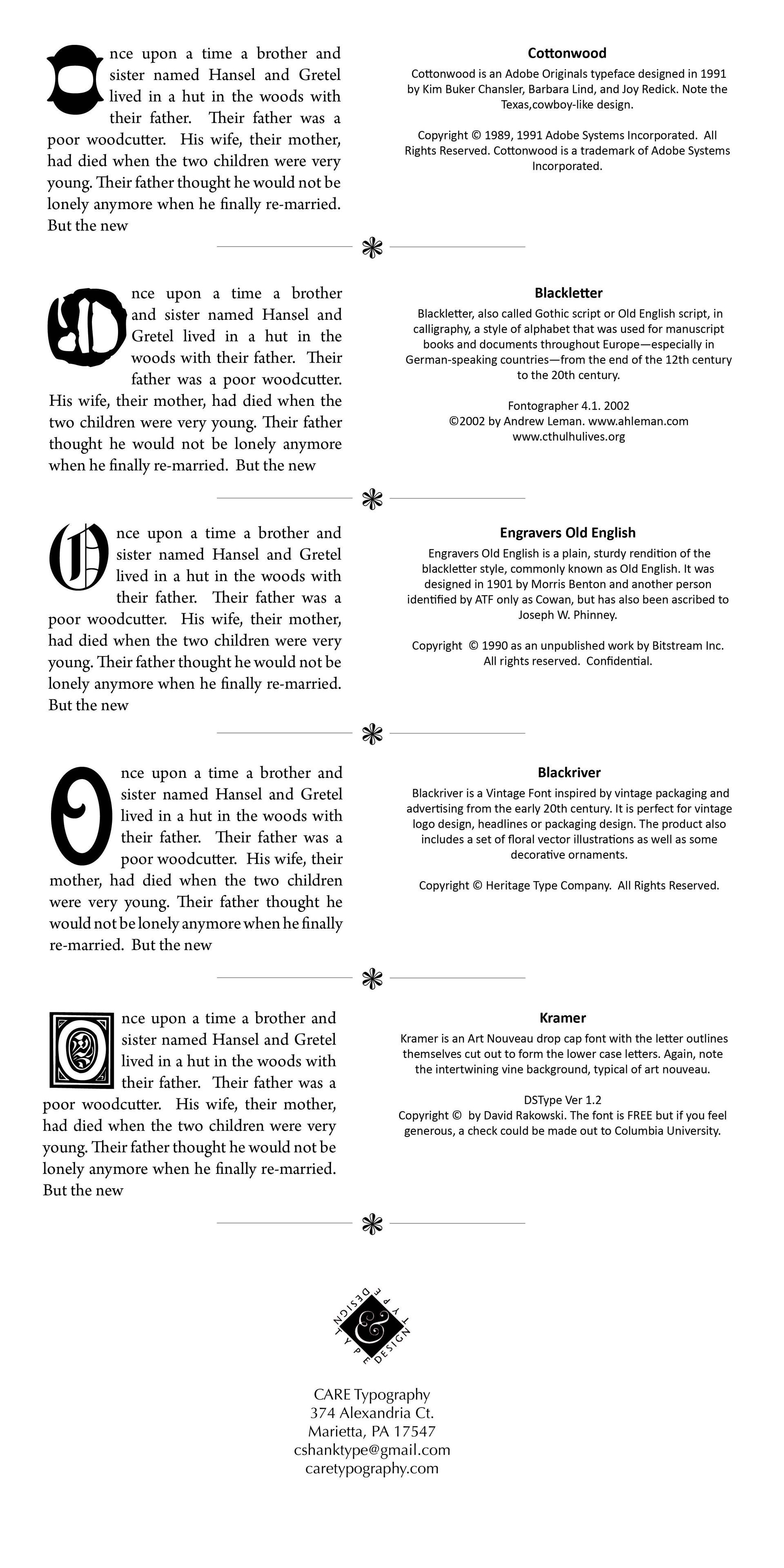
I have included below some fancy drop caps and how they might be used in a text opening. Enjoy!


Successful Layout & Design

By Carl Shank September 29, 2025
Calligraphy & Typography. Calligraphy, the art of beautiful handwriting, has a long and rich history that spans cultures, religions, and centuries. It developed not only as a means of communication but also as a form of artistic expression, religious devotion, and cultural preservation. While typography is not calligraphy, with much of type carefully structured, straight-backed and neatly drawn and focused on lettering for printing readability, both art forms involve visual expression of language. Both focus on the shape, proportion and beauty of letters. Both reflect religious, historical and cultural influences on writing styles. Both are used for artistic and decorative purposes in design, and much of type has been greatly influenced by calligraphic styles. Yet, they differ significantly in their methods, purposes and tools. Calligraphy is the art of hand drawn, beautiful writing, while typography focuses on the design and arrangement of type letters for print or digital use. Calligraphy is created manually with pens, brushes, or quills, while type is created digitally or mechanically using typefaces. Traditional tools used in calligraphy include dip pens, brushes and ink, while type is formed with digital or physical lettering. Calligraphy is highly expressive and free flowing, while type is usually uniform and consistent across all characters. Calligraphy is usually done for decorative and personal use, while typography is often constructed and used for mass communication in books, websites and signage. Mediums for calligraphy include paper, parchment, walls, while typography focuses on print and digital media. Yet, the roots of much of type comes from the wealth of history and styling offered by calligraphy. CARE Typography has been able with Font Lab's tools like Fontographer, to translate fine calligraphy into usable typefaces, even for the modern market tastes. The fine art of calligraphy is highlighted in the background to this post in the 2018 calligraphic rendering of the Scripture, "Well done, good and faithful servant" (Matthew 25:25a) by Calligraphy for Christ ( https://www.calligraphyforchrist.com/ ). Such beautiful religious typographic pieces actually begin not with the Gutenberg era in 1450 but with the ancient Chinese.
By Carl Shank September 22, 2025
Herbert Hoffmann, Albert Bruckner, Max Hertwig, and Rudolf Koch collaborated on a typographic “atlas” or specimen book titled Hoffmanns Schriftatlas: Das Schriftschaffen der Gegenwart in Alphabeten und Anwendungen (1930) ( Hoffmann’s Type Atlas: Contemporary Type Creation in Alphabets and Applications ) Also distributed in France under the title Alphabets by Herbert Hoffman and other collaborators by Arts et Métiers Graphiques magazine, it is a specimen of alphabets, initials, monograms, logos and other typographic forms from early German typography. The atlas captures typographic modernism in Germany around that time, including influences of the Bauhaus and the modernist movement. It is considered a rich visual record of type and lettering design in that period, showing both experimental and traditional forms. In Part One of this series, we investigated the typography of early Germany through the lens of Rudolf Koch, Louis Oppenheim, E.R. Weiss, Lucian Bernhard, Friedrich Wilhelm Kleukens, and Bernard Naudin. In this Part Two we revisit the typography of Ernst Deutsch, Friedrich Heinrichsen, Benjamin Krebs Nachfolger, Maria Ballé, Margarete Leins, Anna Simons and take a brief visit to the Ecole des Arts et Metiers in Stuttgart.
Show More