A Type Tool For You
A Type Tool and An Offer
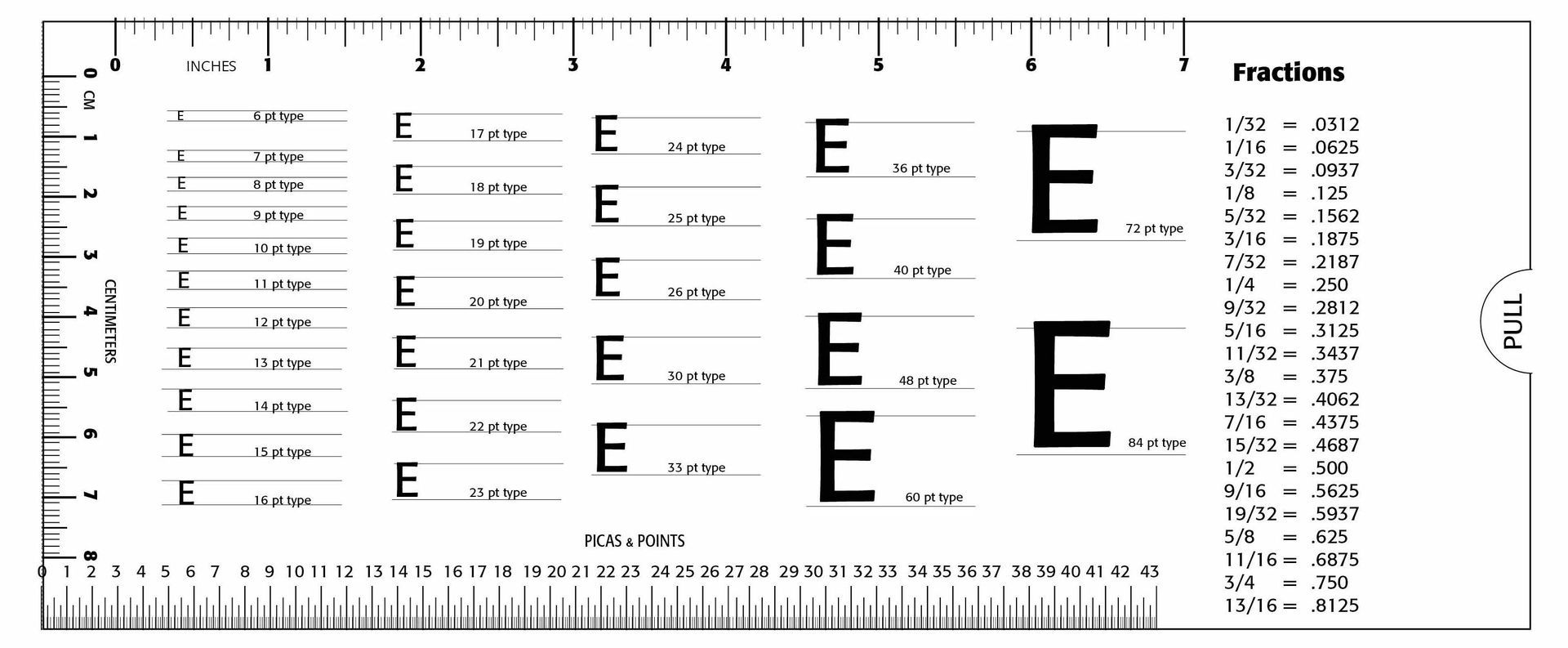
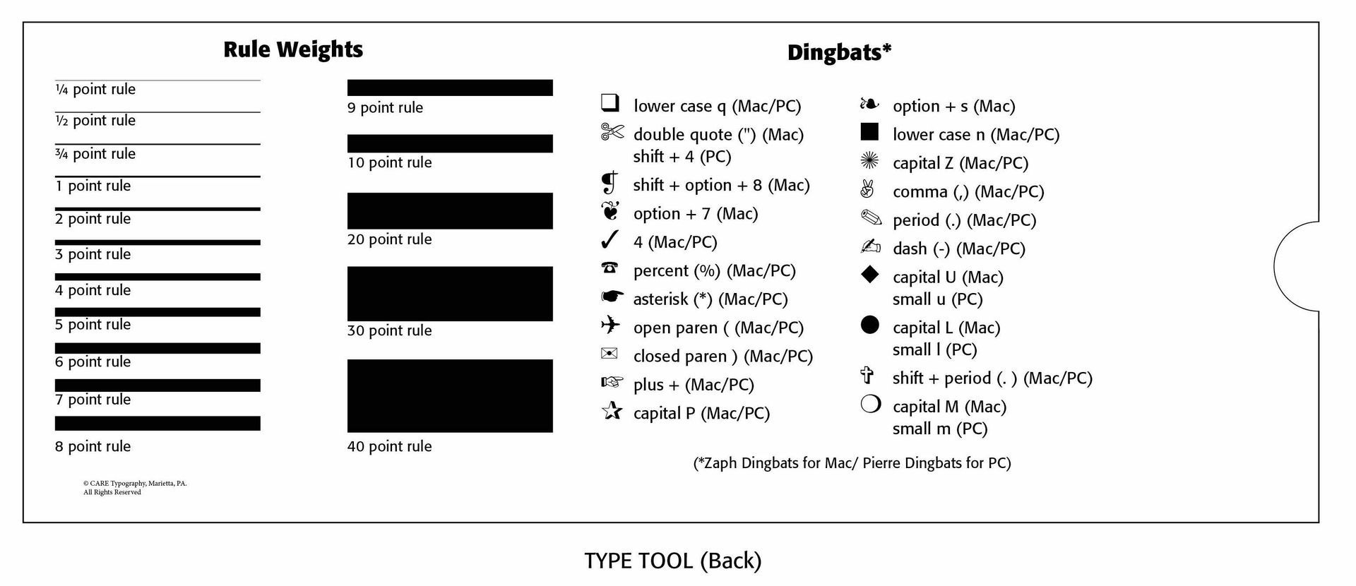
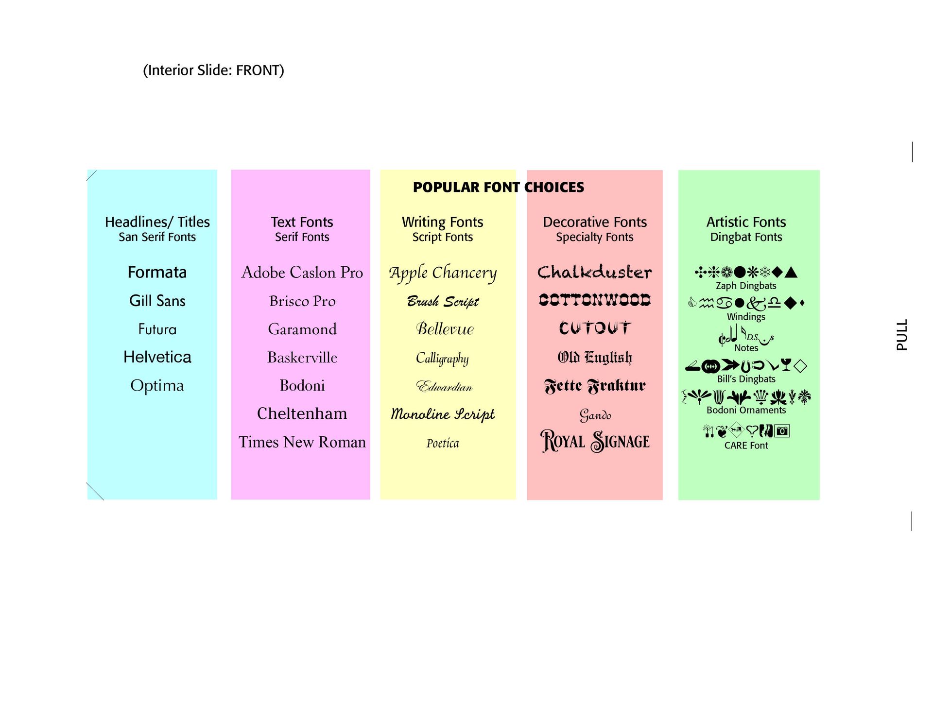
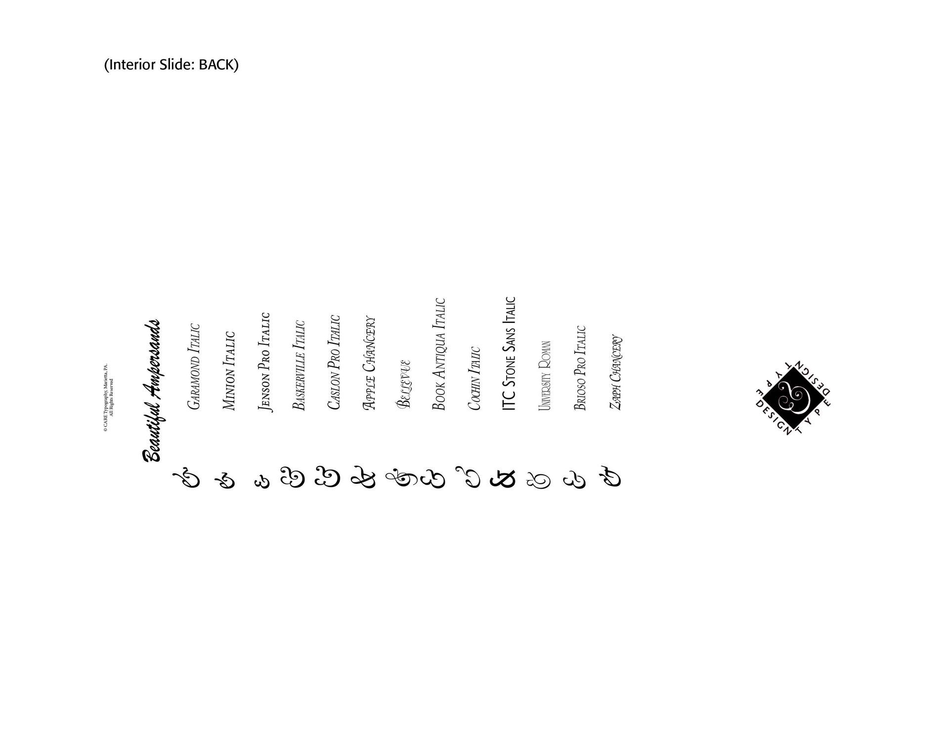
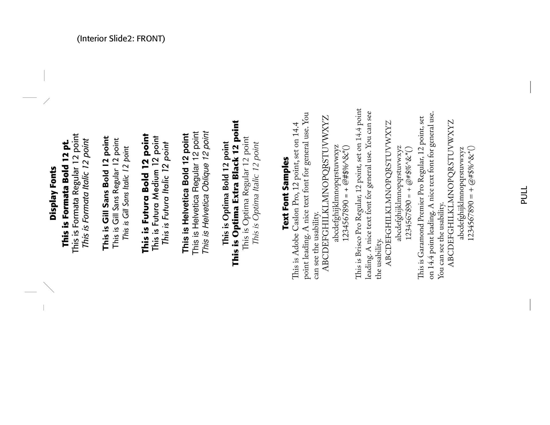
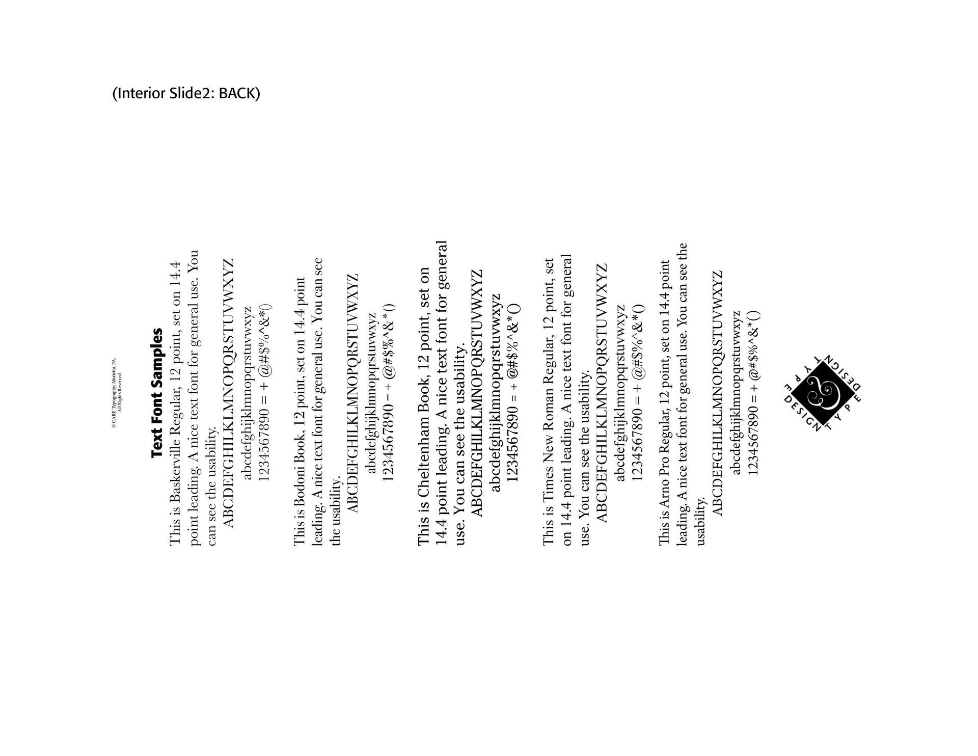
I remember the "good old days" of type and typesetting and layout tools mailed to you by different companies. I still have many of those type spec tools in my layout drawer. I have constructed a Type Tool for your use and enjoyment. It has been a labor of love, constructing the inch ruler, centimeter ruler and pica & point rulers. These have been done from hand by using standard measuring tools. I also put on a fractional equivalency chart, a useful dingbats reference, and an inside pull slider giving some samples of popular font choices and amazing ampersands.
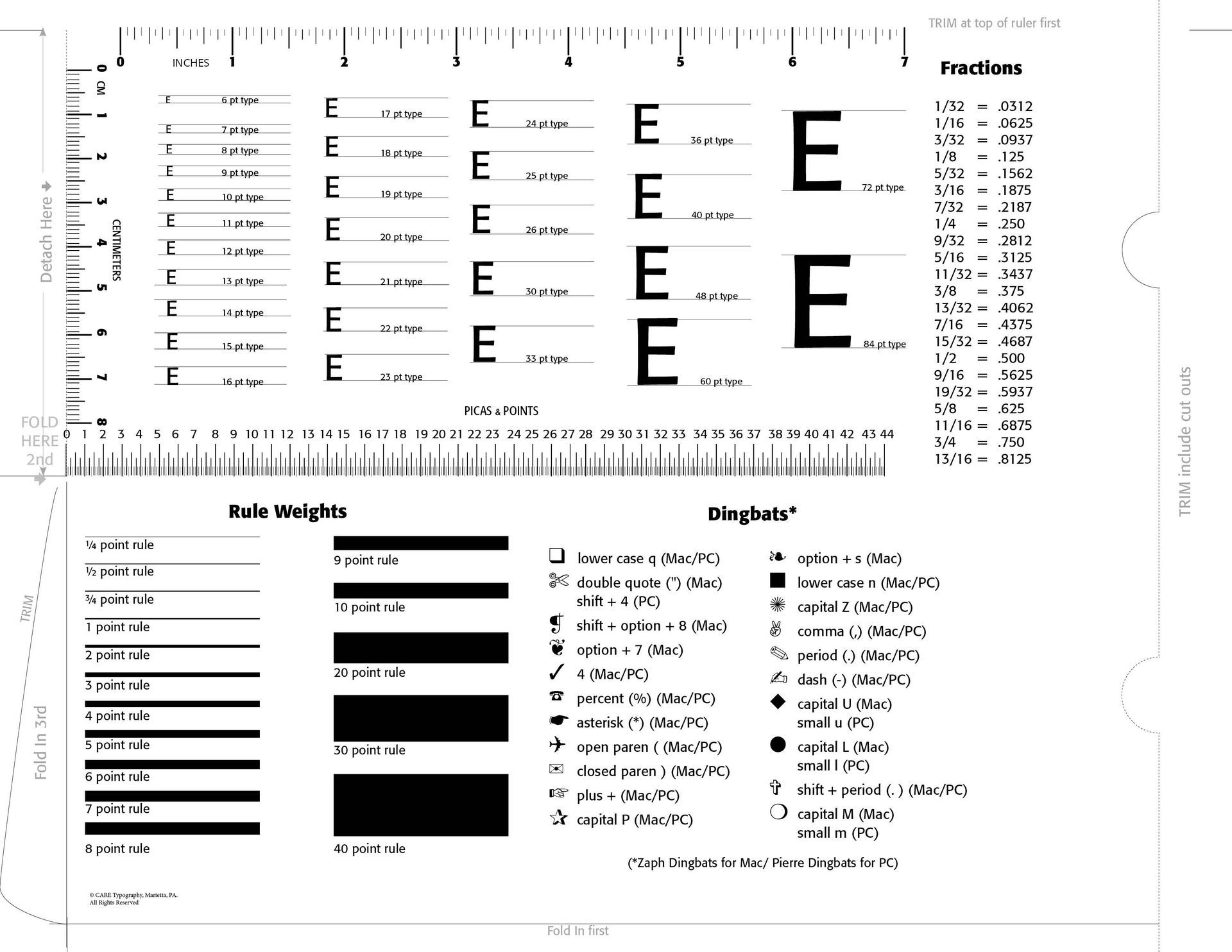
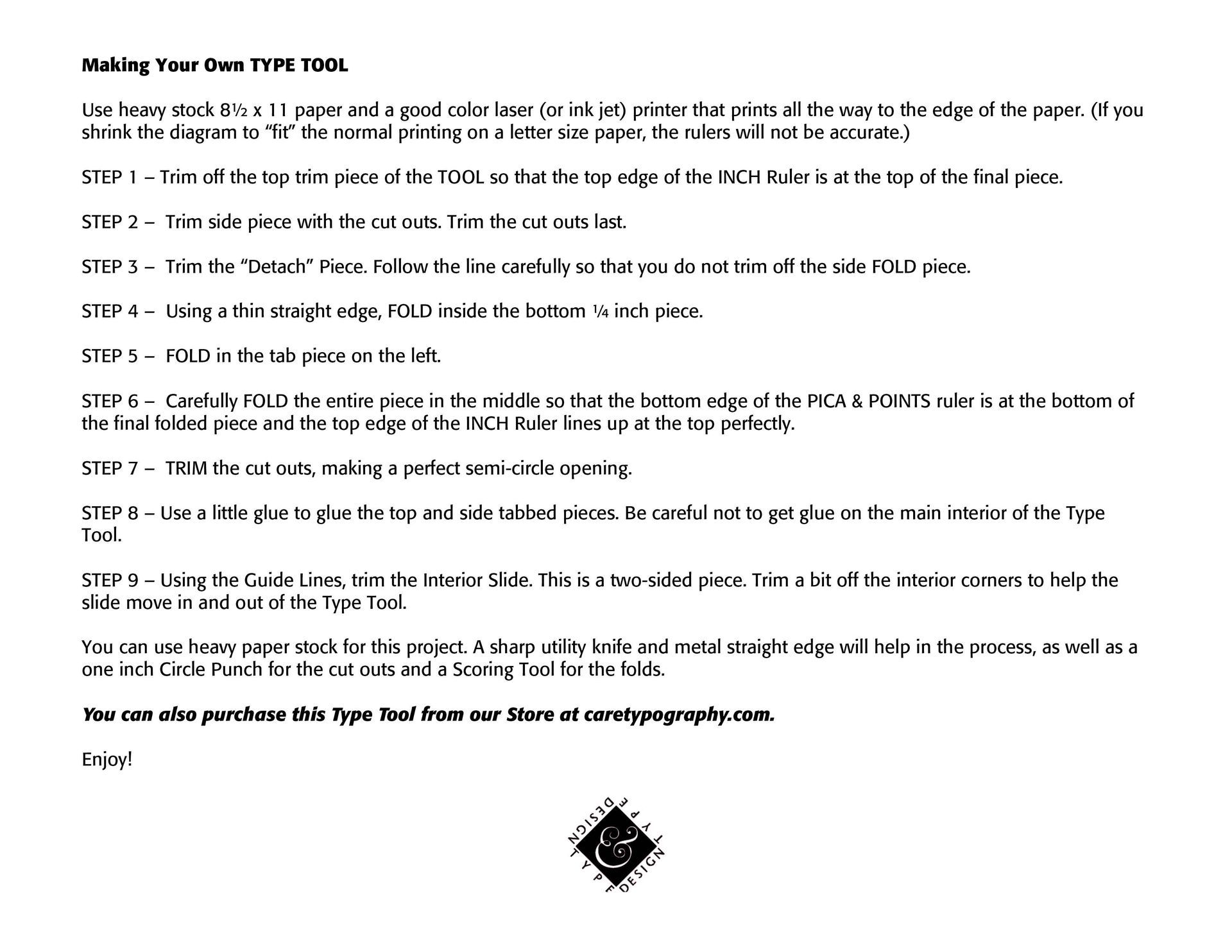
I am including the construction method of this Tool below for your use and fun. You will need a program that can produce an 11 x 8.5 image and download the PDF from here. I am also offering through our Store the Type Tool and a thumb drive of all the blogs I have posted up to this date. They are catalogued using Adobe InDesign's program, employing the Minion Pro font and Formata Bold as well. Quite a bit of work went into these instruments of typography and graphic design tools, so I hope you are able to order and use them freely. They are copyrighted, so please do not remake them as your own.
Most of all, enjoy!
Successful Layout & Design


