An Art Nouveau Font
An Art Nouveau Font. Grasset Regular. Eugène Samuel Grasset (25 May 1845 – 23 October 1917) was a Swiss decorative artist who worked in Paris, France in a variety of creative design fields during the Belle Époque. He is considered a pioneer in Art Nouveau design.
Art Nouveau is an international style of art, architecture, and applied art, especially the decorative arts. It was often inspired by natural forms such as the sinuous curves of plants and flowers. Other characteristics of Art Nouveau were a sense of dynamism and movement, often given by asymmetry or whiplash lines, and the use of modern materials, particularly iron, glass, ceramics and later concrete, to create unusual forms and larger open spaces. It was popular between 1890 and 1910 during the Belle Époque period, and was a reaction against the academicism, eclecticism and historicism of 19th century architecture and decorative art. The new art movement had its roots in Britain, in the floral designs of William Morris, and in the Arts and Crafts movement founded by the pupils of Morris.
New technologies in printing and publishing allowed Art Nouveau to quickly reach a global audience. Art magazines, illustrated with photographs and colour lithographs, played an essential role in popularizing the new style. The Studio in England, Arts et idèes and Art et décoration in France, and Jugend in Germany allowed the style to spread rapidly to all corners of Europe. Aubrey Beardsley in England, and Eugène Grasset, Henri de Toulouse-Lautrec, and Félix Vallottonachieved international recognition as illustrators.
Grasset taught design at the École Guérin from 1890 to 1903, at the École d’Art graphique in the rue Madame from 1903 to 1904, at the Académie de la Grande Chaumière from 1904 to 1913, and at the École Estienne in Paris. Grasset had freely adapted the alphabet of Nicolas Jenson (1471) with the intention of using it to print a book on his own method for ornamental composition, inspired by the courses he gave to the Guérin school. Georges Peignot acquired Grasset's alphabet and obtained an official patent on 7 October 1897 for the typeface under the name, "Grasset". He then gave Henri Parmentier, the workshop's punchcutter, the mission to engrave it. (Wikipedia)
Maurice Pillard Verneuil (29 April 1869 – 21 September 1942) was a French artist and decorator in the Art nouveau movement. He was born in Saint-Quentin, France. Maurice Pillard Verneuil learned his trade from the Swiss designer Eugène Grasset. Maurice Pillard Verneuil then went on to become a well-known artist and designer. He was inspired by Japanese art and nature, particularly the sea. He is known for his contribution to the art deco movement and, in particular, his use of bold, floral designs in ceramic tiles, wallpapers and other furnishing textiles.
His designs covered both the Art Nouveau and Art Deco periods subsequently transitioning into his much acclaimed geometric patterns. Verneuil also produced numerous poster works in France alongside the well-known artists such as Toulouse-Lautrec and Chéret. Other collaborators included Armand Point, René Juste, Alfons Mucha and Mathurin Méheut. (Wikipedia)
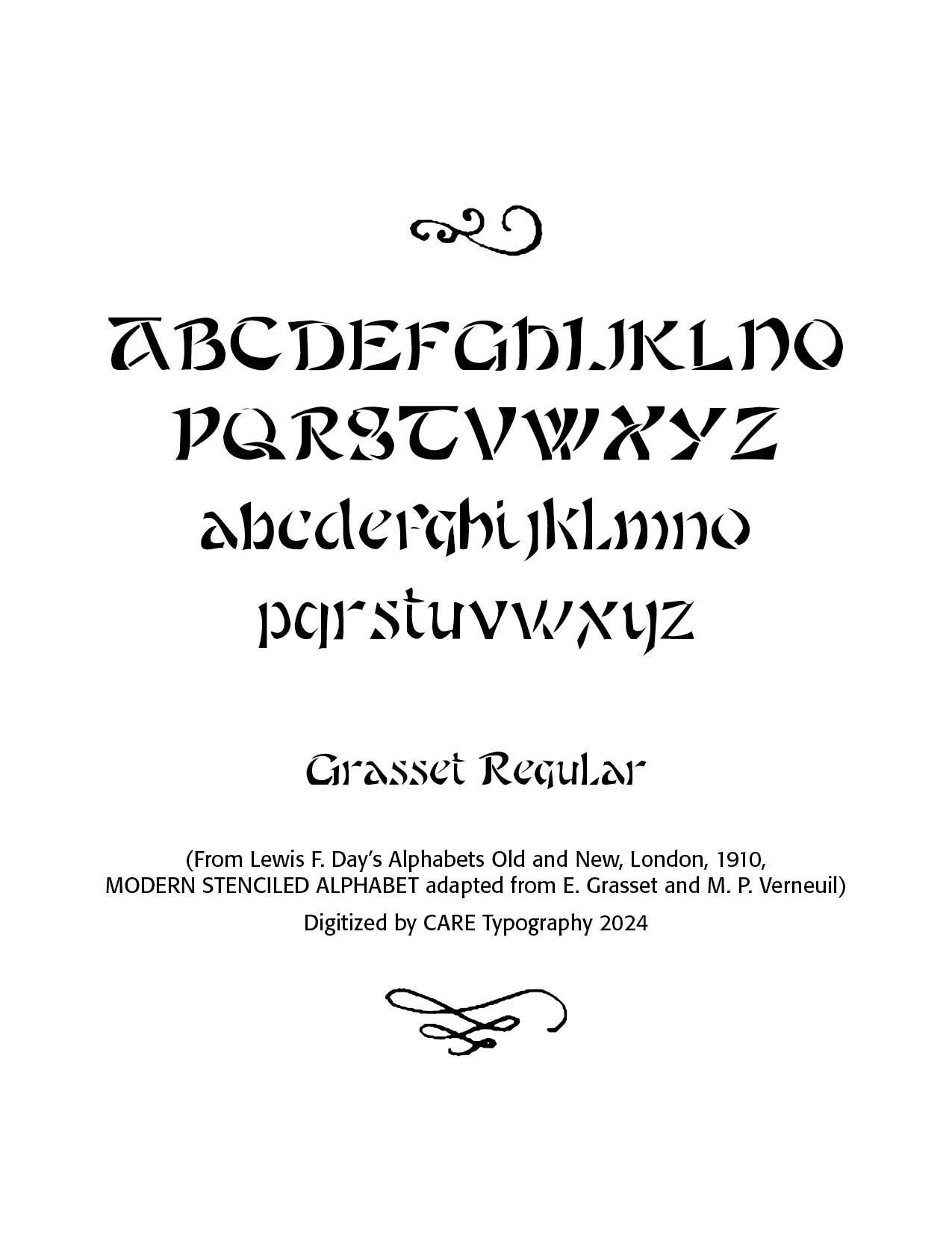
The Grasset Typeface below from Lewis F.Day's Alphabets Old and New, London, 1910, shows that art nouveau flair for which these men were famous. The font has been digitized by CARE Typography and is offered with a number of other historic fonts for a modest fee. Contact cshanktype@gmail.com for details.
Successful Layout & Design


