Historic Font Sets
Lewis F. Day's book, Alphabets Old and New, published in London, in 1910 gives sterling examples of his typography work. Day's approach to design, blending traditional craftsmanship with modern industrial techniques, helped shape the transition from Victorian aesthetics to more modern design principles. CARE Typography has digitized a number of the font faces in the book for modern use and aesthetic appeal. The typefaces below illustrate the beauty and craftsmanship of Day which can contribute to modern typography.
These carefully drawn typefaces have been digitized by CARE Typography using Fontographer to make them available as usable fonts. Caps or Unicals are often used in display faces and advertising. These usable font sets, with both caps and lower case letters, are available. Some of these classic faces can enliven your printing and advertising projects. They are available, either individually, or as a set, for a modest fee. Contact CARE Typography cshanktype@gmail.com for more information and ordering.
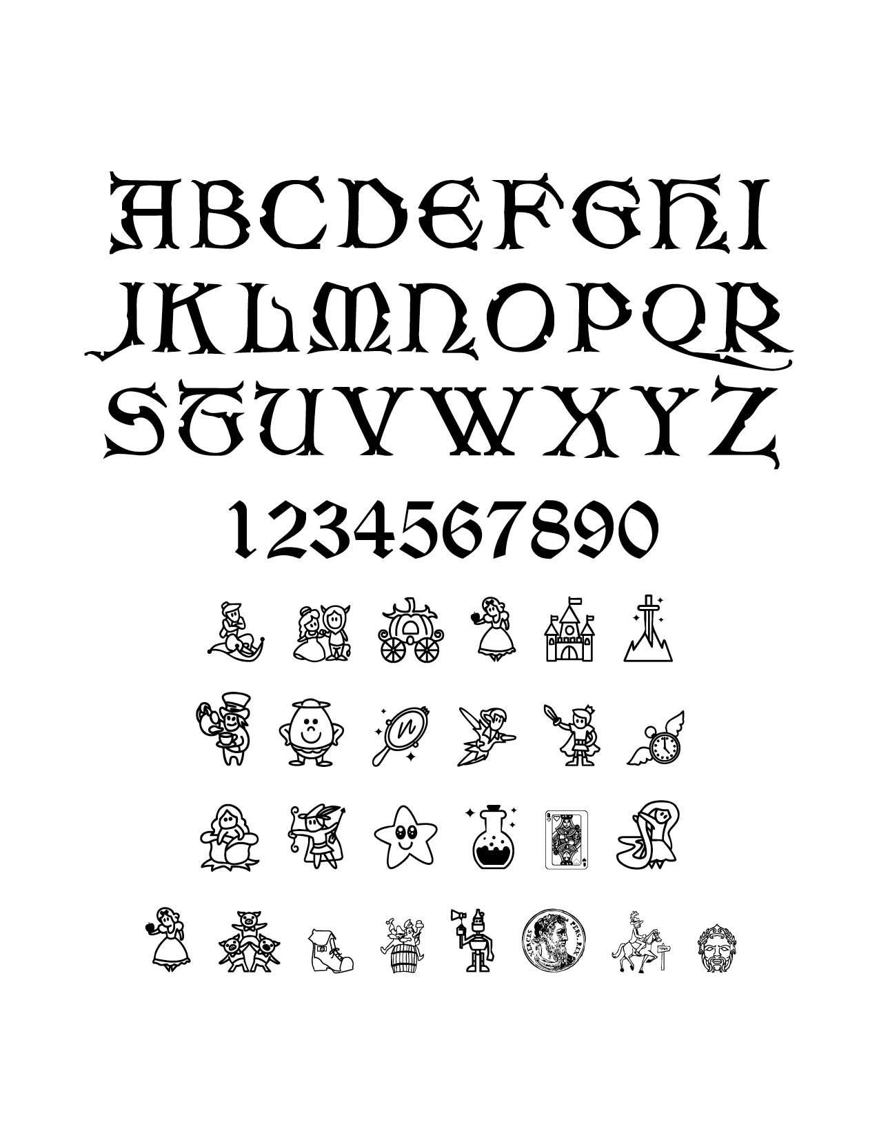
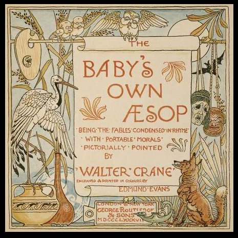
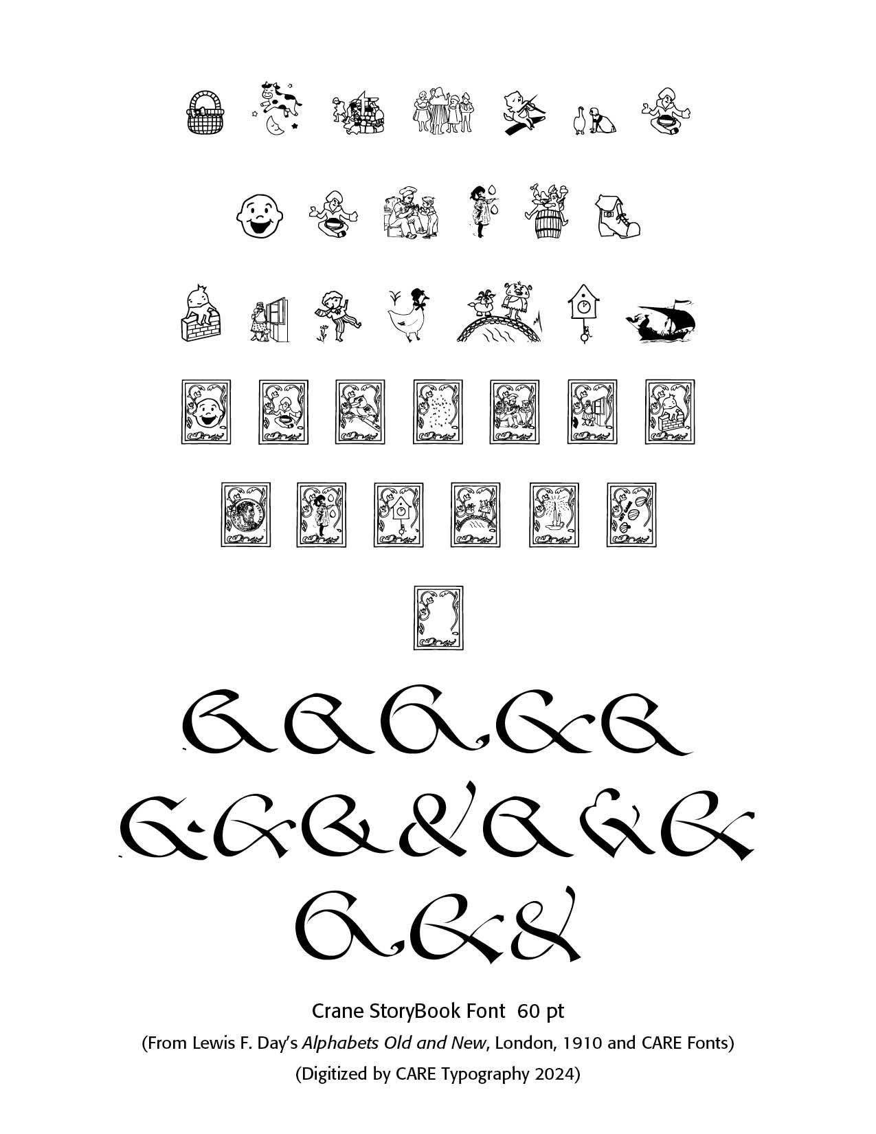
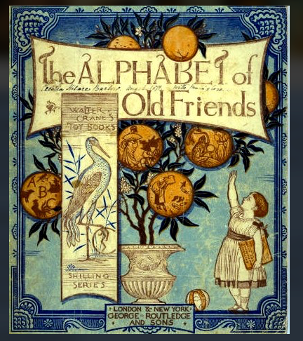
Crane StoryBook Font. Walter Crane (1845–1915) was a prominent English artist and illustrator of children's literature. Renowned for his imaginative and colorful illustrations in children's literature, he is often regarded as one of the most influential figures in the development of children's book illustration during the late 19th century, alongside notable contemporaries like Randolph Caldecott and Kate Greenaway. His early influences included the Pre-Raphaelite movement and the Arts and Crafts Movement, particularly through his collaboration with William Morris. Crane's work is characterized by vibrant nursery motifs and decorative arts, which significantly shaped the genre of children's illustrated literature. He illustrated numerous classic tales, including The Faerie Queeneand various nursery rhymes, and his style was heavily influenced by Japanese prints and Gothic art.
In 1862, his picture "The Lady of Shalott" was exhibited at the Royal Academy, but the academy steadily refused his maturer work and after the opening of the Grosvenor Gallery in 1877, he ceased to send pictures to Burlington House. In 1863 the printer Edmund Evans employed Crane to illustrate yellowbacks, and in 1865 they began to collaborate on toy books of nursery rhymes and fairy tales. From 1865 to 1876 Crane and Evans produced two to three toy books each year. In 1864 he began to illustrate a series of sixpenny toy books of nursery rhymes in three colours for Edmund Evans. He was allowed more freedom in a series beginning with The Frog Prince (1874) which showed markedly the influence of Japanese art.
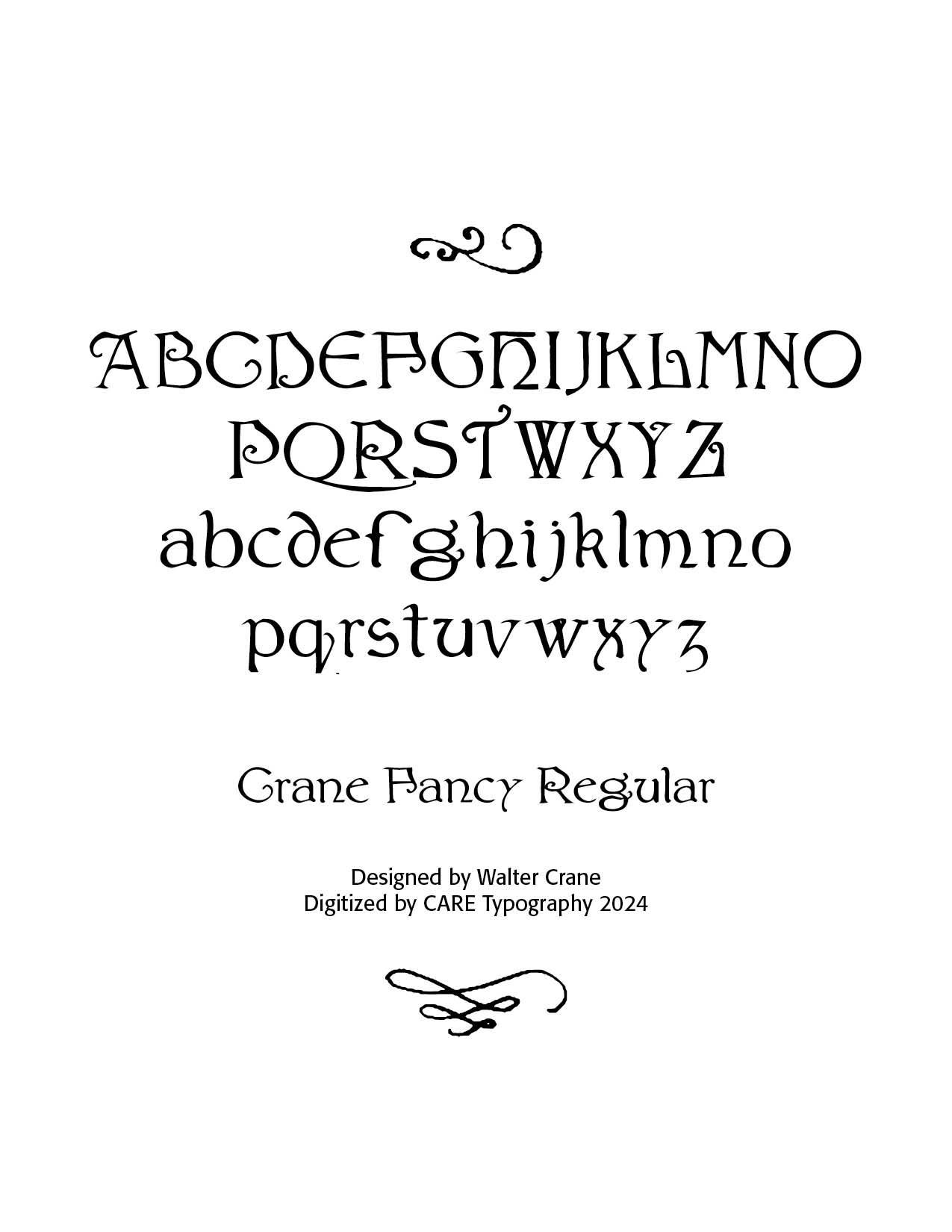
I was introduced to Crane through Lewis F. Day's book, Alphabets Old and New: For the Use of Craftsmen (B.T. Batsford, London, 1910). In that book, Day gave a number of superb diagrams of fonts developed through the ages of typography. While Nick Curtis of Nick's Fonts, produced Crane Titling NF in 2006 (available in MyFonts), CARE Typography digitized Crane's unique alphabet and joined it to previously published font offerings, StoryBook and Fairy Tale fonts, ((See Blog, Dec 15, 2003) because of his children's book interests. The resulting Crane StoryBook font is a goldmine for children's book authors and printers. Crane Fancy Regular is another font offering designed by Walter Crane. Both fonts are available from CARE Typography for a nominal fee. Contact caretypography.com.
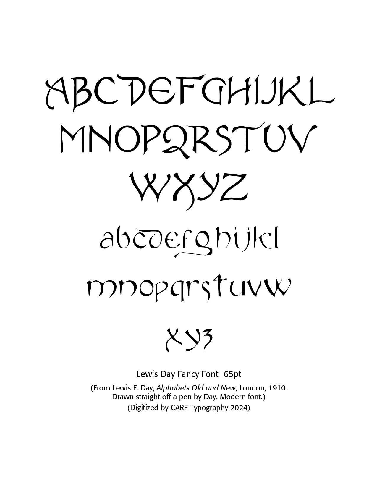
The Lewis Day Fancy Font. Day says this typeface was drawn straight off a pen by the author. It is termed a "modern" font. Note the extra lower swash on the lower case "d" and "g" and the special upper case "A" and "Q." The "E" and "e" are leftovers from the Gothic font age.
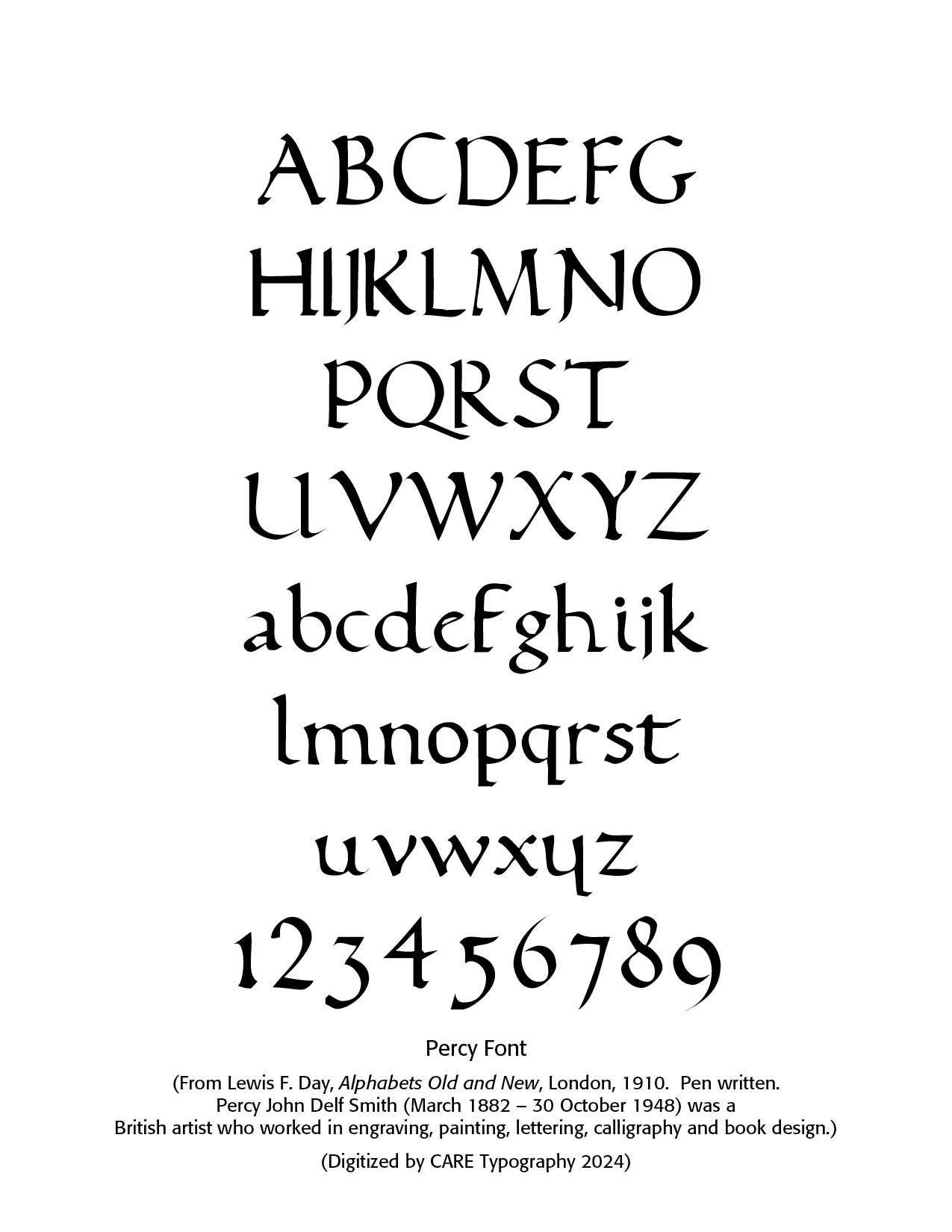
The Percy Font. Percy John Delf Smith (March 1882 – 30 October 1948) was a British artist who worked in engraving, painting, lettering, calligraphy and book design. He studied at Camberwell and the Central Schools of Arts and Crafts. His instructor in lettering at Camberwell was Edward Johnson, an extremely influential calligrapher and lettering artist whose Arts and Crafts movement style of lettering and use of Roman capitals had a strong influence on Delf Smith's career.
Delf Smith then established a career as a lettering artist and teaching the topic, publishing Lettering & Writing, a slipcase of lettering models, in 1908. His teacher and mentor, Edward Johnson, wrote that "The Roman capitals have held the supreme place among letters for readableness and beauty. They are the best forms for the grandest and most important inscriptions. Delf Smith shared this style, naming his workshop the Roman Lettering Company and commenting that Roman lettering has "content and atmosphere, and good examples convey a sense of stability and satisfaction." (wikipedia) Note the slightly upturned bottom serifs and what are called the "old style" numerals.
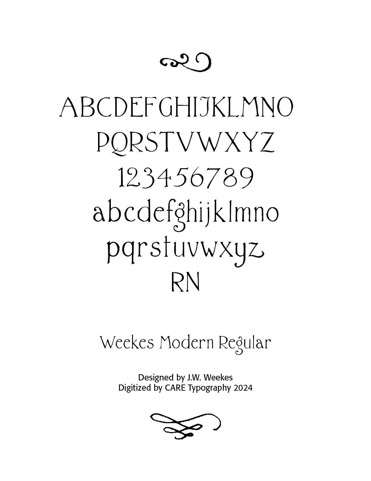
Weekes Modern Font. J.W. Weekes is a notable figure in the field of printing and print media. His work primarily revolves around the technical and historical aspects of printing technology. Weekes has contributed significantly to the understanding and advancement of printing processes, materials, and the evolution of print media.
His expertise includes a deep knowledge of traditional printing methods such as letterpress and offset printing, as well as modern digital printing technologies. Weekes is known for his research on the impact of printing technology on media and communication, exploring how advancements in printing have influenced both the production and dissemination of information.
He was well-regarded among his peers and had a significant impact on the printing community in the Ottawa Valley. Weekes was known for his expertise in the art of printing, which he practiced professionally. His reputation as a skilled printer was acknowledged by his contemporaries, and he was a respected member of the typographical union. Weekes has authored several influential works on printing history and technology, shedding light on how printing practices have evolved over time and their implications for contemporary media. His contributions are valuable to both academics and professionals in the printing industry, providing insights into the technical and historical dimensions of this important field.
Letterer from the last part of the 19th century. Examples of his alphabets (taken from the 1910 book by Lewis Foreman Day entitled Alphabets Old and New) include Modern Roman, another Modern Roman, and Modern Roman Block (sans serif). Crane Titling NF (2006, Nick Curtis) is a digital typeface with medieval-inspired uppercase letters drawn by famed book illustrator Walter Crane. The charming quirky lowercase letters are from alphabets in that 1910 book drawn by J. W. Weekes.
The Weekes Modern Font was digitized by CARE Typography from samples in Lewis F. Day's book. The small letters (minuscules) can be found in Crane Titling NF by Nick Curtis in MyFonts. The capitals (manuscules) are found in my rendering below along with the small letters. CARE is offering this typeface for a minimal fee. Contact www.caretypography.com for details and downloading.
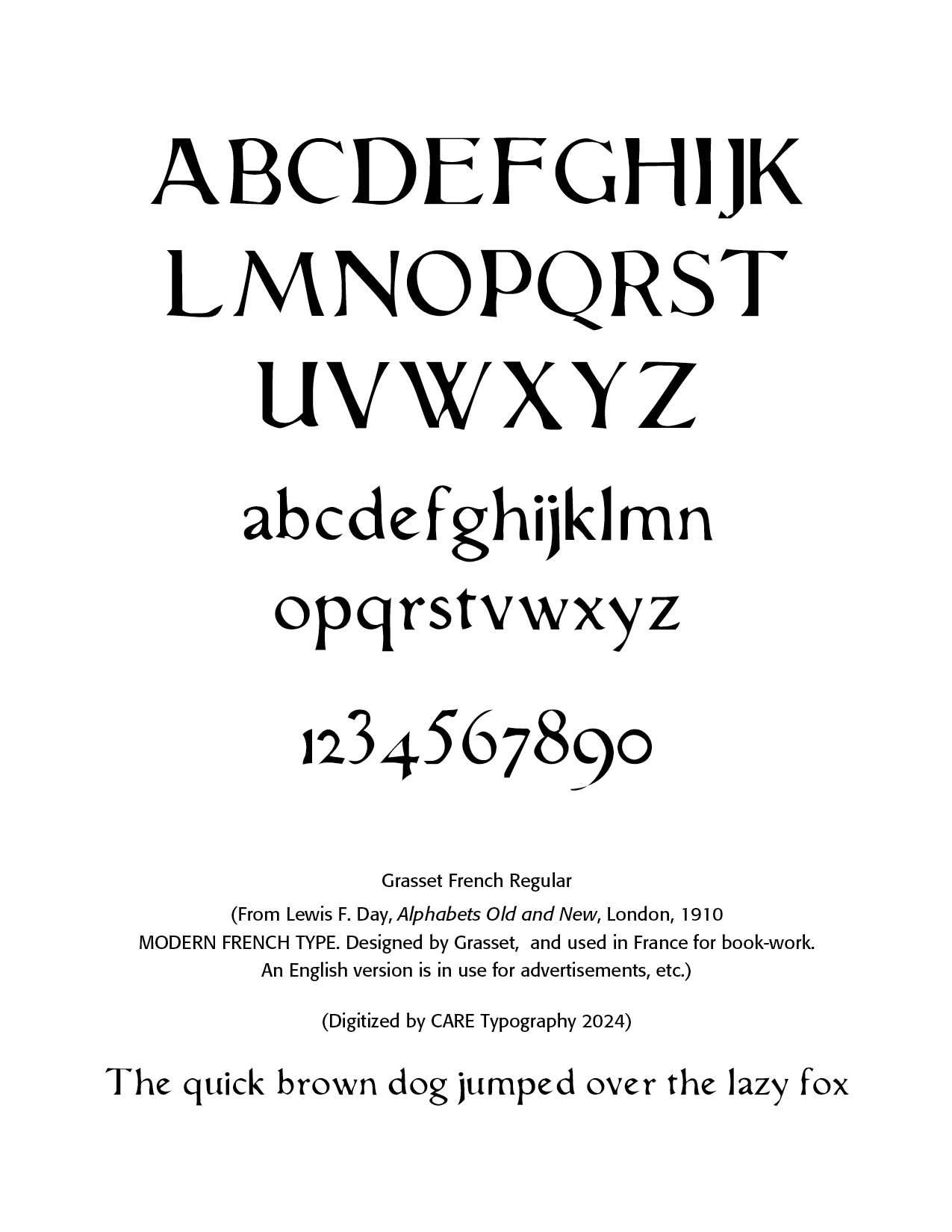
Grasset French Font. Eugène Grasset (1845–1917) was a Swiss-born graphic designer and decorative artist, often considered one of the pioneers of the Art Nouveau movement. He was born in Lausanne, Switzerland, and later moved to France, where he became highly influential in both the fine and applied arts.Grasset is best known for his contributions to poster art and book illustration. His posters, particularly for advertising, were striking in their use of bold colors, stylized figures, and decorative patterns, often inspired by medieval and Gothic art. One of his most famous works is the poster for "La Belle Jardinière," a well-known Parisian department store.
In addition to his graphic work, Grasset designed stained glass, textiles, and even furniture, exemplifying the Art Nouveau philosophy of integrating art into everyday life. He also taught at the École Estienne in Paris, influencing a new generation of designers.
Eugène Grasset's work remains celebrated for its elegance and for helping to shape the aesthetic of the late 19th and early 20th centuries. His influence can be seen in both the fine arts and in the development of modern graphic design.
Successful Layout & Design

CARE Typography is a Christian based type and design service.
