Italics
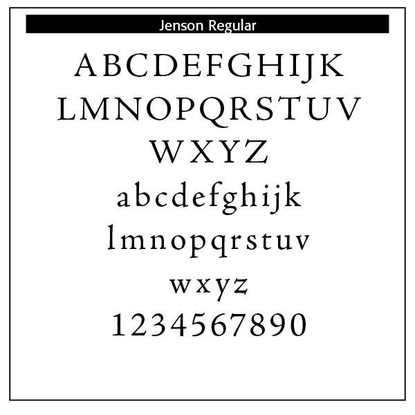
Italics. Typography historically received its most valuable improvements from the printers of Italy giving us three text-letters of greatest usefulness : (1) the Roman typeface, first founded by Sweinheym and Pannartz in 1465, and afterward perfected by Jenson at Venice in 147 1 ; (2) Italic and (3) Small Capitals, introduced together by Aldus Manutius at Venice in 1501. The first volume entirely in Greek was printed at Milan in 1476 ; the first book entirely in Hebrew, at Soncino in 1488.
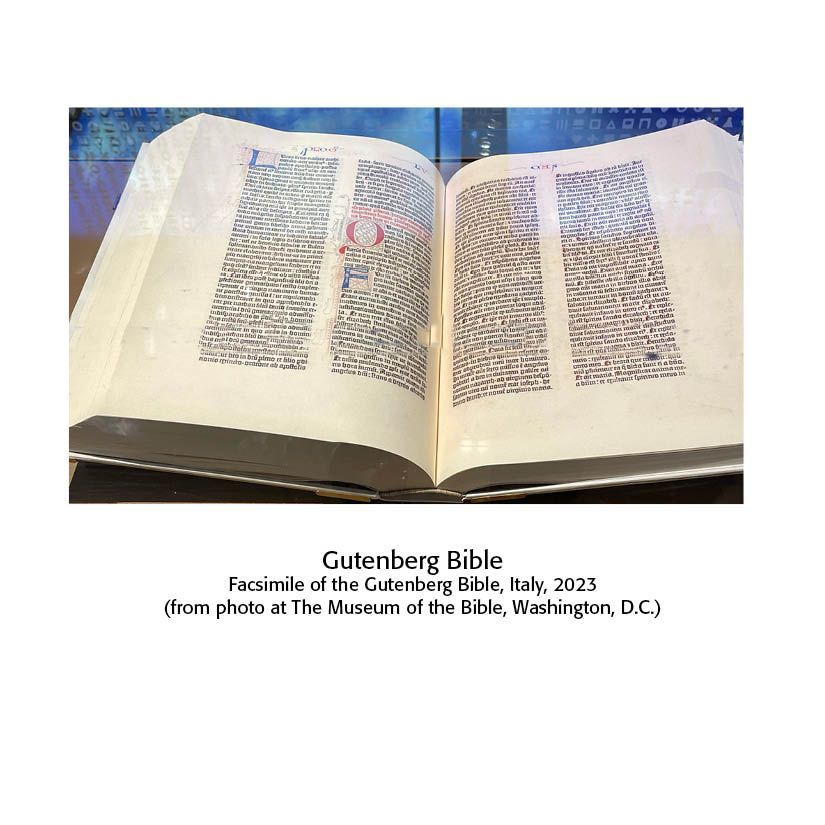
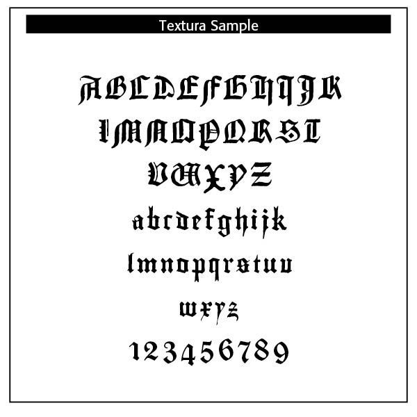
The transition from Gothic to Italic typefaces was part of the broader evolution of typography that took place during the Renaissance period, driven by shifts in cultural, aesthetic, and technological factors. Gothic script was primarily used for religious texts, legal documents, and early printed books like the Gutenberg Bible. It symbolized tradition, formality, and authority. Gothic, was characterized by its dense, angular, and ornate letters, often with sharp vertical strokes, tight spacing, and elaborate flourishes. It was designed to mimic the style of manuscript writing at the time.
The Renaissance, beginning in Italy in the fourteenth century, marked a revival of classical antiquity and a move toward humanism. This brought a renewed interest in the legible, flowing scripts of Roman and Greek antiquity, which were more readable and aesthetically simple compared to Gothic lettering. The development of the printing press (ca. 1440) by Johannes Gutenberg created a need for more versatile and legible typefaces. The emerging humanist values aligned with a preference for typefaces that resembled the clear, round, and graceful writing of ancient Roman scripts.
The Italic typeface was introduced by Aldus Manutius in Venice around 1501. Italic type is a cursive font based on a stylized form of calligraphic handwriting. Along with Blackletter (See Blog Jan 16, 2025 Blackletter Type and Universities) and roman type, italic has served as one of the major typefaces in the history of Western typography.
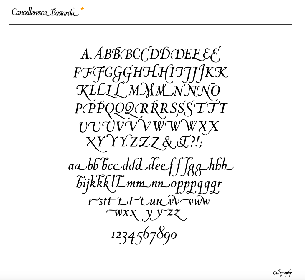
Italics takes notable influences from hand drawn calligraphy, with italic letters normally slanted slightly to the right. Upper case letters may have typographic swashes, flourishes inspired by ornate calligraphy. The name “italic” comes from their Italian use, to replace documents traditionally written in a hand-written style called chancery hand. Notice also the small “end point bowls” on some of the letters, where the ink pen stopped for a second.
While modern italics are often more condensed than roman types, historian Harry Carter describes Manutius' italic as about the same width as roman type. To replicate handwriting, Griffo cut at least sixty-five tied letters (ligatures) in the Aldine Dante and Virgil of 1501. Italic typefaces of the following century used varying but reduced numbers of ligatures
Manutius, a prominent printer and publisher, sought to create more compressed elegant typefaces that could fit more text on a page, catering to the rising demand for smaller, portable books. Italic was based on the handwriting of Niccolò de’ Niccoli, a Renaissance scholar and calligrapher. Italic typefaces are defined by their slanted, cursive-like appearance, with letters that have a flowing, dynamic quality. It allowed for more text to be fitted on the page and mimicked the handwriting style of humanist scholars, like the handwriting of Petrarch.
The common italic “slope” was introduced in the sixteenth century — “The first printer known to have used them was Johann or Johannes Singriener in Vienna in 1524, and the practice spread to Germany, France and Belgium. Particularly influential in the switch to sloped capitals as a general practice was Robert Granjon, a prolific and extremely precise French punchcutter particularly renowned for his skill in cutting italics. Vervliet comments that among punchcutters in France "the main name associated with the change is Granjon's.” (Wikipedia on Italic Type)
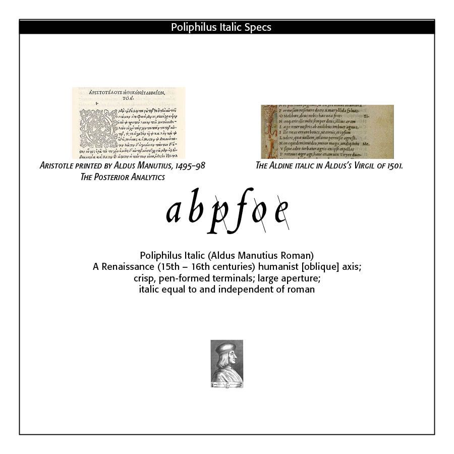
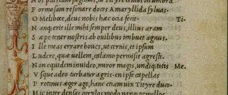
Note that the italic face used in Aldus’ Virgil of 1501 (SEE SAMPLE) is separated from the small Roman caps on the margins. Here we have a demonstration of how the ancient italic face was duly distinct from time-honored regular type. It is also a demonstration that entire texts, not just words or captions or call-outs, were written and printed in all italics. The insertion of an italic typeface alongside a roman face would wait until later to distinguish portions of a book not properly belonging to the work, such as introductions, prefaces, indexes, and notes ; the text itself being in Roman. Later, it was used in the text for quotations ; and finally served the double part of emphasizing certain words.
It is not easy to fix the period at which the Roman and Italic became united and interdependent. Very few English works occur printed wholly in Italic, and there seems little doubt that before the close of the sixteenth century the founders cast Roman and Italic together as one fount. The Italic has undergone fewer marked changes than the Roman. Indeed, in many of the early foundries, and till a later date, one face of Italic served for two or more Romans of the same body. We find the same Italic side by side with a broad-faced Roman in one book, and a lean-faced in another. Frequently the same face is made to serve not only for its correct body, but for the bodies next above or below it, so that we may find an Italic of the Brevier face cast respectively on Brevier, Bourgeois, and Minion bodies.
This admixture of italic with Roman faces were noticeable. Chief variation would have been the capital letters and the long-tailed letters of the lower case. Due to Dutch influence the way was paved to the formal, tidy italics of a Caslon. The reform of the long f and its combinations is usually credited to John Bell, who discarded the long f in his British Theatre, about 1791. In 1749 Ames had done the same thing in his Typographical Antiquities and was labelled an eccentric.
Italic type was not only more elegant than the Gothic but also more efficient in terms of space. It became the preferred choice for printed texts that emphasized classical learning, philosophy, poetry, and humanist literature. Italic was initially used for entire texts but later became more common for emphasis (such as book titles, headings, or foreign phrases) alongside Roman type.
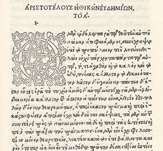
MORE ABOUT ALDUS MANUTIUS. Aldus Manutius (ca. 1450–1515), a native of Bassiano, Italy, was a scholar and teacher for whom printing represented a further means of disseminating classical languages and literature. Establishing a press in Venice in 1494, Aldus printed Greek and Latin classics as well as the works of contemporary writers, including immigrant scholars from Thessaloniki and Constantinople. Aldus published the editio princeps of the complete works of Aristotle in five volumes between 1495 and 1498, the last volume of which is held by Bridwell Library. It was the largest work to be printed in Greek since the beginning of printing with moveable type in Europe. Each section opens with an elaborate woodcut initial and decorative headpiece. The Aldine Press produced nine comedies of Aristophanes in 1498, and Pietro Bembo edited Petrarch's poems that Manutius published in July 1501. In addition to editing Greek manuscripts, Manutius corrected and improved texts originally published in Florence, Rome, and Milan (https://bridwell.omeka.net/exhibits/show/earlygreek/classics/firstaristotle)
Aldine Italic type does make an appearance — albeit a very brief one — in a much larger folio edition of 1500: The Epistole of St. Catherine of Siena (ISTC: ic00281000), set within a beautiful woodcut illustration (not so the feet) of St. Catherine herself. The italic appears printed across the open book and heart in either hand. Interestingly, the book was commissioned by Margherita Ugelheimer, widow of Peter Ugelheimer, former business partner and close friend to Nicholas Jenson (https://ilovetypography.com/2014/11/25/notes-first-italic/)
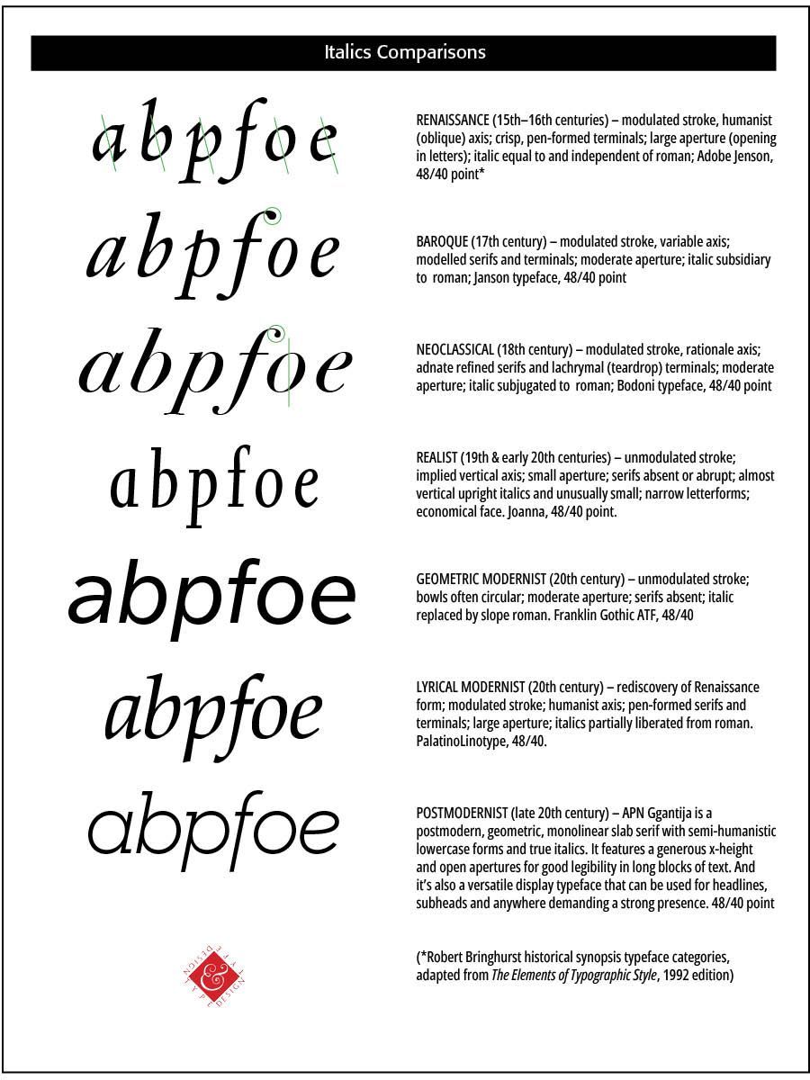
Bringhurst notes that “Early italic fonts had only modest slope and were designed to be used with upright roman capitals. There are some beautiful fifteenth-century manuscript italics with no slope whatsoever, and some excellent typographic versions, old and new, that slope as little as 2° or 3°. Yet others slope as much as 20°. . . . Renaissance italics were designed for continuous reading, and modern italics based on similar principles tend to have similar virtues. Baroque and Neoclassical italics were designed to serve as secondary faces only, and are best left in that role. Sloped romans, as a general rule, are even more devotedly subsidiary faces. Their slope makes sense only as a temporary perturbation of the upright roman. (Bringhurst, The Elements of Typographic Style, 54–56)
“The Venetian Senate gave Aldus exclusive right to its use, a patent confirmed by three successive Popes, but it was widely counterfeited as early as 1502.[Griffo, who had left Venice in a business dispute, cut a version for printer Girolamo "Gershom" Soncino, and other copies appeared in Italy and in Lyons. The Italians called the character Aldino, while others called it Italic. Italics spread rapidly; historian H. D. L. Vervliet dates the first production of italics in Paris to 1512. (Wikipedia)
The characteristics of the Renaissance italic letter can be summarized as follows (Bringhurst, 114)
• stems vertical or of fairly even slope, not exceeding 10 degrees
• bowls generally elliptical
• light, modulated stroke
• humanist axis (slanted axis)
Using Italics. Italic typefaces were originally used separate from the roman face. In fact, Aldus wedded the italic face with small roman capitals in his Virgil of 1501 as noted. The custom of combining italic and roman in the same line “using italic to emphasize individual words and mark classes of information, developed late in the sixteenth century and flowered in the seventeenth. Baroque typographers liked the extra activity this mixing of fonts gave to the page, and the convention proved so useful that no subsequent change of taste has ever driven it entirely away. Modulation between roman and italic is now a basic and routine typographical technique, much the same as modulation in music between major and minor keys.” (Bringhurst)
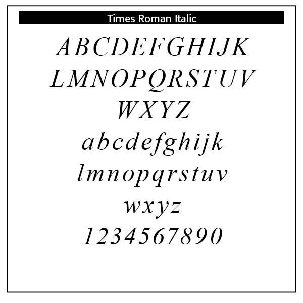
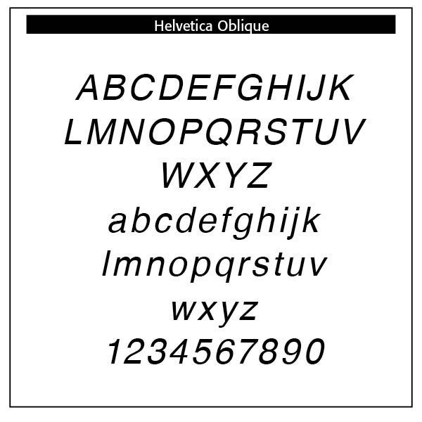
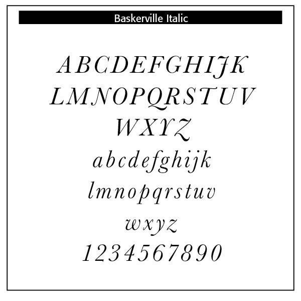
Many so-called italics are not true italics but rather sloped romans, as is the case in the sample Helvetica. As Bringhurst points out, sloped romans as italics have wider lettering than their roman counterparts. Baroque and Neoclassical italics serve as secondary faces only. Sloped romans are even more subsidiary faces. It should be pointed out that a sloped roman is not a true italic at all, just a roman with a slope. The English Neoclassical face Baskerville has a rationalist axis (straight up and down). Helvetica has seen a number of recent revisions. Times Roman is an historical pastiche drawn by Victor Lardent for Stanley Morison in London in 1931. Bringhurst notes that “The roman has a humanist axis but Mannerist proportions, Baroque weight, and a sharp, Neoclassical finish. The italic has a rationalist axis, but in other respects it matches point for point the eclecticism of the roman." (Bringhurst, 93)
Italics use today range from emphasis (“He is the only person here.”) or stress in speech to titles of works, including books, albums, plays, movies or periodicals. While an underscore or quotes are often substitutes for italics, the desire is to use true italics whenever possible. The names of ships (The Titanic), foreign words (Homo sapiens), newspapers and magazines (New York Times and The Atlantic), defining terms, especially technical terms, algebraic symbols (the answer is x =2), mathematical constants and gene names in biology use italics. Italics are used in comics, and older writings use italics like in the King James Version of the Bible to de-emphasize words that have no equivalent in the original text but are necessary in the English translation (God saw the light, that it was good). Mentioning a word as an example of a word uses italics (The word the is an article)
SOURCES
Robert Bringhurst, The Elements of Typographic Style, 1992 edition
https://luc.devroye.org/fonts-30540.html
The Printers’ Handbook of Trade Recipes, Hints & Suggestions Relating to Letterpress and Lithographic Printing, Bookbinding, Stationery, Engraving, Etc., compiled by Charles Thomas Jacobi, London, 1891,
Talbot Reed, A History of the Old English Letter Foundries with Notes, 1887
Theodore Low De Vinne, The Practice of Typography, 1902
Wikipedia on Italic and Manutius
https://bridwell.omeka.net/exhibits/show/earlygreek/classics/firstaristotle#:~:
https://ilovetypography.com/2014/11/25/notes-first-italic/
Successful Layout & Design


