Sketch & Hand Drawn Lettering
Sketch & Hand Drawn Lettering. The history of font development includes a wealth of calligraphic fonts and artistically crafted hand drawn typefaces. A number of these lettering fonts have been drawn and submitted by smaller type foundries and entrepreneurs seeking to make their mark in the font world. A casual look at ChatGPT gives some idea as to their source and character. Fonts that mimic pencil drawings often have a hand-sketched, textured, or rough-lined appearance. These fonts are great for artistic projects, children's books, casual branding, or creative typography. The sample fonts below are mostly given for personal use only, use on personal invitations and so forth, but some have been made available for commercial use as well. They demonstrate the wide range of hand drawn fonts available for use and purchase.
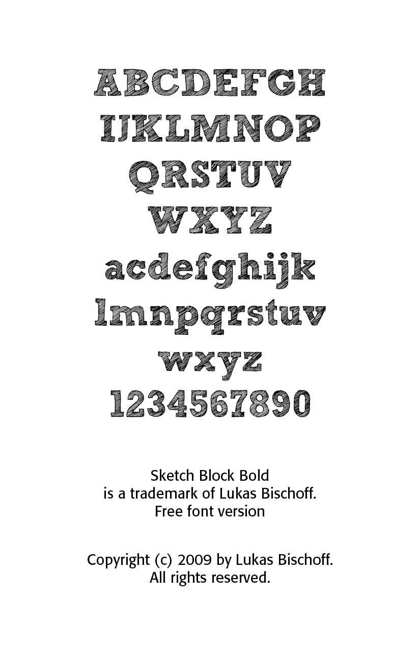
Sketch Block Bold shown here is a free version font. This font is a rough, hand drawn font that looks like it was shaded with a pencil. Sketch Block Bold is a trademark of Lukas Bischoff. Copyright (c) 2009 by Lukas Bischoff. All rights reserved.
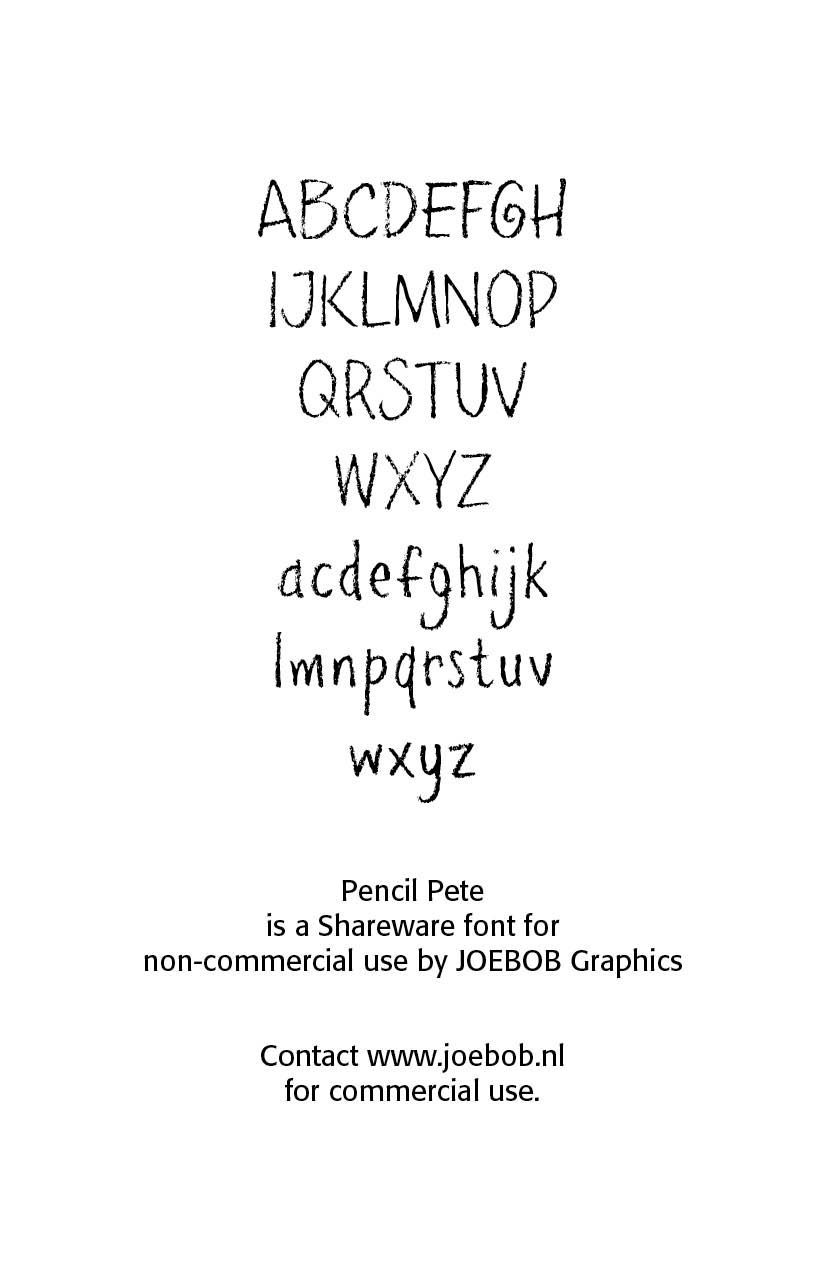
Pencil Pete font below is a playful, loose pencil-style font with a sketched feel offered by JOEBOB Graphics as a shareware font.
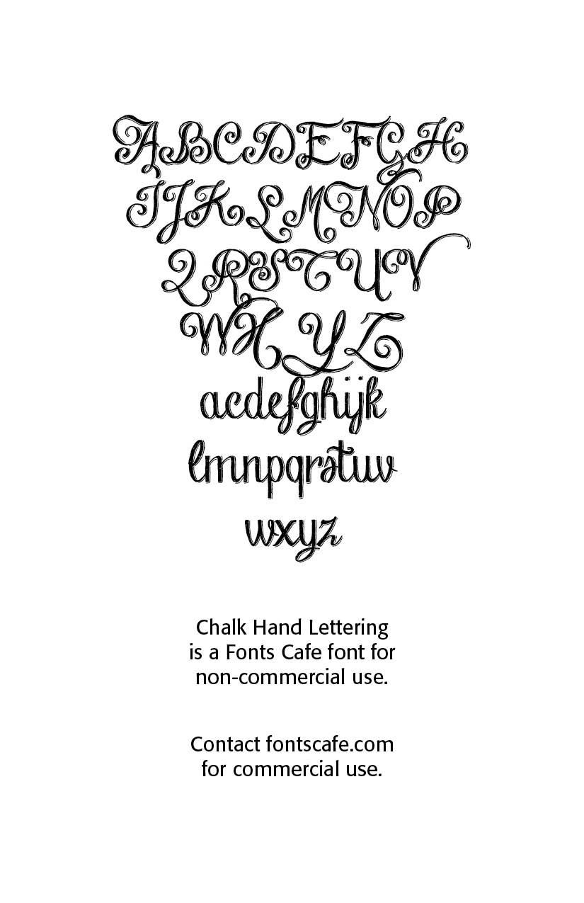
Chalk and Graphite inspired fonts are hand drawn specialty fonts that are perfect for a school themed design. Chalk Hand Lettering mimics a pencil or chalkboard look.
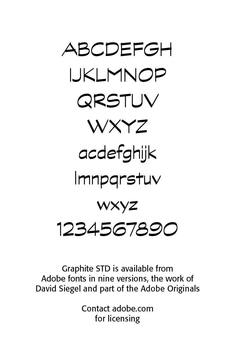
Graphite STD, available in nine flavors, is designed to look like it was drawn with a soft pencil. This is a professionally drawn font by David Siegel. David Siegel earned an undergraduate degree in mathematics and computer science from the University of Colorado at Boulder and a master’s degree in digital typography from Stanford. In 1985, he assisted Hermann Zapf in the production of the Euler typeface for the American Mathematical Society. In the mid-1990’s he collaborated with Hermann Zapf in the production of Zapf’s typeface, Linotype Zapfino. It has been part of the Adobe Originals program started in 1989 as an in-house type foundry at Adobe, brought together to create original typefaces of exemplary design quality, technical fidelity, and aesthetic longevity.
Today the Type team’s mission is to make sophisticated and even experimental typefaces that explore the possibilities of design and technology. Typefaces released as Adobe Originals are the result of years of work and study, regarded as industry standards for the ambition and quality of their development.
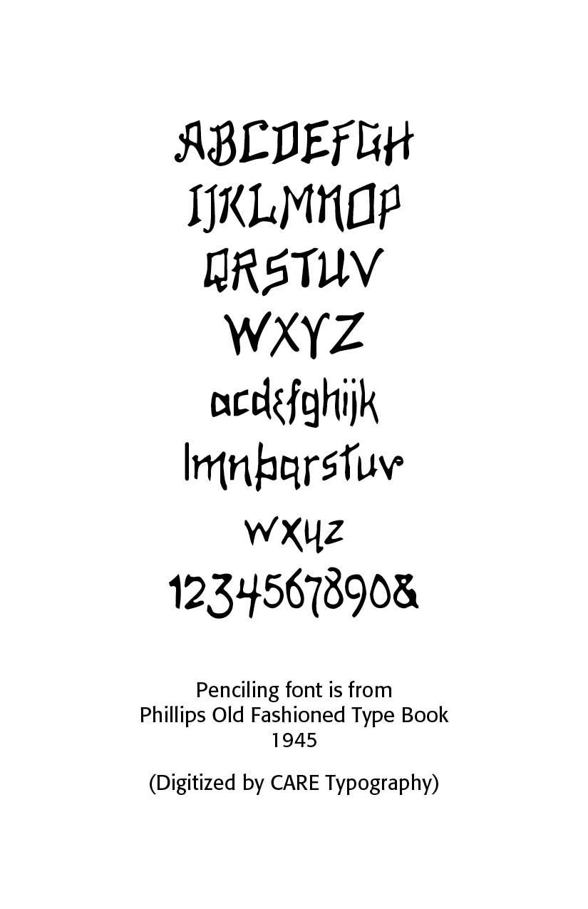
Doodle and Scribble fonts are also hand drawn and use a freehand style about them. Skribble is a messy, yet readable font with a hand-drawn aesthetic. KG Sketch mimics quick, freehand writing with a natural pencil look. The Penciling font shown below is an old type hand drawn font from Phillips Old Fashioned Type Book, New York, 1945 and has been revived by CARE Typography. The resurgence of interest in hand-lettering and calligraphy has led to a boom in custom and artisanal fonts. Designers often blend calligraphic influences with modern digital tools to create unique typefaces.
Successful Layout & Design

CARE Typography is a Christian based type and design service.
