Blog Layout

Four Old Playful Fancy Fonts

Carl Shank • January 20, 2025

Four Old Playful Fancy Fonts. CARE Typography is pleased in its historical search for antique inspired fonts to introduce digitized versions of Harper and Mikado, a Gutenberg  typeface and Lacrosse. Unlike their modern counterparts, these fonts are display only fanciful fonts of a bygone era in typography. However, they exude a rich history of font development that should not be forgotten in our search for the new, the sleek, the up-to-date in type. They have been developed from the rich typographic heritage of Phillips Old Fashioned Type Book published in 1945 by Frederick Nelson Phillips, Inc, in New York. This volume has caught my historic typographic eye for its plethora of ancient font styles and formulations.


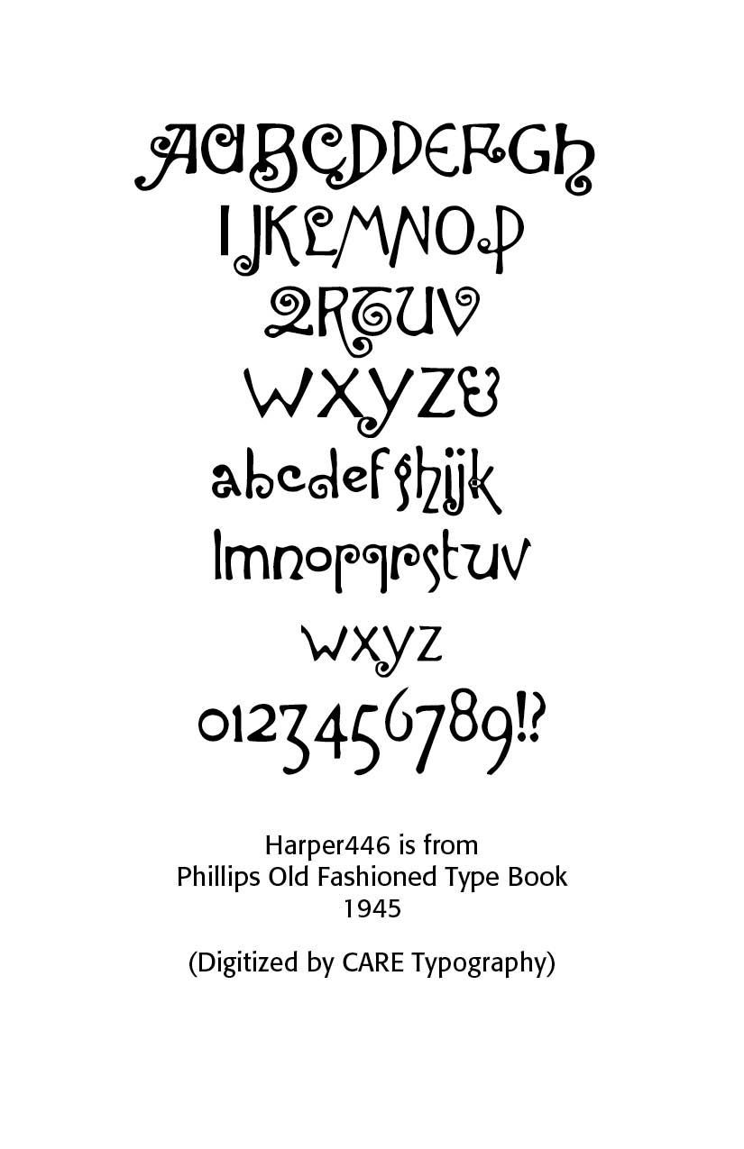
The Harper446 font is especially playful, with its curly capitals, its specialized "Q" capital and, of course, its flavorful and playful small case lettering, with the raised c, e and o letters and the odd looking "g." This is obviously not a text font, but can uses in artful decorative work.


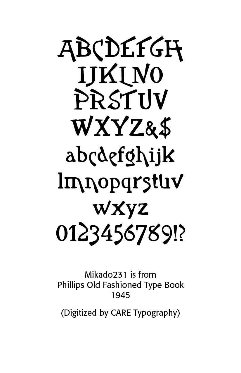
The Mikado231 font does not at all look like the variations of the typeface called "Mikado" in typography history. As that history notes, "Mikado was apparently inspired by Gilbert and Sullivan’s comic opera of the same name. The show opened in London in March of 1885 and in New York later that same year. According to Nicolete Gray in her classic book on ornamented typefaces, the English foundry of Sir Charles Reed and Son introduced a metal type called “Japanese” also in 1885. She characterized this typeface and other oriental based typefaces as superficial in their foreign influence. Nonetheless it appears that it was later copied by several of the American Wood-type companies. The 1906 Hamilton wood-type specimen catalog shows four versions of this design; one by Hamilton and three by acquired companies. The versions by Wells, and Morgans & Wilcox are called Mikado. The Hamilton and Page versions use model numbers 204 and 156 respectively. It is difficult to determine the specific dates when this particular wood-type was introduced, but the earliest wood-type catalog I could find showing Mikado is the 1888 Page catalog. Our sample “WINTER” is a 15 line unstamped type most similar to the Hamilton version. Incidentally, another English foundry, Miller and Richard introduced a metal typeface in 1887, also named Mikado. That typeface is totally different than the one presented here." (https://www.printmuseum.org/wood-type-mikado).


This Mikado adaptation has straight angular  E, F, G, K, T and even raised W, X, Y in the capitals. Note the falling stems of C, L, and  lower c, e, h, m and n. Again, this playful font can be used sparingly in advertisement copy and flavorful playbills.


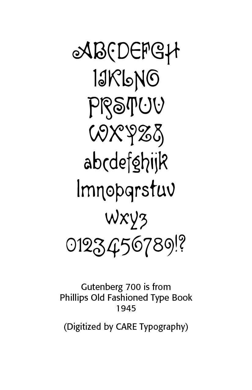
The Gutenberg700 font is again from the Phillips book samples. Note the dotted C, U, V, small g and zero. The ampersand is also interesting. Curly serifs are used in A, J, L, S. The numerals are classic old school numerals. This Gutenberg rendering is unlike any classic Gutenberg typeface that has been presented.


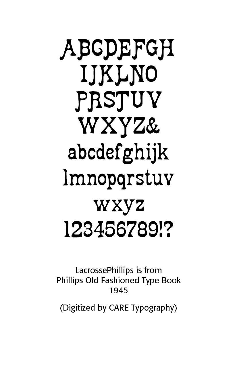
The LacrossePhillips font has a cute left hanging serif on the capitals. It is a bold faced font, both in the upper and lower case. It is a full font offering upper and lower case lettering, numerals and other marks.


These fonts are available from CARE Typography at care typography.com at NO COST. They are free to purchase and use.

Successful Layout & Design

By Carl Shank January 29, 2025
Sketch & Hand Drawn Lettering. The history of font development includes a wealth of calligraphic fonts and artistically crafted hand drawn typefaces. A number of these lettering fonts have been drawn and submitted by smaller type foundries and entrepreneurs seeking to make their mark in the font world. A casual look at ChatGPT gives some idea as to their source and character. Fonts that mimic pencil drawings often have a hand-sketched, textured, or rough-lined appearance. These fonts are great for artistic projects, children's books, casual branding, or creative typography. The sample fonts below are mostly given for personal use only, use on personal invitations and so forth, but some have been made available for commercial use as well. They demonstrate the wide range of hand drawn fonts available for use and purchase.
By Carl Shank January 16, 2025
Blackletter Type & Universities . The use of blackletter fonts in academic contexts dates back to the medieval period and is deeply tied to the history of early European universities. Fonts like Fraktur, Textura, and Gothic were the norm in the academic world until the rise of modern typefaces in the 18th and 19th centuries. Even today, many universities, particularly in Germany and England, continue to incorporate elements of blackletter design into their official documents, crests, and seals. These fonts serve as a link to the academic traditions of the past, evoking a sense of scholarly authority, history, and prestige that remains integral to the identity of many academic institutions. The Blackletter typeface style, often associated with the gothic or medieval period, has a fascinating history in the context of universities and academic institutions. The term "University" in relation to blackletter fonts typically refers to the use of these fonts in academic and religious contexts during the Middle Ages, and later in formal academic environments where tradition, authority, and history are emphasized. The most notable "University" blackletter fonts are linked to the old European universities and have been used in documents, manuscripts, and crests. The University of Leipzig in Germany, founded in the early 15th century, was one of the first to adopt blackletter fonts in its printed materials and documents. The university's early academic works were published in blackletter typefaces, which was consistent with the typographic style of the time. Although blackletter fonts have largely been replaced by more modern typefaces (like serif and sans-serif) in contemporary university branding, some institutions still use elements of blackletter fonts in their logos or crests to emphasize tradition, heritage, and historical continuity. Harvard University (USA) uses a variation of the blackletter style in its iconic Harvard shield, which incorporates a stylized version of the blackletter form in the letter "H" and other aspects of its heraldic design. The blackletter-style elements in the logo give the university an air of tradition and scholarship. Similarly, Oxford University and Cambridge University in the UK have incorporated blackletter fonts or medieval script influences in certain documents, seals, and emblems. Many universities, particularly in Europe, still use blackletter-inspired fonts in their formal graduation certificates, academic diplomas, and official titles. These fonts are not used for everyday communications but remain symbols of academic distinction, formal documents, and prestigious traditions. For instance, in Germany, Fraktur or Textura fonts may still appear in official publications or university documents to honor the historical roots of higher education. What Is Blackletter? Blackletter, also known as Gothic script, emerged in Western Europe around the 12th century, during the medieval period. It was the dominant script used for writing and printing for several centuries, particularly in manuscripts produced by monks in monasteries. Blackletter fonts are distinguished by their sharp, angular strokes, tightly spaced letters, and intricate designs, which made them both highly decorative and somewhat difficult to read. The style was heavily influenced by the insular script, a form of handwriting that evolved in the British Isles, as well as by the Carolingian minuscule used in the Holy Roman Empire. Blackletter fonts were widely used in early printed books, particularly in Germany, where the printing press was first developed. In the early days of academic education in Europe, blackletter fonts were the primary typefaces used in university textbooks, religious texts, and documents. Three types of Blackletter typefaces were commonly used — Fraktur, Textura, and Rotunda.
Show More
Share by: