Blackletter Type & Universities
Blackletter Type & Universities. The use of blackletter fonts in academic contexts dates back to the medieval period and is deeply tied to the history of early European universities. Fonts like Fraktur, Textura, and Gothic were the norm in the academic world until the rise of modern typefaces in the 18th and 19th centuries. Even today, many universities, particularly in Germany and England, continue to incorporate elements of blackletter design into their official documents, crests, and seals. These fonts serve as a link to the academic traditions of the past, evoking a sense of scholarly authority, history, and prestige that remains integral to the identity of many academic institutions.
The Blackletter typeface style, often associated with the gothic or medieval period, has a fascinating history in the context of universities and academic institutions. The term "University" in relation to blackletter fonts typically refers to the use of these fonts in academic and religious contexts during the Middle Ages, and later in formal academic environments where tradition, authority, and history are emphasized. The most notable "University" blackletter fonts are linked to the old European universities and have been used in documents, manuscripts, and crests. The University of Leipzig in Germany, founded in the early 15th century, was one of the first to adopt blackletter fonts in its printed materials and documents. The university's early academic works were published in blackletter typefaces, which was consistent with the typographic style of the time. Although blackletter fonts have largely been replaced by more modern typefaces (like serif and sans-serif) in contemporary university branding, some institutions still use elements of blackletter fonts in their logos or crests to emphasize tradition, heritage, and historical continuity.
Harvard University (USA) uses a variation of the blackletter style in its iconic Harvard shield, which incorporates a stylized version of the blackletter form in the letter "H" and other aspects of its heraldic design. The blackletter-style elements in the logo give the university an air of tradition and scholarship. Similarly, Oxford University and Cambridge University in the UK have incorporated blackletter fonts or medieval script influences in certain documents, seals, and emblems.
Many universities, particularly in Europe, still use blackletter-inspired fonts in their formal graduation certificates, academic diplomas, and official titles. These fonts are not used for everyday communications but remain symbols of academic distinction, formal documents, and prestigious traditions. For instance, in Germany, Fraktur or Textura fonts may still appear in official publications or university documents to honor the historical roots of higher education.
What Is Blackletter? Blackletter, also known as Gothic script, emerged in Western Europe around the 12th century, during the medieval period. It was the dominant script used for writing and printing for several centuries, particularly in manuscripts produced by monks in monasteries. Blackletter fonts are distinguished by their sharp, angular strokes, tightly spaced letters, and intricate designs, which made them both highly decorative and somewhat difficult to read. The style was heavily influenced by the insular script, a form of handwriting that evolved in the British Isles, as well as by the Carolingian minuscule used in the Holy Roman Empire.
Blackletter fonts were widely used in early printed books, particularly in Germany, where the printing press was first developed. In the early days of academic education in Europe, blackletter fonts were the primary typefaces used in university textbooks, religious texts, and documents. Three types of Blackletter typefaces were commonly used — Fraktur, Textura, and Rotunda.
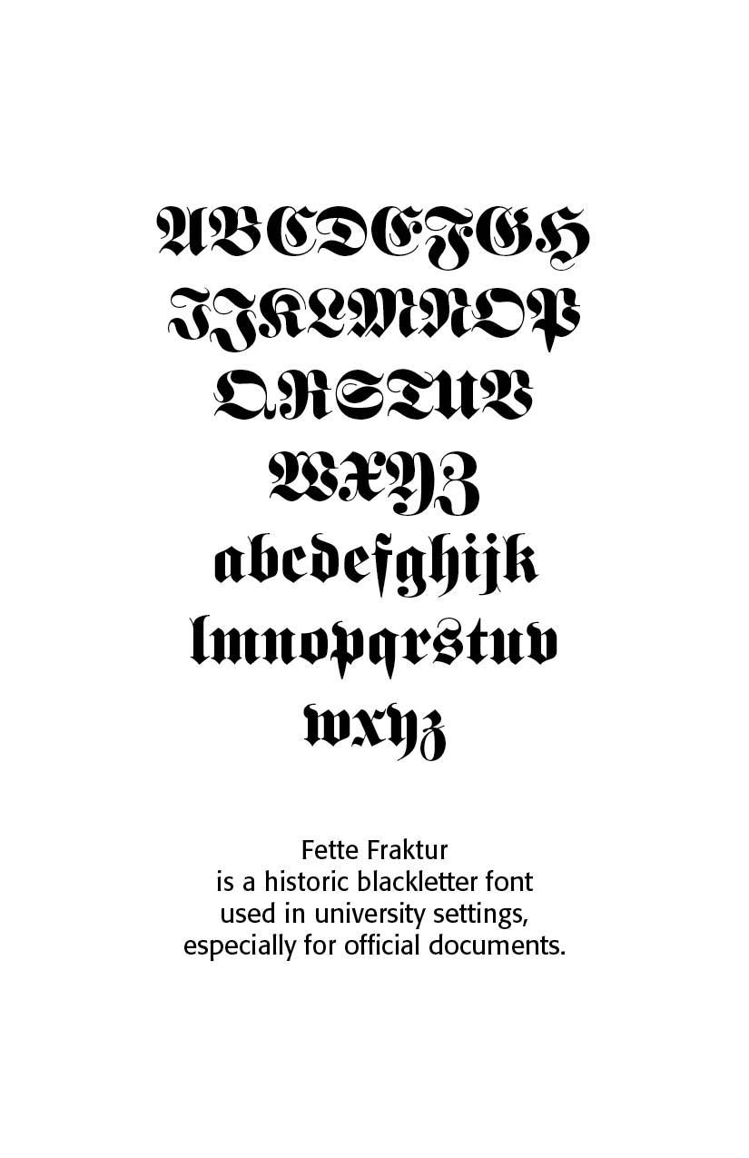
Fraktur, notably Fette Fraktur. A bold and heavy version of Fraktur, commonly used in German-speaking countries for official academic, legal, and religious documents. Fraktur is one of the most iconic forms of blackletter, developed in the early 16th century by the German printer Johan Gutenberg and later popularized by German printing traditions. This specific style of blackletter was used extensively in Germany, especially in academic works, religious texts, and printed books. Many German universities, such as Heidelberg University, adopted Fraktur fonts for their academic works, titles, and official documentation. The use of Fraktur in these contexts emphasized a strong link to the medieval scholastic tradition.
This font is one of the most used broken letter fonts today. Fette Fraktur is used to invoke a nostalgic or rustic feeling and found often on restaurants with hearty homemade food’ or breweries who use the good old recipes’ of the founder. The font was designed in the 19th century and from the beginning intended as an advertisement typeface. The lower case letters have a gothic character with only the ornamental flourishes making them broken letters, while the capital letters are more characteristic of broken letter typefaces. One could say Fette Fraktur is a true mix of styles, not unusual for typefaces created at the turn of the 19th century. (Linotype Design Studio, myfonts.com)

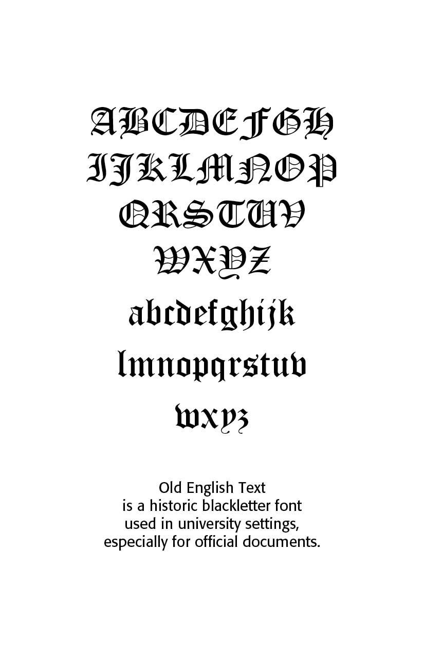
Textura, namely Gutenberg Textura. originating around the 14th and 15th centuries in Northern Europe, particularly in the Low Countries and Germany. This style was used extensively in manuscripts and printed books, and became one of the most prominent typefaces during the Gutenberg era. The Textura style is closely associated with medieval illuminated manuscripts, which were commonly used by universities, particularly in the University of Paris and Oxford University, to preserve important religious and scholarly texts.
Today, blackletter fonts are mainly used decoratively. If you want to communicate a feeling of old-world quality or nostalgia, blackletter fonts are the preferred choice – use them on signs, in brochures or on invitation cards. “Gutenberg Textura Pro” is a classic blackletter font of its epoch which inspires you to create vintage-looking designs with ease.
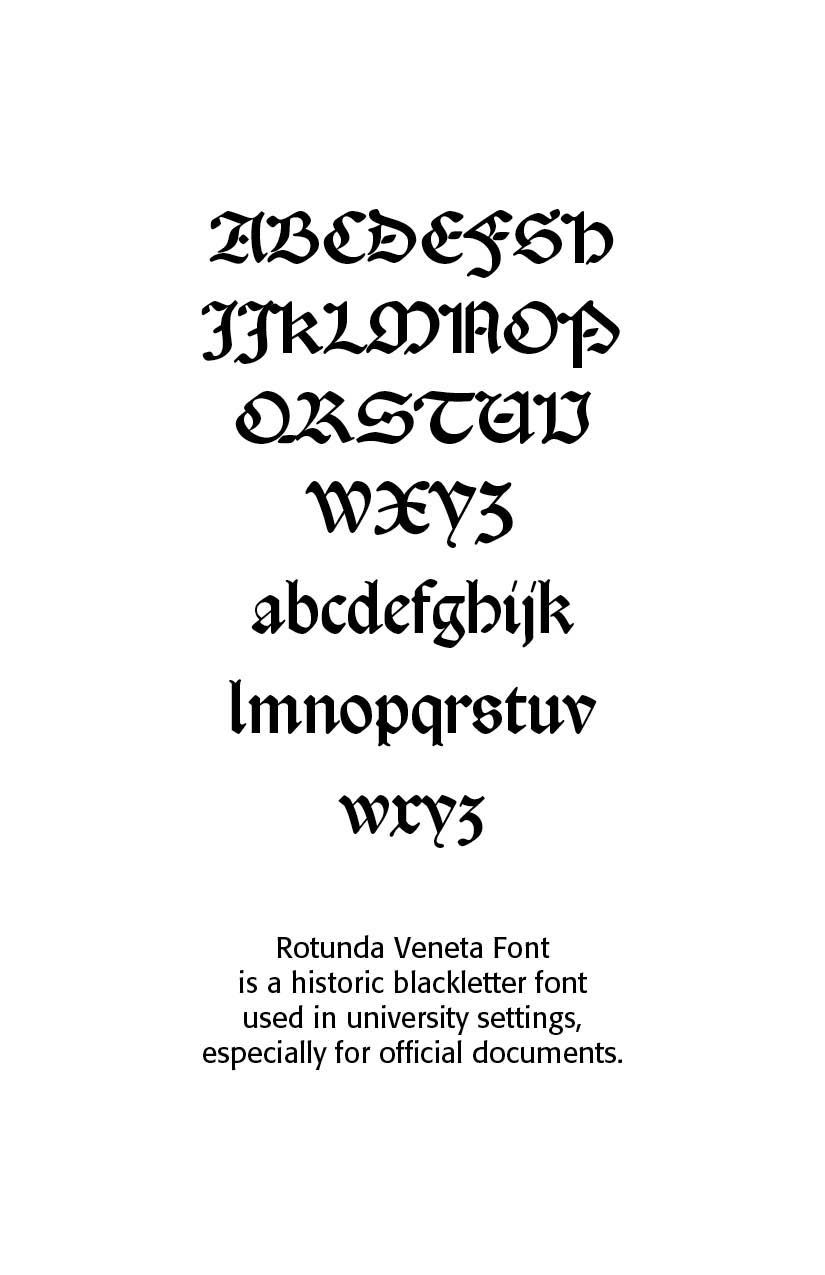
Rotunda.** "An early expression of rotunda was the so called Littera Bononiensis, a hand developed at Bologna University and soon employed at the University of Padua and elsewhere in northern Italy. At the time Bologna was the major European centre of manuscript production for works of canon and civil law and it is noteworthy that as many as 139 scribes were recorded in Bologna just for the years 1265–1268. Canon and civil law were subjects that had to be mastered by ecclesiastics, notaries and anyone in charge of public offices all over Europe; thus rotunda script was well-known in northern Europe since the 13th century.
Rotunda shows important differences from Textura. They both display bold letters, with short ascenders and descenders and a high contrast between thick and thin strokes (‘shading’, to use the palaeographer’s term). But unlike textura, rotunda letters can be rather wide — they lack textura’s compactness — and have curves in the bowls (b, c, d, e, h, o, p, q and s), though some angularity is often found in letters a and g. Finally, in rotunda there is no sign of the typical gothic treatment of the feet of the letters, the diamond-shaped terminals that are found at the baseline of textura letters.
The earliest known rotunda type is the big face, suitable for headings and titles, employed by Ulrich Han in Rome from 1467 onwards (Han 150G, c. 21 pt). The earliest book set entirely in rotunda was a treatise on canon law printed by Vindelinus de Spira in 1471, Panormitanus’s Lectura super primo et secundo Decretalium. The text was set in Spira 99G (14 pt), the earliest known rotunda type for text, while the bigger Spira 200G (c. 28 pt) was used for headlines. Vindelinus had the right intuition: notaries and ecclesiastics who had to master civil and canon law had been used to reading books written in rotunda script for centuries. But in 1470–1473 some printers in Venice — including Spira himself — issued legal treatises in roman, the only type that was available at their presses. It was a miscalculation of the taste of the readers: evidently roman type was not what readers of legal books preferred because after 1474 legal textbooks or treatises were set in rotunda type.
It seems that after a few enthusiastic and confused early years, around the mid-1470s, the printers’ awareness of the market sharpened: probably — as Petrucci suggests — they looked more closely at the Italian book tradition which had already established different graphic models for each literary genre long before printing [Petrucci, pp. 144–145]. From that moment onwards, at least in Venice, the subject of the books defined its graphical aspect, notably the type in which the book was set. We have mentioned legal books, but in the following decades also religious (bibles, sermons, psalters, theological and devotional literature), scientific (including Aristotle and the scholastic philosophers) and many vernacular works were normally printed in rotunda type."
While blackletter fonts are no longer commonly used in modern-day academic writing or publications, their historical connection to the foundations of Western education ensures that they maintain a place of respect in university iconography and formal certificates. Many academic traditions—such as graduation ceremonies and formal university proclamations—still incorporate blackletter fonts to underscore their connection to ancient and medieval learning traditions.
*Courtesy ChatGPT
**Riccardo Olocco, "Notes on the rotunda types of the Renaissance," CAST, June 23, 2020
Successful Layout & Design


CARE Typography is a Christian based type and design service.
