Art In The Alphabet: What AI Cannot Give Us
Art in the Alphabet:
What AI Cannot Give Us
I am a student of typographic history. In fact, I have pulled together a book on this history (Typography Through The Years: A Selected History) available from most booksellers. This book is filled with digitized fonts from earlier years, many not generally available in the open printing and typography trades. They represent hours of careful labor redrawing or copying the pen written works of earlier typographers, like Lewis F. Day (See his Alphabets Old and New, London, 1910 or earlier).
Does AI (artificial intelligence) help us or even substitute for us the work and beauty that goes into historic calligraphy and font histories? As with many people in many businesses and professions, I have used AI (especially ChatGPT and Claude) to access information files and reduce the time formerly spent in libraries or even online searches. That has been true even in my preaching and teaching as a theologian and retired pastor and consultant (See my extended BLOGs, “AI and the Ministry: The Uses and Abuses of Artificial Intelligence” and “AI and the Brethren in Christ: Hallucinations & Corrections” in www.carlshankconsulting.com).
Indeed, there are multiple copyright issues associated with AI generated feeds. In my BLOG on “Copyright Do’s and Don’t’s” Oct 23, 2023) I noted the following — “Right now, in the courts, there are lawsuits pending against big time AI players such as GitHub and Microsoft and Open AI seeking to see whether or not AI created materials are subject to copyright violations and piracy on a level not seen since the Napster violations in the 1990s. Getty Images have filed a suit against Stable Diffusion, an AI art developing tool, claiming that its images are too close to the real thing and thus violate copyright laws. This is far from "Fair Use" standards. The Clarkson Law Firm has two class action suits against OpenAI and Google claiming that AI "stole" copyrighted materials from their creators. Moreover, the U.S. Copyright office has ruled that AI cannot be considered an "author," since only a person can be an author.
Additionally, Internet Archive (https://archive.org/) has filed with the commission investigating AI and copyrights. They do not support any additional laws specifically targeting AI. They write — "Our high level view is that copyright law has been adapting to disruptive technologies since its earliest days and our existing copyright law is adequate to meet the disruptions of today. In particular, copyright’s flexible fair use provision deals well with the fact-specific nature of new technologies, and has already addressed earlier innovations in machine learning and text-and-data mining. So while Generative AI presents a host of policy challenges that may prompt different kinds of legislative reform, we do not see that new copyright laws are needed to respond to Generative AI today."
More courts and Congress will have to argue it out. Suffice it to say at this juncture, that using AI to re-create an illustration or an entire book may involve copyright breaches. Be careful in using the technology to bypass coded laws. There are still many pitfalls, however, and many ways AI cannot help us. There are many who would agree with me in this “short-cutting” our way to beautiful and usable fonts and faces.
My recent foray into AI revealed the following about developing historic early fonts, say from a craftsman like Lewis F. Day, by ChatGPT —
“To create a typeface inspired by Lewis F. Day's decorative design style and the typography of sixteenth and seventeenth-century printing, we'd need to combine key elements from both sources.
1. Lewis F. Day's Influence:
- Ornamentation: Lewis F. Day was known for his intricate decorative designs, inspired by Gothic and Renaissance motifs. His work often emphasized geometric and nature-inspired patterns.
- Flourishes: Day's aesthetic would inspire flourishes around characters, especially in capital letters or title work, where borders or embellishments could be incorporated.
- Symmetry and Balance: His designs usually kept a strong sense of order and symmetry, meaning that the typeface could integrate balanced, stylized serifs or carefully positioned decorations.
2. Sixteenth and Seventeenth-Century Printing Influences:
- Old Style Serifs: Early printing typefaces like Garamond or Caslon, which were common in this period, feature elegant, moderate contrast between thick and thin strokes, and serifs with soft, rounded edges. These fonts have a warm and timeless feel.
- Ligatures: In keeping with old typesetting practices, ligatures (like "fi", "fl", etc.) would be an essential feature.
- Hand-Pressed Imperfections: The text could have slight irregularities to evoke the hand-pressed, metal-type printing look of that era, with slight ink spread or irregular edges on the characters.
- Decorative Initials: Sixteenth and seventeenth-century printing often incorporated large, intricate drop capitals, which can be revisited with ornamentation similar to Lewis F. Day’s floral or geometric designs.
Key Elements for Typeface:
- Character Design:
- Incorporate Old Style serif structure with moderate contrast in stroke weights.
- Slight ink spread effect for a hand-pressed look.
- Ornamentation:
- Incorporate Day's floral and geometric patterns as flourishes on capital letters.
- Consider decorative borders on certain initials or for titles.
- Ligatures & Swashes:
- Use swashes on certain letterforms, especially for f, g, h, k, and long descenders.
- Drop Caps:
- Design large, decorative drop caps that feature intricate floral or scroll designs, combining Day’s Victorian influence with sixteenth-century engravings.
This typeface would feel both classic and ornamental, paying homage to the elegance of early print typography with the decorative touch that Lewis F. Day often brought to his work.”
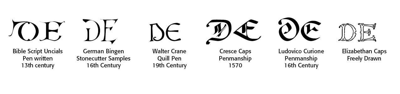
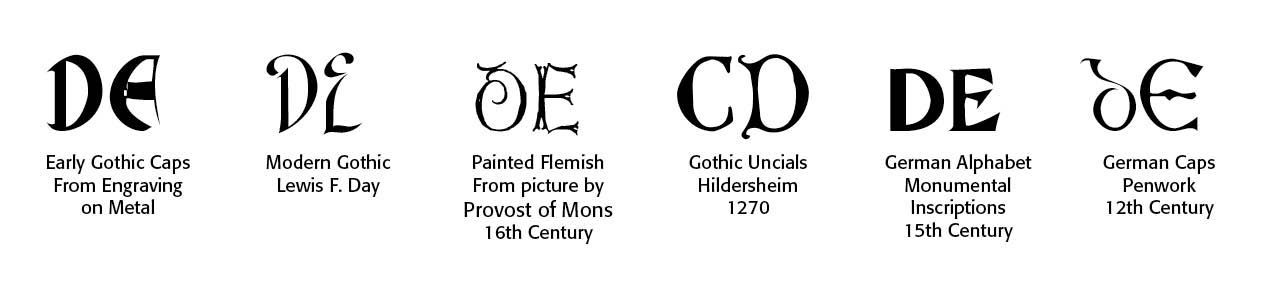
While a sample of Day’s work in generalized pre-Victorian and Victorian era times can be previewed (badly, I would say) on AI (through Claude.ai, for instance), an actual typeface and its construction eludes AI, at least for now. First, the description above makes little sense unless I have been immersed in viewing Lewis F. Day's samples and history. And then, secondly, the descriptors are too vague and undefined. There is not merely one typestyle either in Victorian England or in Day's works. Take a look at the uncials (alphabetic capitals) below for a wide variety of what AI has tried to describe.
The penned and hand drawn letters represented by Day and digitized by CARE Typography cannot be reproduced by AI, no matter how precise the tool. Moreover, accurate letter spacing and hinting and all the features that make up even a hand drawn font are not AI reproducible, nor in the range of AI generated feeds. And, to do so, would probably violate image-drawn copyrightable feeds.
Conclusions. What does all of this mean for the typographer or printer or publisher?
- Do the hard work! Type formation takes significant time and effort and drawing and re-drawing, tweaking until the letters and letter spacings and kerning and everything is right and readable. AI will not do such work for you.
- Seek permission for its use. This is always the best and most honorable course of action. You may have to contact the publisher, who then in turn may contact the writer. I did this for a study guide I wrote on a book from Oxford Press in England on the life and work of Jonathan Edwards, the great early American theologian in New England. While it was only a study guide with excerpts on which to comment, and for church study and use exclusively, the Press required a contractural engagement that lasted for one year with a limited number of copies that could be printed and made available, even for religious study and use. It would have cost me hundreds of dollars. I declined and went another route with some of the material.
- Use legitimate free sources for photos and images. I use dreamstime.com in their free portfolios for the background photos and images for a number of book covers I have crafted. There are other legitimate sources in iStock, for instance. Licensing uses and rules apply to most of these freebies. And give credit for where credit is due, even for the freebies. The Lewis F. Day’s Alphabets Old and New and its samples are in the public domain now.
- Use your own work and photos. I know this requires substantial time and effort, but it is usually the right thing to do. I put together a historical calendar of the Lancaster PA area using photos I personally took.
- Use the old "buyer beware" adage here. Are you willing to risk your site being taken down, or getting a cease and desist letter, a bill or actually being sued through the Digital Millennium Copyright Act (DMCA), which can be very, very costly. People actually make a living on book royalties and selling or licensing their work. Poaching their work for pleasure or profit is unacceptable. Extensis has an entire section on font use and licensing (www.extensis.com).
Conclusion #2. For all Christians and people of faith, we need to heed the apostle Paul’s admonition in the Bible that “Everything is permissible, but not everything is beneficial. Everything is permissible but not everything is constructive.” (1 Corinthians 10:23) Yes, Paul is talking about Christian liberty and eating of food that was devoted to idols of his day, but the principle remains. What we CAN do is not always what we SHOULD do. This involves the use of AI in our churches and ministries.
Second, beware of the “Babel influence.” You do remember the construction of a tower built by early peoples to reach to heaven in Genesis 11 — “Come, let us build ourselves a city, with a tower that reaches to the heavens, so that we may make a name for ourselves and not be scattered over the face of the whole earth.” Christopher Watkin notes in his massive study, Biblical Critical Theory: How The Bible’s Unfolding Story Makes Sense of Modern Life and Culture, “rather than playing a role in God’s story (filling the earth and subduing it), these people want God to play a supporting role in their story, as the heavenly antagonist who is ultimately beholden to, or vanquished through, their heroic self-aggrandizement.” (208-9) This is sinful autonomy. This is humankind globalization of power and wealth and achievement. This is what AI could promise if misused and misapplied. We need to always see the inherent temptation in AI drawing us away from God and dependence on God.
Third, know the times and the promises and pitfalls of artificial intelligence. Get on ChatGPT 4 and Claude.ai and other AI tools. Find out how they work and can work for you. Use them biblically and intelligently and wisely. Be aware that your people are using AI all the time where they live and work, even if you don’t. In other words, be “smart” about AI and its growing use and influence — and keep the dependence on God strong and sure.
Sources
Lewis F. Day’s Alphabets Old and New, London, 1910 edition.
Sara Hawkins, “Copyright Fair Use and How It Works for Online Images,” https://bit.ly/3YyNMCW
Lucie Růžičková, "Ai and Copyright: The Legal Landscape," https://bit.ly/3Ao5zDw.
Gibble, Kraybill & Hess, Attorneys in Lancaster, PA, https://gkh.com/protecting-copyrights-vs-protecting-trademarks/
Successful Layout & Design


