Lewis F. Day's Summary

Carl Shank • October 5, 2024

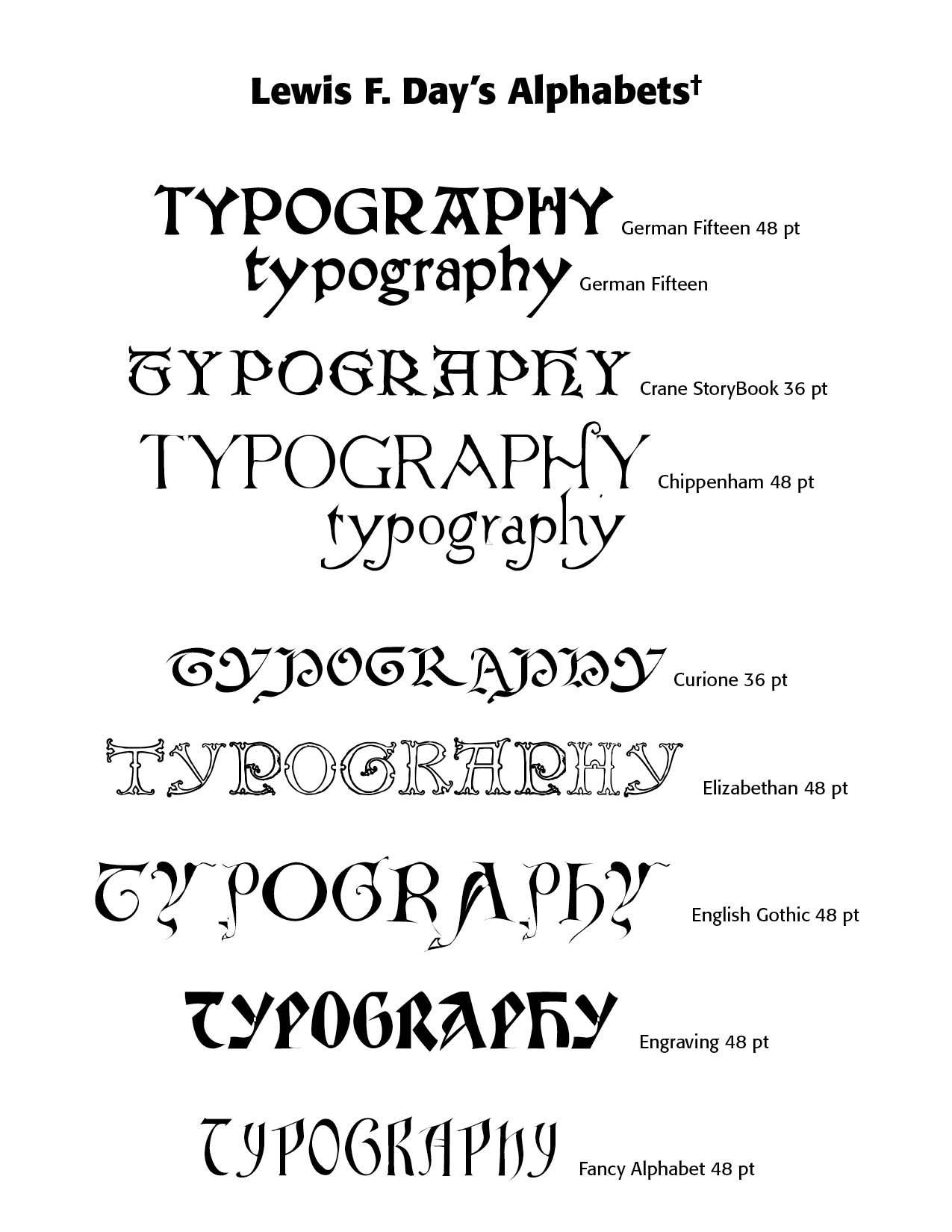
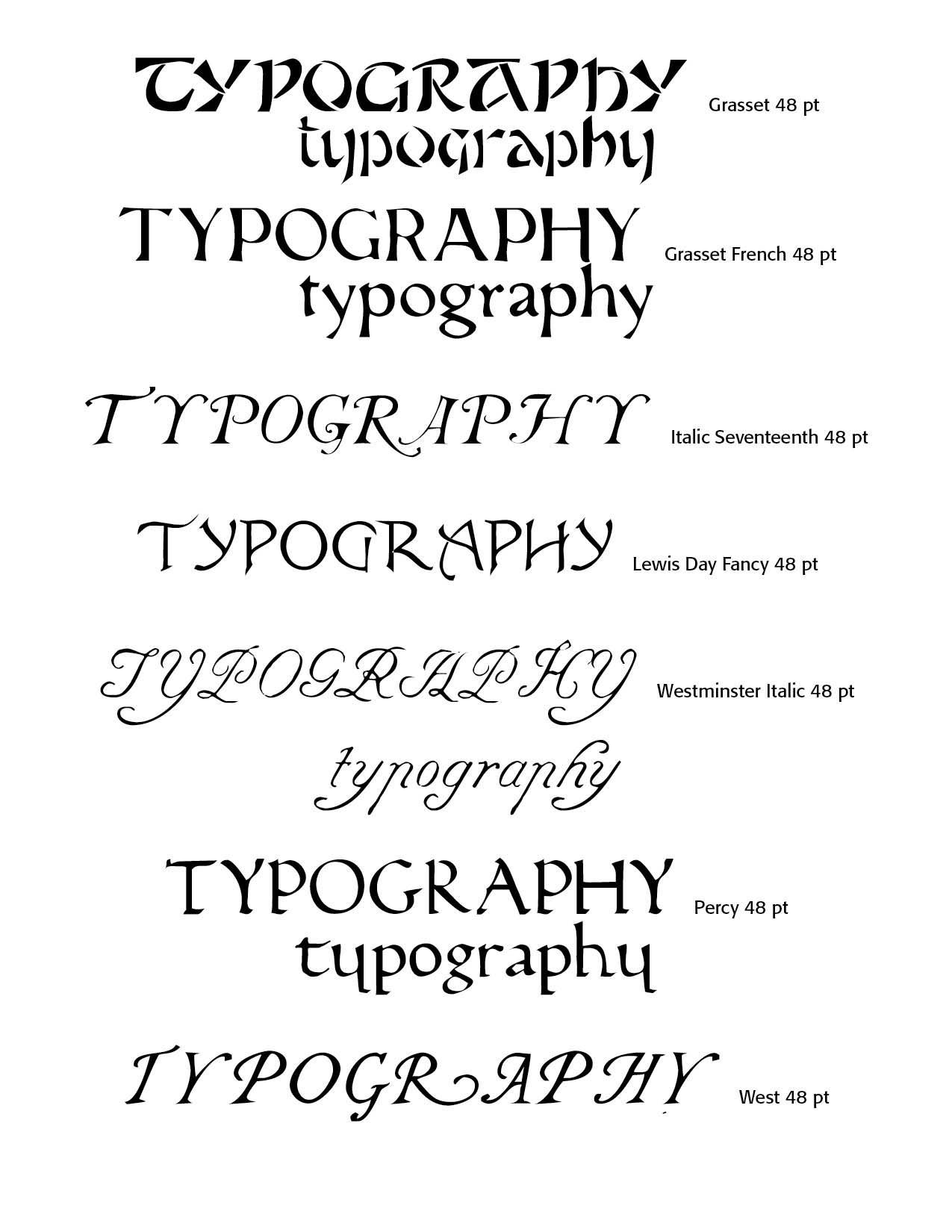
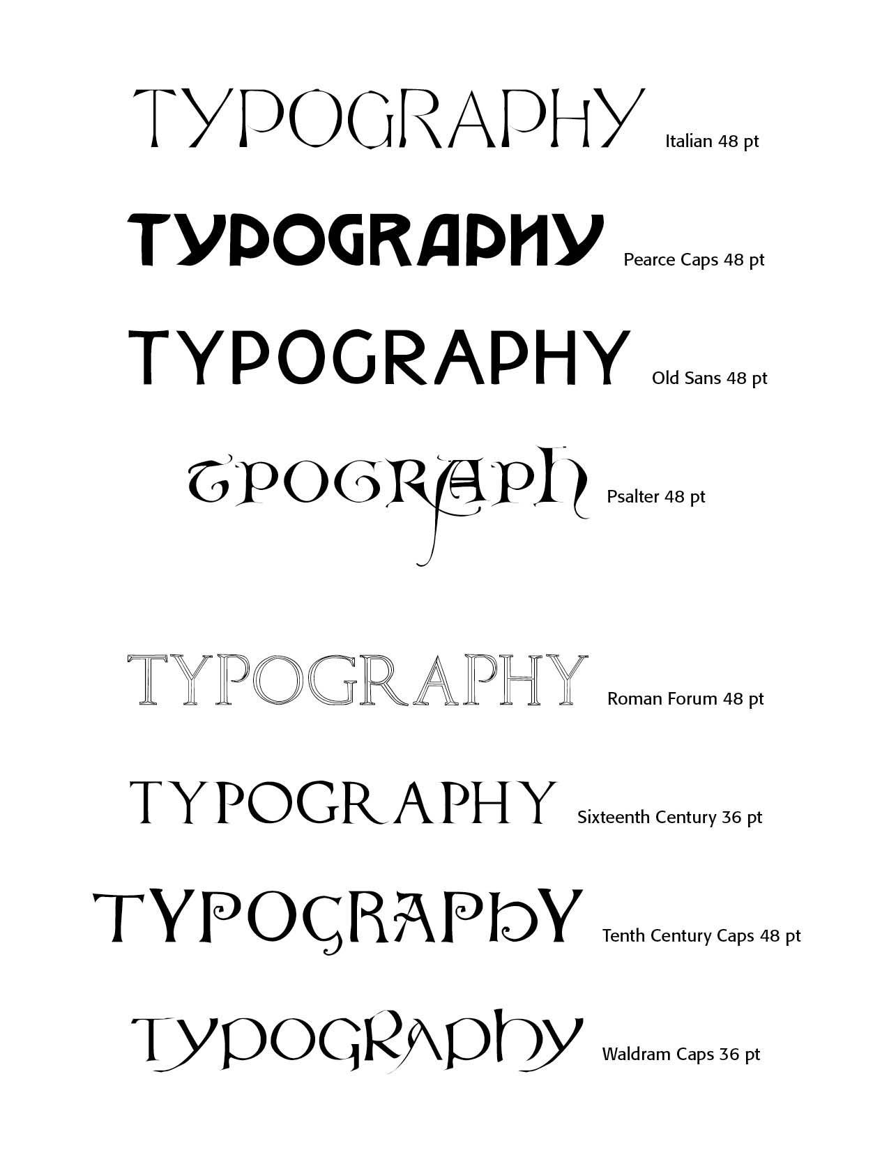
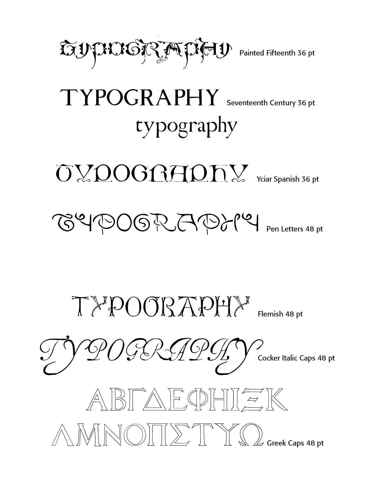
Lewis F. Day's Alphabetic Summary. This is the last post of Day's Alphabets Old and New (London, 1910), highlighting a summary picture of his alphabetic font offerings in the book. Other Blogs investigate the font backgrounds and development of Day's fonts. CARE Typography has meticulously digitized many of Day's typographic offerings. They are available, either individually, or as a set for a modest cost. Contact cshanktype@gmail.com for prices and ordering. Additionally, CARE Typography is offering a beautifully crafted printed summary in a font binder, along with their newest book, Typography Through the Years: A Selected History. This selection gives a carefully researched history of typography and an extensive sampling of historic faces, both old and new.


Lewis Foreman Day (1845-1910) was an influential English designer, author, and lecturer who played a significant role in the Arts and Crafts movement of the late 19th and early 20th centuries. He became a prolific designer, working across various mediums including wallpaper, textiles, stained glass, pottery, and metalwork. Day advocated for the integration of form and function, emphasizing the importance of practicality in design alongside aesthetic considerations. His work and writings contributed significantly to the development of British design education and theory in the late Victorian era.


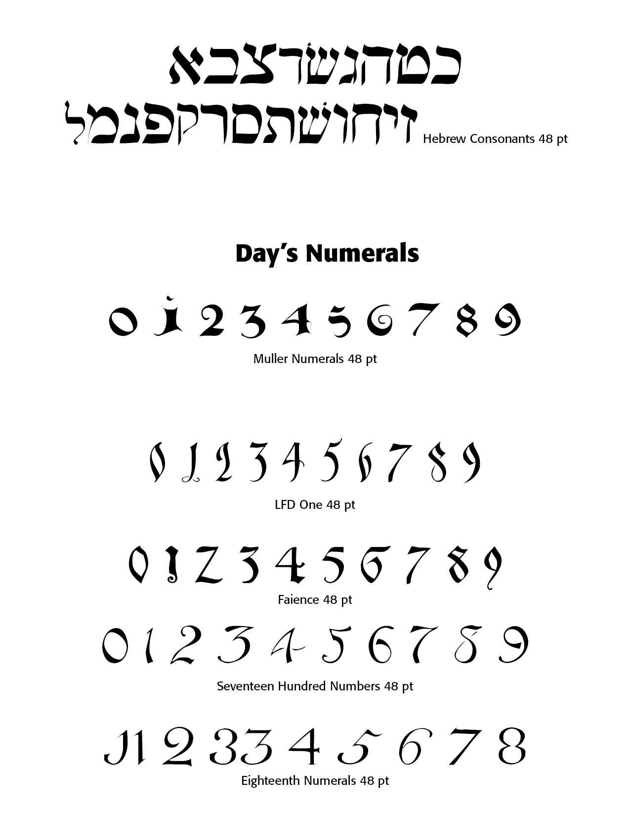
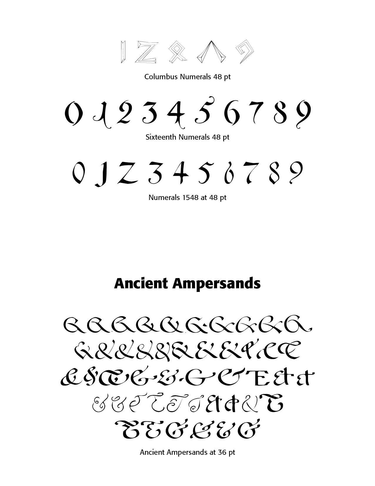
His book, Alphabets Old and New, published in London, in 1910 gives sterling examples of his typography work. Day's approach to design, blending traditional craftsmanship with modern industrial techniques, helped shape the transition from Victorian aesthetics to more modern design principles. CARE Typography has digitized a number of the font faces in the book for modern use and aesthetic appeal. The typefaces below illustrate the beauty and craftsmanship of Day which can contribute to modern typography.


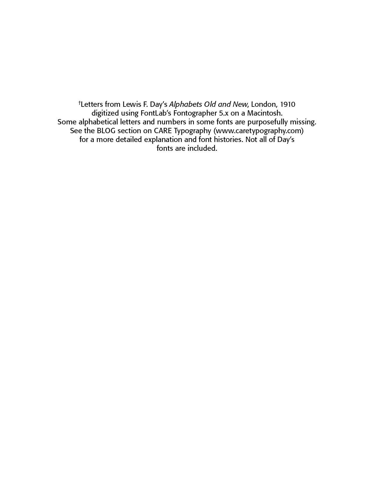
These mostly pen drawn typefaces have been digitized by CARE Typography using Fontographer to make them available as usable fonts. Caps or Unicals are often used in display faces and advertising. Some of these classic faces can enliven your printing and advertising projects. 


Successful Layout & Design

By Carl Shank February 12, 2026
Free Fonts: A Deal or Trouble? The latest Google estimate of available fonts is over 300,000 and counting. Other estimates have catalogued over 550,000 fonts. There are over 36,000 font families, over 4,000 type designers and over 2,700 professional font foundries, not counting smaller font entrepreneurs like CARE Typography, which provides restored fonts from yesteryear. (Quora source https://www.quora.com/How-many-fonts-are-there-in-existence-Does-any-group-attempt-to-keep-a-record-of-all-the-fonts-that-exist ) There are commercial fonts from sources like Adobe and MyFonts (Monotype) which require payment for their use in various platforms. Both provide a subscription service, which usually requires a substantial monthly or yearly fee to download and use their fonts. When I began using Apple Macintoshes in the 1980s, font manufacturers like Adobe and Monotype would “sell” the right to use a number of their fonts for thousands of dollars. And, by the way, you never really “own” the font. You have paid only for the use of the font for a specific purpose or machine. Moreover, the price varies for print use, or web use, or a digital ad use. Even today, the font Trinité Titling by Bram de Does, used in a number of Bibles and biblical studies, costs over $4,000 for the use on a single computer and much more for a number of computer users. Individual users of such fonts are mostly priced out of their budget. Why the seemingly extravagant cost? We had a valve on one of our household plumbing lines go bad. I called the plumber, and he replaced the valve — at a cost of several hundred dollars, while the valve itself cost only a few dollars. Was that fair? Yes, because I was paying for the time and training and effort going into replacing that valve in my house. The same holds true for professional font designers. They spend hundreds, sometimes thousands, of hours in font development. We are paying for their livelihood. Font licenses cover four basic parameters around font usage — “The What: The weight and style of the typeface; The Where: Literally where you’ll use the font – a website, digital ad, or in print; The Who: The number times a font can be installed on a computer (aka the number of people who can use it); The How many: For example, web font licenses describe the number of allotted page views, and app and digital marketing licenses set similar parameters.” (Monotype Report) Companies like Monotype are rarely concerning with an individual using a font for a home, individualized project, but rather an entire design company or printer using that font for commercial gain and advertising dollars. There are fonts available “for personal use only,” prohibiting their use for commercial or money-making projects. There are what have been called “shareware” fonts, fonts with a minimal cost which require attribution of the type designer or provider on projects. Most fonts provide a EULA, or font license, which outlines and determines the legal restrictions and ramifications for their use. What about free fonts? Monotype warns against using unlicensed or what are called “free” fonts for several valid reasons, but, in my opinion, this is an obvious ploy to get the user to buy or subscribe to their font services. One Monotype report cites six issues associated with what are deemed “free” fonts. Free fonts may pop up in similar ads or designs to industry competition, perhaps prompting a lawsuit or cease-and-desist actions. Free fonts often have the inability to scale, add special characters, or even different alphabets. Free fonts have limited creative scope. They may be saddled with malware or software viruses. Poor font design can be a problem with such fonts. A sixth problem with so-called free fonts is that they can be actually “pirated” fonts, copied from legitimately designed fonts. “Aside from branding issues, free fonts also suffer from a whole host of performance issues. Fonts are software files that interact with applications and the operating system on which it’s installed; without the guidance of a skilled font engineer, rendering issues may arise from crashing glyphs, or a lack of proper kerning (the space between glyphs) text in certain scenarios. A free font downloaded from a random website might not support a broad range of languages and or complex scripts (e.g., Japanese or Arabic), or basic diatrics to cover commonly used Latin languages.” (Monotype Report) Monotype maintains that free fonts won’t give a company the individual style it deserves to help it stand out in the marketplace. They also point to the legal ramifications involved with font licensing, not a glamorous subject but one in which company attorneys are hired to examine for possible litigation. Types of Free Fonts There are four sources of free fonts — Open Source fonts with an SIL Open Font License (SEE https://openfontlicense.org ); OS fonts, fonts that come with your operating system and hardware; Subscription add-on fonts that come as an add-on to a subscription service; and, advertised free fonts by independent font designers, such as CARE Typography. Many or most of such free fonts come from freeware, shareware, public domain or demo fonts downloaded or reconstructed from an archive or library, like Internet Archive. Companies such as Website Planet offer free “commercial” fonts, fonts that can be used in business and corporate applications. See https://www.websiteplanet.com/blog/best-free-fonts/. Several cautions, however, are still in order here. First, a font that “looks like” a standard, business font is not the same thing as its “older brother.” An example is Website Planet’s Playfair Display font, both a variable and static font designed by Claus Eggers Sørensen licensed under the SIL Open Font License agreement. Yet, this font looks a lot like the standard Bodoni font, created by Giambattista Bodoni in 1767 and revived by Morris Fuller Benton in 1911 under Linotype’s commercial license.
By Carl Shank December 23, 2025
More on the Greek font. In a previous post ( It's Greek To Me! March 18, 2023) we noted that Cursive Greek type appeared as a chancery script by Francesco Griffo in 1502 and lasted two hundred years. Robert Bringhurst notes that "chancery Greeks were cut by many artists from Garamond to Cason, but Neoclassical and Romantic designers . . . all returned to simpler cursive forms . . . in the English speaking world the cursive Greek most often seen is the one designed in 1806 by Richard Porson." This face has been the "standard Greek face for the Oxford Classical Texts for over a century." ( Robert Bringhurst, The Elements of Typographic Style, Hartley & Marks, Version 3.1, 2005 , pp. 274, 278) In fact, asking Google for the best Greek face to use, it points us to Porson Greek. Porson is a beautiful Unicode Font for Greek. It's not stiff, like many of the cleaner fonts, which are usually san serif. It is bold and easy to read and seems to more closely match the orthography in newer textbooks. (Jan 8, 2004) 
Show More