Blog Layout

Digitizing the Past

Carl Shank • February 2, 2023

I subscribe to what is called Internet Archive (archive.org). The Internet Archive, a 501(c)(3) non-profit, is building a digital library of Internet sites and other cultural artifacts in digital form. Like a paper library, they provide free access to researchers, historians, scholars, people with print disabilities, and the general public. Their mission is to provide Universal Access to All Knowledge. They boast a growing library of  735 billion webpages, 41 million books and texts, 14.7 million audio recordings, 8.4 million videos, 4.4. million images and 890,000 software programs. It is an amazing resource for older, out-of-date, archival works and records.


Recently, they posted old turn-of-the-century calendars as we enter 2023 ourselves. I took two of the public domain calendars, one published in 1893 and the other in 1901, and sought to digitize them, not just take a picture of it and post it, like the Archive does, but rather recreate them using modern digital means. I am no expert at this, but I did the best to retain the overall sense of the artwork and texting. I used a combination of Adobe InDesign, Adobe Photoshop, and Tobias Saul's Kittl (kittl.com) for the work. The faded  patterns remain and the work took several days of playing around with settings and cut-and-paste and tweaking the color schemes and so forth. The results are below.


Enjoy the remade 1893 and 1901 calendar covers!


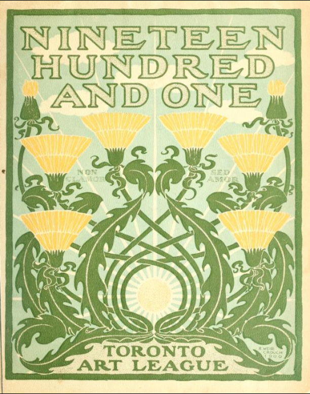
ORIGINAL 1901 CALENDAR COVER

Calendar for the year 1901 (Toronto art league)

by Toronto art league

Publication date: 189?

Publisher: Toronto Art Students League, Musson Book Co

Collection: Queens University Toronto

Digitizing sponsor: Ontario Council of University Libraries & Member Libraries

With verses by some of the Canadian writers of verse, and drawings by members of the Toronto art students' league

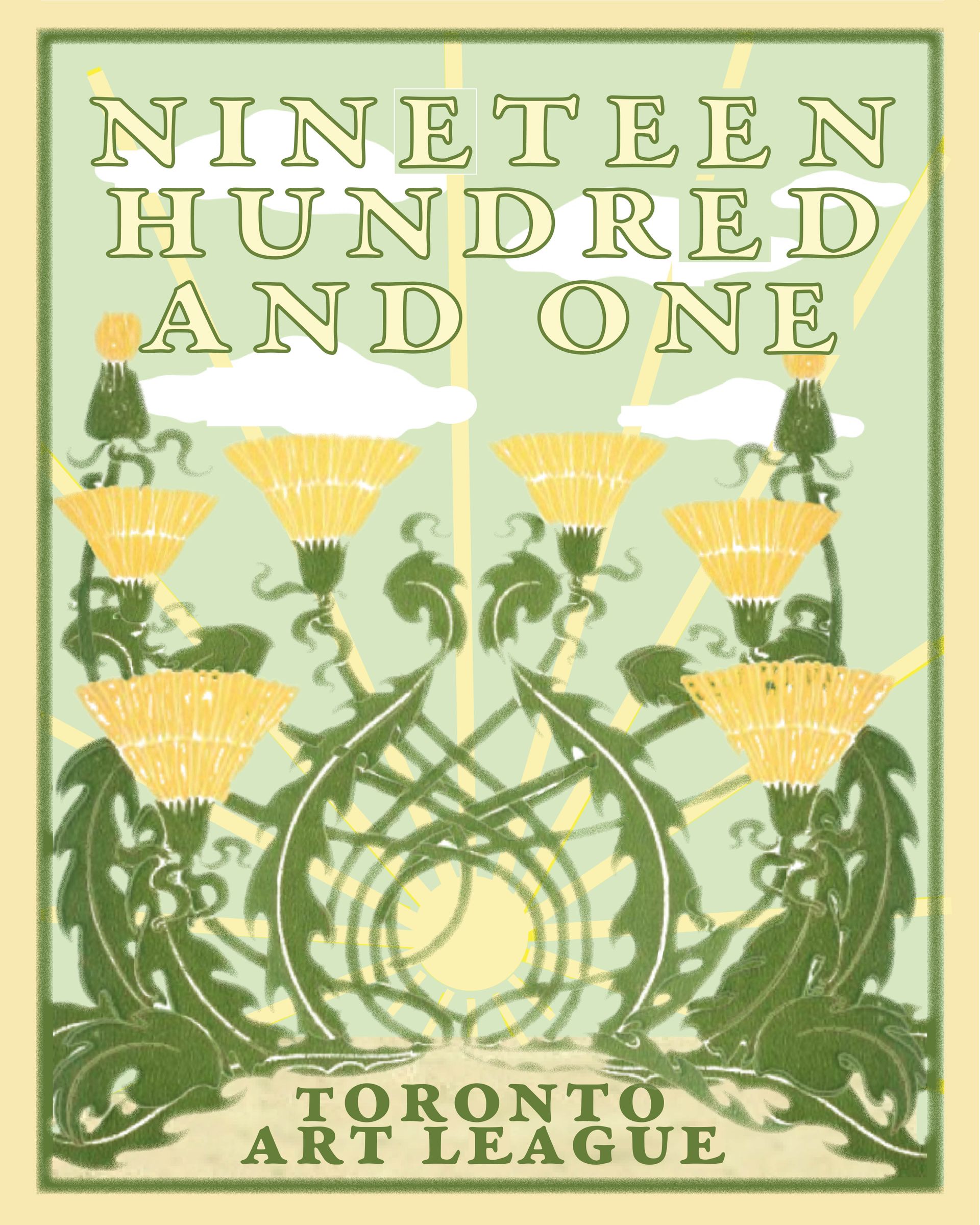
This is the redone digitized cover. While not exactly the same as the 1901 edition, I tried to stay true to the overall colors and fanciful artwork.


The lettering was especially challenging. I used Garamond Premier Pro, Bold Caption for the text. I used the "create outline" function of InDesign on the text to then enhance the capital "E" lower serif to match the original drawing text.


The background art work was done in the very excellent graphics program provided by Kittl and tweaked in InDesign. The background color was matched to the original, with clouds added and then sun with rays that had to be drawn individually and rotated in place. It is certainly clearer than in the original and I could have tweaked it more to make it fade more into the background.

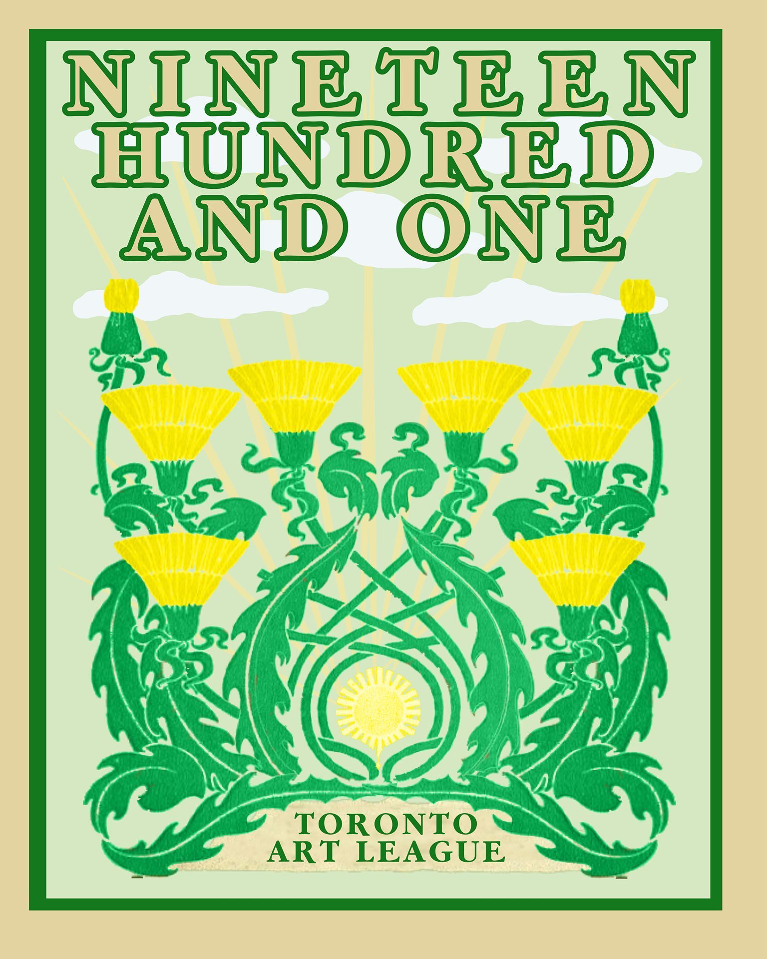
This is the newly redone 1901 Calendar front. The vines and flowers were copied and newly colored in Photoshop. The rest of the artwork was done in Kittl with the import of the revised Adobe Garamond Bold from Fontographer for the elongated "R" and "E."


Note the clarity and sharpness of the newly minted image.

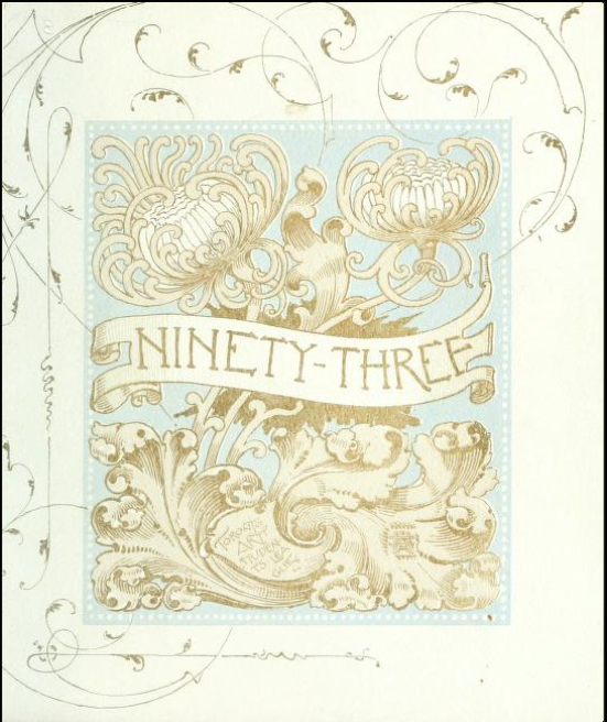
Ninety-three: a calendar for the year of our Lord MDCCCXCIlI; with verses by some of the Canadian writers of verse and drawings by members of the Toronto Art Students' League

By: Toronto Art Students' League

Published: 1893

Collections: Dorothy H. Hoover Library - Ontario College of Art & Design

The publication contains the latin moto: "Non clamor sed amor" which translates as "Not clamour, but love" which is a line by Tommaso da Celano (13th century)

Courtesy: Internet Archive

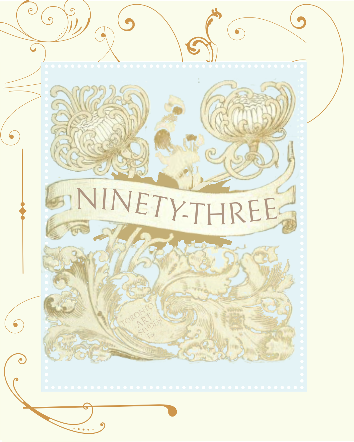
This is the digitized 1893 Calendar. I used Photoshop to capture the interior artwork and coloring, and Kittl to print out the distorted "ninety-three" and add the Victorian flourishes. Text is Bellefair Regular. Note the flourishes are not exactly like the original.

Successful Layout & Design

By Carl Shank January 29, 2025
Sketch & Hand Drawn Lettering. The history of font development includes a wealth of calligraphic fonts and artistically crafted hand drawn typefaces. A number of these lettering fonts have been drawn and submitted by smaller type foundries and entrepreneurs seeking to make their mark in the font world. A casual look at ChatGPT gives some idea as to their source and character. Fonts that mimic pencil drawings often have a hand-sketched, textured, or rough-lined appearance. These fonts are great for artistic projects, children's books, casual branding, or creative typography. The sample fonts below are mostly given for personal use only, use on personal invitations and so forth, but some have been made available for commercial use as well. They demonstrate the wide range of hand drawn fonts available for use and purchase.
By Carl Shank January 20, 2025
Four Old Playful Fancy Fonts . CARE Typography is pleased in its historical search for antique inspired fonts to introduce digitized versions of Harper and Mikado, a Gutenberg typeface and Lacrosse. Unlike their modern counterparts, these fonts are display only fanciful fonts of a bygone era in typography. However, they exude a rich history of font development that should not be forgotten in our search for the new, the sleek, the up-to-date in type. They have been developed from the rich typographic heritage of Phillips Old Fashioned Type Book published in 1945 by Frederick Nelson Phillips, Inc, in New York. This volume has caught my historic typographic eye for its plethora of ancient font styles and formulations. The Harper446 font is especially playful, with its curly capitals, its specialized "Q" capital and, of course, its flavorful and playful small case lettering, with the raised c, e and o letters and the odd looking "g." This is obviously not a text font, but can uses in artful decorative work. The Mikado231 font does not at all look like the variations of the typeface called "Mikado" in typography history. As that history notes, "Mikado was apparently inspired by Gilbert and Sullivan’s comic opera of the same name. The show opened in London in March of 1885 and in New York later that same year. According to Nicolete Gray in her classic book on ornamented typefaces, the English foundry of Sir Charles Reed and Son introduced a metal type called “Japanese” also in 1885. She characterized this typeface and other oriental based typefaces as superficial in their foreign influence. Nonetheless it appears that it was later copied by several of the American Wood-type companies. The 1906 Hamilton wood-type specimen catalog shows four versions of this design; one by Hamilton and three by acquired companies. The versions by Wells, and Morgans & Wilcox are called Mikado. The Hamilton and Page versions use model numbers 204 and 156 respectively. It is difficult to determine the specific dates when this particular wood-type was introduced, but the earliest wood-type catalog I could find showing Mikado is the 1888 Page catalog. Our sample “WINTER” is a 15 line unstamped type most similar to the Hamilton version. Incidentally, another English foundry, Miller and Richard introduced a metal typeface in 1887, also named Mikado. That typeface is totally different than the one presented here." (https://www.printmuseum.org/wood-type-mikado). This Mikado adaptation has straight angular E, F, G, K, T and even raised W, X, Y in the capitals. Note the falling stems of C, L, and lower c, e, h, m and n. Again, this playful font can be used sparingly in advertisement copy and flavorful playbills. The Gutenberg700 font is again from the Phillips book samples. Note the dotted C, U, V, small g and zero. The ampersand is also interesting. Curly serifs are used in A, J, L, S. The numerals are classic old school numerals. This Gutenberg rendering is unlike any classic Gutenberg typeface that has been presented. The LacrossePhillips font has a cute left hanging serif on the capitals. It is a bold faced font, both in the upper and lower case. It is a full font offering upper and lower case lettering, numerals and other marks. These fonts are available from CARE Typography at care typography.com at NO COST. They are free to purchase and use.
Show More
Share by: