Dignified Courier
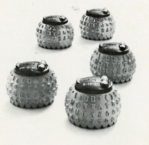
Dignified Courier. This blog is written in the Courier Prime typeface. Note how "typewriter-like" it writes and reads. Typography is a form of communication. Back in the day when I worked in a suburban D.C. print shop, I would select and pick a type ball that was used on an IBM Composer, and then wed that output with rub-on type headlines. Later I used an Itek typesetting machine for the headlines. Perhaps some of you recall those days of print shop work.
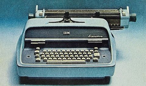
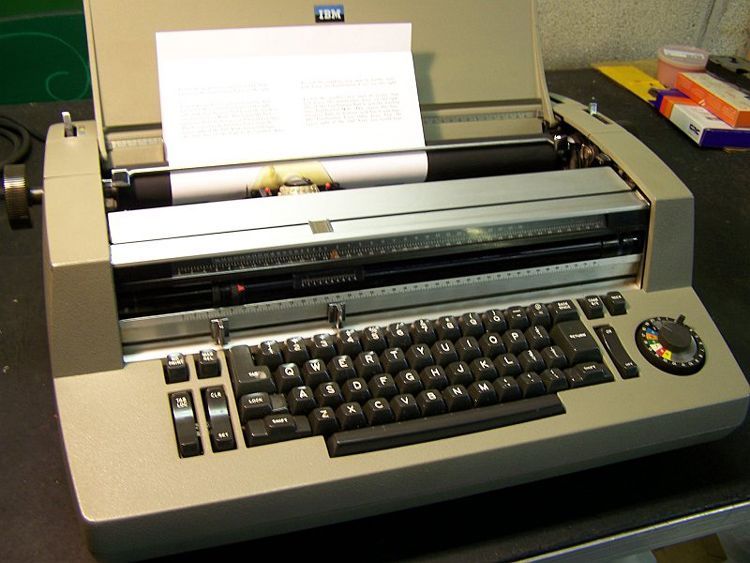
There were, of course, a number of type balls we used on the Composer — Bold Courier, Business Script, Contemporary, Calligraphy, Headline, Advocate, Prestige Pica 72, Courier 12 and Courier 12 Italic among others. Diligent typists would rapidly change the balls and prepare the text for photographing and printing. We were all used to typewriters and cherished the IBM Selectric typewriter. The IBM Executive typewriter came about in 1954, using special fonts and implementing true proportional spacing long before Postscript came about. The flying-ball Selectric used interchangeable balls, preparing the way for the IBM Composer, which allowed for proportional spacing and justified text.
Then the Macintosh came about with the massively large LaserWriter (remember how large that machine was!) and the ImageWriter for home use. We all thought that we died and went to printing heaven with a 300 dpi LaserWriter and Times and Helvetica fonts included. Postscript came along and the traditional Courier typeface became obsolete.
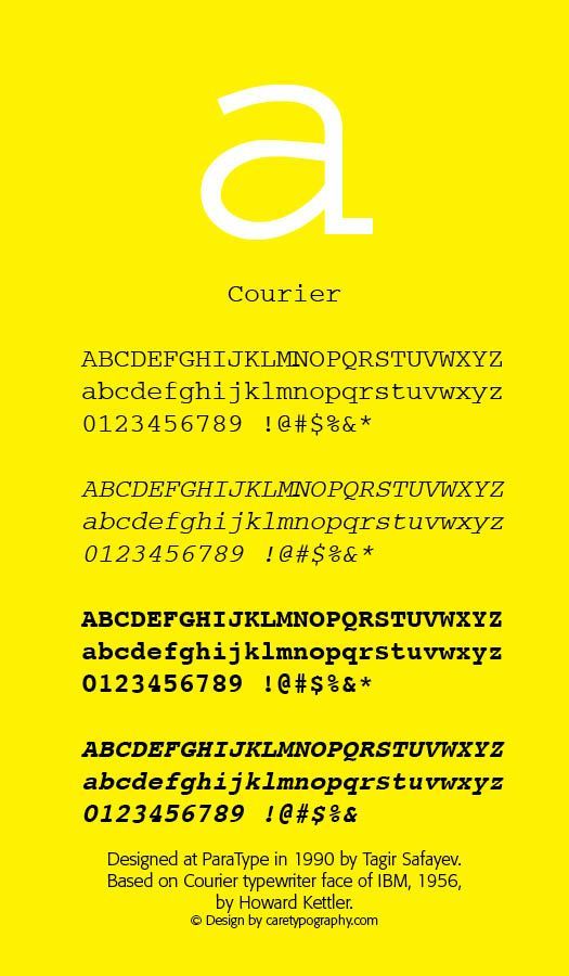
Howard G. "Bud" Kettler, worked as a type designer for IBM in the 1950s. He designed corporate logos, special-purpose fonts, like the Bell Gothic, and a number of typewriter fonts. He was tasked with the job of designing a typeface that was "weightier" than the fine lines of Pica and Elite that were being used at the time. Dirk Stratton, in the March/April 1992 Aldus Magazine noted that Kettler in the mid-1950s designed the face we call Courier — "He based its geometry on nineteenth century Egyptian typefaces, slab-serifs they are called, and made them work on the typewriter." IBM never assigned a trademark to the face and it has been in the public domain ever since. Kettler was proud of his work — "A letter can be just an ordinary messenger [that was thought to be the desired name] or it can be the courier which radiates dignity, prestige and stability." The Courier typeface was born. Even the renowned Robert Bringhurst in The Elements of Typographic Style acknowledges Courier's long standing usefulness — "And on the principle that a good hamburger is better than a bad souffle, even monospace typewriter fonts - such as IBM Courier and Prestige, which are models of their kind - remain well worth considering for routine work on laser printers." (Elements of Typographic Style, Hartley & Marks, 1992 edition, 90–91)
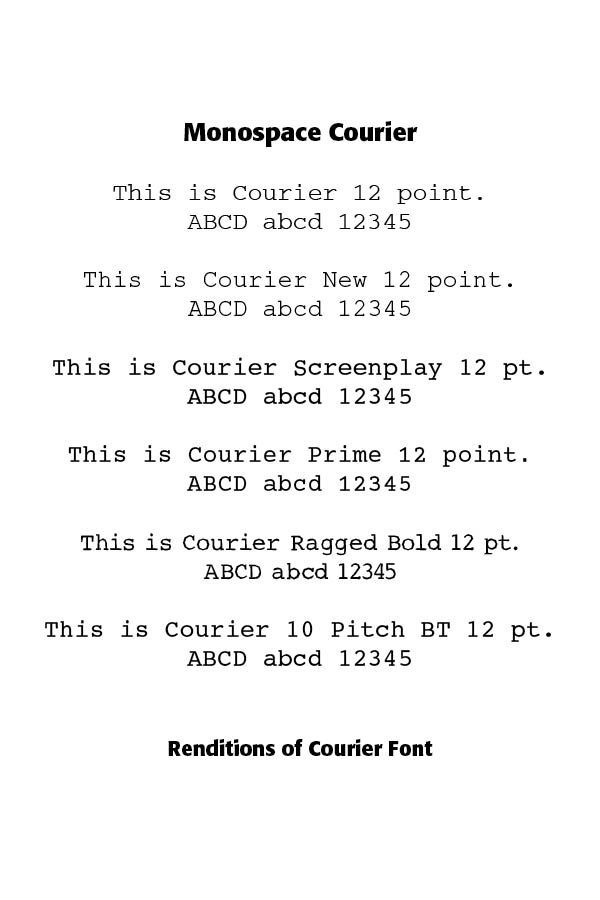
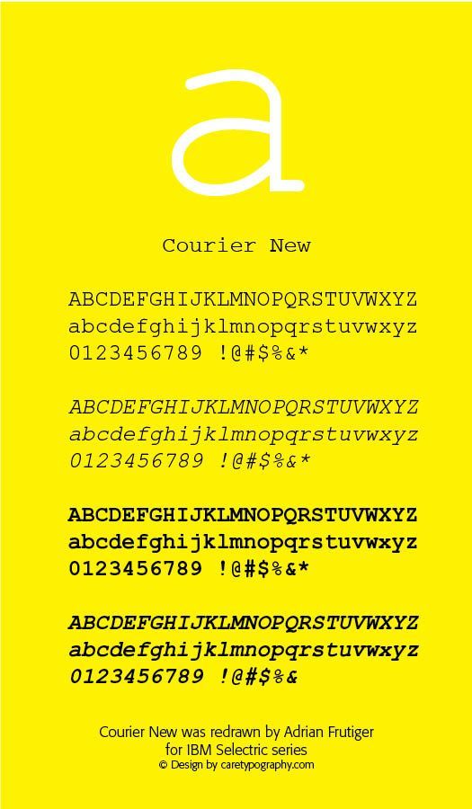
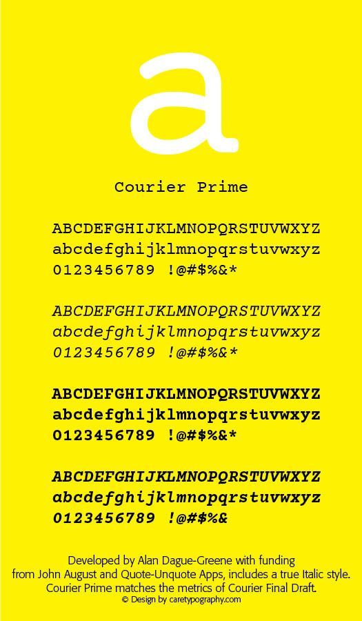
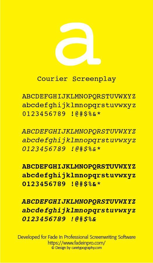
As a monospaced font, Courier found usefulness in computer programming and became the industry standard for screenplays written in 12-point Courier, called Courier Screenplay. The typeface Courier New was used until January 2004 by the federal government, being replaced by 14-point Times New Roman typeface. The iterations and variants of Courier have been many, including Courier New, Courier Screenplay, Courier Prime, Dark Courier, Courier 10 BT, Courier Final Draft and Courier LT Round Font. Comparison of some of the Courier typefaces are in the chart to the right.
Produced by Monotype, Courier New appeared quite a bit "thinner" than regular Courier. Wikipedia notes that "Its thin appearance when printed on paper owes to its being 'digitized directly from the golf ball of the IBM Selectric' without accounting for the visual weight normally added by the typewriter's ink ribbon. ClearType rendering technology includes a hack to make the font appear more legible on screens, though printouts retain the thin look." It comes in four font renderings — Courier New, Courier New Italic, Courier New Bold and Courier New Bold Italic.
Courier Screenplay was developed for Fade In Professional Screenwriting Software. It offers the legibility of Courier 10BT with line counts favored by screenwriters. Fade In Pro's website says that this is "A Courier font that is strong, well-balanced for reading, and excellent for printed and PDF scripts. (Plus your readers will be grateful to you for not using Courier New.)" (fadein pro.com)
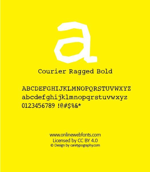
Courier Ragged Font was designed by Lloyd Springer of the TypeArt Foundry, Inc.in 2007."Over the years, TypeArt(R) fonts have become popular with designers all around the world and can be seen in action on books and magazines, in film and television, on CDs and posters, and on a wide variety of other products. The TypeArt Foundry Inc. is the home of the electronic newsletter POINT SIZE, which provides customers and enthusiasts with typographic ideas, tips, and information about new releases and special offers." (MyFonts.com)
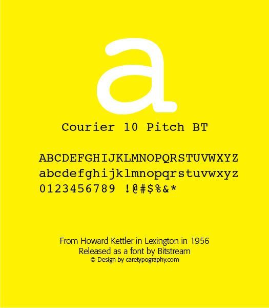
The Courier 10 Pitch BT font, released by Bitstream, and designed by Howard Kettler, is heavier than Courier New and more closely approximates the look of the original Courier type on paper. This is the default Courier on most Linux distributions. The Courier LT Round family was also designed by Kettler and is available from Linotype.
Courier Prime "developed by Alan Dague-Greene with funding from John August and Quote-Unquote Apps, includes a true Italic style. Courier Prime matches the metrics of Courier Final Draft,with some design changes and improvements aimed at greater legibility and beauty." (Wikipedia)
Dark Courier is not a bold font, but rather a normal weight typeface developed as a TrueType face by the Hewlett-Packard corporation and chosen by them because the Courier New alternative was "too thin."
Courier Final Draft, a version of the Courier 10 BT, was developed for the Final Draft screenwriting program. Default setting yield 55 lines per page.
These fonts and their lettering are included in the images below. Howard Kettler is proud of the face, noting that "I personally feel that the type style can stand on its own merits under any conditions . . . It is a good typeface, if I say so myself." ("Courier of Dignity," Dirk Stratton, Aldus Magazine, March/April 1992.
Successful Layout & Design


