Helvetica's Journey
Back in October 2023 (Blog Oct. 19, 2023) I noted several professional typographers comments about Helvetica — In the July/August 1995 edition of Adobe Magazine, Robin Williams, a noted typographer, says Helvetica, though immensely popular in the 60s and 70s, became passé. Like the beehive hairdo, Helvetica is continuously used but creates a tired and dated look. He says, "Just because it's on your computer doesn't mean you have to use it. The greatest single thing you could do for your publications is to invest in another sans serif ("without feet") face, one with a strong, bold black version in its family. As with all trends, Helvetica will someday be back in style—in about two hundred years." He gives in another article some alternatives to Helvetica — ITC Franklin Gothic, Futura, Gill Sans and ITC Stone Sans as examples. And Daniel Will Harris in "Add Impact to Type" in the magazine Technique, March/April 1994 issue, suggests a wide range of alternatives to Helvetica — Agfa Roti's Sans, Avenue, Eras, Formata, Franklin Gothic, Frutiger, Gill Sans, ITC Goudy Sans, Lucida Sans, Optima, Shannon or Univers. We explored some of those substitute fonts at that point.
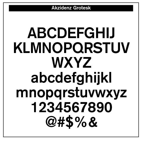
Helvetica's Journey. Helvetica derives its powerful simplicity and display qualities from the 1896 typeface Akzidenz-Grotesk. "The design originates from Royal Grotesk light by Ferdinand Theinhardt who also supplied the regular, medium and bold weights. Throughout the years, Berthold has expanded this extremely popular and versatile family. AG Super was developed in 1968 by Günter Gerhard Lange and is an excellent choice for headlines. In 2001, Günter Gerhard Lange added more weights for Berthold including Super Italic and Extra Bold italic." (MyFonts.com)
Martin Silvertant from medium.com cites three problems that have plagued Helvetica over the years. First, the original Helvetica face is not as contemporary as we would imagine, since it is a take-off from the 1896 Akzidenz-Grotesk face. Then, it is not that legible in small point sizes.
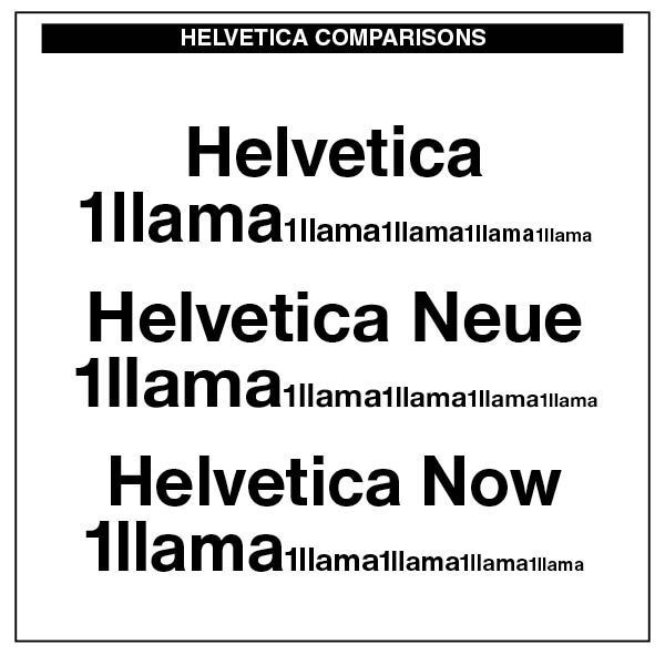
Note the original Helvetica on the left as it goes from large display to a smaller text size. The letters seem squeezed together and not very readable or legible. Legibility is the ease at which letters can be differentiated from each other. In the case of Helvetica, some characters are quite hard to tell apart. With its closed letter forms, it was simply a terrible choice for body text. Indeed, the renowned typographer, Robert Bringhurst, notes, "It would be possible, in fact, to make a detailed chart of lowercase letterforms, plotting their inherent resistance to letterspacing. . . . Around the middle of the list, we would find other unserifed faces, such as Helvetica, in which nothing more than wishful thinking bonds the letters to each other. (Robert Bringhurst, The Elements of Typographic Style, Hartley & Marks, 1992 edition, 31) Consequently, we were advised to not use this typeface in textual materials. The advice was to use it as a sans-serif face in headline text and then use a suitable serif typeface for the text.
Max Miedinger from Linotype then sought to add some more readable quality to the Helevetica face, calling it Neue Helvetica — "Neue Helvetica® is a melding of aesthetic and technical refinements that result in superior design proportions, improved legibility and an expanded range of uses beyond the original Helvetica typefaces. Neue Helvetica World fonts enable the setting of pan-European languages, in addition to Arabic, Armenian, Cyrillic, Georgian, Greek, Hebrew, Thai and Vietnamese. The Cyrillic fonts include full support of the Unicode block, including characters for Bulgarian, Mazedonian, Serbian and Ukrainian." (MyFonts.com) Again, Bringhurst's critique is that "not all of these derivative Cyrillics can claim to be distinguished designs, and few are suited to running text." (Bringhurst, 206)
"Helvetica is a twentieth-century Swiss revision of a late nineteenth century German Realist face. The first weights were drawn in 1956 by Max Miedinger, based on the Berthold Foundry's old Odd-job Sanserif, or Akzidenz Grotesk, as it is called in German. The heavy, unmodulated line and tiny aperture evoke an image of uncultivated strength, force and persistence. The very light weights issued in recent years have done much to reduce Helvetica's coarseness but little to increase its readability." (Bringhurst, 93)
The third issue with Helvetica was its lack of proper hinting. Typeface hinting at its most basic level is "a method of defining exactly which pixels are turned on in order to create the best possible character bitmap shape at small sizes and low resolutions. Since it is a glyph's outline that determines which pixels will constitute a character bitmap at a given size, it is often necessary to modify the outline to create a good bitmap image; in effect modifying the outline until the desired combination of pixels is turned on. A hint is a mathematical instruction added to the font to distort a character's outline at particular sizes. Technically, hints result in operations which modify a contours' scaled control point co-ordinates before the outline is scan converted." (learn.microsoft.com) Rules are assigned to the typeface in terms of where each pixel is located, which depends on the size of the text and the resolution of your screen. In a Macintosh environment, the rendering engine takes care of the pixels. In a Windows computing context, how well typefaces render depends on the original hinting of the typeface itself. Both computing engines can produce blurry or unreadable results. The hinting of Neue Helvetica is better, but not as precise nor as well-defined as that in the Monotype face of Helvetica Now, noted above.
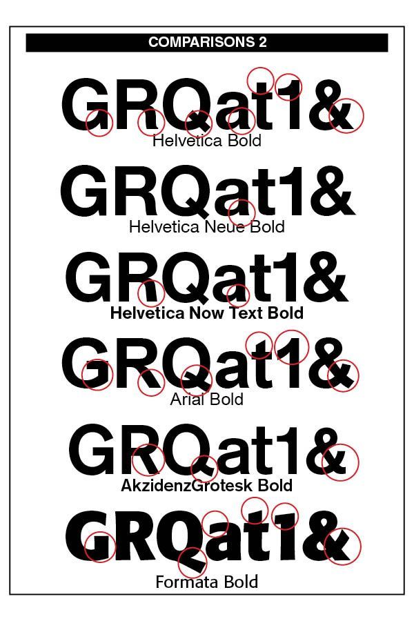
The font comparison chart to the right indicates the often missed, yet important legibility differences, in variations of Helvetica and how they compare with tradition Arial and the sans-serif font I like best, Formata. The obvious typeface difference among the fonts is that the Bold Formata font is decidedly bold, contrasting with the bolds of the three Helvetica samples as well as the Arial bold. To correct this, Helvetica in later additions added Helvetica Extra Bold and even Black.
Note the stem of the "G" in all three Helvetica font versions contrasted with the lack of a stem in the Arial "G" and the Formata capital "G." The Helvetica stems take their cue from the original Akzidenz-Grotesk 1896 font.
The little "tail" on the stem of the capital "R" is noticeable in both the original Helvetica and the Neue Helvetica fonts. However, it has been removed in the newer Helvetica Now edition. The Arial "R" is quite different than the Helvetica models. Note also the tail on the "a" in Helvetica renditions.
The "Q" in all Helvetica versions remain the same, but departs from its original Akzidenz-Grotesk rendering and certainly different than the Formata bold "Q." Note also the slant on the Arial "t" and the difference between its "1" and the Helvetica numeral "1" as well as the Formata "1."
The upper "a" stem in the Formata font differs from the other font sample in that it is not as curled as them. The Formata ampersand ("&") is also constructed differently than the others.
While such differences may seem slight and even uninteresting, to the trained eye they are noticeable and make significant readable differences in overall legibility and appearance.
However, Helvetica never goes away. In fact, it has made a comeback in Monotype's Helvetica Now font and the newest Helvetica Now Variable fonts, crafted by Max Miedinger, Charles Nix, NULL Monotype Studio, Friedrich Althausen, Malou Verlomme, Jan Hendrik Weber, and Emilios Theofanous. Faced with the demand to upgrade the face, these type designers wanted to maintain the original qualities of clarity, simplicity and neutrality "while updating it for the demands of contemporary design and branding. Helvetica Now comprises 96 fonts, consisting of three distinct optical sizes: Micro, Text and Display, all in two widths. Each one has been carefully tailored to the demands of its size —
"The larger Display versions are drawn to show off the subtlety of Helvetica and spaced with headlines in mind, while the Text sizes focus on legibility, using robust strokes and comfortably loose spaces. The Micro sizes address an issue Helvetica has long faced – that of being 'micro type challenged'. In the past, the typeface struggled to be legible at tiny sizes because of its compactness and closed apertures. Helvetica Now's Micro designs are simplified and exaggerated to maintain the impression of Helvetica in tiny type, and their spacing is loose, providing remarkable legibility at microscopic sizes and in low-res environments. There's also an extensive set of alternates, which allow designers the opportunity to experiment with and adapt Helvetica's tone of voice. This includes a hooked version of the lowercase l (addressing a common complaint that the capital I and lowercase l are indistinguishable) as well as a rounded G, and a straight-legged R, a single storey a and a lowercase u without a trailing serif. In the past, designers had to nudge, trim and contort the design to create stylish display-type lockups with Helvetica. Helvetica Now Display was designed and spaced with those modifications in mind—saving effort and providing more consistent (and more stylish) results." (from Monotype's website)
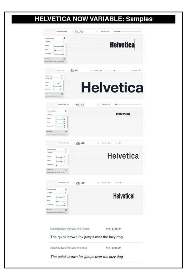
Then in 2021, more updates were made — "Helvetica Now 2.0 includes 96 fonts in three distinct optical sizes (Micro, Text, and Display), now with 48 new condensed weights. The Helvetica Now Variable fonts include even more: 144 instances—48 normal, 48 condensed, and 48 compressed. Helvetica Now Variable gives you over a million new Helvetica styles in one state-of-the-art font file (over two-and-a-half million with italics!)." The samples on the right give some idea of the power and strength of this new variable derivation of Helvetica Now.
"Each one of the Helvetica Now static fonts has been carefully tailored to the demands of its size. The larger Display versions are drawn to show off the subtlety of Helvetica and spaced with headlines in mind, while the Text sizes focus on legibility, using robust strokes and comfortably loose spaces. Helvetica Now's Micro designs are simplified and exaggerated to maintain the impression of Helvetica in tiny type. There's also an extensive set of alternates, which allow designers the opportunity to experiment with and adapt Helvetica's tone of voice. The new Condensed weights put more type into smaller spaces—for intense emphasis, sophisticated contrast, or just everyday space-fitting. Helvetica Now 2.0 is, quite simply, more: more versatility; more power; and more creative possibilities."
The sheer cost of this newer Helvetica font is prohibitive to the individual designer like myself and smaller typesetting offices. For larger firms with plenty of design use for different weights and styles of Helvetica, the Helvetica Now Variable fonts, in both regular text and italic, are eminently useful.
Successful Layout & Design


