Electronic Publishing
Electronic Publishing (E-Publishing). Having come of age in the early 2000s, electronic publishing provides the writer a means to publish their work online without having to go through the task of print design. First appearing in the 1980s in the form of plain text emails sent to a subscriber via a mailing list, the first e-journal appeared in 1994. In the years 1985–1995, a revolution took place in the printing world from analog to digital printing with CD-ROMs and PDFs. E-Publishing has become faster, cheaper and allows many people across the world to have instant access to books and articles, as well as multimedia presentations. While many people still prefer the feel and look of a printed book, electronic books are growing in popularity.
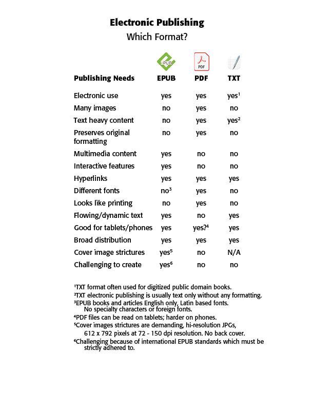
Common Electronic Publishing formats are EPUB, PDF, HTML and TXT. (See Chart Below) The Kindle Reader for Amazon also has its own proprietary format, called KPF. Kindle Package Format (KPF) is the successor to their old MOBI format. Both are proprietary formats created by KDP and specifically meant for displaying ebooks on Kindle devices. The KPF file is built when you use Kindle Create, another proprietary tool for formatting ebooks specifically for sale in Kindles stores. More broad distribution of electronic publishing materials need EPUB or PDF formatting.
EPUB is the open standard format developed by the International Digital Publishing Forum (IDPF). It is specifically designed for e-books and is widely supported by e-readers, tablets and smartphones. It is a responsive format, meaning that the text adjusts itself to fit the screen of the device being used. EPUB supports interactive features such as videos, animations and hyperlinks. It is an ideal format for e-books that contain multimedia content. Also, the content can be updated in real time, allowing users to have an up-to-date document without having to download a new book. EPUB, however, has certain inflexible strictures for font use, cover design, and table of contents (TOC) that need to be obeyed for EPUB publication. The formatting can be challenging and requires a significant investment of time and resources.
The PDF format is a file format system developed by Adobe Systems in the 1990s. It is a very popular format that preserves the formatting of the original document, including images, fonts and layout. PDF files can be read on almost any device, including desktop computers, laptops, tablets and smartphones. It has the advantage next to printed materials of being WYSWYG, or what you see is what you get, in terms of visual compatibility with the original text. PDF is popularly used for textbooks, business reports and where a lot of specialty fonts and images are employed. EPUB is the better format if the content is primarily distributed through e-readers. If the content, however, is on various platforms, including desktop computers and mobile devices, PDF is the better choice.
The HTML format is a markup language used to create web pages. HTML files can be used to create e-books that can be read on a variety of devices using a web browser. It is the format offered by Adobe InDesign on their Digital Publishing menu, giving a web address to the file created through InDesign. I have created calendars using this format that I have offered online to anyone interested. (See the BLOG on Calendars for 2024)
The TXT format is a simple text file format that can be used for e-books. TXT files do not support formatting or multimedia content and are often used for public domain books that have been digitized. TXT files can be read on almost any device using a text editor or e-reader app.
EPUB Design Basics (using Lulu.com) — Lulu suggests using a word processor, like Microsoft Word or Google Docs, for creating e-books. Just like designing a printed book, the first step is to finish writing and editing the book. Here, don’t forget to proofread, or better, have someone else, proofread the final book. Don’t worry about formatting, metadata, or the cover design until you have finalized the book’s contents.
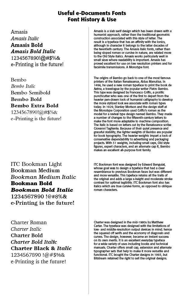
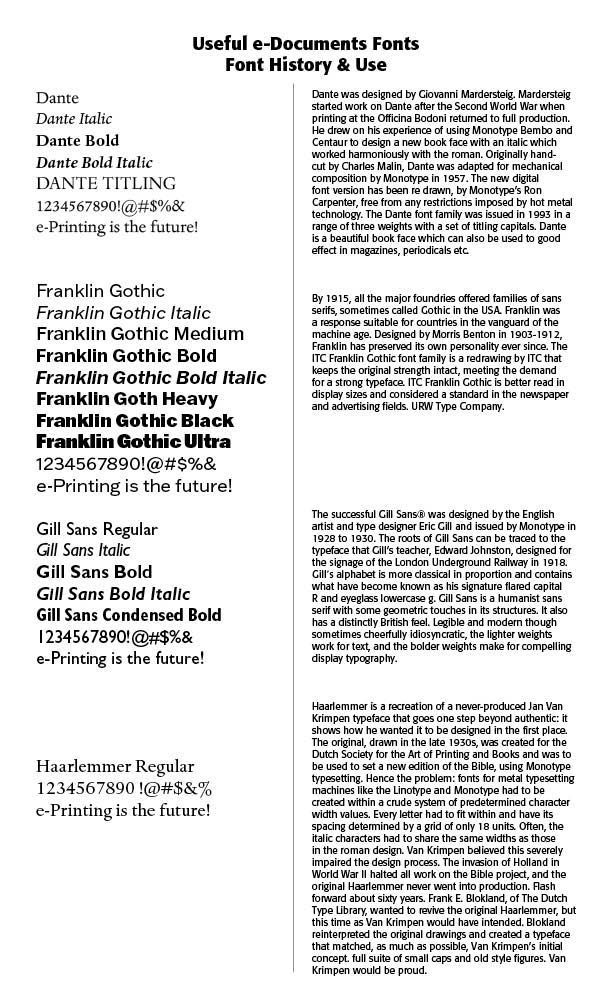
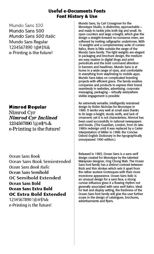
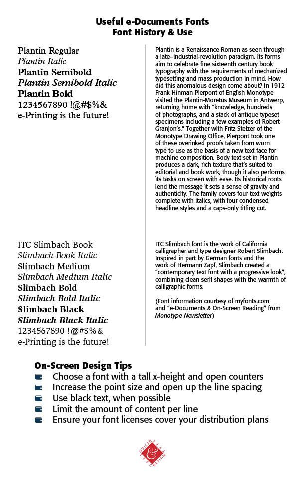
Give emphasis to the typography of your book, blowing up the title to an exaggerated size, and setting the text in a highly contrasting color to the background. Make sure the typeface is clear and easy to read, and conveys the genre of your book instantly. When you’re creating a fixed layout EPUB be sure to choose a highly legible font and make the font size and leading (space between baselines) generous. (See the type samples below for some help)
Thanks to Microsoft Word’s style-based formatting, you can let Word do most of the work for you for an EPUB approved file. Using the standardized headings in Word, Heading 1 style is for the book title, Heading 2 style is for the chapter titles, and the content is the body or Normal style in Microsoft Word.
Never use the “Enter” key to create extra white space. Reflowable books, like EPUBs, do not have a page size. They show content based on your reader’s screen size. Multiple line breaks may make your text appear not as intended on different devices.
Images need to be appropriately sized in JPEG or PNG format. No single image can be greater than 3.2 million pixels (total pixels = length in pixels x width in pixels). Indeed, Apple will not accept EPUB files that contain individual images greater than 5.6 million pixels. They need to be clear, high-quality and complete. They must be clearly readable and saved in RGB color format. (See BLOG on “All About Color.”)
Table of Contents (TOC) is required for EPUBs, but not your usual printed contents with page numbers. Get rid of those. Use Microsoft’s heading styles to define what appears in your table of contents.
Hyperlinks need to be checked to make sure they work properly.
Front & Back Matter. The Front matter to the book includes a title page, copyright page, dedication and preface. Back matter can include an about the author page, glossary, and bibliography. Use an ISBN either your own or free from Lulu without any spaces between the numbers. These are to be added to the main text of the book before formatting for EPUB. The copyright page comes after the title page in an EPUB. It must have accurate metadata and look something like this:
Copyright © 2023 YOUR NAME. All rights reserved.
Published by YOUR NAME/COMPANY NAME
ISBN 1234567891012
Cover Design — The file must contain front cover image only (spine and back cover images will be rejected). The color must be RGB. Cover image must be a flat, 2D image and sized correctly: 612 x 792 pixels and 72–300 pixels per inch resolution. Any references to pricing cannot be included. No advertisements or hyperlinks or mention on possible included elements, like CDs. The cover text must be English, using a standard Latin character set. The cover content cannot infringe upon another publisher’s or artist’s copyright on the same cover.
Some other notes from Lulu.com include — No truncated text and no overlapping of text and images. EPUB files with interactive elements are not accepted by Lulu. EPUB files with fillable areas (like fill-in-the-blanks) are not accepted. Illegal content is not accepted, including public domain content or repurposed Project Gutenberg content. Advertisements or prices are not allowed in EPUB content. Links to online retailers or booksellers are not allowed.
My takeaways — While the cost of a book as an EPUB instead of a print paperback or hardback is certainly low, the disadvantages for me as a specialty typographer, with articles and books that illustrate many different fonts, special characters, and settings are enormous. I definitely choose the PDF route, even with Lulu.com, and the print book options. Moreover, they distribute the book over a wide swath of booksellers and commercial sites, like Amazon and Barnes & Noble.
Successful Layout & Design