Font Facts
All About Type
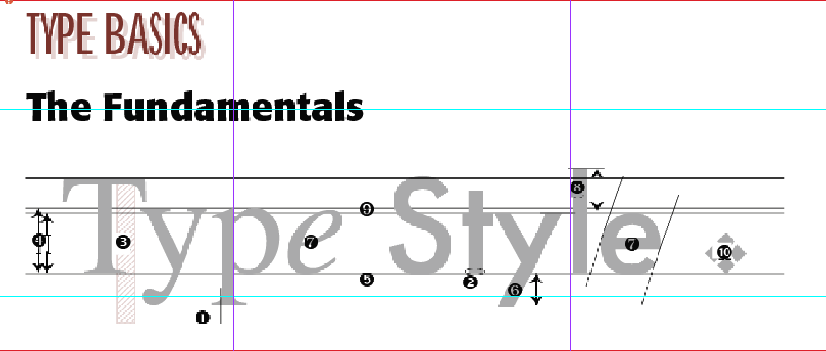
1. SERIF – (in TYPE above) “feet” in French; a small finishing stroke to a letter form that crosses roughly perpendicular to the stroke. Serif type is preferred in text, or “body,” copy because it is more readable in longer sections of type. This is because the letter forms are more distinguishable, and the eye naturally follows the horizontal strokes of the letter forms.
2. SANS SERIF – (in STYLE above) “without feet” in French; a font without serifs. Helvetica is an example of a “sans serif” font. Sans serif type is more legible and often preferred in headlines or what is called “display” copy. It’s uniform strokes help the face to stand out.
3. POINT SIZE – the height of the type body, including the ascenders (cf. 8 ) and the descenders (cf. 6) and extending to a fixed depth below the descenders. In modern desktop publishing, one point equals 1⁄72 inch.This sample is set in 90 point type.
4. X-HEIGHT – the height of lowercase letters without ascenders or descenders, like the “e” measured from the baseline (cf. 5 ) to the mean line (cf. 9), or top of such letters. X-height becomes important when choosing a typeface, or font, for a particular column width. Wider columns use type with greater x-height, while narrow columns generally require a typeface with a smaller x-height.
5. BASELINE – an imaginary horizontal line on which the font letters forms rest. Note that for font design purposes, some letter forms, like the "o" fall slightly below the baseline.
6. DESCENDER – the portion of letters like “g,” “j,” “p,” “q,” and “y” that extends below the baseline. It is usually less than the height of an ascender.
7. ITALICS – type that slants to the right, used to set off quotes, book titles and special phrases. Some fonts have what are called “true” italics (like the “e” in TYPE), while others have “oblique” or merely slanted letters (like the “e” in STYLE). Sans serif (cf. 2) in STYLE) letter forms usually have “obliques” for italics.
8. ASCENDER – the portion of a lowercase letter that extends above the mean line (cf. 9).
9. MEAN LINE – the imaginary line at the top of lowercase letters without ascenders or descenders, like the “e” measured from the baseline (cf. 7 ). SEE x-height 4.
10. DINGBATS – small decorative marks, bullets, boxes, or symbols that make up a specialty font; once known as “printer’s flowers.” Here the dingbat is from the typeface known as Zapf Dingbats. Dingbats add “spice” to ads and even some kinds of text copy.
Successful Layout & Design


