Font Management in Mac

Carl Shank • March 24, 2022

If you are like many users, you will soon be overwhelmed by the wealth and number of fonts in your font system folder. This is where a Font Management tool comes in handy. Such a tool helps you organize, specify and use a limited number of fonts for specific projects. It also helps to identify font conflicts, badly designed or corrupted fonts or fonts that simply do not work anymore.


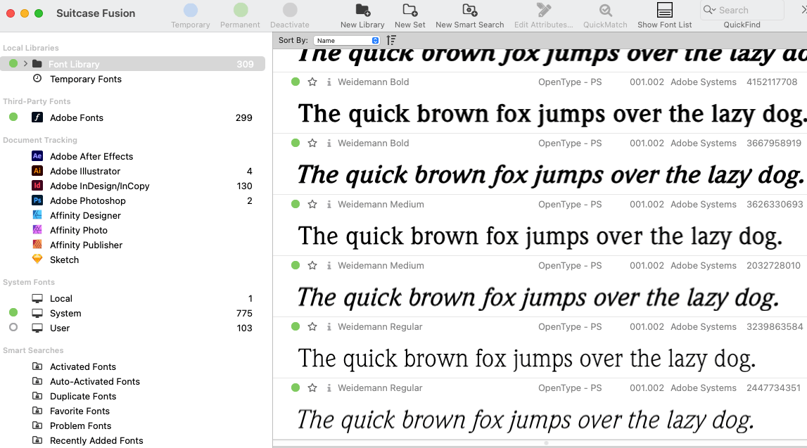
SUITCASE. A premier font management tool is Suitcase Fusion (www.extensis.com). This tool has served font and design professionals over the years with expert and solid font management. The modern name is "Suitcase Fusion," version 22.x. This tool helps the user to install Adobe fonts directly into the Extensis files, auto-activates fonts in Adobe's Creative Cloud, drag and drop fonts into Affinity Designer, Photo and Publisher on the PC. It finds and compares fonts on the list view. The modern iteration works on the newer Macs M1. There is a free trial offered.


Older Mac Systems

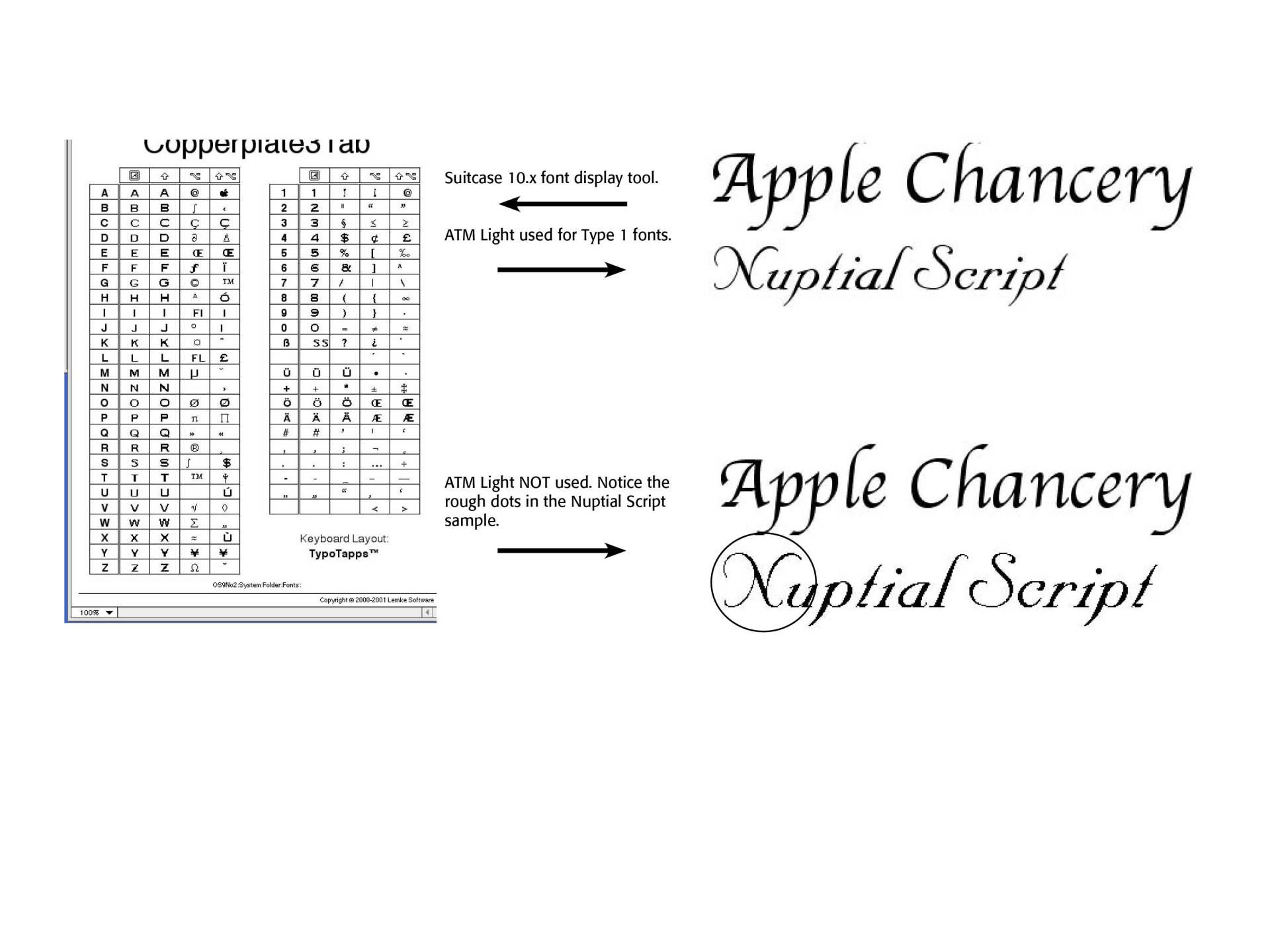
As my readers know, I use a number of older Macintosh systems for archived software use. Extensis Suitcase Version 10 is what I use on these systems as well. Suitcase Strip puts font management on the Control Strip of Mac OS 9, and a "Collect for Output" function allows users to send their fonts with the projects to a printer. Suitcase on these older machines requires a PowerPC processor, OS 8.6 or newer and 32MB of RAM. The program also includes LemkeSoft's FontBook, a font preview utility (See below.)


The downside is working with Adobe's Type Manager (ATM). ATM Deluxe does not work in Mac OS 9.2.2 with Suitcase. However, ATM Light 4.6.2 or 4.6.2a is necessary for smooth font previews, since Suitcase has no smoothing option. Adobe Type Manager (ATM) Light is a system software component that automatically generates high-quality screen font bitmaps from the PostScript outlines in Type 1 or OpenType format. ATM Light was discontinued in 2005, but Adobe still makes it available for customers who require it for older operating systems. With ATM Light, you can scale your fonts on legacy systems without the characters appearing jagged, and you can also enable "font smoothing," which further improves the appearance of your fonts onscreen by using your computer monitor's color palette to intelligently improve the rendering of characters. ATM Light also allows you to print PostScript fonts on non-PostScript printers. You may have to hunt and search for ATM Light version 4.6.2, but a good place to start is Macintosh Garden (macintoshgarden.org) and Macintosh Repository (macintosh repository.org). See the examples below.

Successful Layout & Design

By Carl Shank November 18, 2025
Advances in Typography (1500–1900) A Historical Sketch (Part 1) Early Renaissance (1500–1550) We had noted in the Blog “What Happened After Gutenberg: 1460–1640” (November 8, 2025) that movable type spread across Europe beyond its German roots. Gothic Blackletter type, though still used for religious and legal documents, began to give way to Venetian old style humanist faces. Influenced by humanist handwriting and calligraphy, Aldus Manutius and Francesco Griffo developed italic type for compact books. National printing centers became established in Venice, Italy, Paris and Lyon, France, Basel, Germany and Antwerp in the Netherlands The transition from Gothic to Italic typefaces was part of the broader evolution of typography that took place during the Renaissance period, driven by shifts in cultural, aesthetic, and technological factors. The Renaissance, beginning in Italy in the fourteenth century, marked a revival of classical antiquity and a move toward humanism. This brought a renewed interest in the legible, flowing scripts of Roman and Greek antiquity, which were more readable and aesthetically simple compared to Gothic lettering. The development of the printing press (ca. 1440) by Johannes Gutenberg created a need for more versatile and legible typefaces. The emerging humanist values aligned with a preference for typefaces that resembled the clear, round, and graceful writing of ancient Roman scripts.\ The Italic typeface was introduced by Aldus Manutius in Venice around 1501. Italic type is a cursive font based on a stylized form of calligraphic handwriting. Along with Blackletter (See Blog Jan 16, 2025 Blackletter Type and Universities) and roman type, italic has served as one of the major typefaces in the history of Western typography. Italics takes notable influences from hand drawn calligraphy, with italic letters normally slanted slightly to the right. Upper case letters may have typographic swashes, flourishes inspired by ornate calligraphy. The name “italic” comes from their Italian use, to replace documents traditionally written in a hand-written style called chancery hand. Notice also the small “end point bowls” on some of the letters, where the ink pen stopped for a second. While modern italics are often more condensed than roman types, historian Harry Carter describes Manutius' italic as about the same width as roman type. To replicate handwriting, Griffo cut at least sixty-five tied letters (ligatures) in the Aldine Dante and Virgil of 1501. Italic typefaces of the following century used varying but reduced numbers of ligatures. Manutius sought to create more compressed elegant typefaces that could fit more text on a page, catering to the rising demand for smaller, portable books. Italic was based on the handwriting of Niccolò de’ Niccoli, a Renaissance scholar and calligrapher. Italic typefaces are defined by their slanted, cursive-like appearance, with letters that have a flowing, dynamic quality. It allowed for more text to be fitted on the page and mimicked the handwriting style of humanist scholars, like the handwriting of Petrarch. The common italic “slope” was introduced in the sixteenth century — “The first printer known to have used them was Johann or Johannes Singriener in Vienna in 1524, and the practice spread to Germany, France and Belgium. Particularly influential in the switch to sloped capitals as a general practice was Robert Granjon, a prolific and extremely precise French punchcutter particularly renowned for his skill in cutting italics. Vervliet comments that among punchcutters in France "the main name associated with the change is Granjon's.” (Wikipedia on Italic Type) The insertion of an italic typeface alongside a roman face would wait until later to distinguish portions of a book not properly belonging to the work, such as introductions, prefaces, indexes, and notes; the text itself being in Roman. Later, it was used in the text for quotations ; and finally served the double part of emphasizing certain words. Italic type was not only more elegant than the Gothic but also more efficient in terms of space. It became the preferred choice for printed texts that emphasized classical learning, philosophy, poetry, and humanist literature. Italic was initially used for entire texts but later became more common for emphasis alongside Roman type.
By Carl Shank November 8, 2025
What Happened to Type After Gutenberg? A Brief Historical Sketch from 1460-1640 At the end of the 15th century, German printing was at the forefront of a revolutionary transformation in Europe, driven by the invention of the movable-type printing press by Johannes Gutenberg in the mid-15th century. This development had a profound impact on culture, education, and the dissemination of knowledge. By the end of the century, Germany had become one of the key centers of printing in Europe, particularly in cities like Mainz, Nuremberg, and Augsburg. Books printed before 1501 are referred to as incunabula . German printers produced a significant portion of the incunabula, with many focusing on religious texts such as the Bible, liturgical works, and theological treatises. Secular works, including classical texts, legal documents, and scientific works, also gained prominence towards the end of the century. Incunabular typography can be said to have two major sources of inspiration —fifteenth century scribes and German typecutters, the second group of which drew largely on (and sometimes coincided with) the first. Fifteenth-century typography was characterized by both continuity and innovation. Typecutters like Nicolas Jenson and Johan Veldener found themselves highly influential in their regions, designing typefaces for many printers, but scribes also contributed their weight to the design of typography. German printers played a key role in developing early typefaces. However, they were not the only typeface creators and users. There were altogether in the Netherlands twenty-two towns where books were issued before 1500. When printing had once been introduced it spread rapidly, all but three towns starting within the first ten years. Jacob Gibbons notes that types “changed hands” and were sold or rented across Europe, Germany to Italy and France, France and the Rhine valley to England, the Netherlands to England and France to the Netherlands. Type founding and paper making were international businesses. Typography became a vehicle of cultural exchange in late medieval and early modern Europe. Thus typography was as mobile as the printing press itself in fifteenth century Europe, and perhaps a more subtle carrier of cultural, regional, national, and even personal identity. One of the most popular typeface was Blackletter (also called Gothic script or Fraktur), which dominated printed works in Germany during this period. The dense and elaborate script was particularly suited to religious and formal texts. However, that Gothic Blackletter script was developed with nuances across Europe. Gutenberg’s textura quadrata face, used in printing his famous Bible, became Gutenberg textura used in university and legal settings. Albrecht Pfister produced his own typeface, somewhat distinct from Gutenberg, though possibly derived from it. Ulrich Zell used Fust and Schoeffer’s Durandus typeface. Rotunda type became a readable alternative to Gutenberg’s. Zainer’s Cotico Antiqua was used until 1485. The Schwabacher type was a dense but softer face, paving the way until the Fraktur face in the sixteenth century and beyond. By 1500, there were over 1,000 printers operating in various German cities, making Germany a leading hub for the printing industry. Notable printing centers included: Mainz—The birthplace of Gutenberg’s press; Nuremberg — An important center for both printing and intellectual activity; and, Augsburg—A commercial and printing hub. What is often lost in typographical history in the years closely following Gutenberg are the important printers and typographers in Germany, Italy, Switzerland, France, the Netherlands, Spain, England, Austria, Sweden, Holland, Denmark, Scotland, Mexico, Ireland and the United States who furthered the cause of typography and printed works. This Blog serves as a historical sketch of a number of these important people.
Show More