Grids, Type and the Golden Ratio
What does the Golden Ratio Have to Do With Type and Layout?
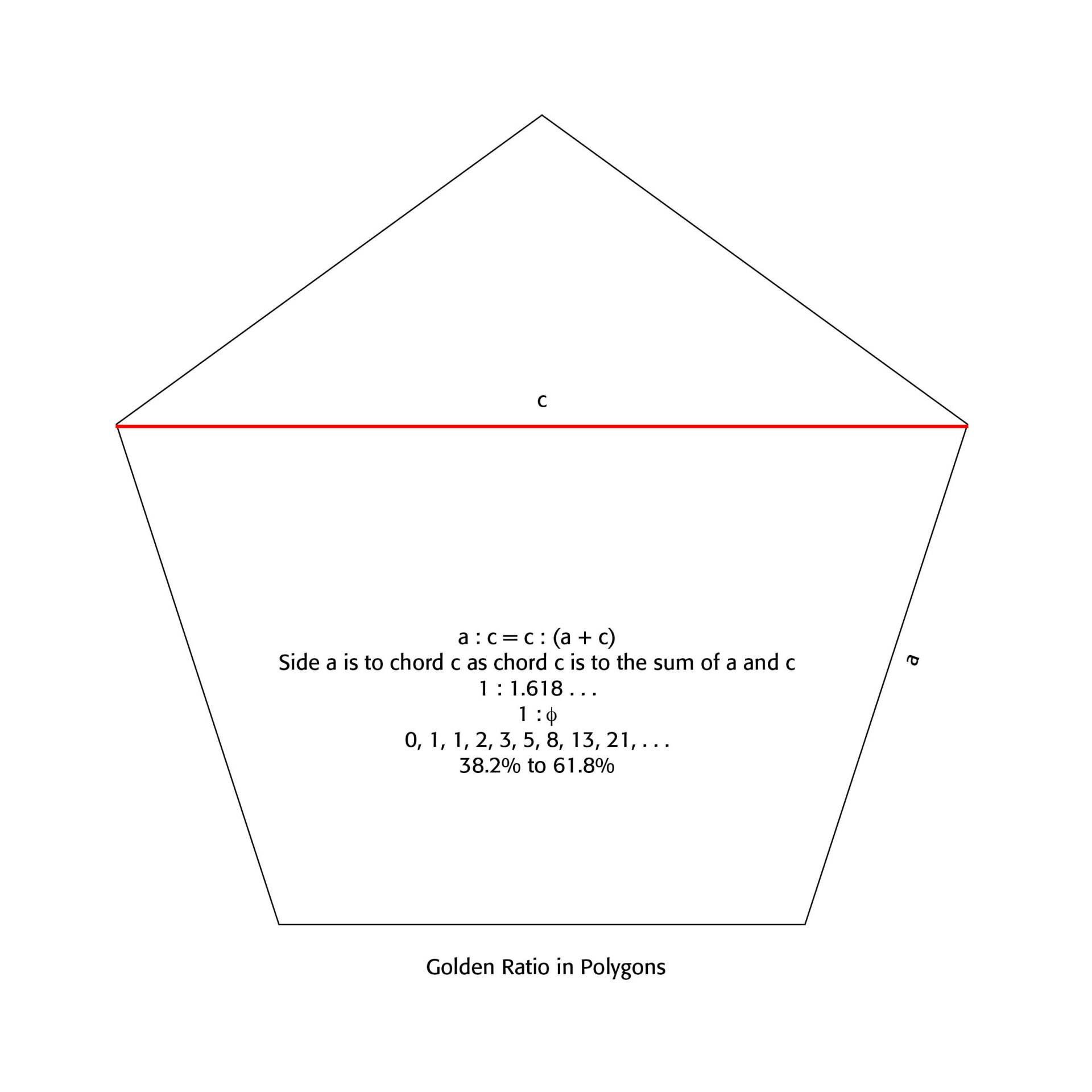
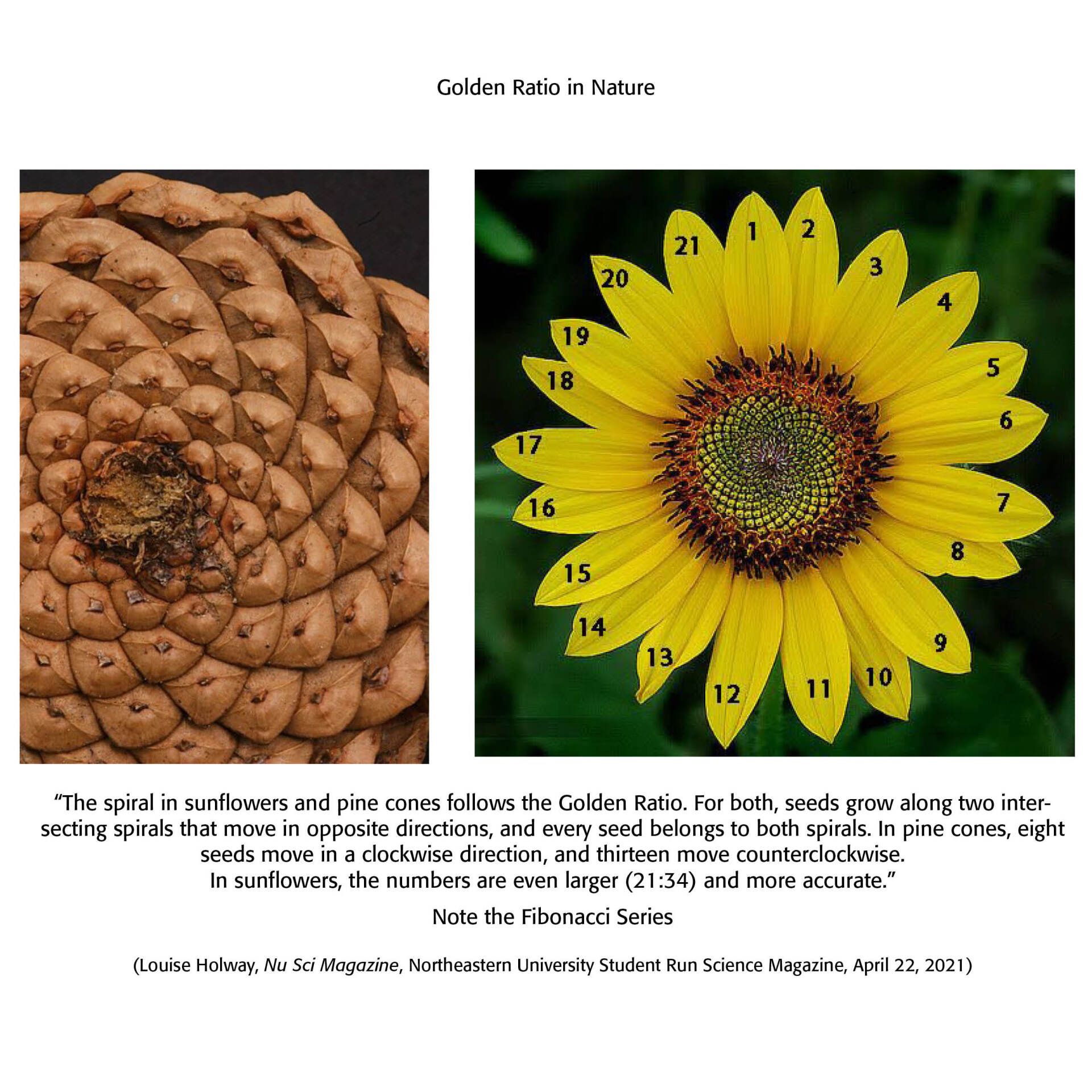
One of the wonders of how to shape a page in layout work and typesetting has to do with what is called The Golden Ratio. This is a mathematical and organic ratio of 1:1.618... found inherent in simple geometric figures, like the equilateral triangle, the square, the regular pentagon [See Example 1 Below], hexagon and octagon. Not only are these dimensions pleasing to the human eye and sense, they are found universally in many aspects of nature, like the the pine cone, sunflower, hurricanes, seashells and even the human brain [See Example 2 Below]. Robert Bringhurst in his masterful The Elements of Typographic Style notes that the Golden Ratio and other proportions "occur repeatedly in nature, and pages that embody them recur in manuscripts and books from Renaissance Europe, Táng and Sòng Dynasty China, early Egypt, pre-Columbian Mexico and Ancient Rome. It seems that the beauty of these proportions is more than a matter of regional taste or immediate fashion. . . Working and playing with them is a way of developing good typographical instinct, and they serve as useful references in analyzing old designs and calculating new ones." (p. 130)
Typographers have been using the Golden Mean and Golden Ratio, therefore, for centuries. Laying out a page with such a proportion is not merely good typography but resonates with our brains and our inner sense of proportion in the universe. Indeed, "a 2019 study from John Hopkins University compared 100 human skulls. The Nasioniac arc connects the tip of the nasal bone to the inion, a small bump on the back of the skull, and the Bregma is a curve on the top of the skull that follows a similar path that a headband would. In all of the 100 skulls researchers studied, they found that the bisection of these points creates two arcs whose distances exhibit the Golden Ratio." (Louise Holway, "The Golden Ratio: Myth or Magic of Mathematics," Nu Sci Magazine: Northeastern University's Student Run Science Magazine, April 22, 2021) In other words, our brains are "hard wired" to notice this ratio universally, certainly in page layout projects.
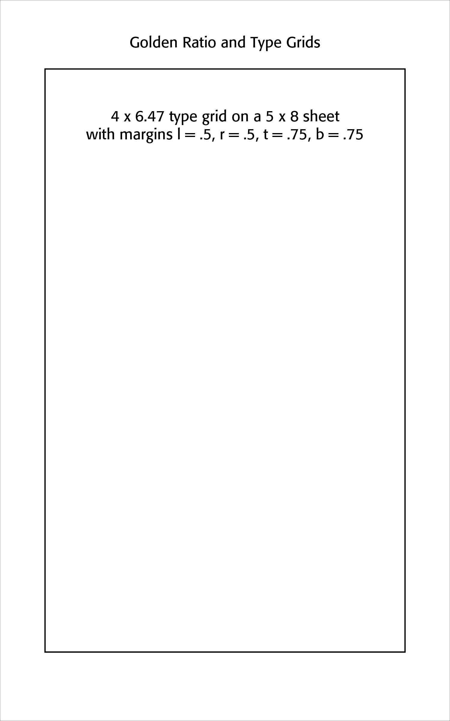
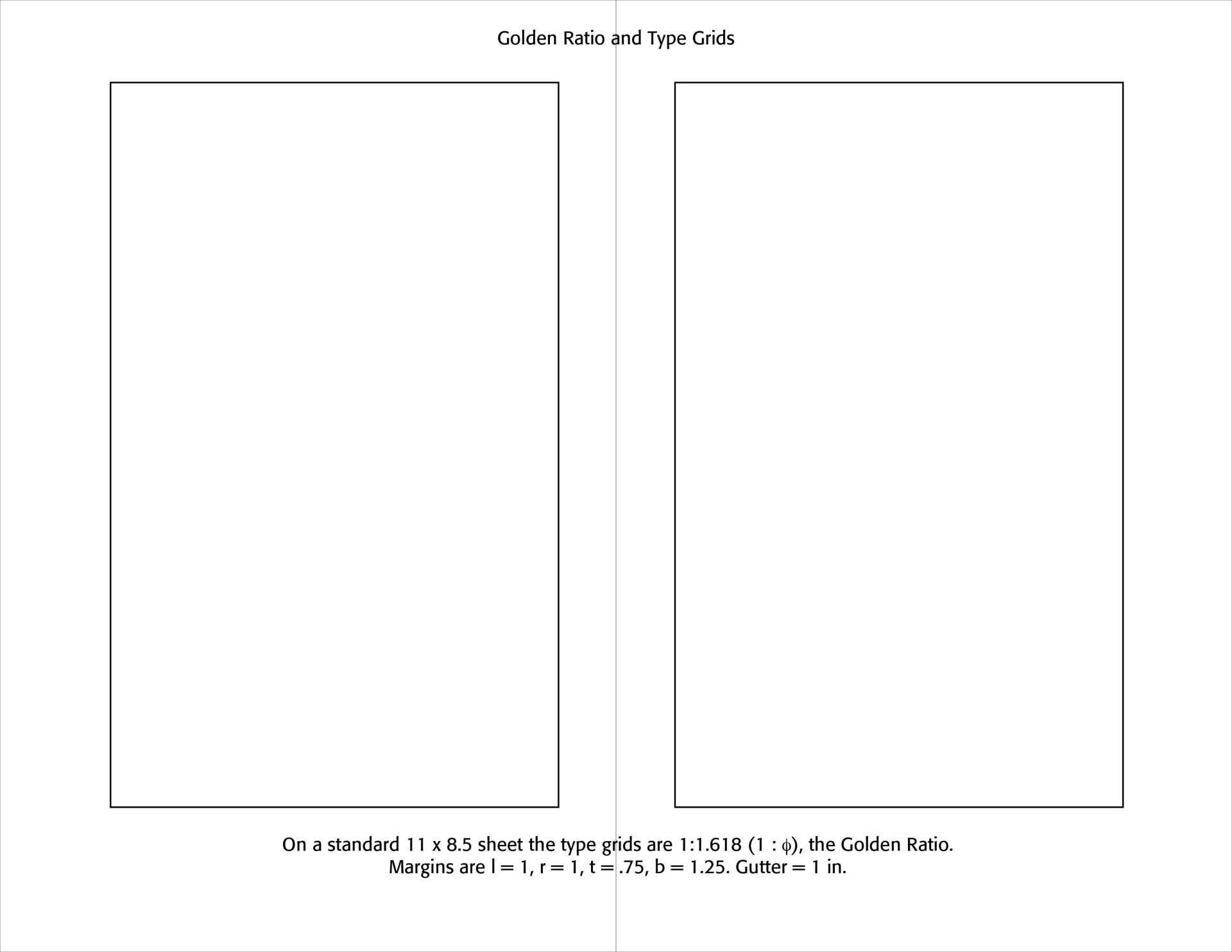
Forming grids on pages that are pleasing to the eye should take such proportions as the Golden Ratio into account. Note the Examples below for such a layout. To be sure, modern magazine layouts are not slavishly tied to such proportions, but our aesthetic sensibilities often demand them and we can see things as "off" in page layouts without them.
Successful Layout & Design


