Font Master: Frederick W. Goudy

Carl Shank • July 6, 2024

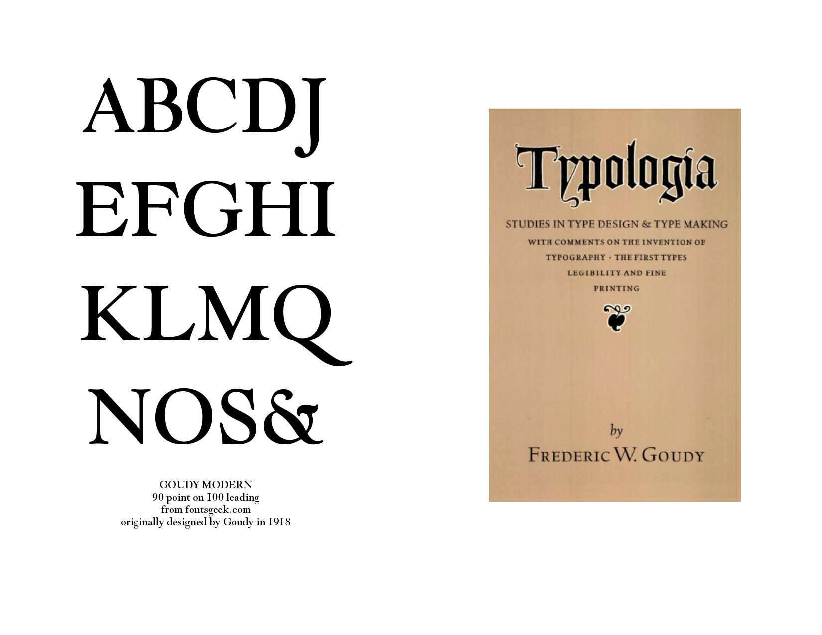
Font Master — Frederick W. Goudy.  There is perhaps no other more celebrated font creator than Frederick Goudy, certainly not in the first half of the twentieth century. Goudy provided the type and printing world with a both legible and beautiful typeface. In his master work, Typologia: Studies in Type Design & Type Making, With Comments on the Invention of Typography • The First Types Legibility and Fine Printing (University of California Press, 1940, 1977 Reprint), Goudy says that more than legibility is important — "but this is not enough, for types should be pleasantly readable too, a quality depending somewhat on the ability of the arranger of the letters, as well as partly inherent in the letters themselves." (129–130) He notes that "the proper standard of beauty in types resides, first of all, in their utility, but I believe also that there are secondary esthetic attributes which may be included in their design with no sacrifice of life and vigor and legibility." (77)


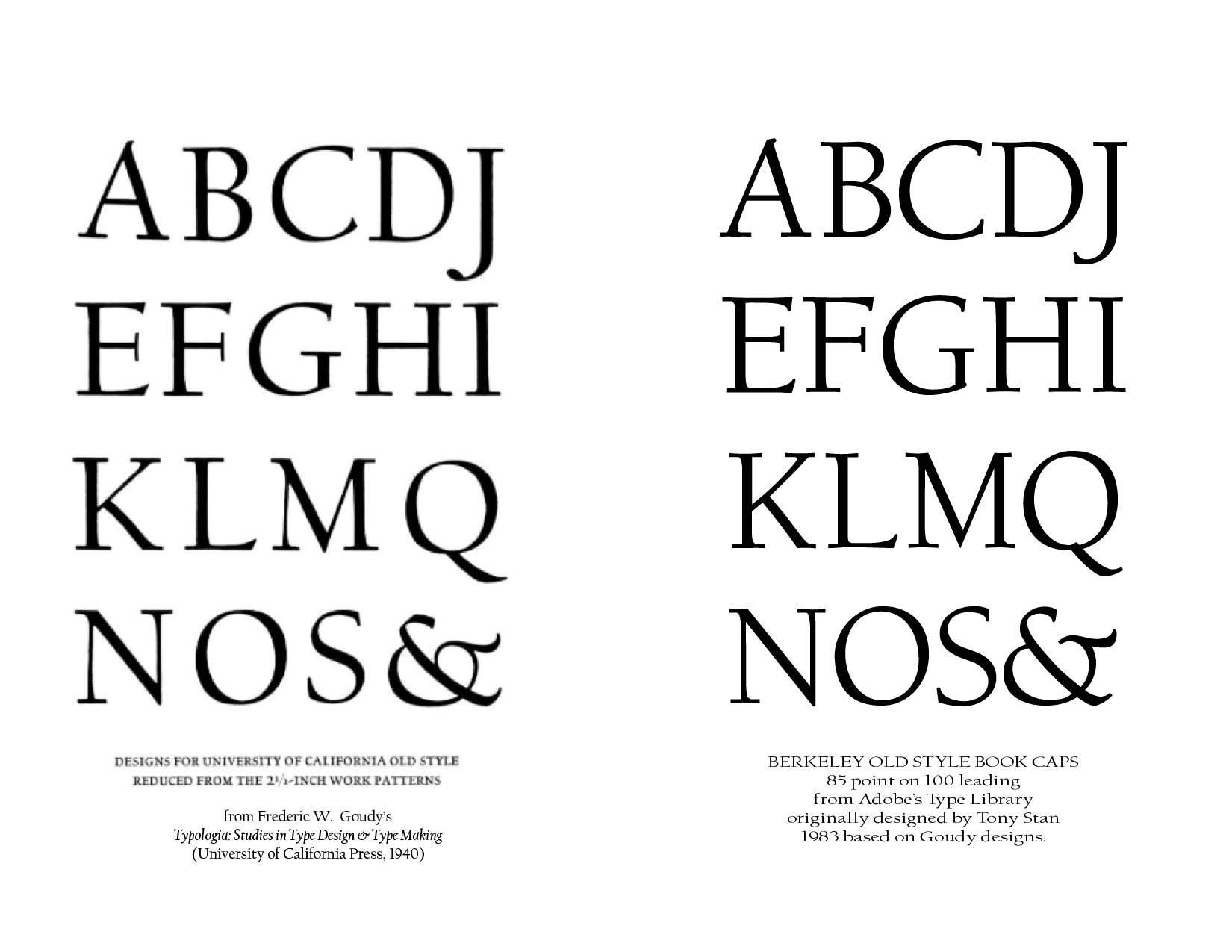
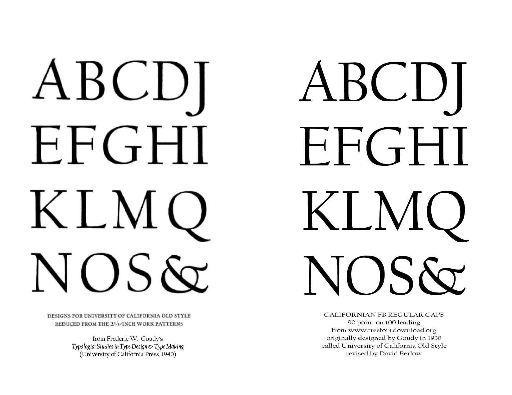
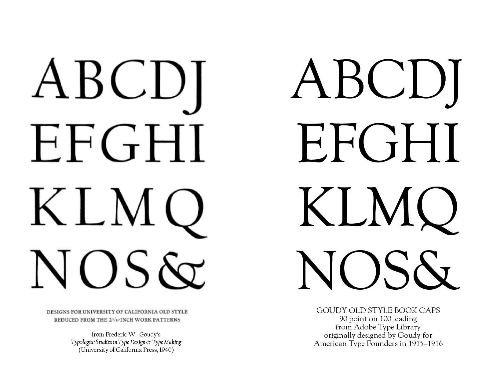
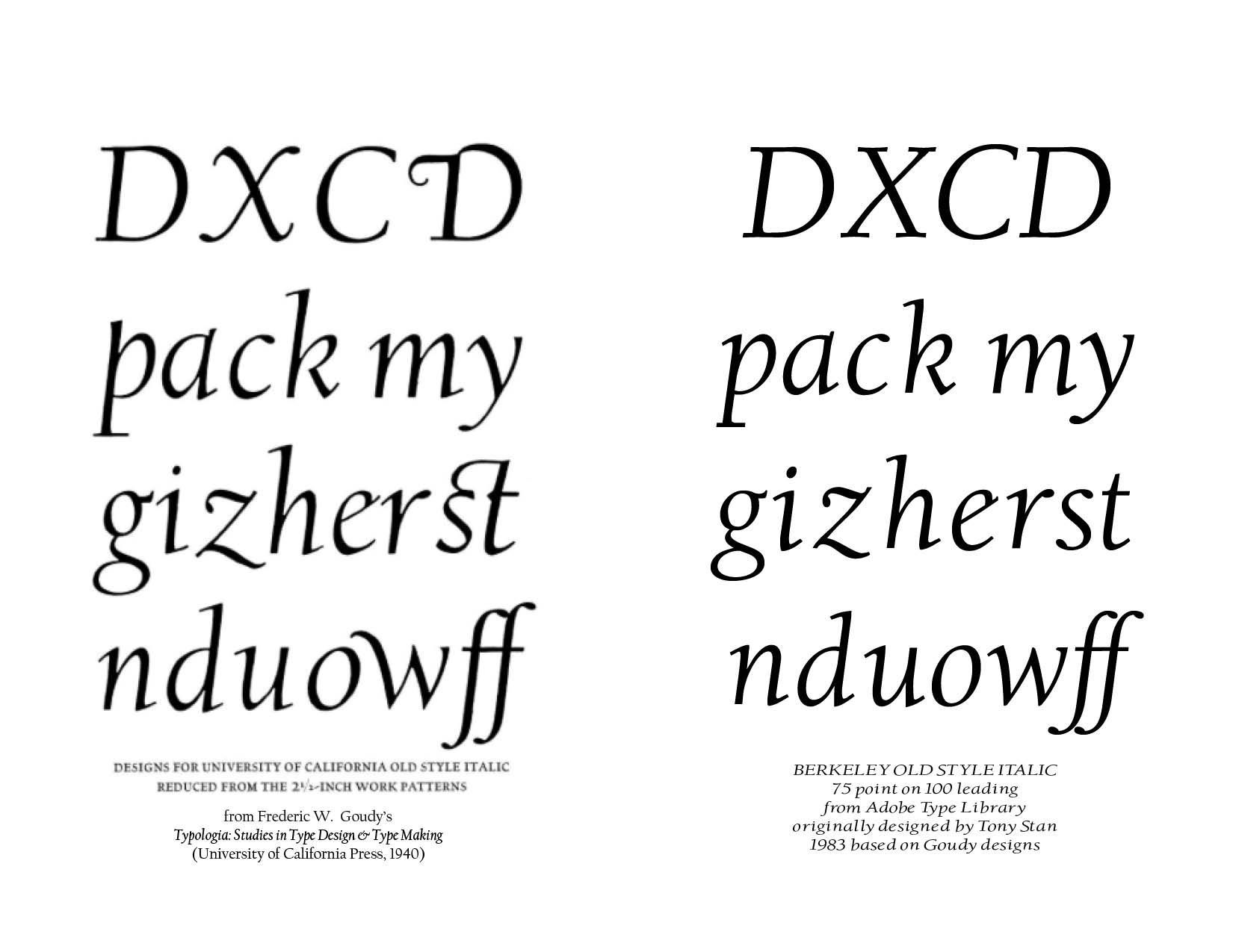
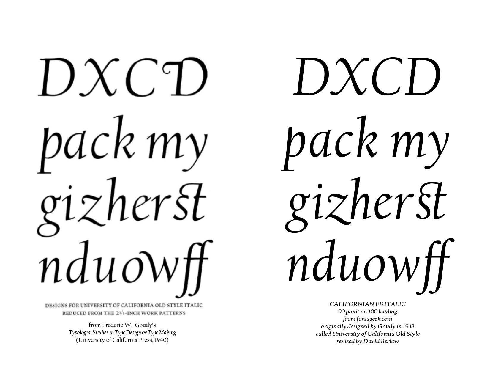
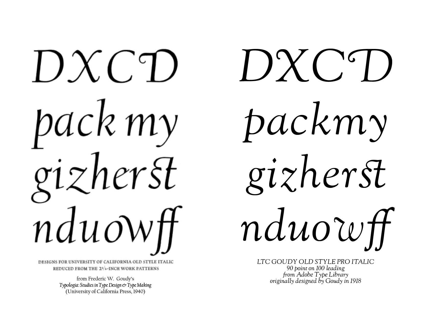
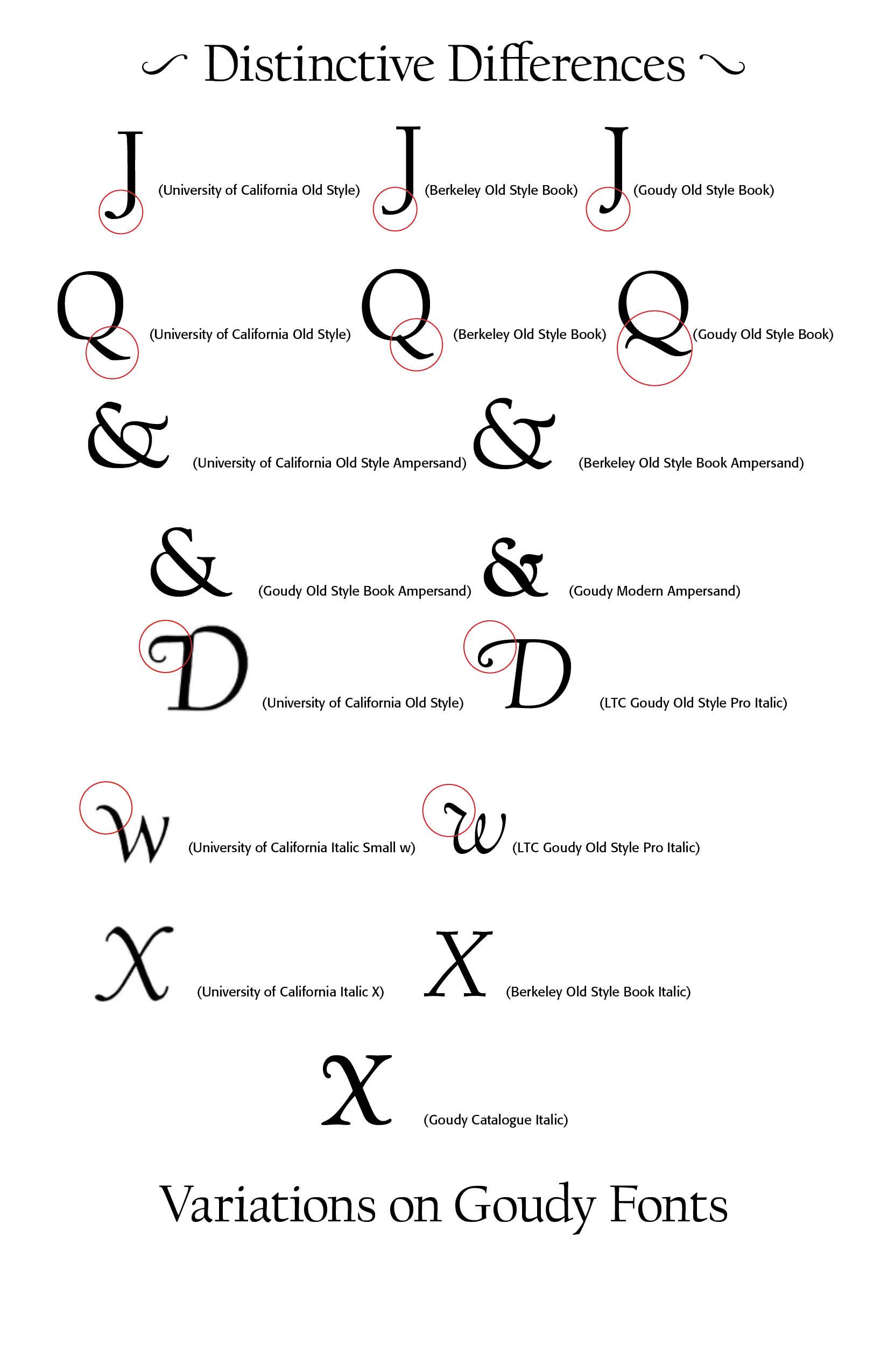
What makes type legible and beautiful? "Legibility depends on there things: first, simplicity, that is, a form having no unnecessary parts [not the bastard simplicity of form which is mere crudity of outline]; second, contrast, as shown by marked differences in the weight of the lines composing the individual letters [stems and hairlines], and also as shown in the varying widths of different letters; and third, proportion, each part of a letter having its proper value and relation to the other parts and to other letters—these three things in connection with the aspects of purpose and use." (130) The University of California at Berkeley hired Goudy to design a typeface for them that radiated legibility and beauty, and Goudy carefully crafted the University of California Old Style Regular and Italic. "He described it as particularly intended to be attractive in mass and said that the italic was intended to be "a refined letter, yet not, I hope, one which may be called prudish…some letters are a bit exuberant. As an italic is [mostly used] to emphasize a word…or sometimes merely to give a lighter touch, I have allowed myself to incorporate here and there in my font some forms more or less fanciful." It was finished just before a fire that destroyed Goudy's workshop, engraving machine and plan drawings, and Goudy noted in his book that it was lucky that he had posted off finished work to Monotype to use as a basis for making punches for their hot metal typesetting system, allowing some letters to be redrawn from patterns." (wikipedia) MyFonts.com notes that "in 1958, Lanston Monotype issued it as Californian. Carol Twombly digitized the roman 30 years later for the University of California; David Berlow revised it for Font Bureau with italic and small caps; Jane Patterson designed the bold."


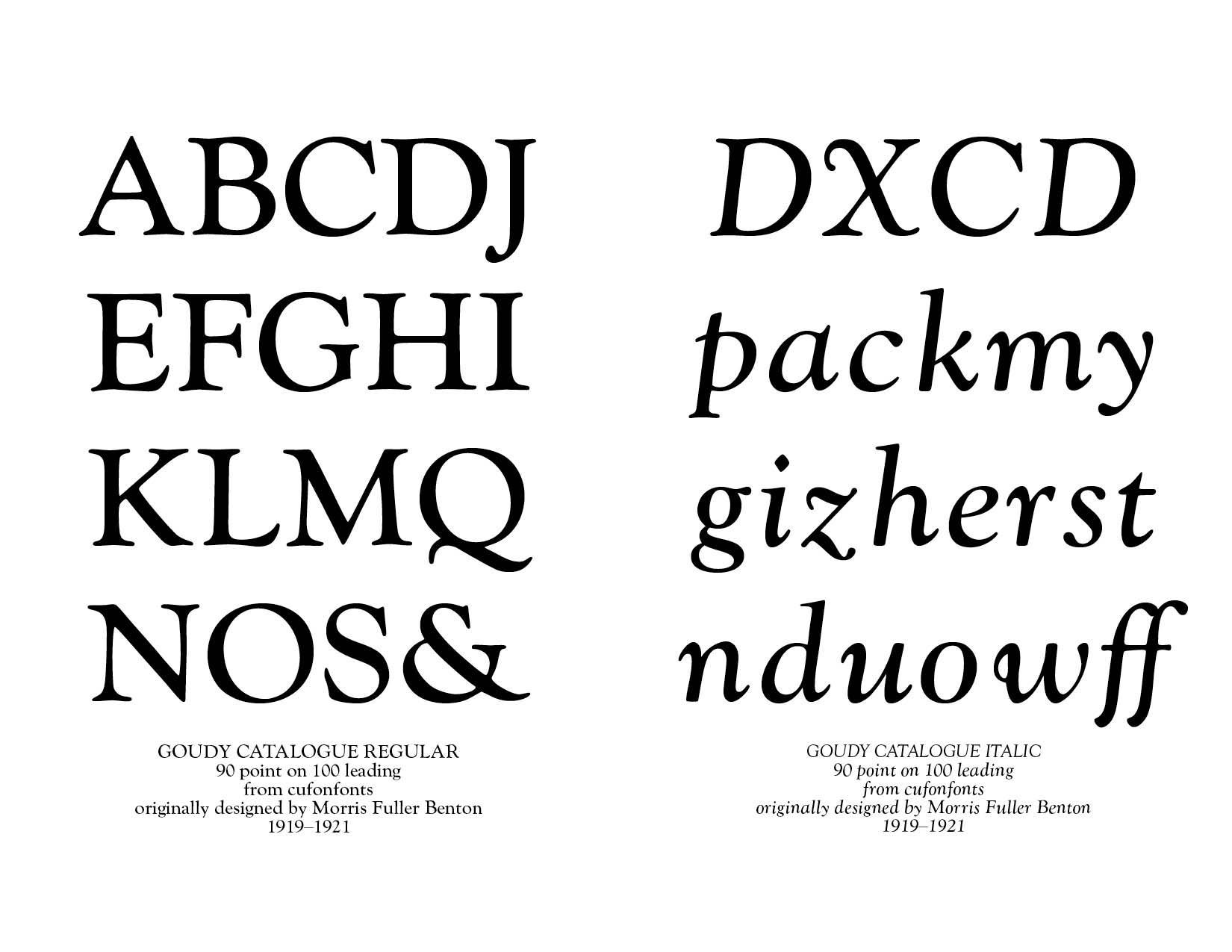
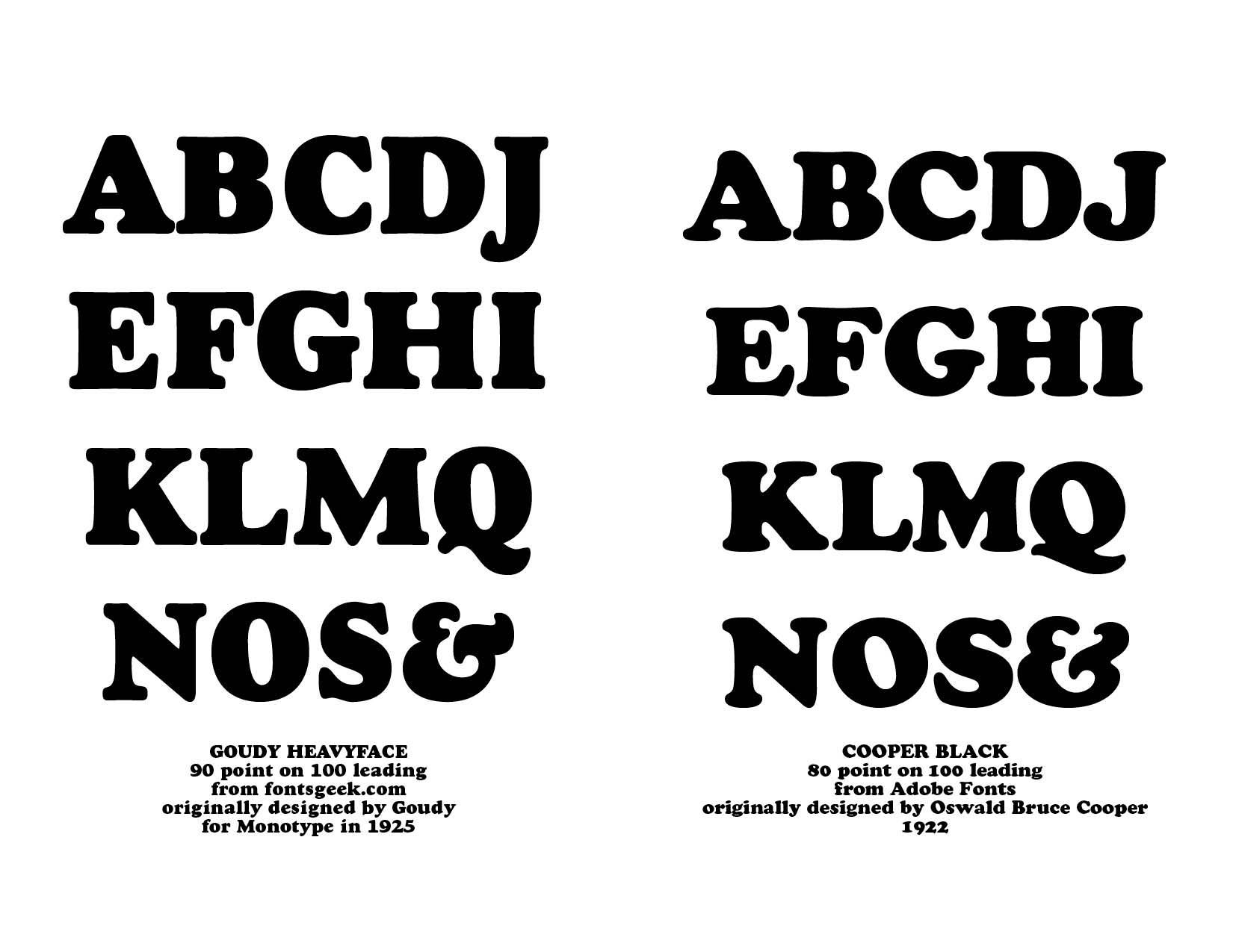
Goudy designed more than 100 typefaces over the course of fifty years. Initially inspired by the cap lettering on a Renaissance painting, Goudy's own individualistic style shows through — the upward pointing ear of the g, the diamond-shaped dots over the I and j, and the roundish upward swelling of the horizontal strokes at the base of the E and L. (See Samples Below) Wikipedia notes that the modern typeface Berkeley Old Style is the digital representation of the University of California Old Style of 1938. There are marked differences, however, as seen in the comparisons below. "Tony Stan redrew the family for ITC (International Typeface Corporation) in 1983, naming it ITC Berkeley Old Style, Berkeley being the city where the University of California Press is located." (from Myfonts.com)


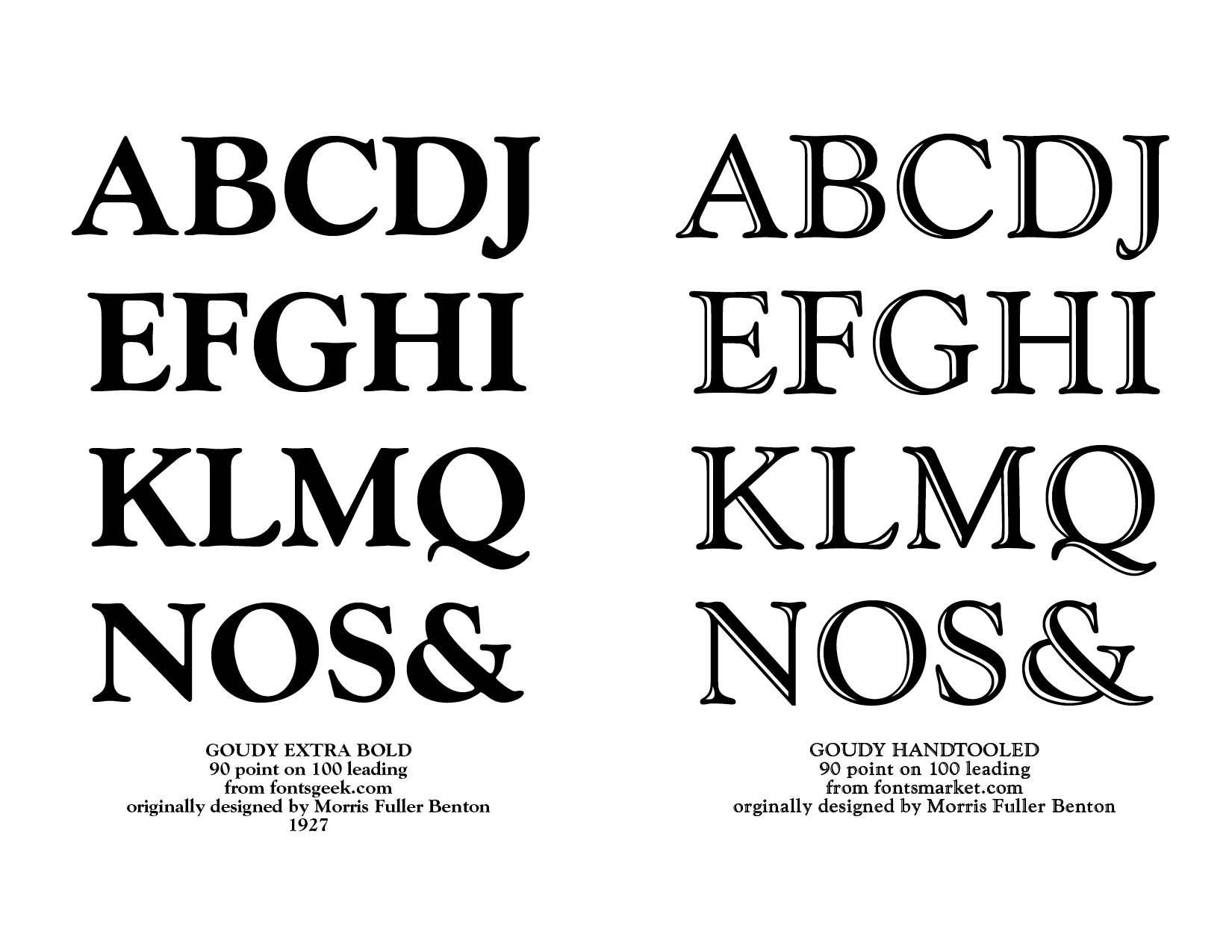
Goudy's type designs continue to show up, especially in display and advertising venues. The included examples below display the beauty and functionality of Goudy's work.

Successful Layout & Design

By Carl Shank November 8, 2025
What Happened to Type After Gutenberg? A Brief Historical Sketch from 1460-1640 At the end of the 15th century, German printing was at the forefront of a revolutionary transformation in Europe, driven by the invention of the movable-type printing press by Johannes Gutenberg in the mid-15th century. This development had a profound impact on culture, education, and the dissemination of knowledge. By the end of the century, Germany had become one of the key centers of printing in Europe, particularly in cities like Mainz, Nuremberg, and Augsburg. Books printed before 1501 are referred to as incunabula. German printers produced a significant portion of the incunabula, with many focusing on religious texts such as the Bible, liturgical works, and theological treatises. Secular works, including classical texts, legal documents, and scientific works, also gained prominence towards the end of the century. German printers played a key role in developing early typefaces. One of the most popular was Blackletter (also called Gothic script or Fraktur), which dominated printed works in Germany during this period. The dense and elaborate script was particularly suited to religious and formal texts. By 1500, there were over 1,000 printers operating in various German cities, making Germany a leading hub for the printing industry. Notable printing centers included: Mainz—The birthplace of Gutenberg’s press; Nuremberg — An important center for both printing and intellectual activity; and, Augsburg—A commercial and printing hub. What is often lost in typographical history in the years closely following Gutenberg are the important printers and typographers in Germany, Italy, Switzerland, France, the Netherlands, Spain, England, Austria, Sweden, Holland, Denmark, Scotland, Mexico, Ireland and the United States who furthered the cause of typography and printed works. This Blog serves as a historical sketch of a number of these important people.
By Carl Shank November 1, 2025
SWISS TYPE BEAUTY DESIGNERS LIKE JAN TSCHICHOLD were foundational to many of the Swiss design principles. This style evolved from Constructivist, De Stijl and Bauhaus design principles, particularly the ideas of grid systems, sans-serif type and minimalism. Emerging in Switzerland during the 1940s and 1950s, this typography, also known as the International Typographic Style, directly responded to the type chaos of Dada and the stylization of Art Deco. The Swiss style emphasized readability, visual harmony and universality. Clarity, objectivity and functionality were key components. Contributors included Max Miedinger, creator of the Helvetica typeface and Adrian Frutiger, creator of the Univers typeface, both in 1957. The Journey of Helvetica We all use Helvetica. In fact, some say it has been overused through modern years. Helvetica derives its powerful simplicity and display qualities from the 1896 typeface Akzidenz-Grotesk. “The design originates from Royal Grotesk light by Ferdinand Theinhardt who also supplied the regular, medium and bold weights. Throughout the years, Berthold has expanded this extremely popular and versatile family. AG Super was developed in 1968 by Günter Gerhard Lange and is an excellent choice for headlines. In 2001, Günter Gerhard Lange added more weights for Berthold including Super Italic and Extra Bold italic.”[1] “Helvetica is a twentieth-century Swiss revision of a late nineteenth­ century German Realist face. The first weights were drawn in 1956 by Max Miedinger, based on the Berthold Foundry’s old Odd-job Sans-serif, or Akzidenz Grotesk, as it is called in German. The heavy, unmodulated line and tiny aperture evoke an image of uncultivated strength, force and persistence. The very light weights issued in recent years have done much to reduce Helvetica’s coarseness but little to increase its readability.”[2]
Show More