Making A Pictogram Font
Making A Pictogram Font
In a recent publication by CARE Typography (CARE Fonts: Selected Pictogram Fonts and Their History, 2024, Lulu Press), I introduced several "dingbat" fonts that we were able to craft, especially for church or non-profit use. They included the Ministry Pics font, the Fanciful Alphabets font, The StoryBook font, the Fairy Tale font, the Hand Tools font and fonts derived from ancient alphabets. We also introduced the Christograph font.
SUBJECT TO SCORN, says the famous typographer, Robert Bringhurst in his description of what are called dingbats. Dingbats are real characters, actually pictograms, like telephones, mail envelopes, crosses, cartographic symbols and so forth. It might seem that dingbats serve little useful purpose. However, in 1994, David Carson of Ray Gun magazine set an interview in Zaph Dingbats, unreadable, but “ironic perhaps that we’re still bringing it up, more than two decades later.” (Nigel French & Hugh D’Andrade, The Type Project Book: Typographic Projects to Sharpen Your Creative Skills & Diversify Your Portfolio (Pearson Education, Inc., 2021), callout on “Icons” on 228)
I happen to like dingbats. They spur my imagination and help me say things or describe things that can’t be fully said in words alone. In his now out of print, Before & After Magazine, editor and creator John McWade talks about the “hidden art in dingbat fonts” — “Dingbats are real pictures and often excellent, but so small they’re commonly overlooked (except by kids, who are expert at spotting small treasures).” (John McWade, “The Hidden Art in Dingbat Fonts,” Before & After Magazine, Vol. 3, No. 5, 1993) He notes that dingbats can be made super size to catch the eye, or made tiny to delight the eye.
Actually creating a font is time consuming and hard work. Things like "The Bump Rule," where drawing points are placed at inflection points, "The Rule of One-Third," which says the distance between a drawing point and its associated Bévier Control Points (BCPs) should be one-third of the length of the curve being drawn, "The Conciseness Rule," where the smallest number of drawing points should be used to create a shape, and "The Orthogonality Rule," where the handles should be perpendicular or at right angles, are highly recommended by Stephen Moye in
Fontographer: Type By Design (MIS Press, 1995, 13). Then we must think about removing overlapping points, accurately drawing Bézier curves, eliminating orphan points, hinting, kerning and so forth. All of this goes into creating a font that is clean, well-constructed, easy to the eye and can pass typographical standards. Months of work went into my Greek font I made some time ago for the Christian-based Word Publications. But this blog is not about such complexity.
How do you make a dingbat or pictogram font? Having made several now, using FontLab's Fontographer (I use version 5.2.4 on a Mac mini 2012 running Mac OS 10.14 Mojave. Newer Mac systems must use FontLab 7 or the newer 8) (See Below). There are several important steps. But first, we need to make some definitions and acquaint you with some of the language used in the Fontographer program.
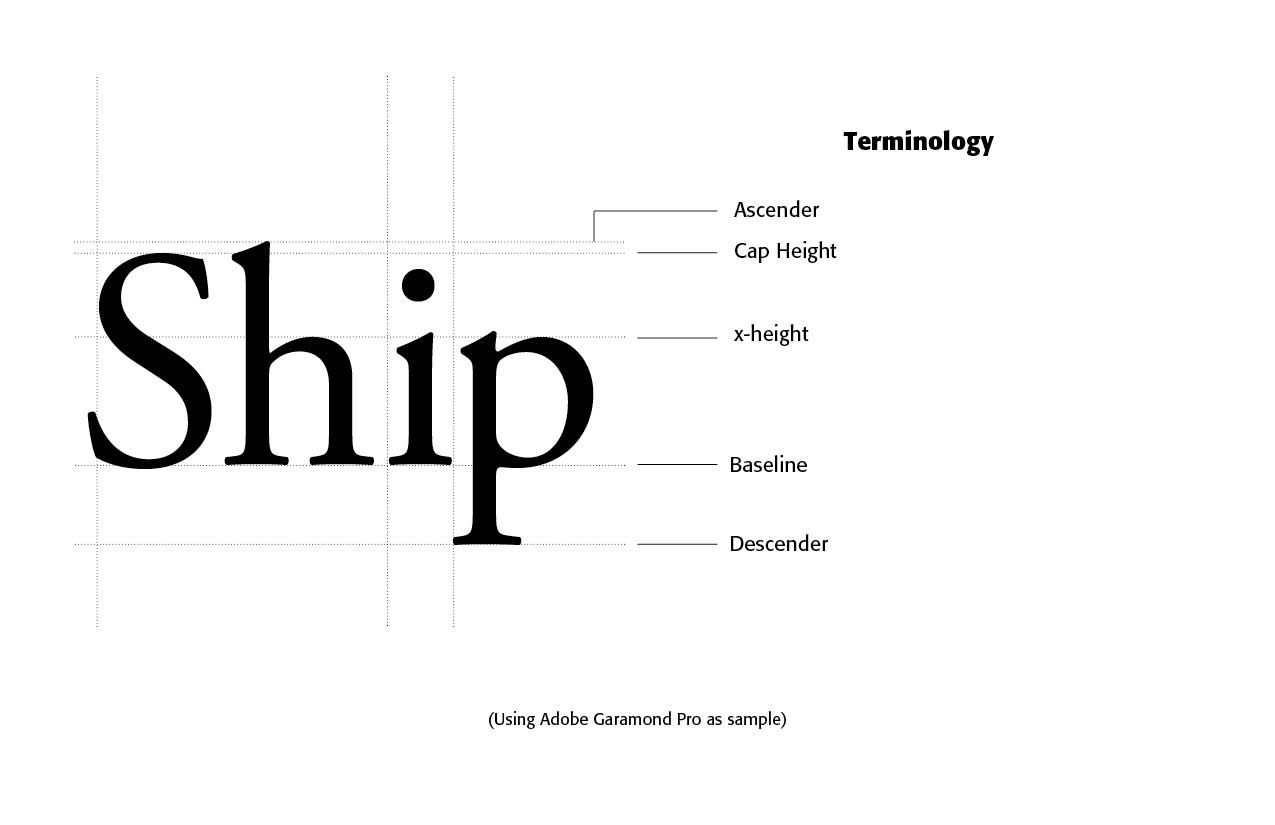
Using Adobe's Garamond Pro font as an. example, the above word "Ship" helps us understand some font or typeface terminology. The letters, or in our case, the pictograms or images, sit on what is called a BASELINE, with the ORIGIN point at the x, y coordinates of (0, 0). The top of the letter or image is called the CAP HEIGHT. If it is a regular font, we would also include the height of the small letters, or the X-HEIGHT, and any ASCENDERS, like the "h" above that protrude above the CAP HEIGHT a bit. We need not worry about these latter definitions with most dingbat fonts.
We do need, however, to acquaint ourselves with Fontographer's guides that are used to place the images or pictograms inside to make the font. This can be seen below.
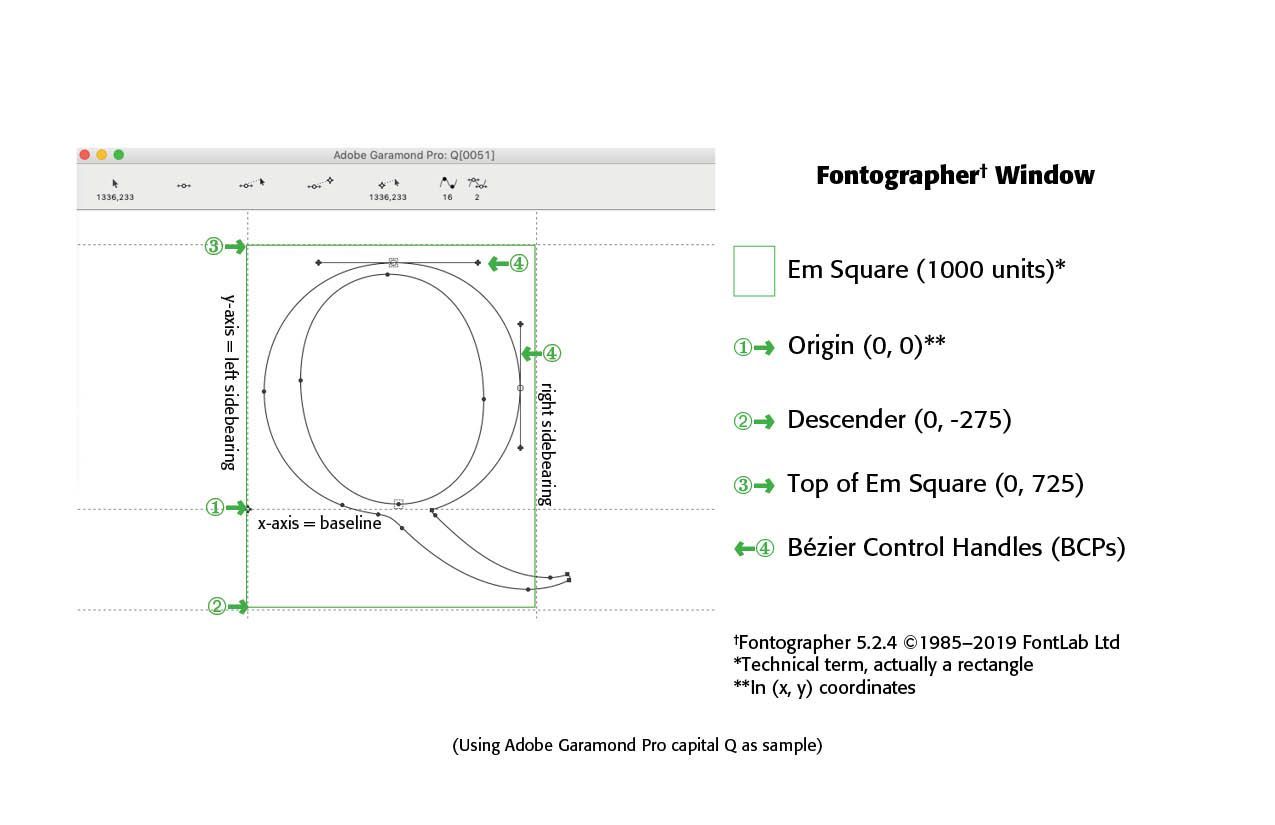
Each letter, or image in our case, rests inside what is called an EM-SQUARE, which is a rectangular field the size of a capital "M" covering the DESCENDER (below the Baseline) all the way above the CAP HEIGHT to the top of the em-square. Notice in the letter "Q" above, the tail of the "Q" rests beneath the Baseline in the Descender area. To the sides of the letter or image will be the left and right SIDEBEARING, spaced usually evenly from the left and right edges of the letter or image used. Such distances are usually 30-40 units in the Fontographer program, but better seen in eyeballing the left and right sidebearings.
Making the Pictogram Font
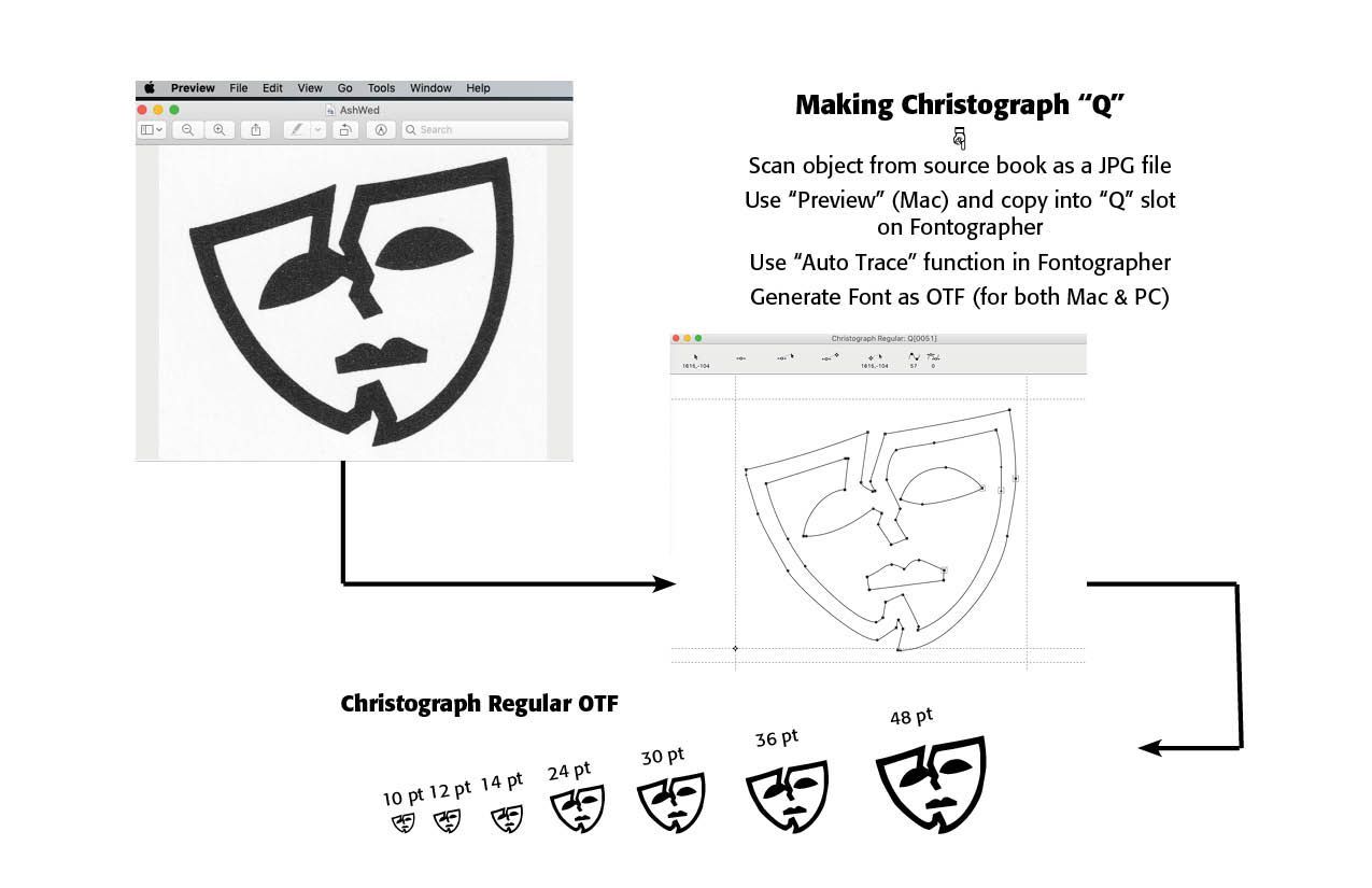
STEP ONE — Find suitable, well drawn images, to scan at about 300 dpi (dots per inch). Make the scans ALL THE SAME height, usually about an inch or so in height.
STEP TWO — Scan the original images, making sure the scan is straight.
STEP THREE — Save the scanned images, one at a time, as JPG images.
STEP FOUR — Open the Fontographer program (I use Fontographer 5.2.4). Using the included "Preview" program on all Macintoshes, open the images one at a time and paste them into Fontographer. Assign each scan to whatever glyph you want. Thus, for the "Q" letter, I assigned the scanned image for the "Ash Wednesday" graphic in the Christograph Font.
STEP FIVE — Trace the image. This can be a manual or automatic trace. If the images are clear and clean and scanned well, I use Fontographer's "Auto Trace" tool to trace the scanned images. make sure the principle handles are orthogonal. Use Guides for height so that the images rest on the baseline and are at the same height in the Fontographer em-square. Clean up the traced images using Fontographer's tools for "Clean Up Paths," "Remove Overlap," and "Correct Path Direction" if needed.
STEP SIX — Generate the Pictogram font, using OTF for both Macs and PCs. Print an extensive sample and make corrections, if needed.
Successful Layout & Design

CARE Typography is a Christian based type and design service.
