Making The Right Chart
Making the Right Chart. With more than forty (40) chart types out there and the chart making capabilities of Microsoft in either Excel or Word or PowerPoint, some basic guidance would be helpful from a typographical standpoint. Charts and graphs are mostly used in presentations, be they slides or paper proposals. However, they can be confusing, boring and generally uninviting or unclear to the audience. There are a few always used charts, and some chart types that should be used, but are ignored or neglected. Let's take a look at a few and some suggestions.*
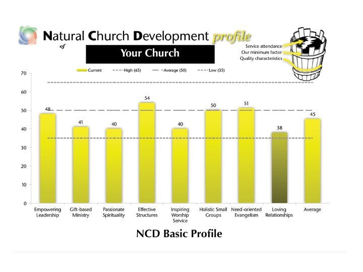
The Bar Chart
This chart is commonly used to plot categorical data, show trends or patterns, or demonstrate nominal data. The chart on the right is from what is called a natural church development analysis, a measurement of eight factors that make up a healthy church anywhere. Note the shaded bar to indicate what they call a "minimum factor" which the church needs to seriously consider for health and continued growth and development. The numerical values are added to the bars to give precision to the chart.
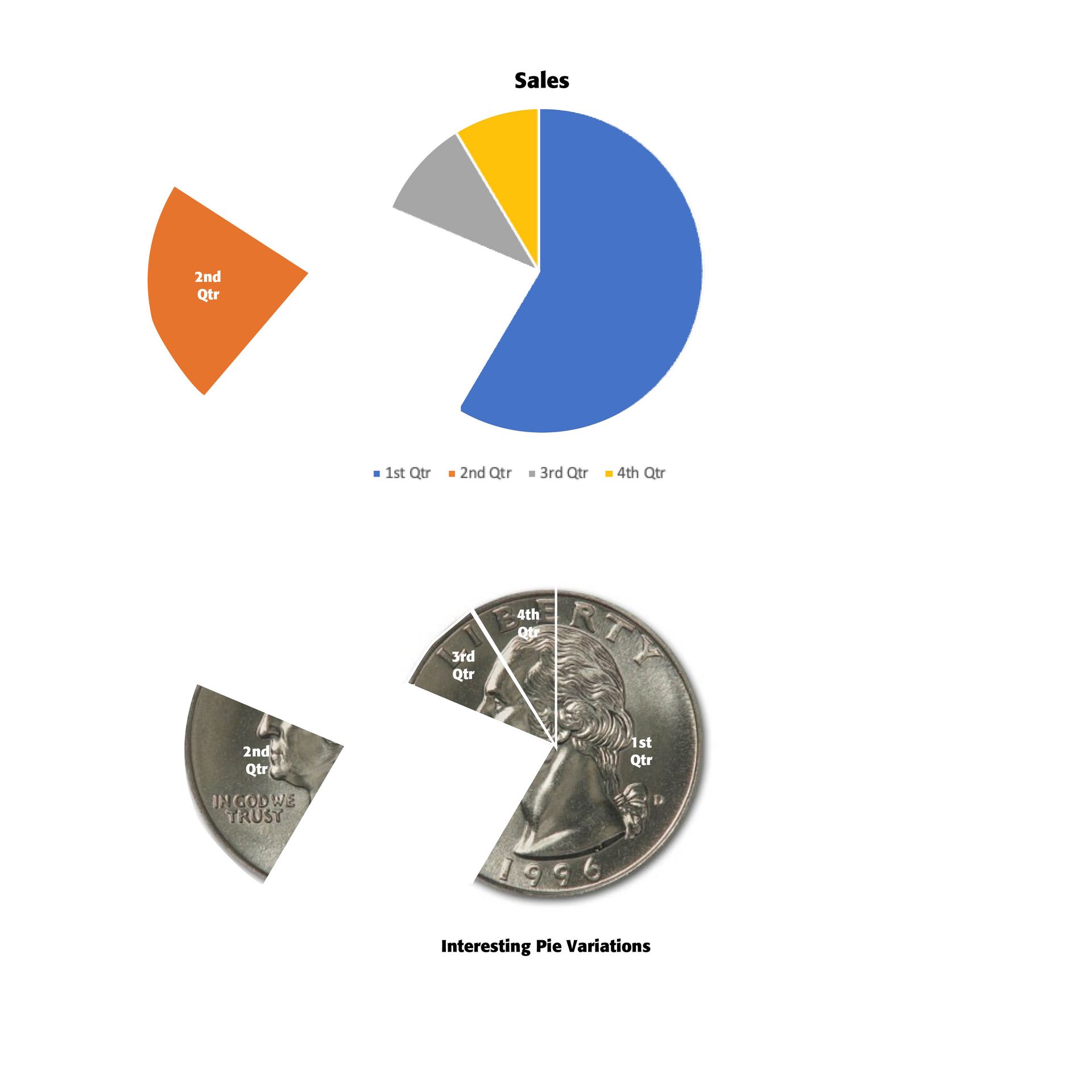
The Pie Chart
The pie chart is used to show relative proportions and percentages of an entire dataset. It can be used up to six categories and used when the data is nomial not ordinal. Variations can be used on the pie chart to help it stand out in your presentations. Note the cut slices to the charts on the left. Also, note the money symbol used in the bottom pie chart since the charts are demonstrating company monetary income, and again the pie piece to the left. The pieces in the chart below need proper identification since they are not color coded. When using a pie chart, consider creating a separate slide with a stacked bar chart showing the component parts.
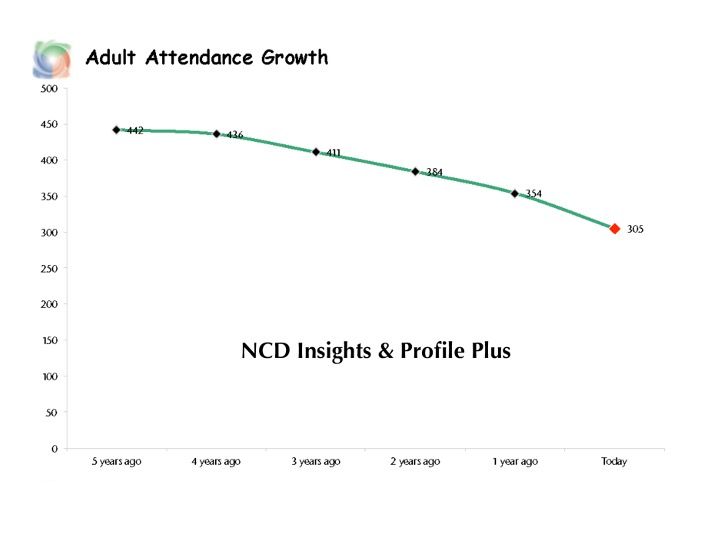
The Line Chart
Line charts are used to indicate continuous data that changes over time. If the data is too big for a bar chart, use a line chart. Line charts visualize trends rather than exact values, though the chart on the right has data points included for the years indicated below. The point of the chart is to visualize attendance changes in this church over a five year period, beginning with where they are now as contrasted to five years ago. A line chart should have no more than four lines to keep it easy to read.

A Scatter Chart
A scatter chart is used to show correlation and clustering in big datasets. It is often used when the order of points is not essential. In the chart to the left, the three data points are normally not enough to use in a scatter chart, though this example is from Microsoft itself.
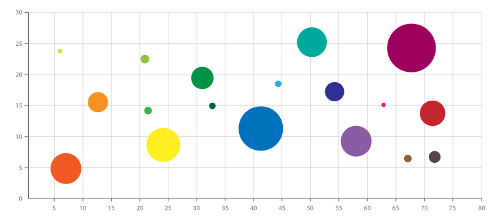
A Bubble Chart
A bubble chart is primarily used to depict and show relationships between numeric variables. They are a great tool to establish the relationship between variables and examine relationships between key business indicators, such as cost, value and risk. A bubble chart is a variation of a scatter chart in which the data points are replaced with bubbles, and an additional dimension of the data is represented in the size of the bubbles. Just like a scatter chart, a bubble chart does not use a category axis – both horizontal and vertical axes are value axes.
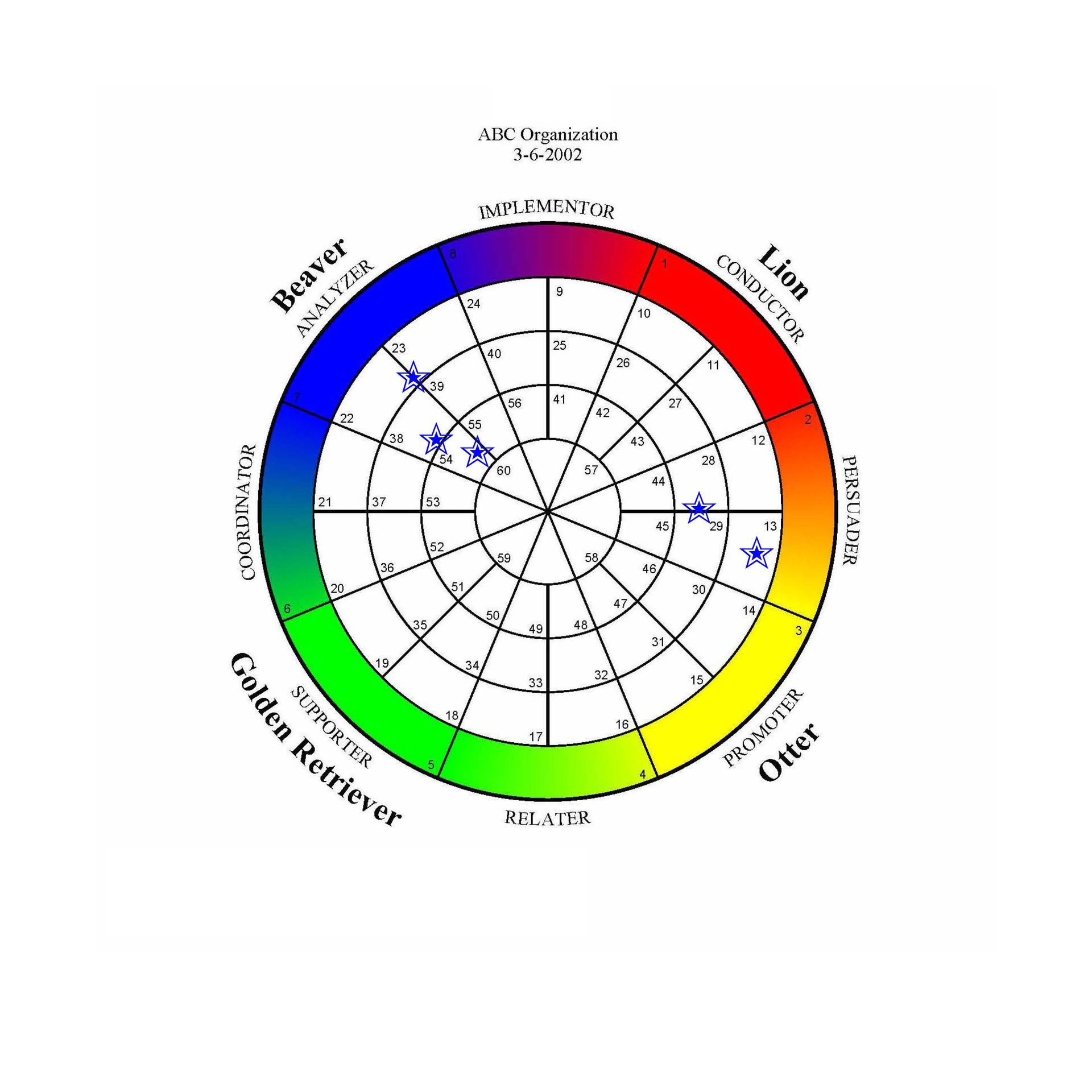
A Polar Chart
A Polar chart is used to plot data points as described by their distance from the center of a circle (radius) and their relative angle in degrees from a reference point. This example is from a staff retreat where personalities were measured and plotted to see how they correlated with one another and the overall mix of staff in the company. In this particular case, the company's motto ("make the impossible possible") is going to prove difficult. Most of the top leaders are "beavers" which mean they are processors, while two leaders are "persuaders." There are no "lions," and they have to depend on the persuaders to move the company forward, while the beavers are naturally cautious and are the company's "doers."
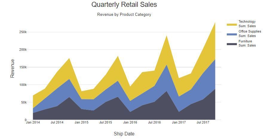
Area Chart
An area chart is used to portray part-to-whole relationships. You can see the volume of your data, not just the relation to time. An area chart is based on a line chart, with the area between the line and the x-axis colored to illustrate volume. This sample is a stacked area chart.
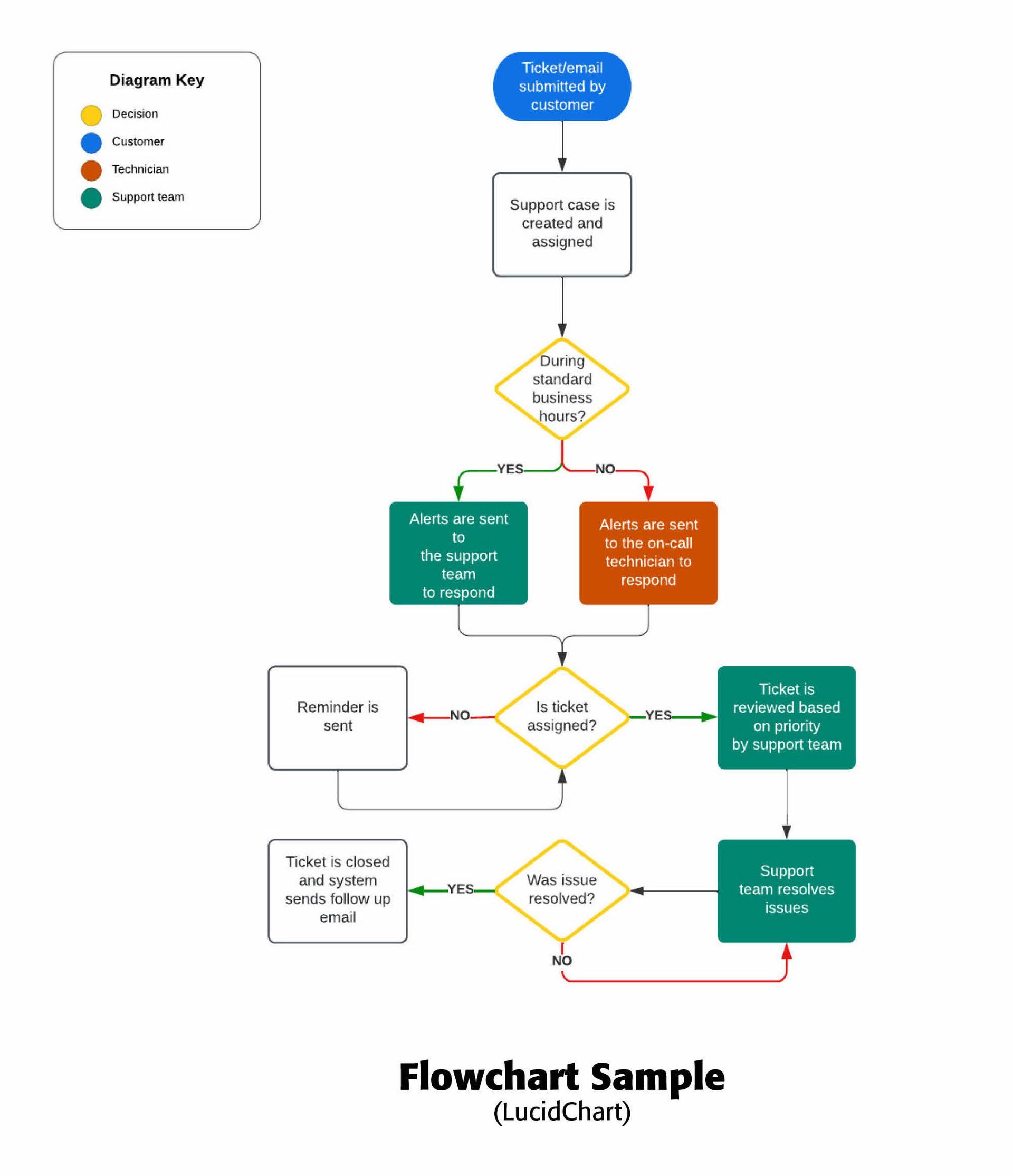
Flow Chart
A Flow Chart is a diagram that shows the relationships and steps involved in the development of a process. Often special symbols and colors are used to represent specific kinds of processes. This flow chart on the right derived in LucidChart shows how a support request is handled by the company. There is usually a "yes" or "no" option which then leads to other options. Note the different colors and symbol forms used.
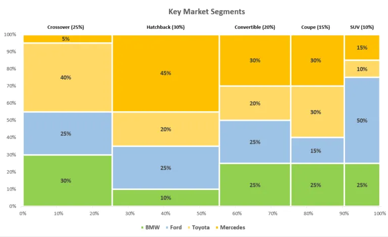
A Mekko Chart
A Mekko chart (also known as a Marimekko chart or mosaic plot) is a two-dimensional stacked chart where the chart column width usually represents the dollar amount or relative size of a market segment while the chart column height breaks down each segment, revealing the key players as well as their respective company shares. The graph provides a detailed overview of the target market for different car makes, all in one place which is why it has been used for decades by strategy consultants.
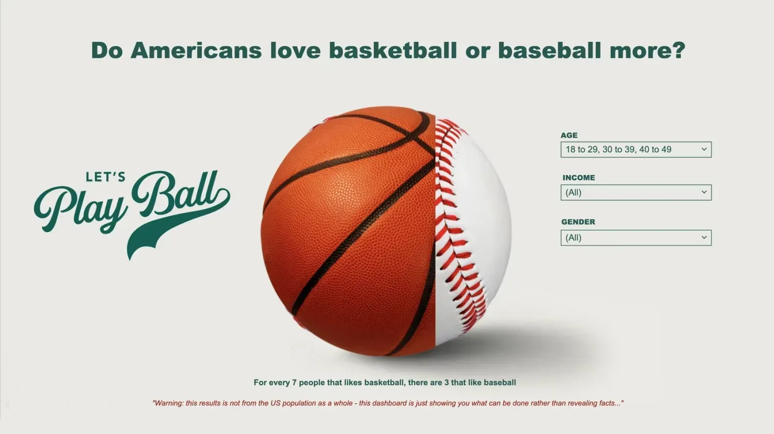
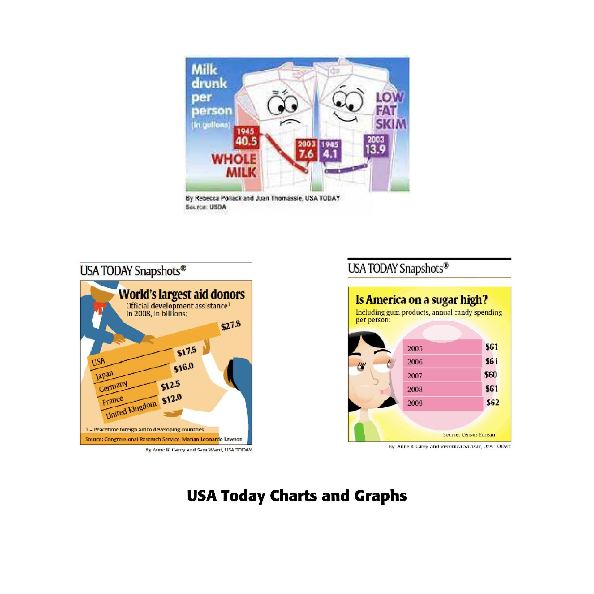
Chart Take Offs
Rather than just dull charts with numbers on the x and y axes, consider dressing up your basic charts with typographical and graphical flair. Consider the wonderful charts and graphs made in USA Today, as well as a telling sports chart below made by DisplayR. They demonstrate what can be done with a chart to make it eye-catching and interesting to even children in a classroom.
Most of these charts are available on the Microsoft platforms. They can also be made in a layout program like Adobe's InDesign. Specialized programs like DisplayR and Lucid Chart as well as Jan V. White's Using Charts and Graphs (R.R. Bowker Co., NY, 1984) can help make the chart making process less daunting. Knowing when and how to use them effectively is important in visualizing what you want people to take away from a presentation.
*A number of these descriptions adapted from Sara A. Metwalli, https://towardsdatascience.com/data-visualization-101-how-to-choose-a-chart-type-9b8830e558d6, Sep 7, 2020, as well as MacWorld, April 1988 and Windows Magazine, Winter 1995, by Irfan Salim.
Successful Layout & Design


