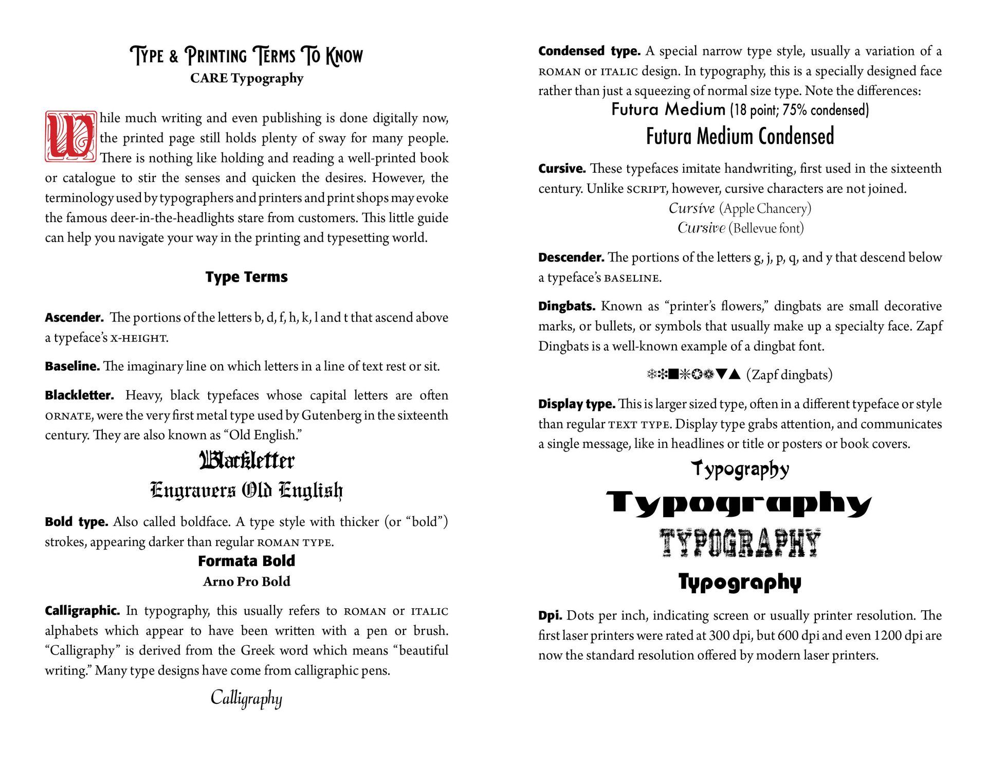
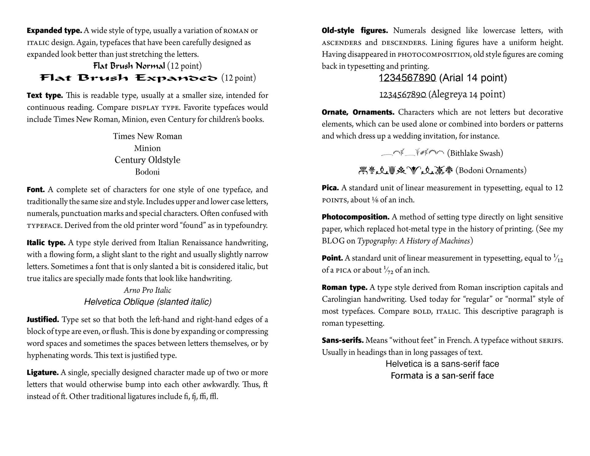
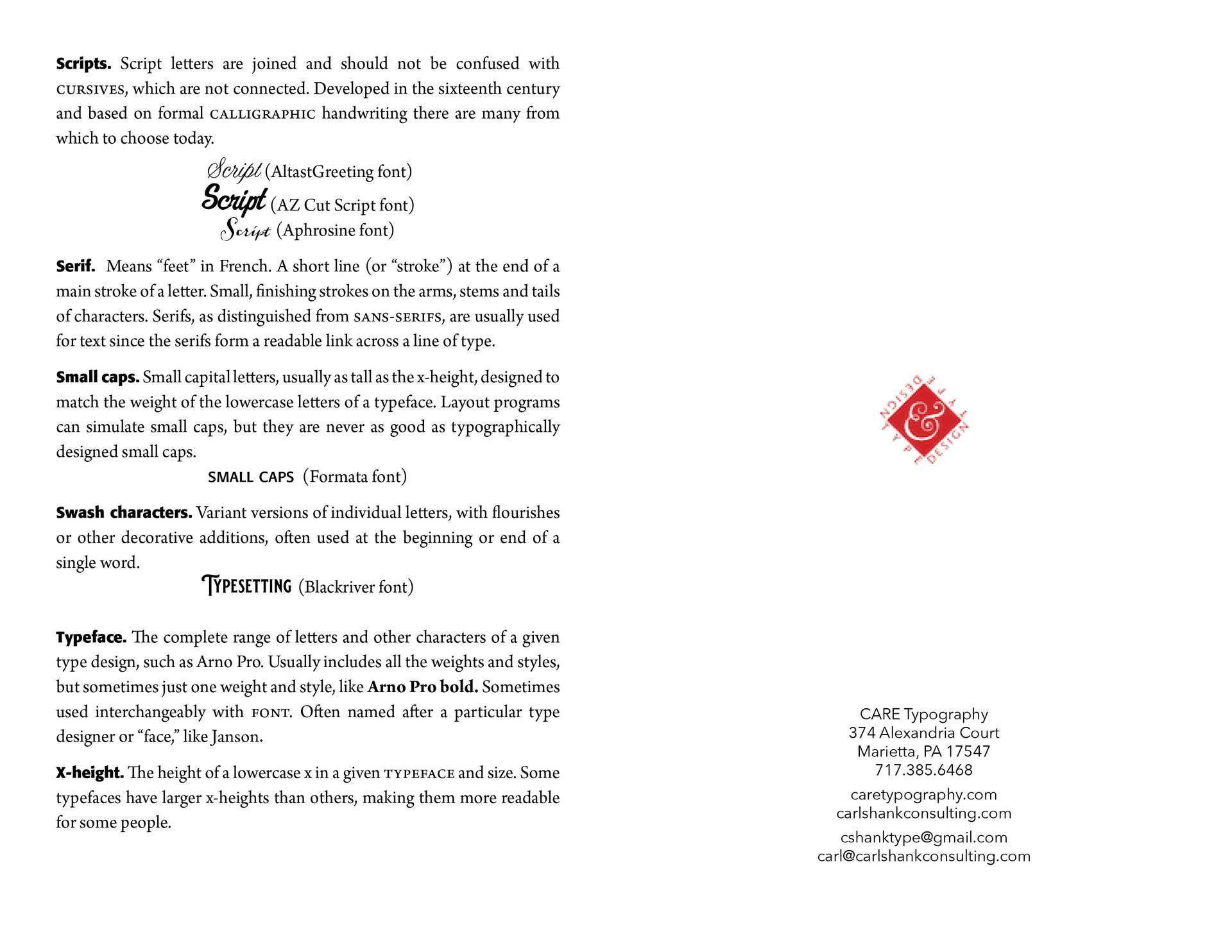
Type Terms

Carl Shank • March 14, 2023

Type and Printing Terminology. When I was employed in a very busy print shop outside of Washington, D.C. customers would come into the shop asking for printing help and advice. Usually, the conversation would go something like this — "I need some invitations to a party I am hosting. What do you recommend?" I would respond by asking what kind of party and who is invited, trying to get some idea as to the type of invitation that would be appropriate. Sometimes I would pull out a sample book of invitations for the customer to peruse.


When I would ask what kind of type they would want, the conversation would continue — "Oh, I don't know. Something that will grab their attention, maybe big type with an illustration or picture." Or, if it was a pamphlet they wanted printed, they would say, "Just make it easy to read." They knew little to nothing about typefaces and fonts or display type and leading and those things typesetters and printers almost take for granted. They did not know the language or enough about printing and typography to guide the conversation or answer a few leading questions. Or, they would produce a piece they received somewhere and ask if we could imitate that in our set up and printing. As I would seek to explain what was involved, there would be a deer-in-the-headlights kind of interaction that would take place. Big, small, medium size, looks nice, easy to read at a distance, similar to what I saw downtown — these would be their guiding hints.


Certainly, everyone needs a bit of education as to typography and printing language. And this not only for those of us in the business, but for inquiring customers and consumers of printed pieces as well. There are good type and printing glossary guides available.* Here's a sampling of what might be helpful the next time you go to the printshop for some help.


*https://www.canva.com/learn/typography-terms/. https://www.monotype.com/resources/z-typographic-terms. Glossary of Typesetting Terms (Chicago Guides to Writing, Editing, and Publishing), University of Chicago Press, 2008.

Successful Layout & Design

By Carl Shank June 13, 2026
Compositors & Type: Origin and Use of “Uppercase” and “Lowercase” Carl Shank, CARE Typography Most everyone knows what “uppercase” and “lowercase” letters are. They refer, of course, to our “capital” letters and our “regular” small print. But not many know why or how they came to be known by such terminology. The answer is found in the history and development of typography and printing. “Case” here doesn’t refer to “circumstance” or “condition.” It refers to the wooden trays used to store metal letters, the top case for capital letters (“uppercase”) and the lower case for small letters. Each tray was divided into compartments to hold the type. The lower case also held the punctuation marks and other pieces of type, like “spacers.” The type case was a shallow wooden tray divided into compartments of various sizes. There were about thirty styles of type cases, and some of these were made in different sizes.[1] The most common, or standard, size was 32¼ by 16 inches, outside dimensions, and ⅛ inches deep, inside. One of three traditional plans or schemes for such type cases involved (1) all characters in one case; (2) capitals, small capitals and a few other characters in one case; or (3) the small letters, figures, points, spaces and quads in another case. The two latter cases formed a pair and would nearly always be used together.(See Images) Hand compositors (or “swifts”) would take individual letters, spaces and punctuation marks or other characters from the type case and place them in what was called a composing “stick” in such a manner that when the type characters are properly assembled, they form words, sentences and paragraphs. The work of the press room compositor was divided into two fundamental operations — the “setting” of type and the “unsetting” of type. The former was called composition and the latter, distribution. A visual example of such typesetting can be seen in some of the episodes of The Waltons, an American historical dramatelevision series about a family in rural western Virginia in the Appalachian/Blue Ridge mountains chain, during the economic hardships and mass unemployment of the Great Depression in the 1930s and the subsequent United State home front during World War II in the 1940s. The series aired from 1972 to 1981. John-Boy, a leading character of the series, opened a print shop in a shed by the family home with an old-fashioned mechanical printer that required setting cold metal type from a type case. His brother was the compositor while John-Boy ran the printing machine.
By Carl Shank June 6, 2026
Reading through an old volume of Frederick Nelson Phillips, Inc, Type Faces:With Which We 'Prove It With Proofs' in Typography for Advertisements (New York, 1924), I came across some type that falls outside of the standard typography models, called "vanity type." The term “vanity typography” is not a formal category in typographic history like Old Style, Transitional, Modern, or Sans Serif. Designers typically use the phrase informally to describe typography that draws attention primarily to itself rather than serving the text or reader. Vanity typography occurs when type is used as a display of the designer's skill, fashion, or personal taste rather than to improve communication. Readability is sometimes sacrificed for self-expression and artistic flair. Such type styles use excessive ornamentation, decorative letterforms, overuse of effects like shadows, outlines, gradients and distortions, unusual spacing, and generally typography used to impress rather than inform. Notice in the sample by Phillips, the different "A's," "F's,", "G's," "H's," "L's," "M's," "S's," T's" and "W's." This is not calligraphy lettering, but rather type that could have been used for verses or opening letters to paragraphs or stories.
Show More