It's Greek To Me!
It's Greek to Me! (or in the actual ancient Greek language, είναι ελληνικό για μένα!) Having successfully navigated the Greek Koiné (Koiné refers to the Ancient Greek of the New Testament Bible) classes in seminary and using that knowledge in my pastoral and theological life, it is perhaps time to talk about Greek text. I found Robert Bringhurst's (The Elements of Typographic Style, Hartley & Marks, Version 3.1, 2005) coverage of Greek fonts fascinating and noteworthy.
Bringhurst points to three important classes of Greek type, that have been with us since the fifteenth century — the orthotic, the cursive and the chancery script variations. Orthotic Greek is analogous to roman, with upright letters. Cursive Greek is like our italic faces. Chancery Greek are more elaborate forms of the cursive. Bringhurst says that "[the orthotic] is the oldest form of Greek type, first seen in the partial alphabets cut by Peter Schaeffer the Elder at Mainz and by Konrad Sweynheym at Subiaco, near Rome, in 1465. It is also the style of the first full-fledged and polytonic [using two or more breathing and diacritic marks] Greek type, cut by Nicolas Jenson at Venice in 1471." (Elements, p. 274) He notes that the "most widely used modern version is the New Hellenic type designed by Victor Scholderer in London in 1927." (Ibid)
Cursive Greek type appeared as a chancery script by Francesco Griffo in 1502 and lasted two hundred years. Bringhurst again notes that "chancery Greeks were cut by many artists from Garamond to Cason, but Neoclassical and Romantic designers . . . all returned to simpler cursive forms . . . in the English speaking world the cursive Greek most often seen is the one designed in 1806 by Richard Porson." This face has been the "standard Greek face for the Oxford Classical Texts for over a century." (Elements, pp. 274, 278)
"Most Greek faces are like the Renaissance italics: upright, formal capitals [ABCDEFGHIJKLMNOPQRSTUVWXYZ] married to a flowing, often sloping, lower case." (Elements, p. 275) He also notes that Greek faces are often used alone or as supplementary faces intermixed with standard roman faces. Perhaps the most widely known Greek face is the Symbol font that was issued by Apple in the Laserwriter in the 1980s — "Symbol (often written as Σψμβολ in typeface) is one of the four standard fonts available on all PostScript-based printers, starting with Apple's original LaserWriter (1985). It contains a complete unaccented Greek alphabet (upper and lower case) and a selection of commonly used mathematical symbols. Insofar as it fits into any standard classification, it is a serif font designed in the style of Times New Roman. Due to its non-standard character set, lack of diacritical characters, and type design inappropriate for continuous text, Symbol cannot easily be used for setting Greek language text, though it has been used for that purpose in the absence of proper Greek fonts. Its primary purpose is to typeset mathematical expressions." (Wikipedia, https://en.wikipedia.org /wiki/Symbol_(typeface))
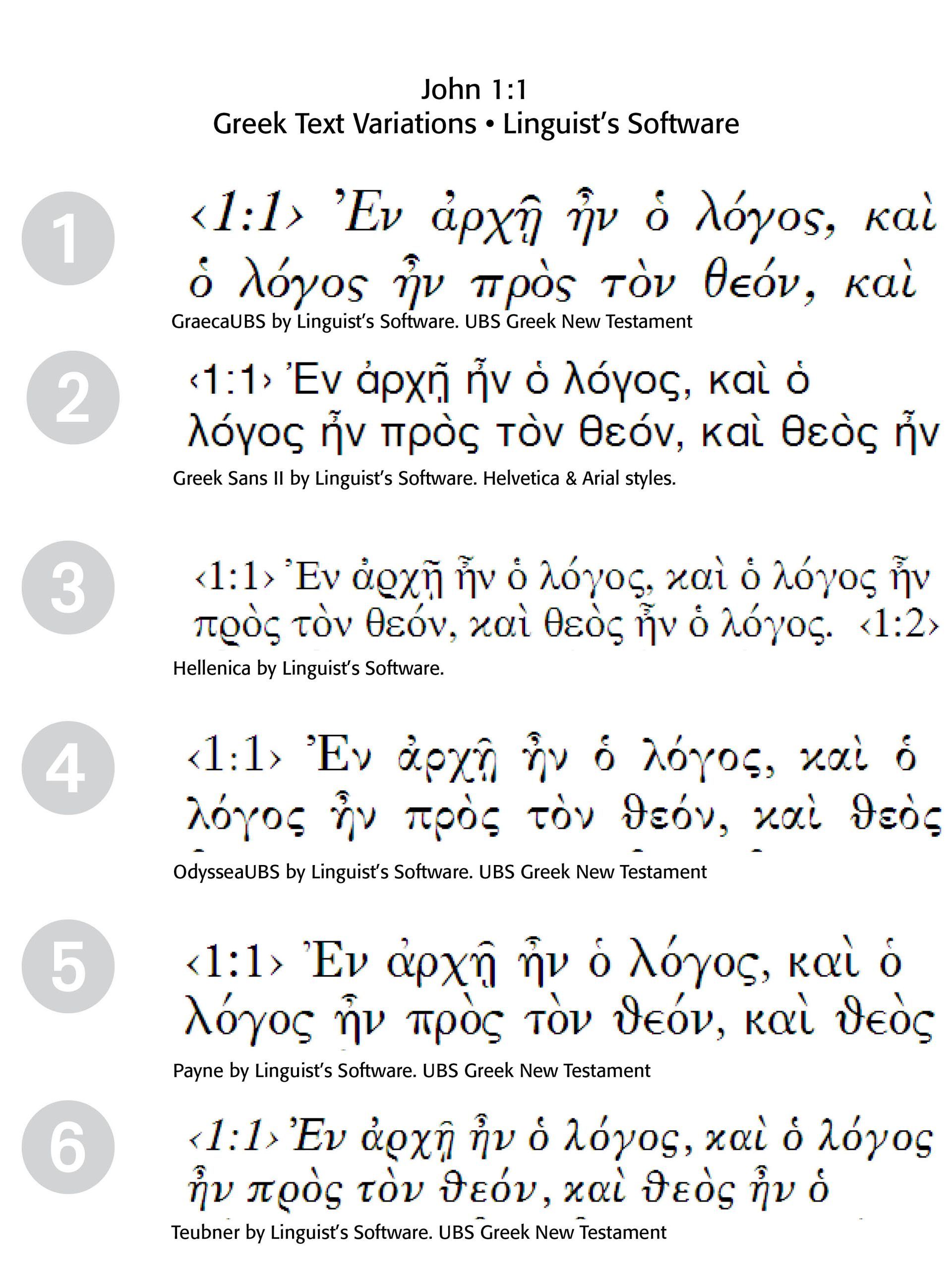
True Greek fonts, like those used in Bible texts and classroom settings, often come from Linguist's Software. This company has been making Greek fonts for quite a while, first starting with the SuperGreek and SSuperGreek fonts supplied by that firm. They have produced a number of Greek fonts used in the United Bible Society's texts over the years. A survey of some of their font choices is in the second illustration below.
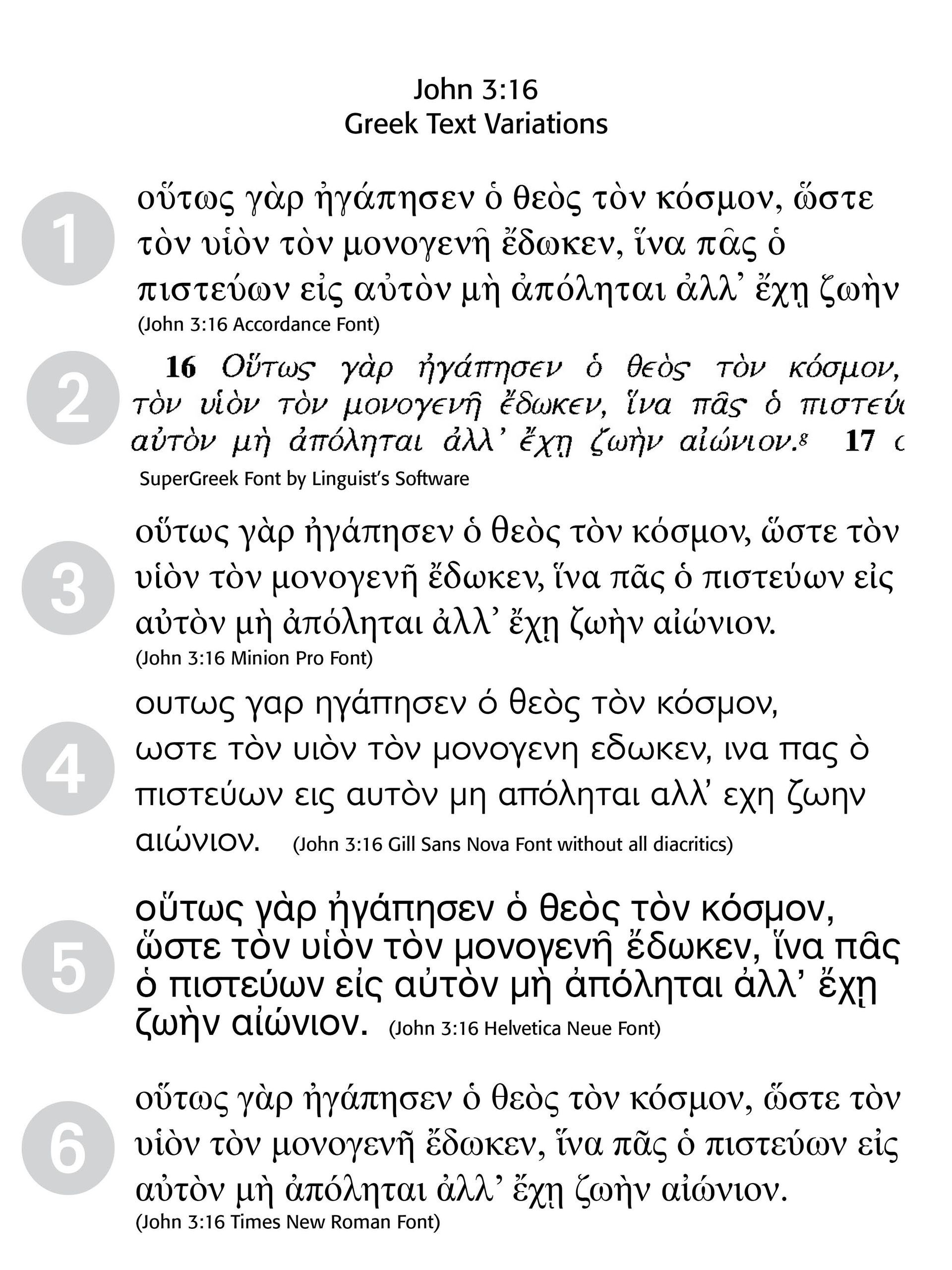
1 Font sample #1 has been taken from the Accordance Software program (NA28 Greek NT) from Oaktree Software (www.accordancebible.com). This complete Greek New Testament is based on the NA28 (Nestle-Aland, 28th Edition). The text is identical to the NA28 in all aspects except it does not include critical apparatus marks, available in NA28-T.
2 Font Sample #2 is from The Greek New Testament, Fourth Revised Edition, 1993, using Linguist's Software SuperGreek and SSuperGreek fonts.Note the different epsilon from the other font samples. This would be a reworking, I believe, of the Richard Porson font initially issued by Monotype in 1912 and then by Linguist's Software group in their LaserGreek set.
3 Font Sample #3 is from the Minion Pro font characters. Note the swash tilde above the alpha character (a). Minion is a contemporary type family created by Robert Slimbach and released by Adobe Originals.
4
Font Sample #4 is from Gills Sans Nova font, originally designed in the 1950s by Monotype draftsmen, namely by "Monotype Studio designer George Ryan, who expands the much-loved Gill Sans family from 18 to 43 fonts and features a coordinated range of roman and condensed designs. The Gill Sans Nova typeface family is part of the new Eric Gill Series, drawing on Monotype's heritage to remaster and expand and revitalize Eric Gill's body of work, with more weights, more characters and more lanquages to meet a wide range of design requirements." (From
fonts.com)
5 Font Sample #5 is the Helvetica Neue font's rendering of the Greek text. What is interesting is that this is a sans-serif rendering of the Greek font and an expansion on the classic Helvetica typeface. Neue Helvetica World fonts enable the setting of pan-European languages, in addition to Arabic, Armenian, Cyrillic, Georgian, Greek, Hebrew, Thai and Vietnamese.
6 Font Sample #6 is from the Times New Roman front, again an expansion from the original Times font family.

The sample Greek fonts on the right are all from Linguist's Software. They describe the font selections this way —
1 "GraecaUBS, a light text font similar to Rahlf’s Septuaginta font. The italic style matches the style of the regular text of the UBS Greek New Testament, 1st through 3rd editions, and was created at their request for future editions. GraecaUBS is provided in plain, bold, italic, and bold-italic styles.
2 GreekSans II, a Helvetica®- (Arial®-) style sans serif Greek font with classical accents and letters. It is provided in plain, bold, italic, and bold-italic styles.
3 Hellenica, a new font optimized for classical Greek with similarities in style to the SymbolGreek® font found in the original LaserGreek product.
4 OdysseaUBS, the font style of the bold text in the UBS Greek New Testament, 1st through 3rd editions.
5 Payne, an Attic-style Greek typeface. Payne is provided in plain, bold, italic, and bold-italic styles.
6 TeubnerLSC, like TeubnerLS, but with a crescent moon-shaped circumflex. It is provided in plain and bold."
Successful Layout & Design


