Why We Need More Than A Spell Checker

Carl Shank • March 25, 2023

Why we need more than a spellchecker. Spell checkers are great. They help us in busy offices doing busy tasks everyday. EXCEPT they cannot correct errors of statement or errors of typography. Grant Weisbrot of New York City has noted that "it is impossible to efficiently proofread without a knowledge of typesetting and printing procedures." ("The Typographic Eye: Proofreading," Electronic Publishing, May 13, 1994) He gives some examples of errors of statements — spelling when letters are missing, like "he" for "the;" spelling in a piece published in Britain, like "color" for "colour;" using a correctly spelled word in a wrong way, like 20 carat gold (carat is a diamond weight, karat is an alloy of gold, caret is an insertion mark, and carrot is a vegetable); awkward sentence structure, incorrect or inconsistent capitalization; and errors of fact, like the kangaroos of Tibet.


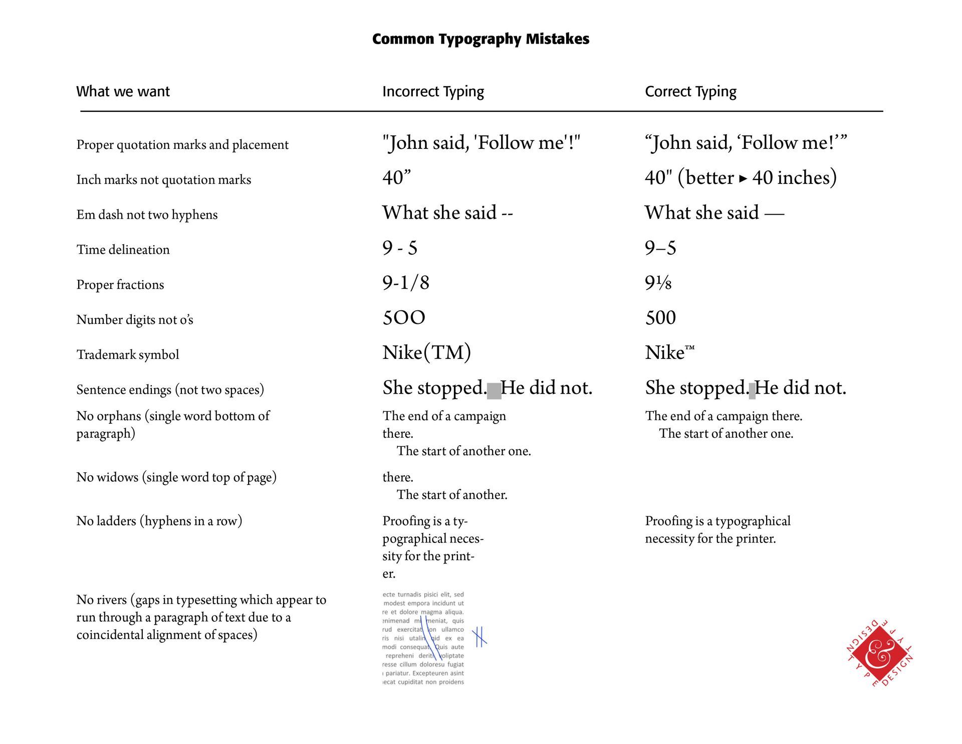
Then there are errors of typography, like primes (' ") for apostrophes or quotes (See Below), or quotes used for inch marks, double-hyphens (--) for an em-dash (—), fractional mistakes (See my Blog on Fractions), kerning that is on or off, word spacing that is inconsistent, unbalanced centered copy, allowing widows, orphans, ladders or rivers (See Below), wrong sized bullets, subscript or superscript failures (NIKE (TM) instead of NIKE™), two spaces after a sentence ending instead of just one space (a common typist mistake), asterisks to represent bullets, using the letter "l" for the number 1, capital O for the digit 0, and misnumbered pages.


Interestingly, the ancient Koreans were known for the quality of their proofreading work. If a novice made one typo, they lost a finger. The second typo caused the loss of a hand! In 1539, France required printers to hire proofreaders or to be fined and held liable for damages due to typographical errors. Today, we just add a "not responsible for typographical errors" to ordinary newspapers and mailers. We have grown sloppy, uncaring, and typographically ignorant—sad to say. Frank Romano in a March 1993 Electronic Publishing article, "The History of the Typo," says that "today artificial intelligence and fuzzy logic are being used to electronically generate typographical errors without human involvement."


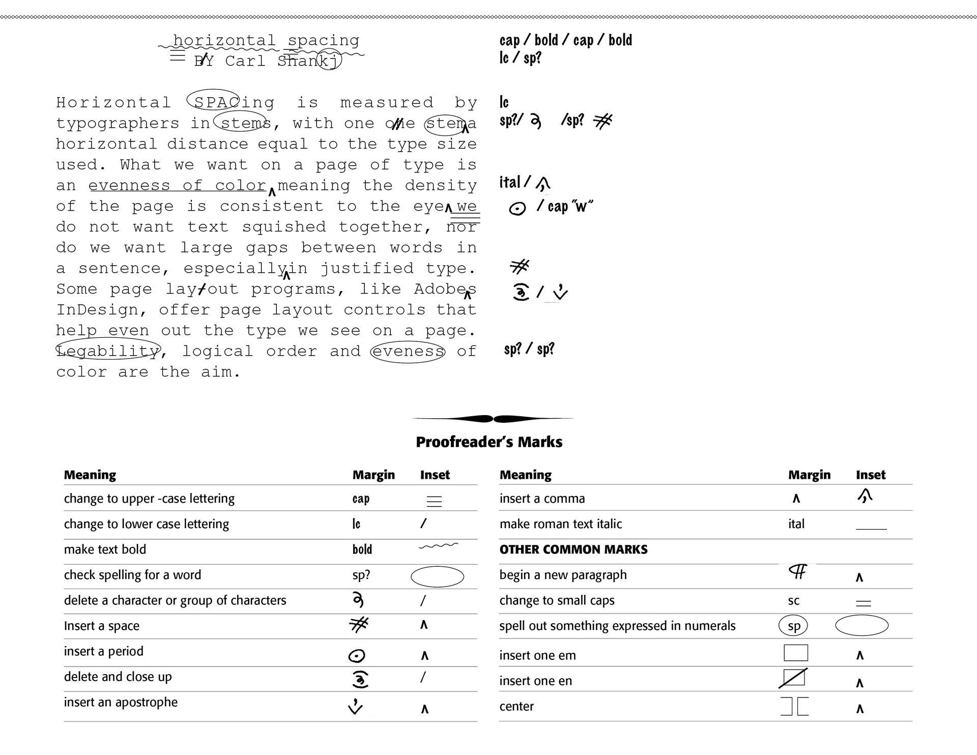
Weisbrot notes that "a proofreader must correct the proof and enhance the typography without ever making changes in the text or specifications; editors usually frown on a proofreader's pretensions to improve the language, but it is rare for a designer to complain if the layout is typographically improved." I have included a Sample below of a typical proofreader's remarks on a submission.


In saying all of this, I read a letter submitted to the Typographical Journal of 1894 of the desperate conditions of a friend of a newspaper comp. She notes — "I do believe that the morning newspaper, set by weary, sweating, half-blinded, nerve exhausted humans, who are driven to the saloon to recuperate by temporary exhilaration, and to early graves by soul and body enervating toil in unwholesome, ill-ventilated, stinking, over-heated composing rooms, a greater curse to humanity than the much dreaded machine [the coming Linotype machine] can ever be. May the morning newspaper set by human hands soon die, I say." (Alexander Lawson, Thoughts on the Typo Workplace, Electronic Publishing, January 7, 1994) We have come a long way from those days, but I wonder what we have given up for speed and so-called efficiency.

Successful Layout & Design

By Carl Shank June 13, 2026
Compositors & Type: Origin and Use of “Uppercase” and “Lowercase” Carl Shank, CARE Typography Most everyone knows what “uppercase” and “lowercase” letters are. They refer, of course, to our “capital” letters and our “regular” small print. But not many know why or how they came to be known by such terminology. The answer is found in the history and development of typography and printing. “Case” here doesn’t refer to “circumstance” or “condition.” It refers to the wooden trays used to store metal letters, the top case for capital letters (“uppercase”) and the lower case for small letters. Each tray was divided into compartments to hold the type. The lower case also held the punctuation marks and other pieces of type, like “spacers.” The type case was a shallow wooden tray divided into compartments of various sizes. There were about thirty styles of type cases, and some of these were made in different sizes.[1] The most common, or standard, size was 32¼ by 16 inches, outside dimensions, and ⅛ inches deep, inside. One of three traditional plans or schemes for such type cases involved (1) all characters in one case; (2) capitals, small capitals and a few other characters in one case; or (3) the small letters, figures, points, spaces and quads in another case. The two latter cases formed a pair and would nearly always be used together.(See Images) Hand compositors (or “swifts”) would take individual letters, spaces and punctuation marks or other characters from the type case and place them in what was called a composing “stick” in such a manner that when the type characters are properly assembled, they form words, sentences and paragraphs. The work of the press room compositor was divided into two fundamental operations — the “setting” of type and the “unsetting” of type. The former was called composition and the latter, distribution. A visual example of such typesetting can be seen in some of the episodes of The Waltons, an American historical dramatelevision series about a family in rural western Virginia in the Appalachian/Blue Ridge mountains chain, during the economic hardships and mass unemployment of the Great Depression in the 1930s and the subsequent United State home front during World War II in the 1940s. The series aired from 1972 to 1981. John-Boy, a leading character of the series, opened a print shop in a shed by the family home with an old-fashioned mechanical printer that required setting cold metal type from a type case. His brother was the compositor while John-Boy ran the printing machine.
By Carl Shank June 6, 2026
Reading through an old volume of Frederick Nelson Phillips, Inc, Type Faces:With Which We 'Prove It With Proofs' in Typography for Advertisements (New York, 1924), I came across some type that falls outside of the standard typography models, called "vanity type." The term “vanity typography” is not a formal category in typographic history like Old Style, Transitional, Modern, or Sans Serif. Designers typically use the phrase informally to describe typography that draws attention primarily to itself rather than serving the text or reader. Vanity typography occurs when type is used as a display of the designer's skill, fashion, or personal taste rather than to improve communication. Readability is sometimes sacrificed for self-expression and artistic flair. Such type styles use excessive ornamentation, decorative letterforms, overuse of effects like shadows, outlines, gradients and distortions, unusual spacing, and generally typography used to impress rather than inform. Notice in the sample by Phillips, the different "A's," "F's,", "G's," "H's," "L's," "M's," "S's," T's" and "W's." This is not calligraphy lettering, but rather type that could have been used for verses or opening letters to paragraphs or stories.
Show More