Newsletter Layout Basics
What makes up a good newsletter? There are both CONTENT and LAYOUT issues to consider.
CONTENT. Make the newsletter concise, readable, active by using strong verbs, scannable, up-to-date, people oriented, and economical. Make it regular, weekly if possible. "Scannable" means easy to read and see main pieces of information. Tie broader interests into the lives of local people. This is especially important if you reference, in a church newsletter, for instance, denominational or national news and views. Include short snippets by others in your group of readers. Advertise links to well-researched and important information for your readers. Include an occasional literary piece or arts piece to cultivate creative interchange and add vitality and dimension to your newsletter. Every so often use special interest pieces. Make sure the source of the newsletter is clear and readable, including name, address, date, staff. Do not plagiarize — give credit to where credit is due.
LAYOUT. Have a distinctive and well-designed logo. Hire a graphic artist if needed for a professional logo look. Make sure the newsletter has "visual vitality" — good paper stock, quality reproduction, eye-catching headlines, plenty of white space and graphic elements to break up long text. Other type considerations would be —
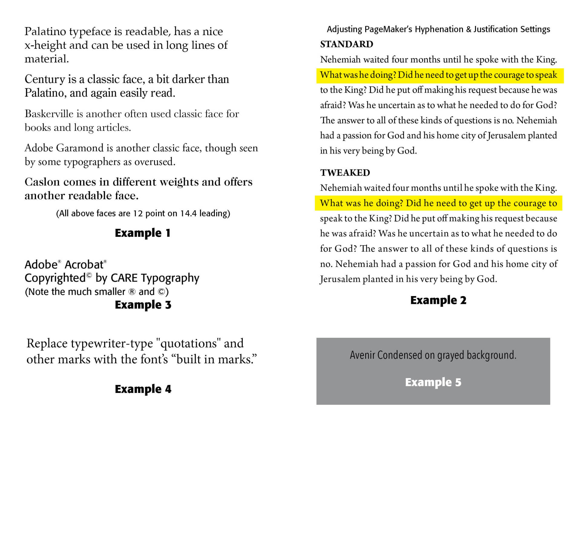
(1) Choose the right typeface. Don't be limited to Times Roman, Helvetica and ghastly Courier. Try Palatino, Century, Lucida and Stone Informal. Book faces would include Garamond, Caslon 540, Galliard and Baskerville. (See Example 1 below) Choose a face legible in small sizes. Whatever you choose, be careful of fanciful, grotesque, weird and strange faces for most of the newsletter. "Extreme features—thick strokes, very thin strokes, tall and narrow forms, short and squatty forms, slanted characters, fancy serifs, swashes—anything that calls attention to itself lowers the readability of the face, because you notice the letterforms, rather than the message." (Robin Williams, "Improving Readability," Technique, August 1995). What you want is readability, cleanness, and communication.
(2) Size type to fit. This means appropriate size of type and line spacing. Strive for lines between 50 and 70 characters. Another way to say this would be from 8 to 11 words or wide enough to accommodate 2 1/2 lowercase alphabets of the typeface chosen. People read groups of words at a time, so be careful of too few or too many words on a line. Do not double-space between the end of sentences (an old practice on typewriters—remember those?!) For a piece too long, hyphenate lines setting them ragged right, or cut some text. For a piece too short, remove hyphenations, break long paragraphs into shorter ones, or narrow the column widths. The general rule for leading is 20 percent of type size, so 2 points of leading for 10-point type, making a total of 12 points from one baseline to the next. However, some faces require more leading for readability. Since we read in phrases, avoid uneven letter and word spacing, or too close or too far apart spacing. Kerning and tracking controls on page layout programs like PageMaker often need tweaked. (See Example 2 below) Whatever looks right is important here.
(3) Use display type for headlines. Do not use all capital letters. A mix of upper and lower case letters gives more readability and pleasure in headline reading. Generally, avoid ALL CAPS even for headlines. Leave conjunctions such as and, in, and the, lowercase. There are many display faces available, but I would say choose a display face that goes with the text used in the piece. Sans serif faces (without "feet") are often good display faces, but again be careful of gaudiness. And use your computer program's kerning function (space between letters) to create visual acceptability —
WORKING TOOLS or Working Tools (Formata Bold font),
but not WORKING TOOLS (unless it is a Halloween piece!)
Also, end lines at logical stopping points —
Today it will be sunny with periods
of rain and spotty showers Not this — but rather this —
Today it will be sunny
with periods of rain
and spotty showers
Trademark or copyright symbols should be a smaller type size than the font and move the symbol so that its top aligns with the top of the text. (Example 3 below)
(4) Replace typewriter-type quotations and other marks with the font's built in marks. (Example 4 below) Jim Heid from Macworld also rightly advises "avoid gimmicky font styles such as shadow and outline. Also think twice about using the small-caps option that many programs provide. . . . avoid superimposing type over a gray-shaded background." (Macworld, June 1989) (Example 5 below)
Successful Layout & Design


