Numbers in Typography
Numbers In Typography
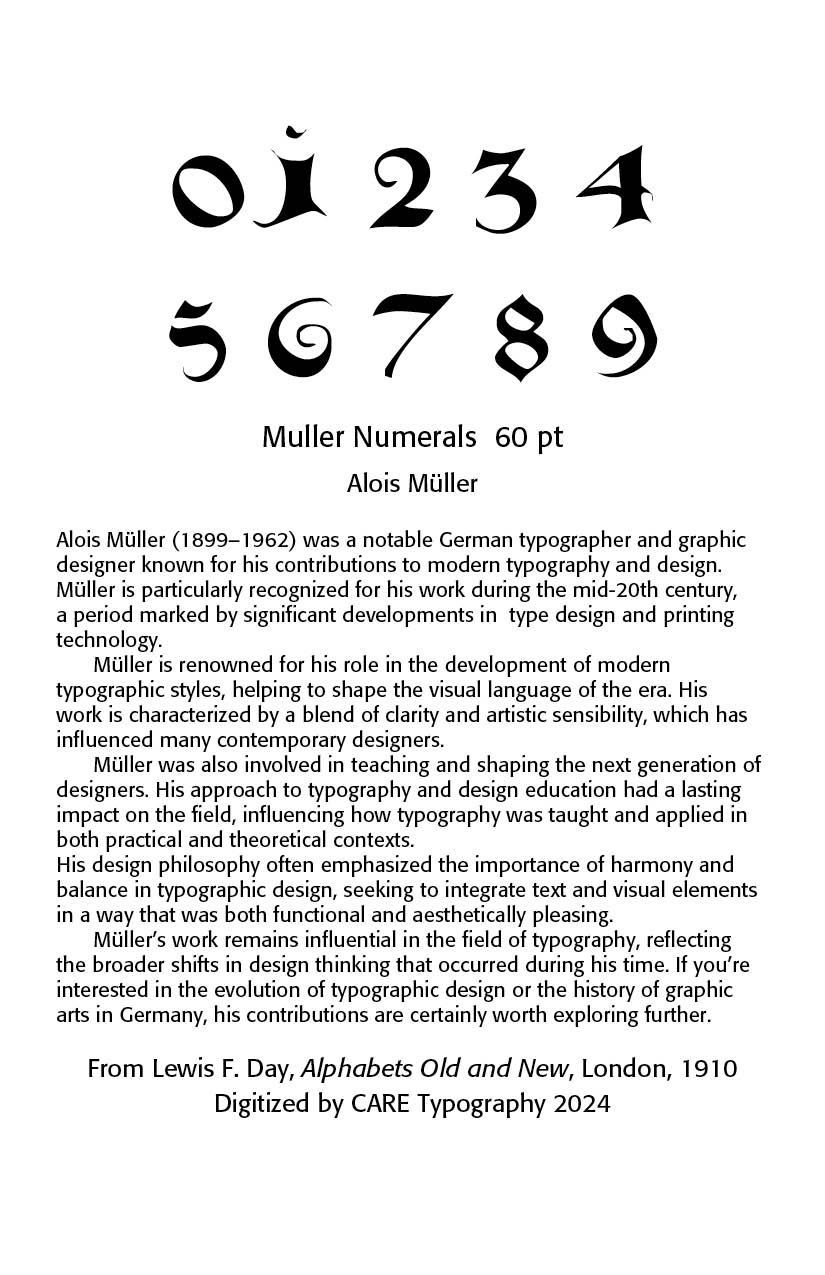
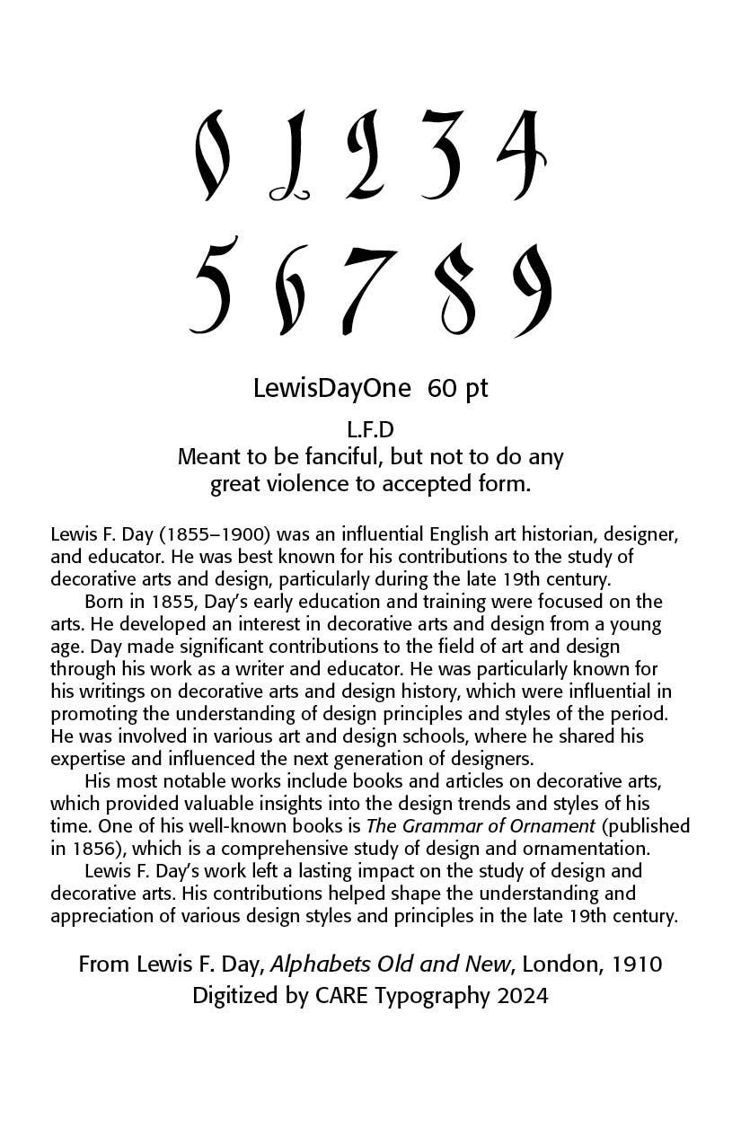
Personal Background. I am a minister by calling and a self-trained typographer. Yet, I was also trained to be a mathematician by my college degree in mathematics. Indeed, before seminary days, I was a mathematics teaching assistant at the University of Maryland for a season. Numbers have played a significant role in my training and development, both as a theologian and typographer. It is for this reason that I found the sample numerals in Lewis F. Day’s Alphabets Old and New (London, 1910) fascinating and important to the development of type and fonts.
Numbers and Numerals. First things first. We must distinguish between “numbers” and the symbols that represent them as “numerals.” A number is a mathematical object used to count, measure, and label. The most basic examples are the natural numbers 1, 2, 3, 4, and so forth. Numbers can be represented in language with number words. More universally, individual numbers can be represented by symbols, called numerals; for example, "5" is a numeral that represents the number five.
The current symbols we use for numbers, namely 0,1, 2, 3, 4, 5, 6, 7, 8. 9, only came about in practice in the late 14th and early 15th century in Western European civilization. Before these Arabic symbols, the Egyptians invented the first ciphered numeral system, and the Greeks followed by mapping their counting numbers onto Ionian and Doric alphabets. Roman numerals, a system that used combinations of letters from the Roman alphabet, remained dominant in Europe until the spread of the superior Hindu–Arabic numeral system around the late 14th century, and the Hindu–Arabic numeral system remains the most common system for representing numbers in the world today.
Numbers were indicated by Egyptian hieroglyphics, Hebrew and Greek letters and the classic Roman numerals. As a schoolboy, I had to learn the Roman numeral system, thus, 1= I, 5 = V, 10 = X, L = 50, C = 100, D = 500, M = 1000. Such a numeral system only gradually faded over time, with Roman numerals often seen on current day clock faces, monuments and buildings and copyright dates on the title screens of movies and television programs. MCM, signifying "a thousand, and a hundred less than another thousand", means 1900, so 1912 is written MCMXII. For the years of the current (21st) century, MM indicates 2000; this year is MMXXIV (2024).
The Arabic Numerals. The Arabic numerals found their way into Europe some time during the 12th century via the Italian scholar and mathematician Leonardo Fibonacci (1170 – 1250) who grew up in North Africa and is credited for bringing the decimal system to Europe. Although he died two centuries before Gutenberg, Fibonacci introduced Arabic numerals to northern Italian scribes. His 13th-century work Liber Abaci was crucial in making Arabic numerals known throughout Europe; however, their use in Europe was largely confined to Northern Italy until the invention of the printing press in the 15th century.
The adoption of these numerals in England lagged behind their European counterparts, with the beginning of the 17th century as the date of their universal acceptance. The numerals, as we know them, or even as they were written in the 15th century, do not bear any marked resemblance to the genuine Arabic. Numbers 1 and 9, and the all-important cypher, 0, are the only Eastern figures which seem to claim direct oriental ancestry.
The Numeral 0. You will note in a typographical study of numerals that the numeral “0” is often missing in the earliest studies and writings. As late as the 15th century, the numeral zero was regarded as umbre et encombre, “dark and encumbered,” and its German name, Null, is derived from the idea that it is nulla figura, not a “real” figure. The mathematician Fibonacci used the term zephyrum. This became zefiro in Italian, and was then contracted to zero in Venetian. The Italian word zefiro was already in existence (meaning "west wind" from Latin and Greek Zephyrus) and may have influenced the spelling when transcribing Arabic ṣifr. The Indian system includes the zero, permitting complicated mathematical operations. Indian sources have called zero shunya, “emptiness,”, that is, an emptiness that fills the lines between numbers and thus makes it easy to distinguish the position of a number in terms of units, tens and so forth.
Numerology. We cannot study numbers and numerals without taking note of their typological importance. Numerals meant something to many peoples throughout the ages. In early Greek, still existing in Hebrew and Arabic, the Arabic alphabet follows the old Semitic sequence of letters, called abjad. Each letter has a twofold meaning, allowing one to develop relations between names, meaningful words and numbers.
The number “666” in the Bible in the Book of Revelation is a model case. Found in Revelation 13:18 — “This calls for wisdom: let the one who has understanding calculate the number of the beast, for it is the number of a man, and his number is 666.” — many Bible scholars have sought to unmask the significance of such a number combination.
Some have said it represents the “Nero Caesar,” that is, if the final letter is omitted to give the Latin spelling of the name so that the total is 616, an acceptable variant reading of the text.
However, Leon Morris in his excellent commentary on Revelation notes that “to get this result we must use the Greek form of the Latin name, transliterated into Hebrew characters, and with a variant spelling at that (the vowel letter y has to be omitted from qysr). This solution has its attractions, but no-one has shown why a Hebrew name with an unusual spelling should be employed in a Greek writing.” (Leon Morris, The Revelation of St. John, Tyndale Series Commentaries)
He would suggest that “we should understand the expression purely in terms of the symbolism of numbers. If we take the sum of the values represented by the letters of the name IēsousN, the Greek name ‘Jesus’, it comes to 888; each digit is one more than seven, the perfect number. But 666 yields the opposite phenomenon, for each digit falls short. The number may be meant to indicate not an individual, but a persistent falling short,” that the unregenerate man is persistently evil.
Philosophy of Numbers. It may seem obvious that 1 + 1 = 2, that the Euclidean system of doing and thinking about numbers has codified the numeral system. Up to the latter part of the 19th century, mathematics operated with axioms and rules of Euclidean geometry. For example, two points define a straight line. It was presupposed that there existed only one coherent analysis of numbers, line, space and so forth. “1+1 = 2 is true” went unquestioned for the most part.
With the rise of the Enlightenment and Rationalism, along with the variant theologies of German Rationalism, and skepticism in the theological sphere, came an explosion of new mathematics. The theory of infinite numbers was introduced. Negative, complex and irrational numbers entered mathematical activity. Euclidean geometry became quite inadequate. For the first time in great measure, the problem of consistency came up.
The Law of Contradiction no longer held true. Thus, in Riemannian geometry, through a given point outside a line no parallel to it can be drawn! And the nightmare began! There was no way to prove mathematical consistency with itself because even if all the theorems of a system were logically true, we don’t have all the theorems at hand. Perhaps the next one may contradict them all! Axioms outside the range of finite or infinite cannot be known. This pointed to the unsolvable dilemma of consistency. The terms “point,” “line,” “between” became meaningless.
Bertram Russell said that “pure mathematics is the subject in which we do not know what we are talking about, or whether what we are saying is true.” God, after all, if He does exist, might be playing a grand hoax. After the last mathematician dies, the last equation written, the last problem solved, He would deny all such work and have completely different truths about numbers than what we have now. We see this struggle in René Descartes work on methodical doubt.
I am convinced that 1 + 1 = 2 and am satisfied that a God of order and consistency has so ordained it to be so. The Bible says in Colossians 1:17 that “And he [Jesus Christ] is before all things, and in him all things hold together.” To “cohere” in verse 17 implies consistency. So, 1 + 1 = 2 is true because ultimately God has in fact ordained and revealed it to be truth.
The apologist Cornelius Van Til has said, “The scientist is guilty when he handles nature as though it were a grab-bag tossed into his lap by chance instead of the estate of the Creator-Redeemer.” (Cornelius Van Til, The Doctrine of Scripture)
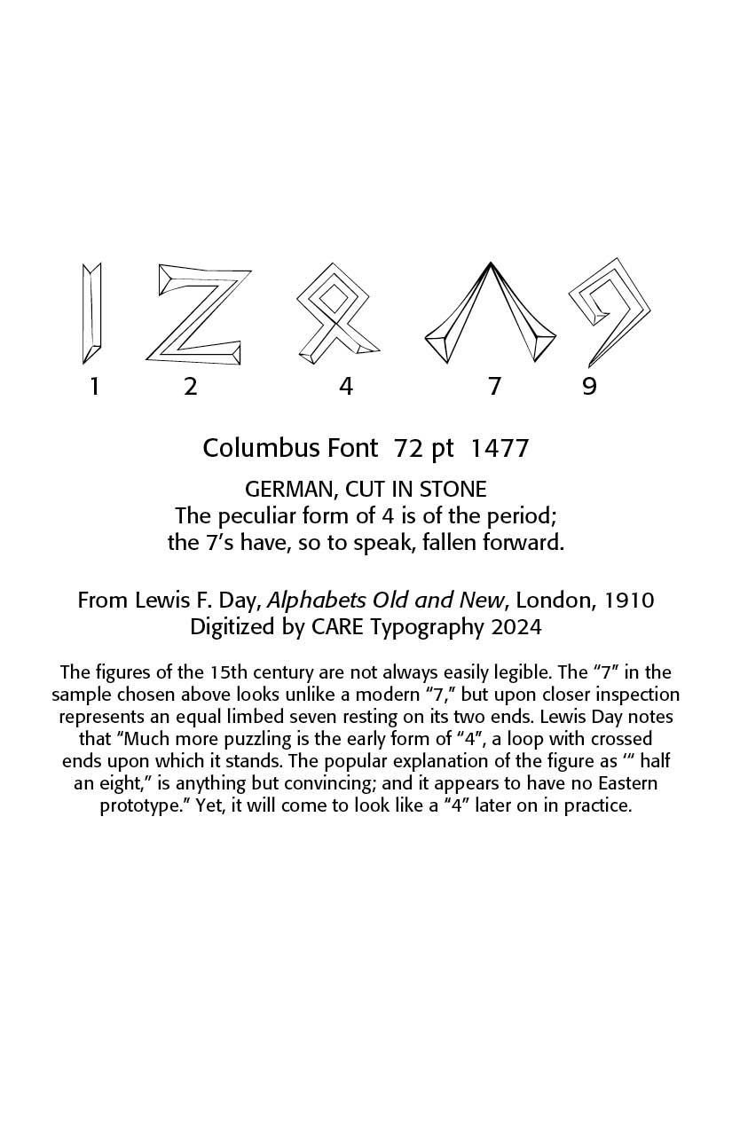
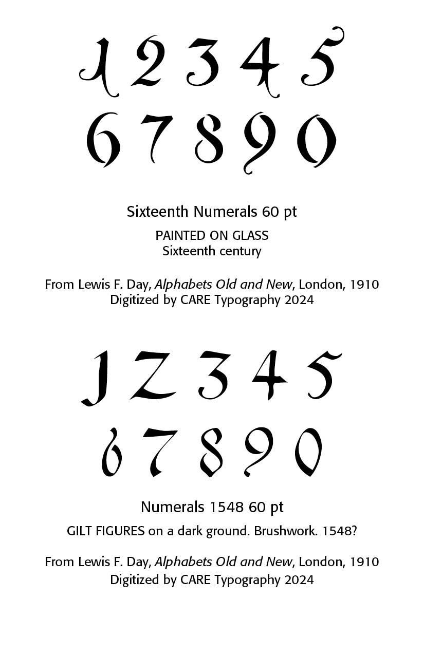
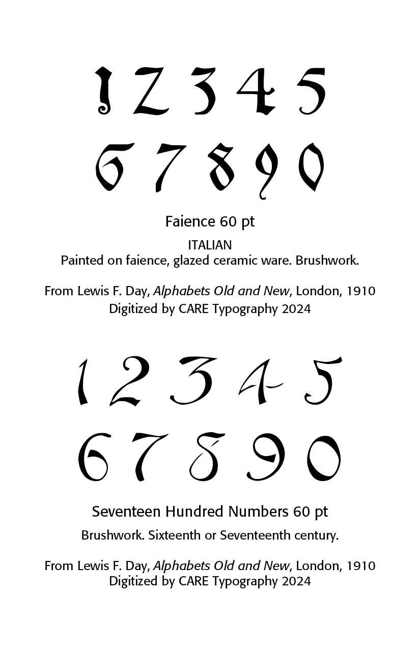
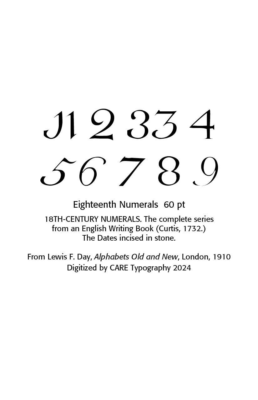
The examples below are digitized samples from the 15th century onwards drawn from Day’s book.
Successful Layout & Design


