Typographic Signposts
Typographic Signposts Reading the history of typography and writing has become a fascinating joy for me. The richness and diversity of typographic innovation is marvelous and instructive and often mirrors the cultural milieu of the period. One fascinating book I recently read is the 1910 Alphabets Old And New by Lewis F. Day (B.T. Batsford, London, 1910). Lewis F. Day (1845–1910) was a prominent British designer and author known for his contributions to decorative arts and design during the late 19th and early 20th centuries. He is best remembered for his work in the Arts and Crafts Movement, a design philosophy that emphasized craftsmanship, simplicity, and the beauty of natural materials.
Day was educated at the South Kensington School of Art, where he honed his skills and developed a deep appreciation for historical design styles. He became well-versed in a variety of design techniques and materials, which he employed in his own work as well as in his writings. One of his most significant contributions was his writing. Day authored several influential books on design, including "The Book of Ornament" and "The Grammar of Ornament," which were widely read and respected in design circles. These works provided detailed insights into the principles of design, drawing on a range of historical styles and cultural influences.
In addition to his written work, Day was involved in various design projects, including ceramics and textiles. His designs were characterized by their careful attention to detail and a deep understanding of historical and contemporary styles. Day's legacy is evident in the continued relevance of his design principles and writings, which have influenced subsequent generations of designers and craftsmen. His work remains an important reference for those interested in the intersection of history, aesthetics, and craftsmanship in design.
In his Alphabets Old and New, Day provides typographic examples and traces the development of the typographical alphabet from earliest times. Starting with the 6th century lettering, Day provides examples of alphabetic lettering through the 14th, 16th, 17th and on into modern typography of his period. The digitized samples below are drawn from Day's book and provide a visually satisfying typographic history.
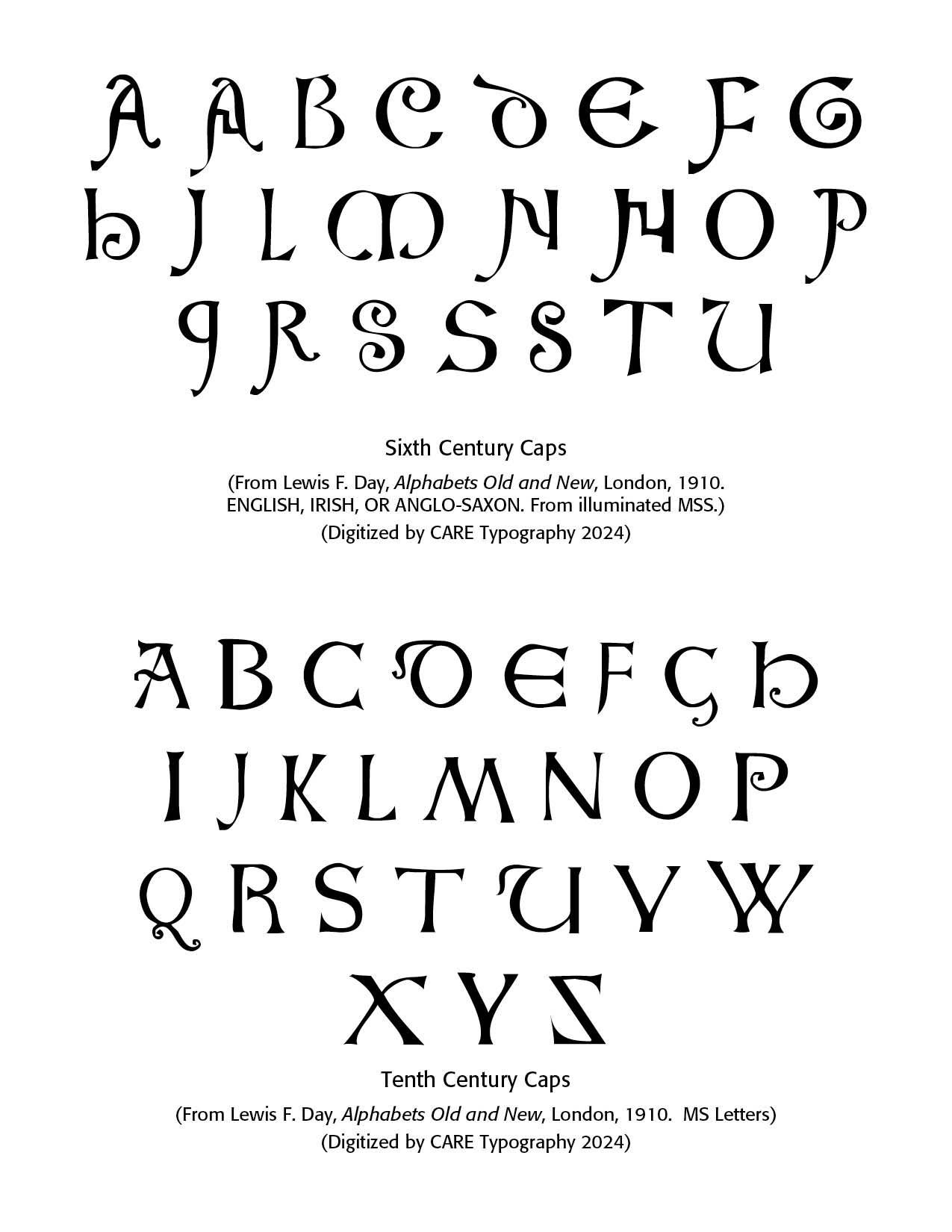
Sixth Century As I mentioned in earlier Blogs (SEE Ancient Alphabets, Oct 28, 2023), along with a pictorial history of type (Typography: Pictorial History, May 15, 2024), a pictorial history of the development of printing machines (Typography: A History of Machines, March 12, 2023), printers marks (About Printers Marks: Highlighting Crosses, March 15, 2024) and old Bible typographic versals (Old Bible Typography Versals, April 19, 2024) writing moved from scribal pens and diligent artists to actual letters, mostly capital letters at this point. The sixth century sample comes from illuminated manuscripts from English, Irish or Anglo-Saxon sources. Note the beginning of ascenders and descenders, the Gothic "E" and "M" and fancy "D, G and H."
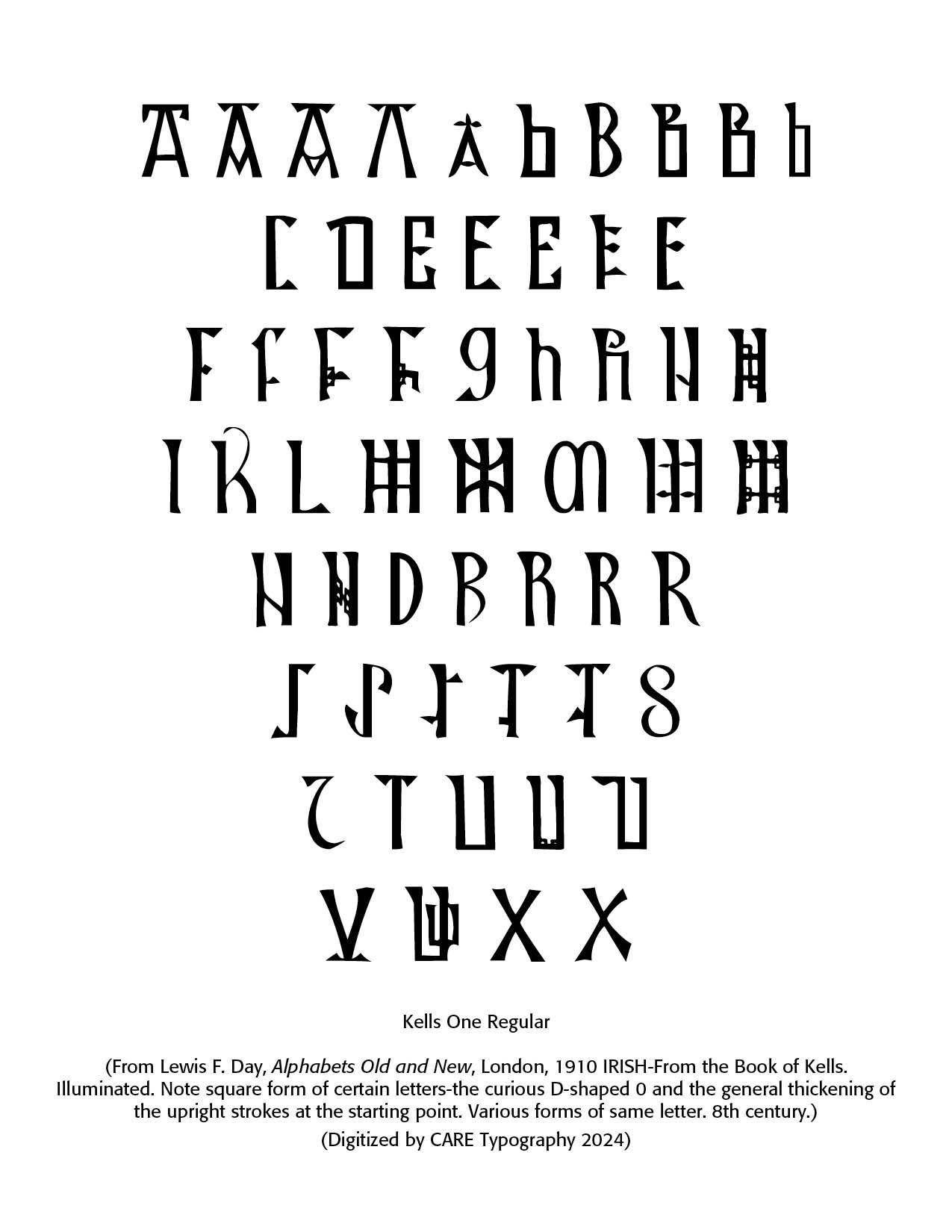
Eighth Century. Scribal art can be seen in the Book of Kells, a copy of the Gospels written. This early lettering example comes from the eighth century. Kells was a monastery founded by St. Columbo.
Tenth Century The tenth century saw the increasing development of Roman type of letters. These manuscript letters more nearly resemble the orthodox Roman character, with exception of D, E, G, P, U, in which Gothic characteristics begin to appear, and perhaps a hint of future minuscule (small letters) forms. Note the backward "Z" which I consider an anomaly.
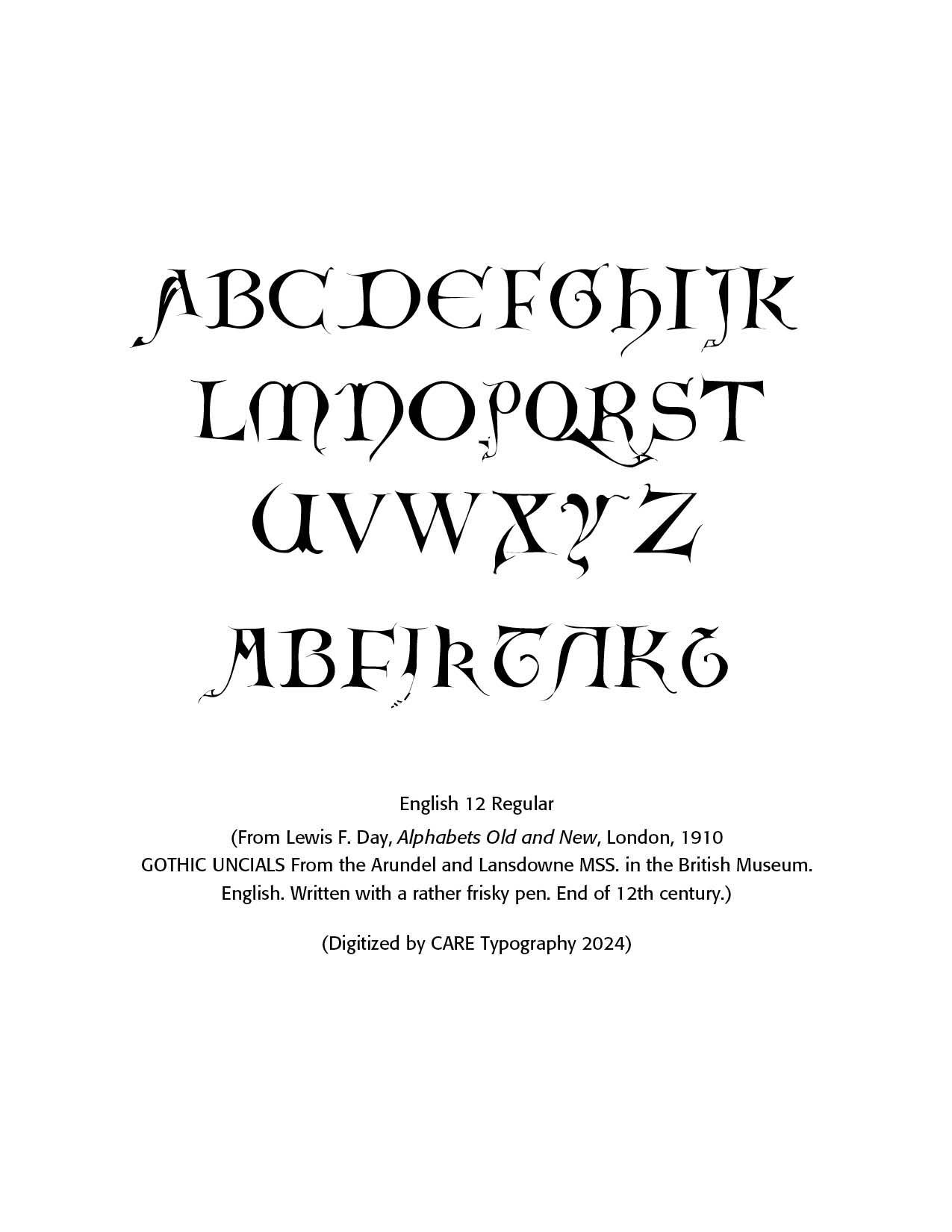
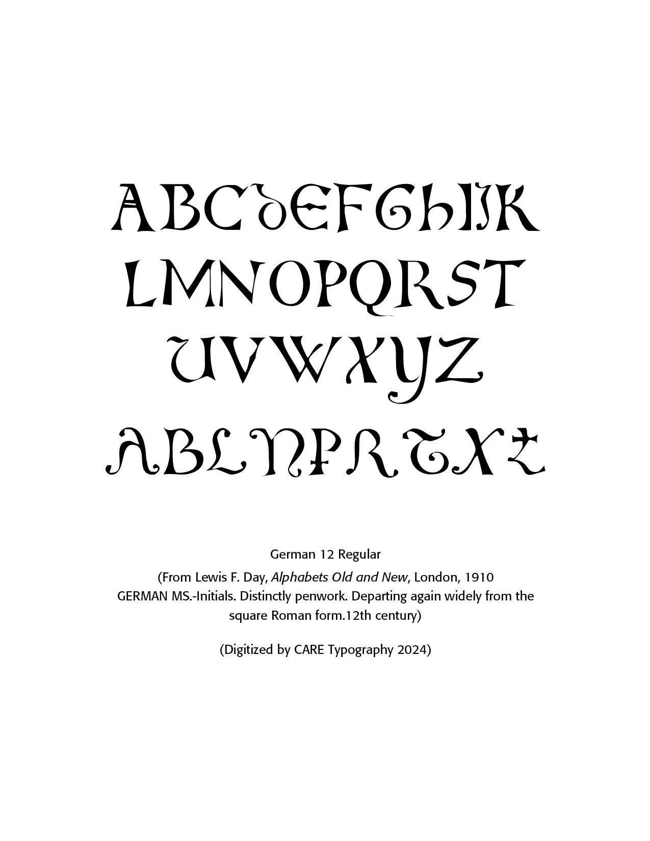
Twelfth Century. The twelfth century continued with Gothic style caps. Note the "E" and "M" as well as the flourishes on the English pen created caps, especially on the "Q." There are alternates as well with some of the letters, which I have included below. On the German alternates, note the "T" and the "P" alternates with what looks like a cross. This continues the old tradition of Printers Marks with crosses, now in letter form.
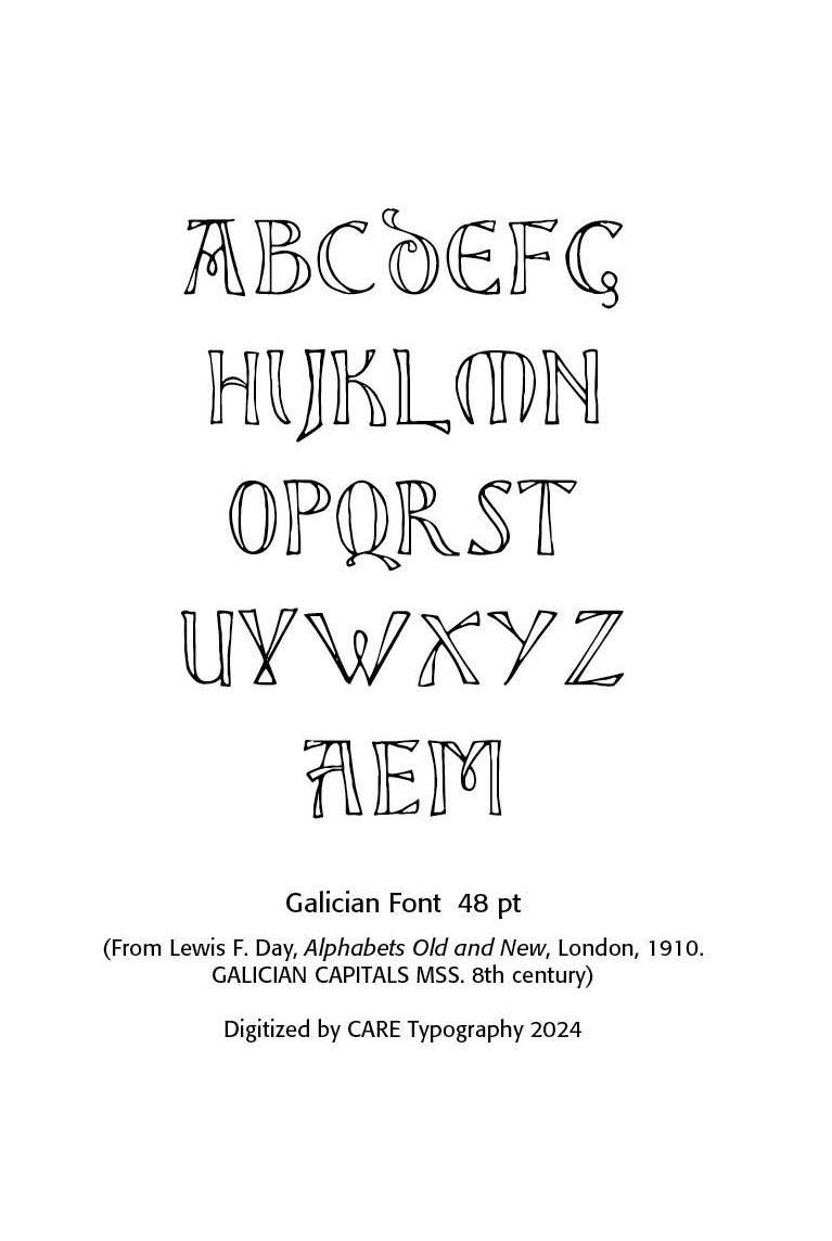
8th Century Galician. Galician (Galego) is a language spoken primarily in the region of Galicia in northwestern Spain. It is closely related to Portuguese, as both languages evolved from the medieval Galician-Portuguese language spoken in this region during the Middle Ages. Here is an overview of Galician, covering its history, linguistic characteristics, and cultural significance:
Galician developed from Vulgar Latin, the same root as many other Romance languages. It emerged in the early Middle Ages (around the 9th century) in the northwest Iberian Peninsula, where the Kingdom of Galicia played a key role in medieval Spain.
From the 12th to the 14th century, Galician and Portuguese were essentially the same language. During this time, it was the language of lyric poetry and courtly culture across the Iberian Peninsula. Over time, the political separation of Galicia from Portugal (following the creation of the Kingdom of Portugal) led to the divergence of the two languages, with Galician increasingly influenced by Spanish, while Portuguese evolved separately.
After the 15th century, Galician’s prestige declined as Spanish became the dominant administrative and cultural language in Galicia. However, in the 19th century, there was a revival of Galician, particularly with the Rexurdimento (Resurgence), a cultural movement aimed at restoring the prestige of the Galician language.
The Royal Galician Academy (Real Academia Galega) is the main body that regulates the language, setting orthographic and grammatical norms. The Galician language is a cornerstone of Galician identity, and many cultural expressions, such as folk music, poetry, and literature, are closely tied to the language. Notable authors like Rosalía de Castro and Manuel Rivas have written in Galician, contributing to its literary tradition.
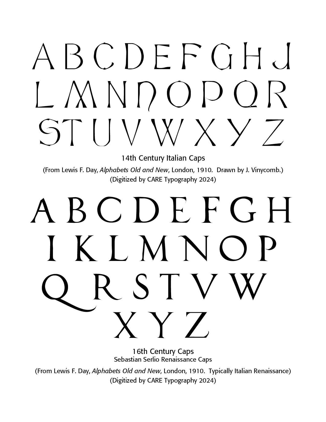
Fourteenth Century This century, as modeled by Victorian calligraphic artist, John Vinycomb, an internationally acknowledged expert in heraldry, saw the number of carefully drawn alphabets delivering a "skeleton" of lettering with all letters of equal stroke width in his Modern Sans font.
He also drew a number of other alphabets, Italian 14th Century Capitals, Modern Roman French Style and Modern Roman Italics OldStyle. The 14th Century Italian Caps are digitized by CARE Typography from Day's book. Dick Pope in 2012 created the digital typefaces LFD Thin French 208 and LFD 14th C Italian 75 from Day's panels. In 2020 Paul Hardin released LDN Queenstown at London Type.
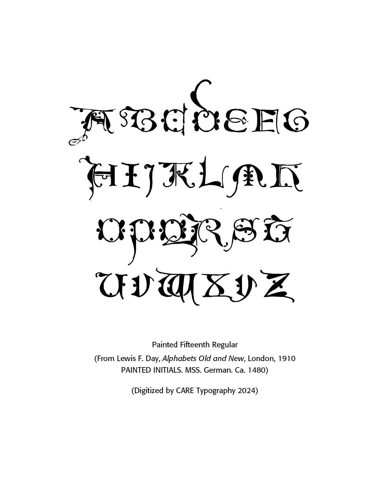
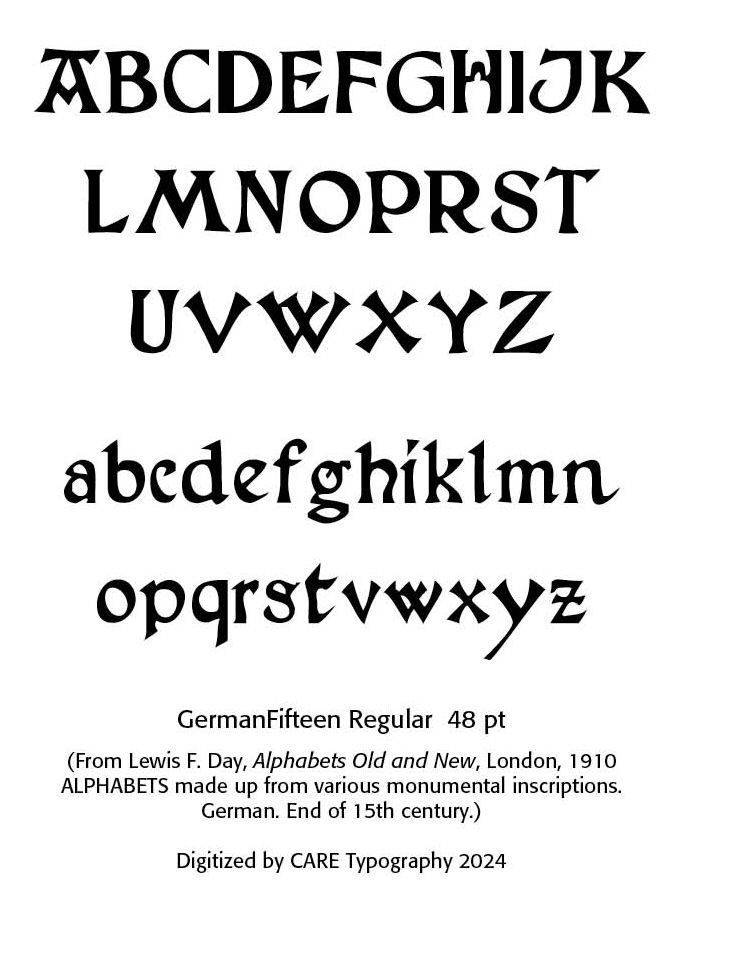
Fifteenth Century. More extreme fonts are produced as in the sample below. Note the Gothic styled "D, " "E," and "M." Lewis Day notes these are painted initials from Germany around 1480.
Sixteenth Century Sebastiano Serlio, an Italian Mannerist architect, engraver and painter of the sixteenth century, designed some of the most refined variants of the classic Roman letters—the prototypical Italian Renaissance roman alphabet, also known as Serlio's Alphabet. Born in Bologna in 1475, he died in 1554. He was part of the Italian team building the Palace of Fontainebleau.
This font digitized by CARE Typography from Day's Panels, notes the flourishing tail of the "Q" letter. Note also the tail of the letter "R." The serifs are precise and inviting. There are a few roman capital fonts in the digital age. These include Serlio (1990, Linotype), Sentian (Novel Fonts) and Opti Serlio (Castcraft).
German Blackletter Fonts. At the end of the 15th century, German printing was at the forefront of a revolutionary transformation in Europe, driven by the invention of the movable-type printing press by Johannes Gutenberg in the mid-15th century. This development had a profound impact on culture, education, and the dissemination of knowledge. By the end of the century, Germany had become one of the key centers of printing in Europe, particularly in cities like Mainz, Nuremberg, and Augsburg.
By 1500, there were over 1,000 printers operating in various German cities, making Germany a leading hub for the printing industry. Notable printing centers included: Mainz—The birthplace of Gutenberg’s press; Nuremberg — An important center for both printing and intellectual activity; and, Augsburg—A commercial and printing hub.
Books printed before 1501 are referred to as incunabula. German printers produced a significant portion of the incunabula, with many focusing on religious texts such as the Bible, liturgical works, and theological treatises. Secular works, including classical texts, legal documents, and scientific works, also gained prominence towards the end of the century.
German printers played a key role in developing early typefaces. One of the most popular was Blackletter (also called Gothic script or Fraktur), which dominated printed works in Germany during this period. The dense and elaborate script was particularly suited to religious and formal texts.
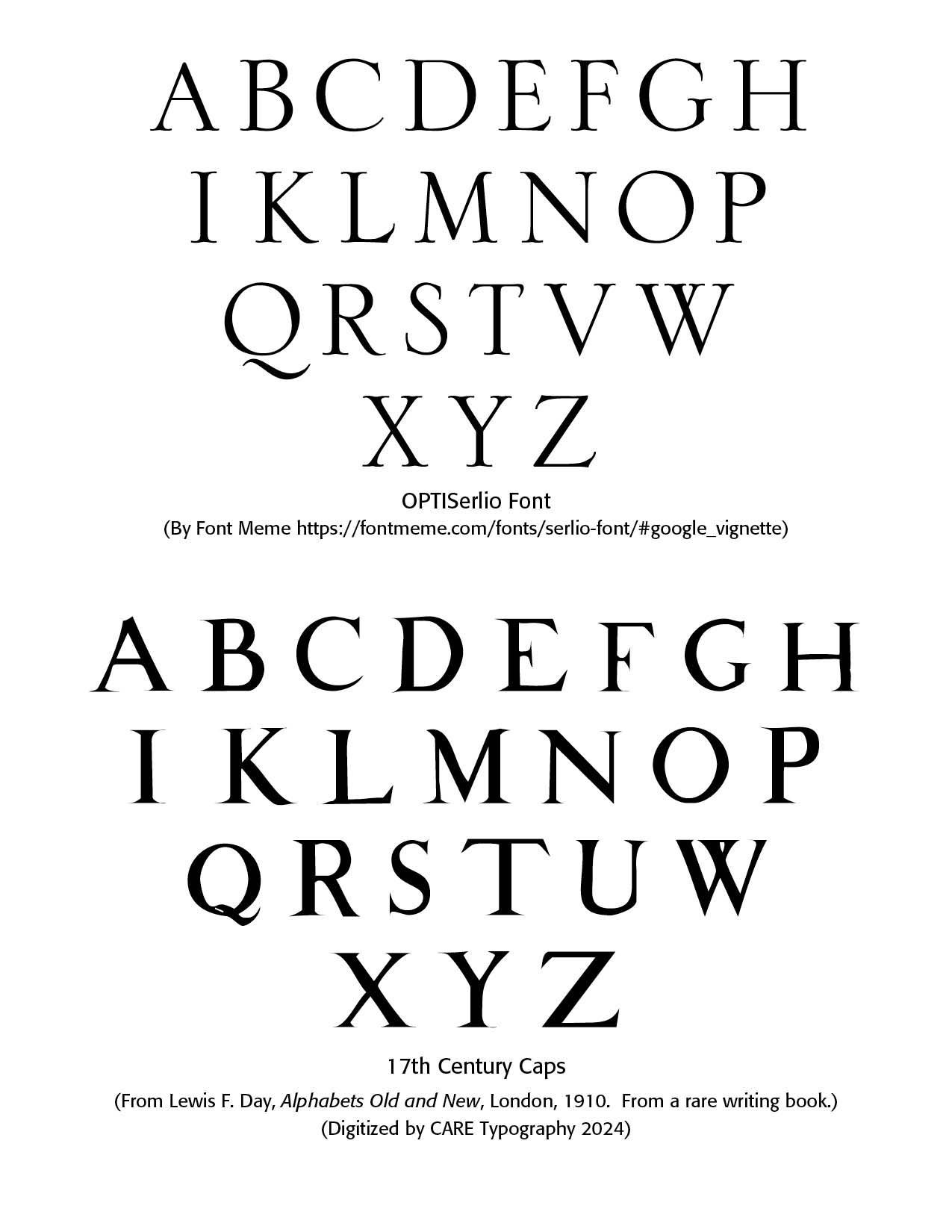
The modern font Serlio has been digitally produced by Linotype. Note that the tail on this Linotype "Q" does not match the flourishing tail on the original "Q" above. Serlio is a fine digital Titling typeface. OptiSerlio has been copyrighted by Castcraft Software, Inc. 1990-1991, but is available for personal use by many other companies.
Seventeenth Century The sample provided by Day is noted by the short middle stems in the "E" and "F" letters. This has also been digitized by CARE Typography. These capital letters are from a rare writing book, says Lewis Day. They stand out as fine samples of Roman serif type.
Percy John Delf Smith (March 1882 – 30 October 1948) was a British artist who worked in engraving, painting, lettering, calligraphy and book design. He studied at Camberwell and the Central Schools of Arts and Crafts. His instructor in lettering at Camberwell was Edward Johnson, an extremely influential calligrapher and lettering artist whose Arts and Crafts movement style of lettering and use of Roman capitals had a strong influence on Delf Smith's career.
Delf Smith then established a career as a lettering artist and teaching the topic, publishing Lettering & Writing, a slipcase of lettering models, in 1908. His teacher and mentor, Edward Johnson, wrote that "The Roman capitals have held the supreme place among letters for readableness and beauty. They are the best forms for the grandest and most important inscriptions. Delf Smith shared this style, naming his workshop the Roman Lettering Company and commenting that Roman lettering has "content and atmosphere, and good examples convey a sense of stability and satisfaction." (wikipedia) Note the slightly upturned bottom serifs and what are called the "old style" numerals.

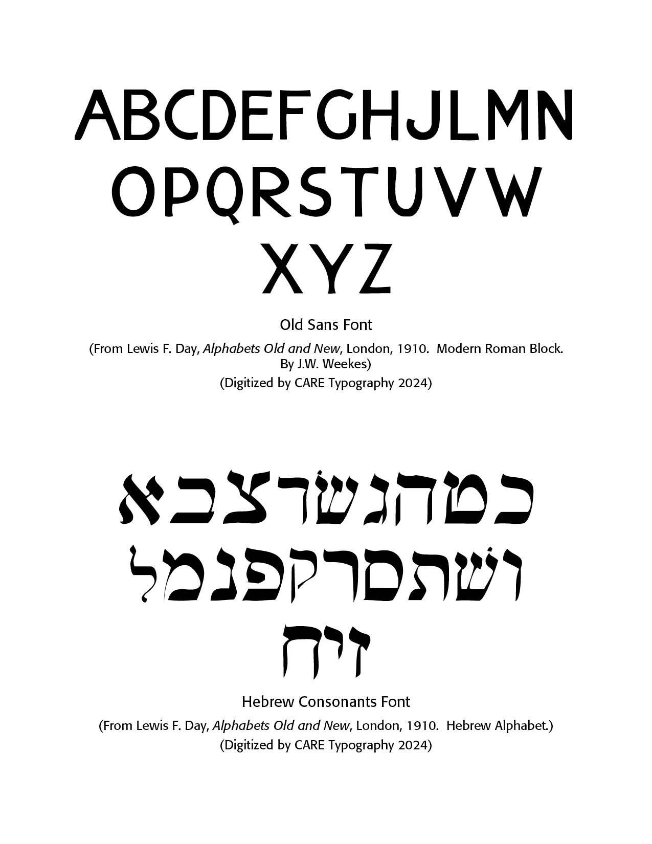
J.W. Weekes produced a "sans serif" (without feet) modern Roman block font, miscalled "Egyptian" as Day notes in his book. Weeks was a letterer from the last part of the 19th century. Examples of his alphabets, taken from the 1910 book by Lewis Foreman Day, include Modern Roman and Modern Roman Block. Crane TitlingNF by Nick Curtis in 2006 is a digital typeface with medieval-inspired uppercase letters drawn by famed book illustrator Walter Crane. This Modern Roman Block font, called Old Sans in the diagram, has been digitized from Day's book by CARE Typography.
J.W. Weekes is a distinguished typographer and printer renowned for his contributions to the art and craft of typography. With a deep appreciation for the historical and aesthetic aspects of print design, Weekes has dedicated his career to advancing the standards of typographic excellence.
His work is characterized by a meticulous attention to detail and a commitment to blending traditional techniques with modern innovations.
Weekes' expertise spans a range of disciplines within the field, including type design, letterpress printing, and bookbinding. His innovative approach to typography has earned him recognition in various design and print media, and his projects often reflect a deep respect for the craft's rich heritage.
In addition to his professional work, Weekes is a passionate advocate for the preservation of traditional printing methods and the promotion of typographic education. His contributions to workshops, publications, and conferences have helped to inspire a new generation of designers and printers. (Chat GPT)
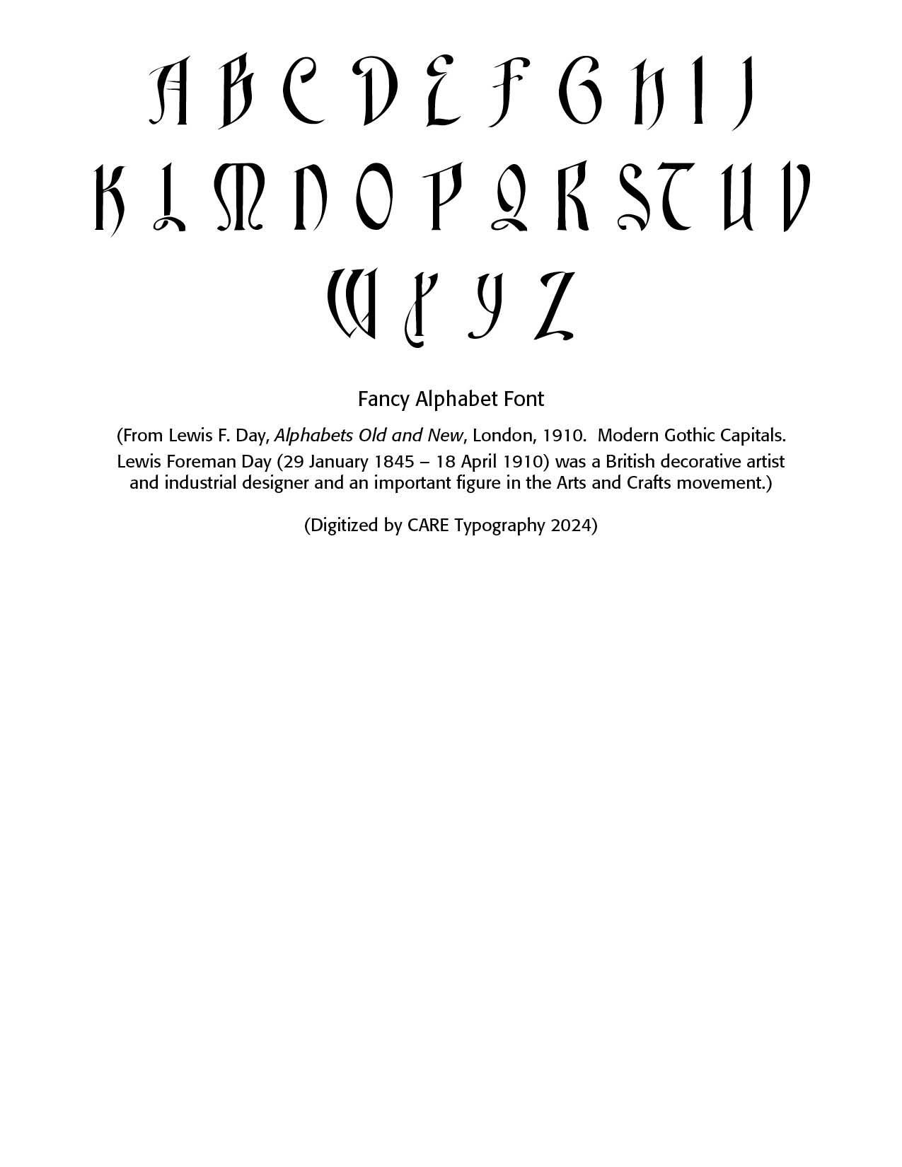
The final choice titling font I have named the Fancy Alphabet Font. It is Modern Gothic Capitals digitized from Day's book by CARE Typography. Lewis Day introduces this font with the words — "Meant to be fanciful, but not to do any great violence to accepted form. An alphabet in which there is the least approach to design is always in danger of being considered illegible. Legibility is for the most part the paramount consideration; but there are cases, however rare, in which it is permitted even to hide the meaning so long as it is there, for those whom it may concern."
Successful Layout & Design