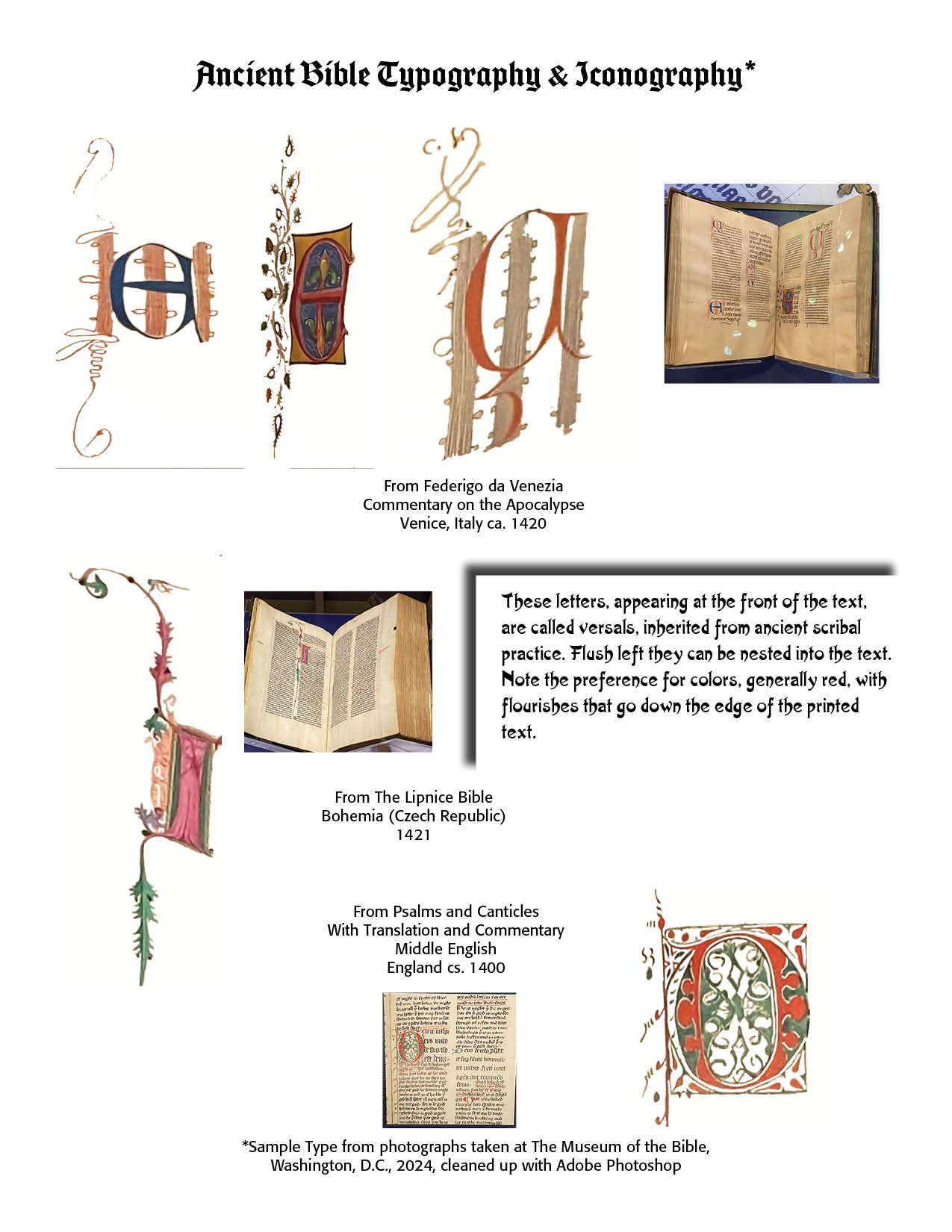
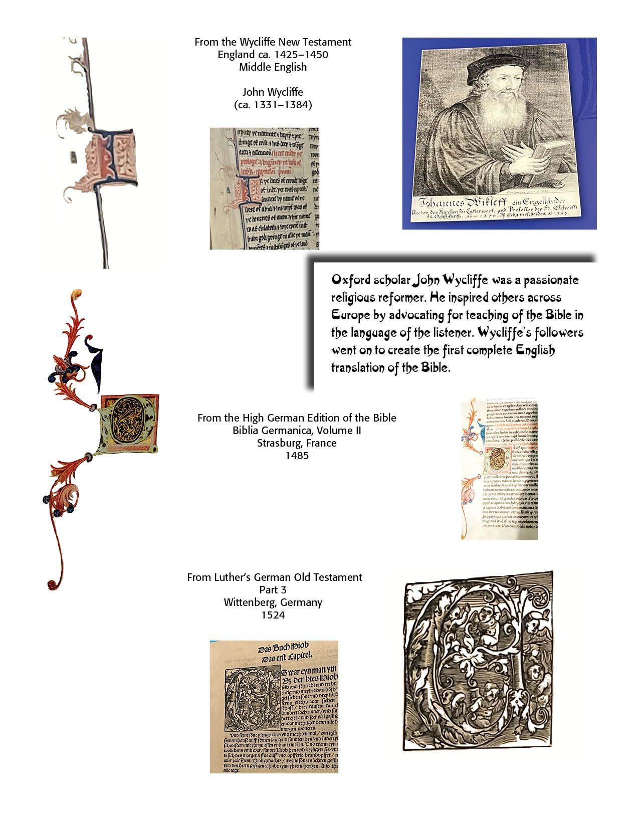
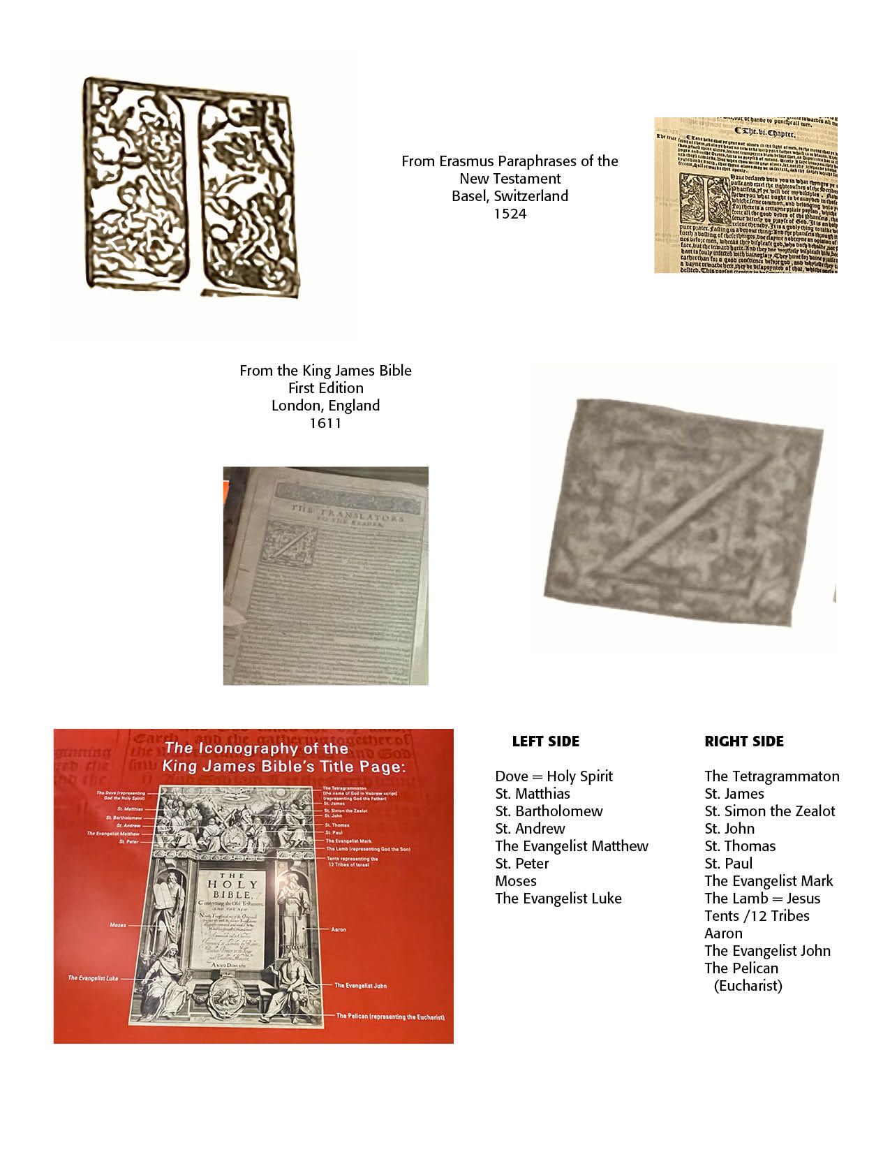
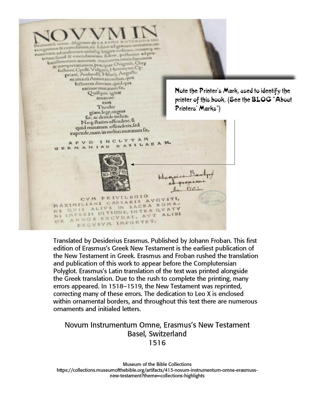
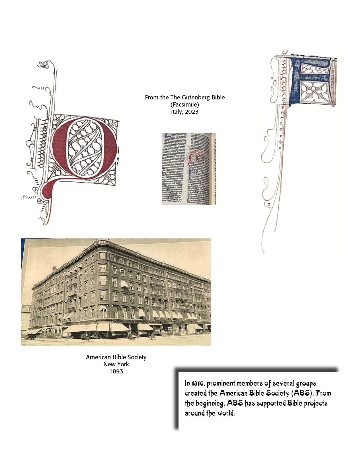
Old Bible Typography Versals

Carl Shank • April 19, 2024

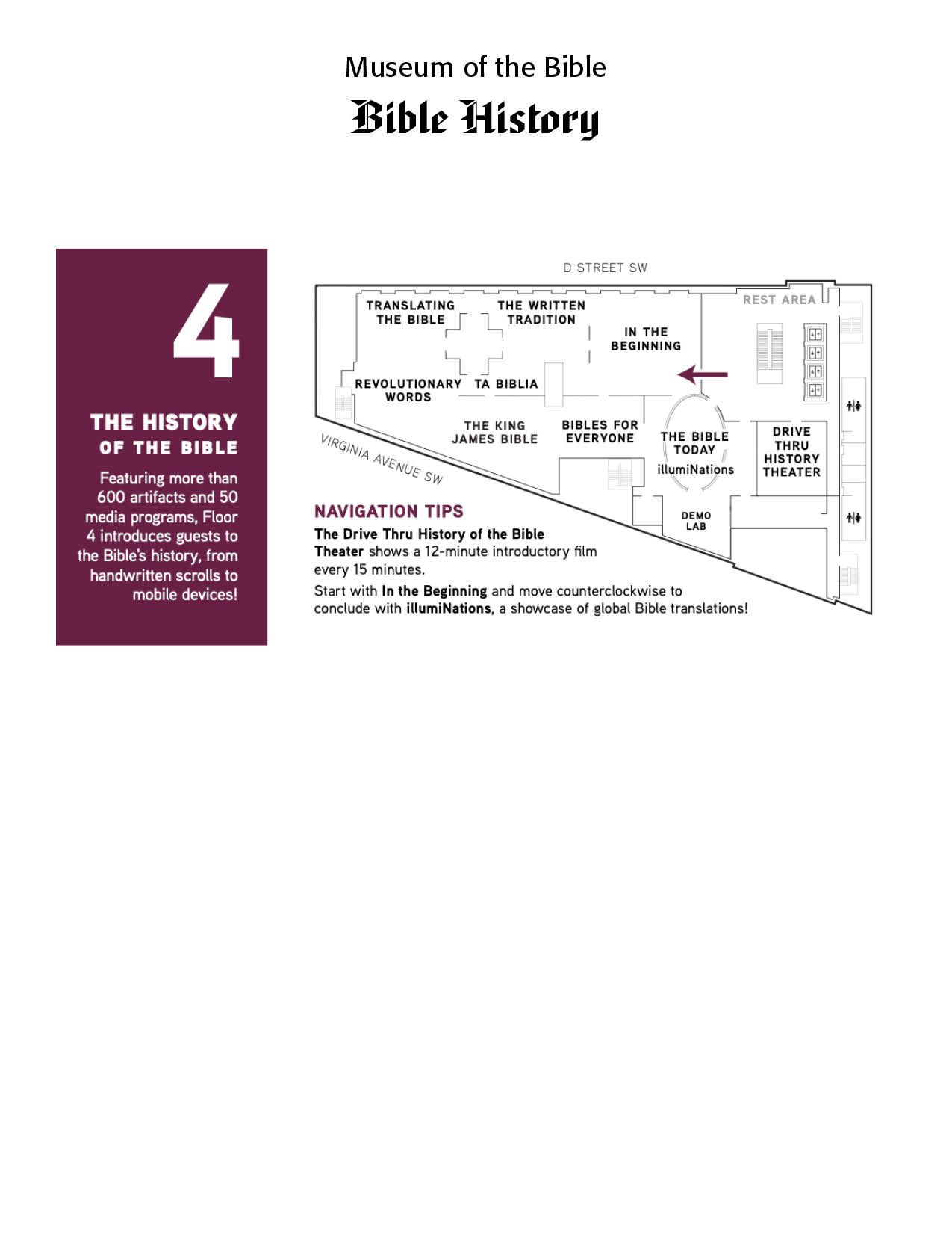
My wife and I took a trip to Washington, D.C. to the Museum of the Bible. This is an amazing place with collections of Bible history, Bible characters and Bible applications for the interested viewer. We especially toured the fourth floor that contains more than 600 artifacts and 50 media programs introducing us to the Bible's history, from handwritten scrolls to mobile devices.


As a theologian and typographer, I was interested in not merely the history of the printed Word of God, but also how it was printed through the ages. I was especially fascinated by the delicate and intricate versals, those opening letters and flourishes to the printing. I have gathered a number of the versals and cleaned them up using Adobe Photoshop for display.


The pages below contains some of the oldest versals used in Bible typography and printing. They are historically valuable and worth our time and effort in viewing and understanding. Enjoy them!

Successful Layout & Design

By Carl Shank March 15, 2025
Wide Is Beautiful What makes a typeface beautiful? Aesthetically pleasing fonts or typefaces have differing qualities that make them suitable and beautiful in different contexts and uses. I have chosen six (6) wide or "extended" font faces to highlight the inherent beauty and usability of such type. The samples chosen range from well used Adobe fonts to a specialty antique wide font CARE Typography crafted from an old fashioned type book published by Frederick Nelson Phillips, Inc of New York back in 1945.
By Carl Shank February 22, 2025
Italics . Typography historically received its most valuable improvements from the printers of Italy giving us three text-letters of greatest usefulness : (1) the Roman typeface, first founded by Sweinheym and Pannartz in 1465, and afterward perfected by Jenson at Venice in 147 1 ; (2) Italic and (3) Small Capitals, introduced together by Aldus Manutius at Venice in 1501. The first volume entirely in Greek was printed at Milan in 1476 ; the first book entirely in Hebrew, at Soncino in 1488. The transition from Gothic to Italic typefaces was part of the broader evolution of typography that took place during the Renaissance period, driven by shifts in cultural, aesthetic, and technological factors. Gothic script was primarily used for religious texts, legal documents, and early printed books like the Gutenberg Bible. It symbolized tradition, formality, and authority. Gothic, was characterized by its dense, angular, and ornate letters, often with sharp vertical strokes, tight spacing, and elaborate flourishes. It was designed to mimic the style of manuscript writing at the time.
Show More