Slashes & Dashes
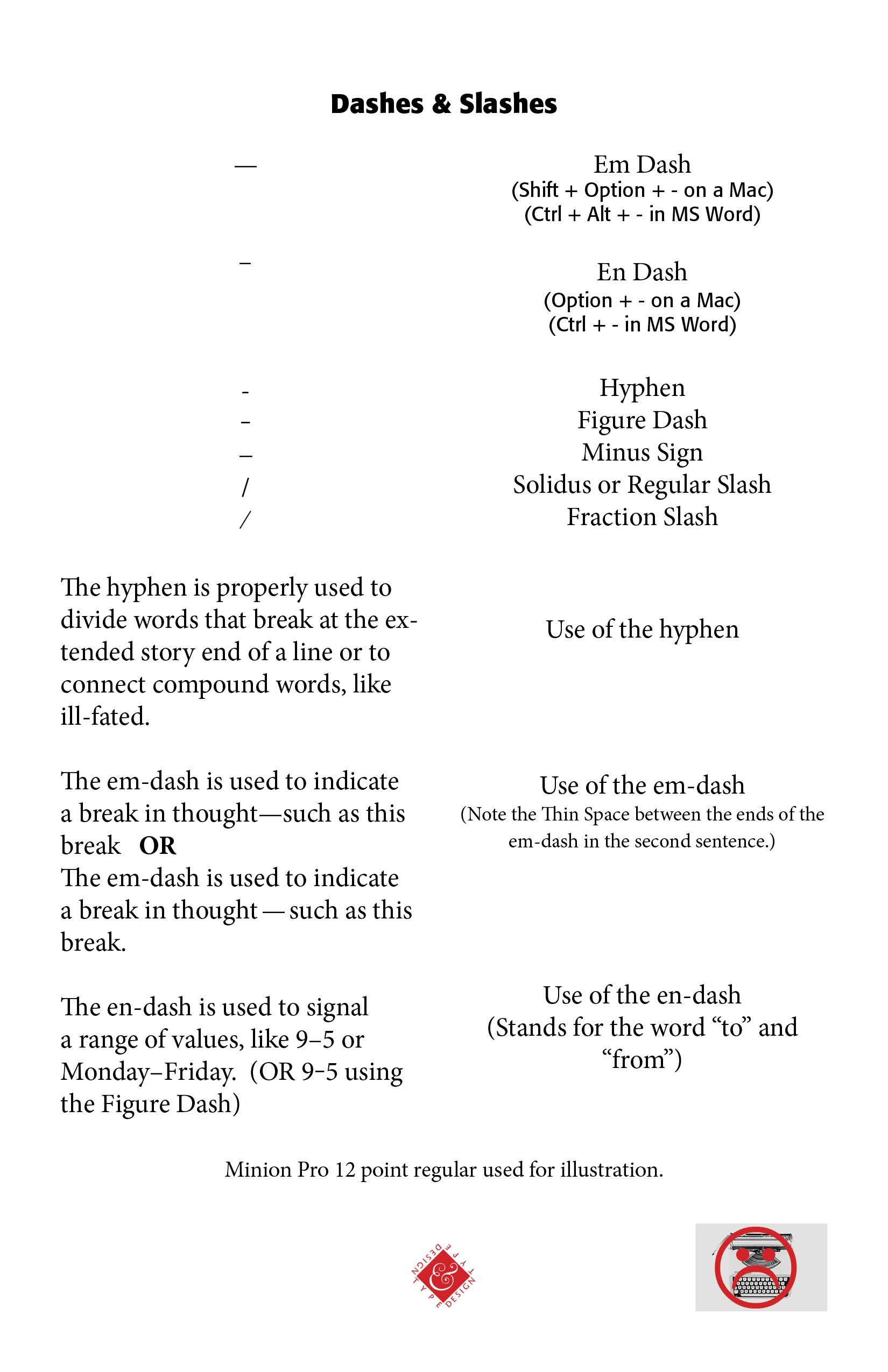
Slashes & Dashes. In old typewriter days, we used a stoke (-) for a hyphen and a double stroke (--) for a dash. Those days are gone. The typewriter has given way to computer keyboards and word or layout programs. And so, it is appropriate that we discuss the three commonly used dashes in the computer and layout world — the em-dash, the en-dash, the hyphen. There are other kinds of dashes, such as the subtraction dash, which may or may not be the same length as the en-dash, and the figure dash (equal to the width of a standard numeral).
The shortest in length of the three, the hyphen is used to divide words that break at end of lines, or to connect compound words, such as non-believer. It is easily found on the keyboard to the right of the numeral zero. The longest of the three, the em-dash (— [Shift + option + - on a Mac]) is used in sentences that involve a break in thought or action, such as "There were the days—actually seeming longer than most—that tried men's souls."
The mid-sized en-dash is often used to indicate a range of values or a span of time or numerical quantities, such as 9–5 or Wednesday–Friday, similar to using the words "to" or "from." However, a figure dash may be more pleasing to the eye in numerical quantities. (See Sample Below) Bringhurst notes — "The hyphen is too short to serve this function, and in some faces the en dash (which is traditionally prescribed) appears too long. A three-to-em (M/3) dash is often the best choice. Three-to-em dashes are missing from many type fonts, but they are easily made on digital equipment, by condensing or shortening an en dash.") (Robert Bringhurst, The Elements of Typographic Style, Hartley & Marks, 1992, 78)
Normally, there is no space break between the beginning and the end of an em-dash. However, in some quarters, it is thought that a small space or even a regular space at the beginning and end of an em-dash makes the text more readable and flows better. And others prefer to use en-dashes instead of the longer em-dashes in a book or document. The key is always consistency of use, whatever dashes are used with whatever spacing. Whatever we do, we need to avoid the double hyphen approach (--) when seeking to use a dash in a sentence or phrase. The old typewriter days are gone and should be gone in our writing and typesetting.
Successful Layout & Design