Blog Layout

Certificates & Awards

Carl Shank • September 10, 2022

Designing Certificates and Awards

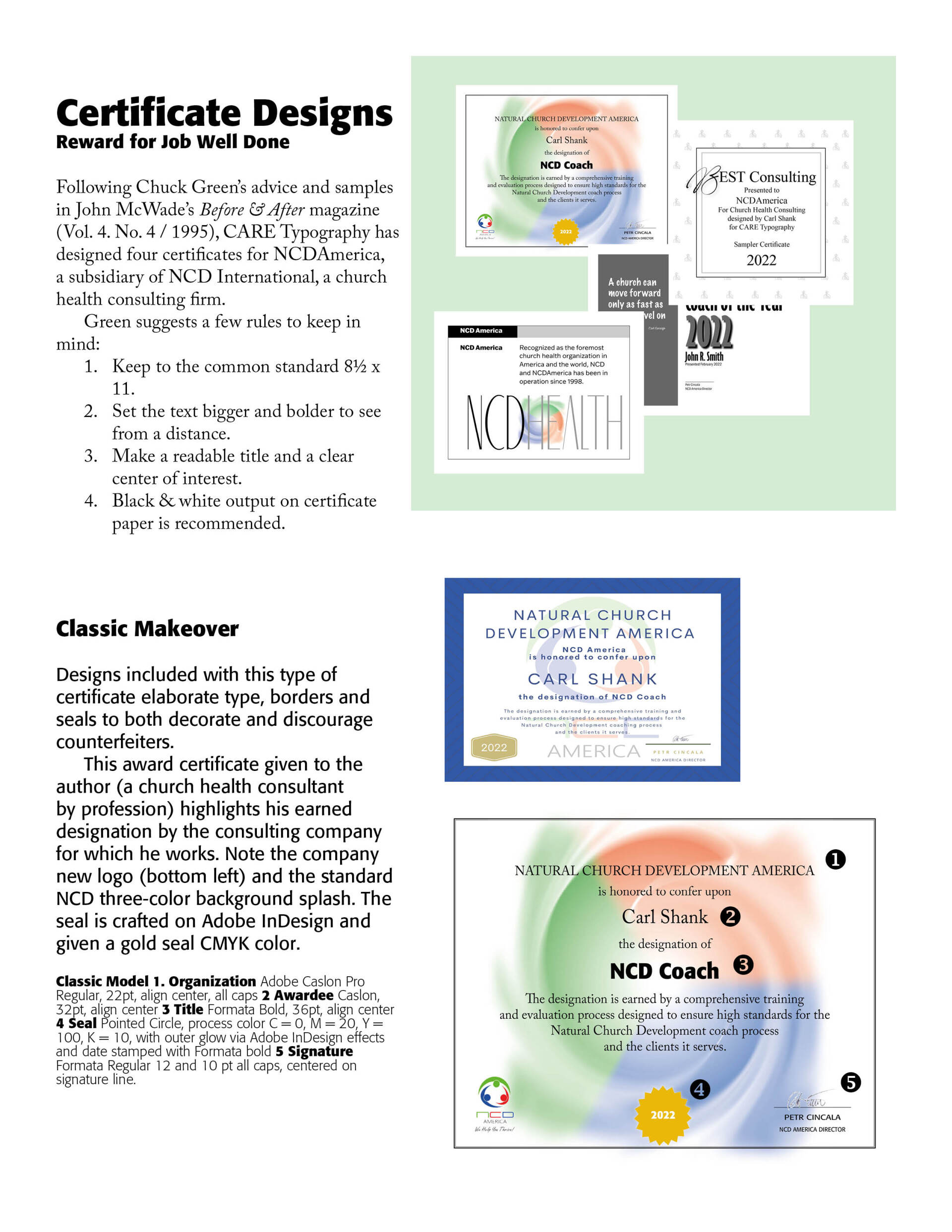
Everyone likes to be recognized for a job well done or for a special milestone accomplished. We can do this, in part, through certificates and award papers that are then framed and given to the recipient. However, there is not much thought through design given to the standard certificate. Preprinted certificate papers with fancy border designs help, but the typesetting and layout in the heart of the certificate often lacks power or pizzazz. In Example one below, I redid a certificate given to me by an employer, NCDAmerica, which is a church health consulting firm in Michigan. I have been licensed through them since 1998 and specialize in church consultations in the Northeast. You will note how I redid the layout and design below.


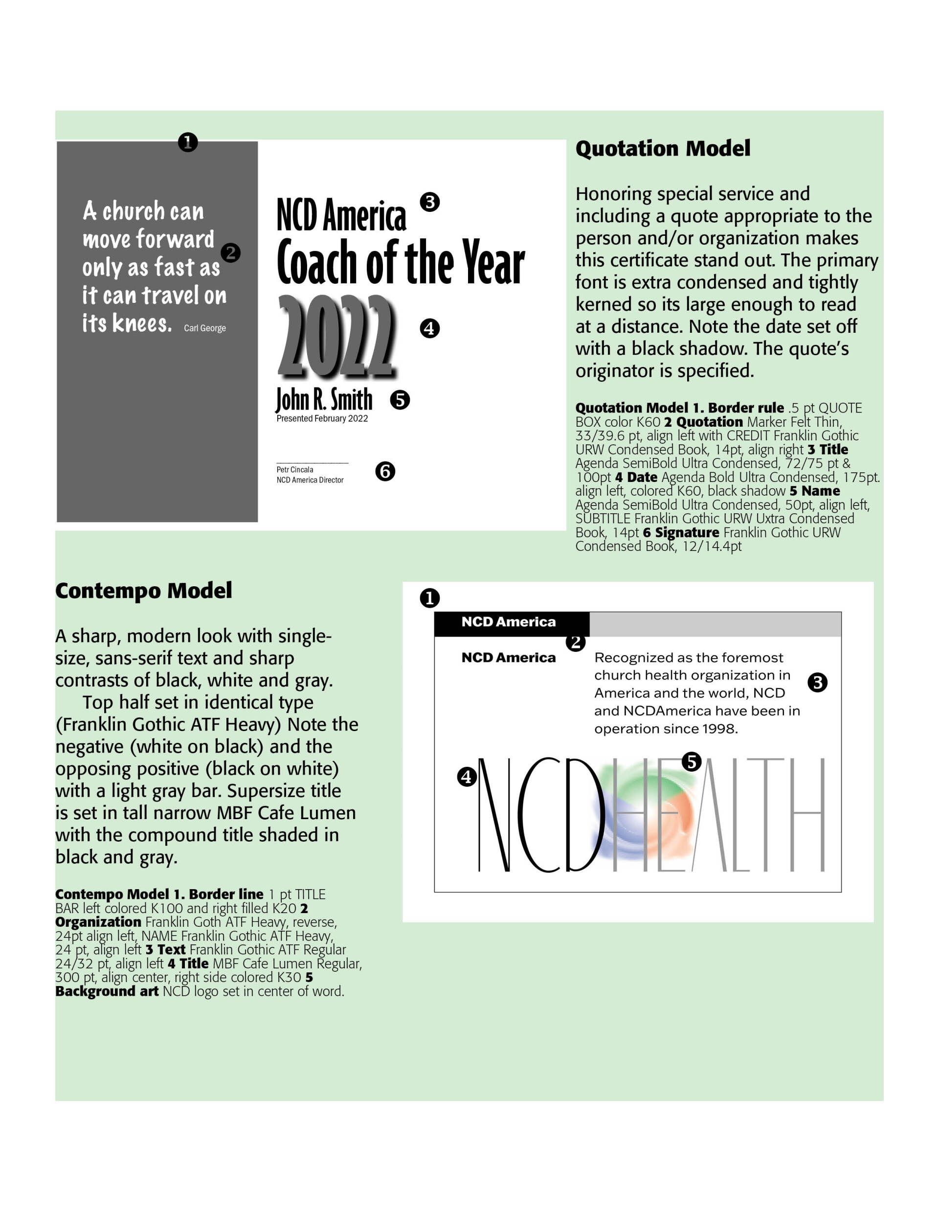
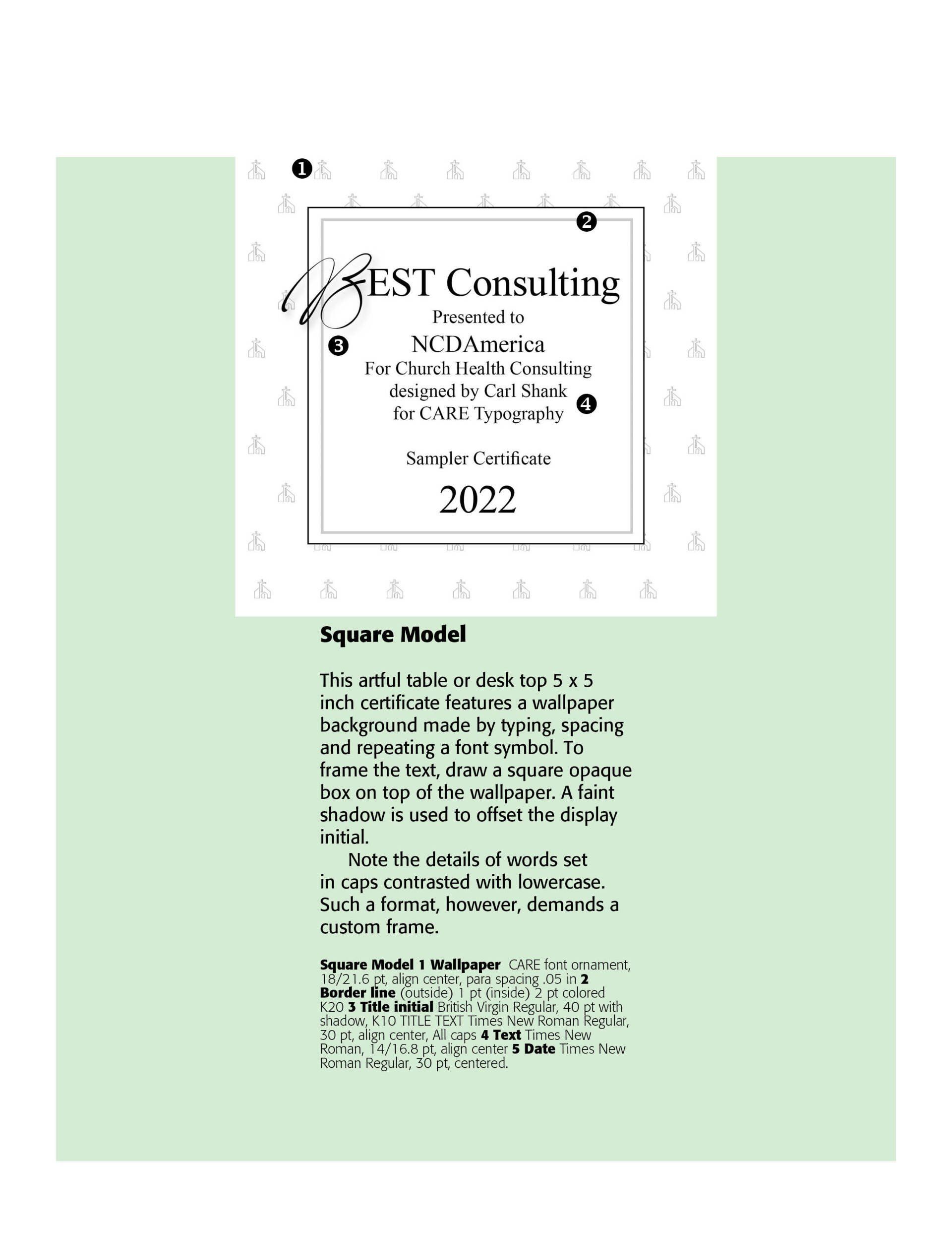
Certificates usually have eight or nine standard elements — (1) Name of presenter; (2) Title; (3) Name of recipient; (4) Reason for the presentation; (5) Term of membership or certification (if applicable); (6)Date presented; (7) Signatures of presenter or presenter's agent; (8) Presenter's logo or seal; and (9) Presenter's city and state. Chuck Green in John McWade's excellent Before & After magazine (Vol. 4, No. 4 / 1995) gives ample clues as to content and design of certificates and awards. I have designed some certificates for NCDAmerica, a church health consulting firm, originally in Germany and based in several countries. Note the examples below.

Successful Layout & Design

By Carl Shank March 15, 2025
Wide Is Beautiful What makes a typeface beautiful? Aesthetically pleasing fonts or typefaces have differing qualities that make them suitable and beautiful in different contexts and uses. I have chosen six (6) wide or "extended" font faces to highlight the inherent beauty and usability of such type. The samples chosen range from well used Adobe fonts to a specialty antique wide font CARE Typography crafted from an old fashioned type book published by Frederick Nelson Phillips, Inc of New York back in 1945.
By Carl Shank February 22, 2025
Italics . Typography historically received its most valuable improvements from the printers of Italy giving us three text-letters of greatest usefulness : (1) the Roman typeface, first founded by Sweinheym and Pannartz in 1465, and afterward perfected by Jenson at Venice in 147 1 ; (2) Italic and (3) Small Capitals, introduced together by Aldus Manutius at Venice in 1501. The first volume entirely in Greek was printed at Milan in 1476 ; the first book entirely in Hebrew, at Soncino in 1488. The transition from Gothic to Italic typefaces was part of the broader evolution of typography that took place during the Renaissance period, driven by shifts in cultural, aesthetic, and technological factors. Gothic script was primarily used for religious texts, legal documents, and early printed books like the Gutenberg Bible. It symbolized tradition, formality, and authority. Gothic, was characterized by its dense, angular, and ornate letters, often with sharp vertical strokes, tight spacing, and elaborate flourishes. It was designed to mimic the style of manuscript writing at the time.
Show More
Share by: