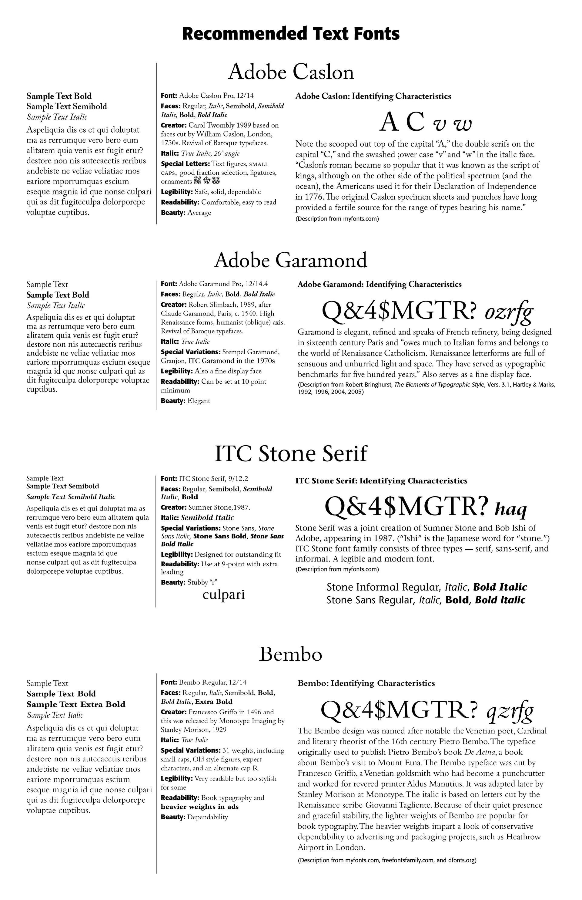
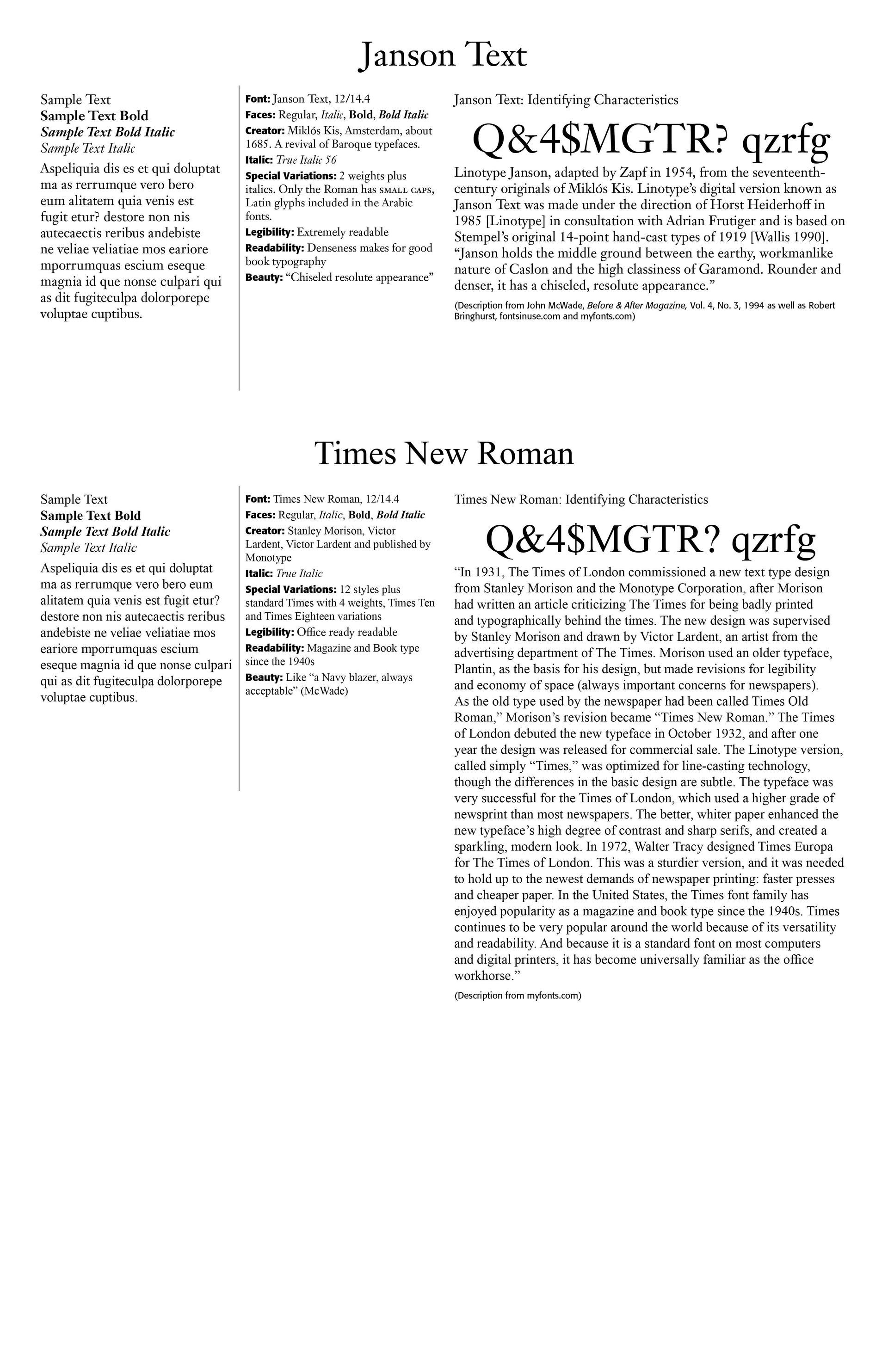
Type for Text
Type for Text. What type do you use for regular text, such as in books, articles, reports, proposals and the like? A number of typographers and writers throughout history have settled on actually a few few faces that make it to the top of the list for typing regular text. I have noted them and written about them in the graphics below. Some very favorite type for text faces include Adobe Caslon, Adobe Garamond, Janson Text, and Times New Roman, all of which have been faithfully used throughout the history of book making. Designed by Robert Slimbach, Arno Pro is also a favorite face of mine that I have used in a number of books I have written. I find the face inviting, clear, very readable and legible and dense enough and comfortable enough for any reader.
Myfonts.com notes this about the Arno font — "Named after the Florentine river which runs through the heart of the Italian Renaissance, Arno draws on the warmth and readability of early humanist typefaces of the 15th and 16th centuries. While inspired by the past, Arno is distinctly contemporary in both appearance and function. Designed by Adobe Principal Designer Robert Slimbach, Arno is a meticulously-crafted face in the tradition of early Venetian and Aldine book typefaces. Embodying themes Slimbach has explored in typefaces such as Minion and Brioso, Arno represents a distillation of his design ideals and a refinement of his craft. As a multi-featured OpenType family, with the most extensive Latin-based glyph complement Adobe has yet offered, Arno offers extensive pan-European language support, including Cyrillic and polytonic Greek. The family also offers such typographic niceties as five optical size ranges, extensive swash italic sets, and small capitals for all covered languages."
What makes a font a good and highly usable text font? John McWade in his expertly written and illustrated Before & After Magazine series, said it well — "The hallmarks of good text type are legibility and readability. Legibility refers to clarity; it's how readily one letter can be distinguished from all others. Readability refers to how well letters interact to compose words, sentences and paragraphs. When evaluating the choices,, your operative word is medium." (John McWade, Before & After, Vol. 4. No. 3. 1994) Medium fonts include fonts with medium x-height, that is the height of a lowercase letter of a typeface, fonts with medium height-to-width ratio in the individual letters, that is, letters that do not look distorted or weirdly shaped, and fonts with some variability in stroke weights that distinguish each letter from its neighbors. The latter description leads us away from too uniform geometric sans-serif styles and beautiful, super thin strokes of some modern styles of fonts.
The fonts I have chosen, with help from McWade and others, are great text fonts. They show up well in text heavy applications. I have included some of the history of the font in the ones chosen below. In addition to the faces mentioned above, I have included Stone Serif, a relatively modern face, and Bembo, a stylish face for some jobs. Use these time tested fonts for your heavy text work, and you will not be disappointed.
Successful Layout & Design


