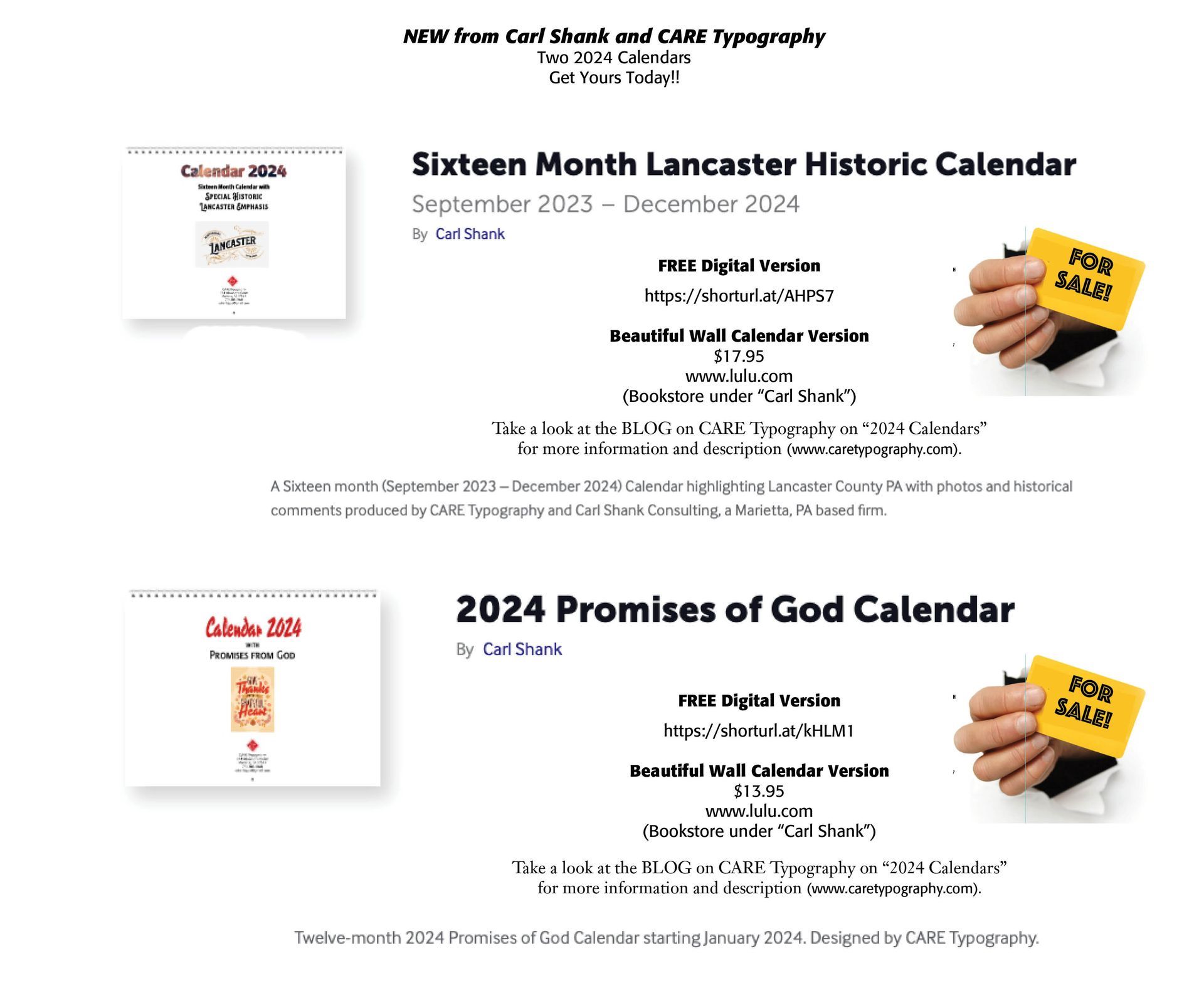
Blog Layout

Calendars for 2024

Carl Shank • July 20, 2023

Calendars for 2024. Everyone needs a calendar, and CARE Typography has produced two new 2024 Calendars. Each Calendar has the recognized national holidays cited with a graphic. They are both available in a FREE digital edition AND a beautiful color printed wall calendar edition.


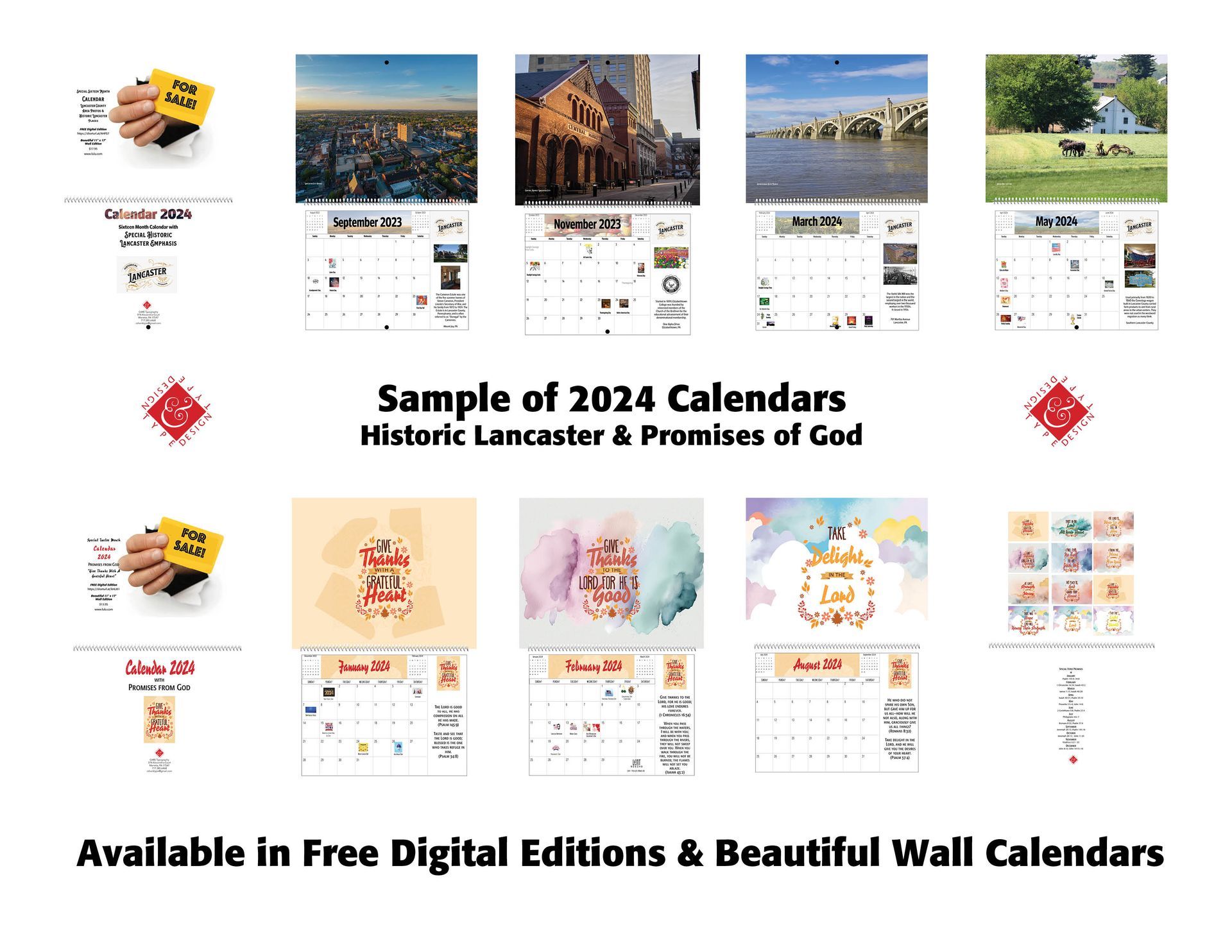
The 2023-2024 Historic Lancaster Calendar is a sixteen-month Calendar with a modern photo supplied by area photographers and historic places noted on the side of the calendar days. This is a Calendar for Lancaster County, PA history buffs as well as those interested in Lancaster County places and sights.


The 2024 Promises of God Calendar is a twelve-month 2024 Calendar with specific verses from Scripture citing the promises of God for Christians. The large graphics have been designed using Kittl templates. Each month is a reminder of God's gracious promises to his people. It is also available as a FREE digital calendar as well as a beautiful color printed wall calendar.


The printed color wall calendar editions can be purchased from the Bookstore at www.lulu.com under the name "Carl Shank." Prices are given in the Ad below.


We invite you to purchase both for your home or office!

Successful Layout & Design

By Carl Shank March 15, 2025
Wide Is Beautiful What makes a typeface beautiful? Aesthetically pleasing fonts or typefaces have differing qualities that make them suitable and beautiful in different contexts and uses. I have chosen six (6) wide or "extended" font faces to highlight the inherent beauty and usability of such type. The samples chosen range from well used Adobe fonts to a specialty antique wide font CARE Typography crafted from an old fashioned type book published by Frederick Nelson Phillips, Inc of New York back in 1945.
By Carl Shank February 22, 2025
Italics . Typography historically received its most valuable improvements from the printers of Italy giving us three text-letters of greatest usefulness : (1) the Roman typeface, first founded by Sweinheym and Pannartz in 1465, and afterward perfected by Jenson at Venice in 147 1 ; (2) Italic and (3) Small Capitals, introduced together by Aldus Manutius at Venice in 1501. The first volume entirely in Greek was printed at Milan in 1476 ; the first book entirely in Hebrew, at Soncino in 1488. The transition from Gothic to Italic typefaces was part of the broader evolution of typography that took place during the Renaissance period, driven by shifts in cultural, aesthetic, and technological factors. Gothic script was primarily used for religious texts, legal documents, and early printed books like the Gutenberg Bible. It symbolized tradition, formality, and authority. Gothic, was characterized by its dense, angular, and ornate letters, often with sharp vertical strokes, tight spacing, and elaborate flourishes. It was designed to mimic the style of manuscript writing at the time.
Show More
Share by: