Using Open Type Fonts
Using Open Type Fonts*
Most modern fonts are what we call "Open Type" fonts (See my Blog Post "More About Fonts"). The advantages of Open Type fonts are mainly fourfold — (1) they have a larger glyph limit (usually about 65,000 glyphs). This is an advance over the traditional 256 glyphs in a standard Type 1 or TrueType font. (2) They are cross platform fonts, thus able to be used in both Mac and Windows applications. (3) They offer support for both PostScript Type 1 and True Type outlines. (4) They support advanced typographic features. More on this later.
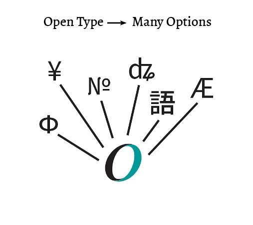
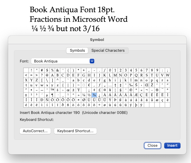
Open Type fonts can contain many thousands of characters and multiple alphabets, such as Latin, Greek, and Cyrillic; or kanji, kana, and romaji for Japanese use). OpenType fonts can also include typographic refinements such as true small caps, different styles of figures, and extensive sets of ligatures and alternates, as well as complete sets of accented characters and diacritical marks. Different applications have differing levels of support for all the OpenType features.However, not all programs can support all Open Type features, as shown by the Windows fraction 3/16 in Microsoft Word in the Windows font Book Antiqua Sample below.
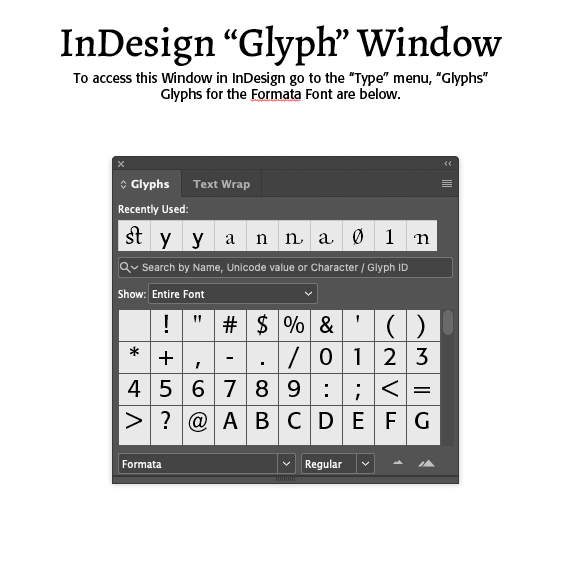
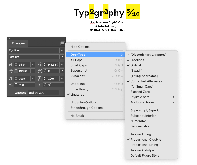
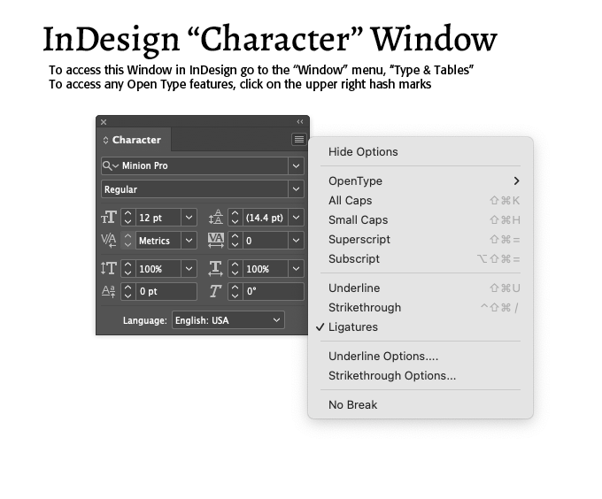
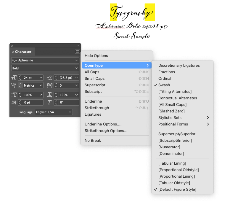
Open Type options built into advanced programs, such as Adobe InDesign and Photoshop CC include several features, that can be turned on in the "Character" menu under InDesign (See Sample Below) —
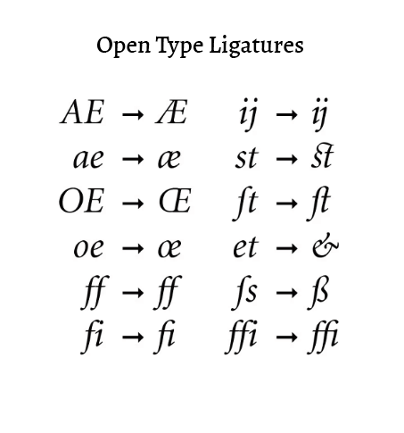
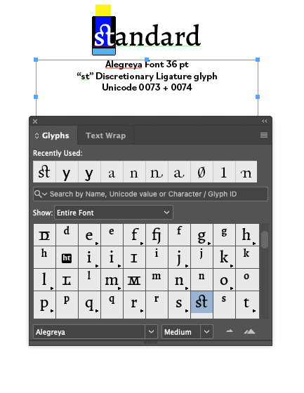
Ligatures — Ligatures are typographic combinations of two or more letters into a single character (See Sample Below). There are three types of Ligatures, Standard, Discretionary and Historical. You are most likely familiar with Standard Ligatures, such as the combination of "f" plus "l" in fl or "f" plus "f" plus "i" in ffi. Discretionary ligatures are decorative in nature, adding a unique visual element to text that does not affect its readability nor functionality (See Sample Below). Historical Ligatures maintain old-fashioned letter combinations, used for centuries by typographers, such as the combination œ ("o" plus "e") seen in medieval manuscripts. Actually, this lexical ligature is called an "ethel" and typographically required for deliberate archaism and for academically correct quotation from older English sources, as well as in some French phrases, such as hors d'œuvre.
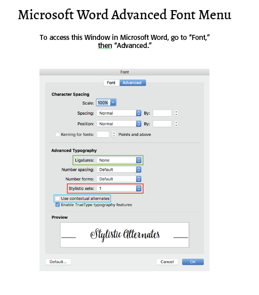
Contextual Alternates — Contextual alternates are ligatures that are applied to individual characters based on the letters around them (their context). Contextual alternates can also be applied to entire words in certain contexts, for example, words frequently used in titles (such as "of" and "the"). When contextual alternates are enabled for a font, they are used instead of the standard ligatures in those contexts defined by the font designer. In Microsoft Word, contextual alternates can be found in the Open Type Features group, "Advanced" tab, on the "Font" dialogue.
Discretionary Ligatures — Discretionary ligatures are designed to be ornamental and not specifically designed for readability. They are not common in use. Texts usually borrow some of their elements as accents.
Swashes — (See Example Below) A swash is a typographical flourish, such as an exaggerated serif, terminal, tail, entry stroke, etc., on a glyph. The use of swash characters dates back to at least the 16th century, as they can be seen in Ludovico Vicentino degli Arrighi's La Operina, which is dated 1522.
Stylistic Alternates — Stylistic alternates, or simply "alternates," usually placed in one of the stylistic set features ( ss01 - ss20 ), are usually simple one-to-one substitutions (no context) and, of course off, by default. The user can enable them.
Titling Alternates — These are specially-designed capitals that are intended for display usage. Titling characters differ from their text counterparts in that their scale, proportion and design details have been altered to look best at larger sizes.
Ordinals — In common (rather than mathematical) usage, ordinals are superscripted letters following a number, such as in 1st, 2nd and 3rd. They are used in other languages as well, for example, the Spanish and Portuguese "a" and "o" ordinals. (See Sample Below)
Fractions — Fractions can be divided into three categories–basic, extended and arbitrary. Basic fractions are ¼, ½ and ¾, and are standard in many fonts in all formats. Extended fractions are found in many, but not all, OpenType fonts, and usually include 1/8, 3/8, 5/8, 7/8, and sometimes 1/3 and 2/3. Arbitrary fractions include anything and everything else, such as 18/256. (See Sample Below and my Blog on "About Well Defined Fractions")
Choosing Glyphs
A glyph is a single representation of a character. Every font has a Unicode character map that links (abstract) character IDs with how to display that character, using the default glyphs. A single character can have multiple glyphs (alternates), and a single glyph can represent multiple characters (ligatures). (See Sample Below)
Open Type in Microsoft Word
Those who use Microsoft Word will note that Word has limited Open Type support and uses. What are generally available, if the font in question has them, are Stylistic Alternates, Contextual Alternates and Standard and Discretionary Ligatures. Thus, the fl ligature, for example, can be accessed in Word (See Example Below). If the Open Type font has fractions that go beyond the normal fractional glyphs, they will also be available in Word documents. Most likely, however, fractions that are real typographic fractions are limited in Word usage.
To access these features in Word, (1) Select your text and go to to Format > Font and select the Advanced tab. (2) For Stylistic Alternates, click on the dropdown menu under “Stylistic Sets” and choose one of the sets. Keep in mind that not all fonts will have 20 stylistic sets. (3) To enable contextual alternates, check the box toward the bottom. Ligatures — If you click on the dropdown beside Ligatures you’ll be able to choose from Standard ligatures, Historical and Discretionary, and so forth. (See Sample Below)
To access Open Type glyphs in other text programs, you have to use what is called PUA Unicode-mapping. Unicode has been around for several decades, but it didn’t come into the limelight until 2000 when Adobe and Microsoft jointly adopted Unicode for font encoding. Today, Unicode is the default character encoding for nearly all computer technologies.Unicode is a common character set that is supported on the Windows, Apple, and Unix platforms. It assigns a unique number (called a code point) to each character of the world’s major languages, plus mathematical symbols, common decorative symbols like checkboxes, diacritical marks, punctuation, and other characters. Unicode supports more than 900,000 code points which means it can handle more than 900,000 characters or glyphs. That’s a huge increase from legacy TrueType and PostScript fonts which had only 256 code points.
Consequently, using Unicode, a typist can access characters such as true prime (U 2032), double prime (U 2033) and true quotes. For Windows users, (1) Open the Windows Character Map App; (2) Set the Font to the desired one in the list; (3) At the bottom, check [ ] Advanced View; (4) Set “Group by:” to Unicode Subrange; (5) At the bottom of the list, select “Private Use Characters." You can also use a glyph finder app like "PopChar" (https://ergonis.com/popchar $29.99)
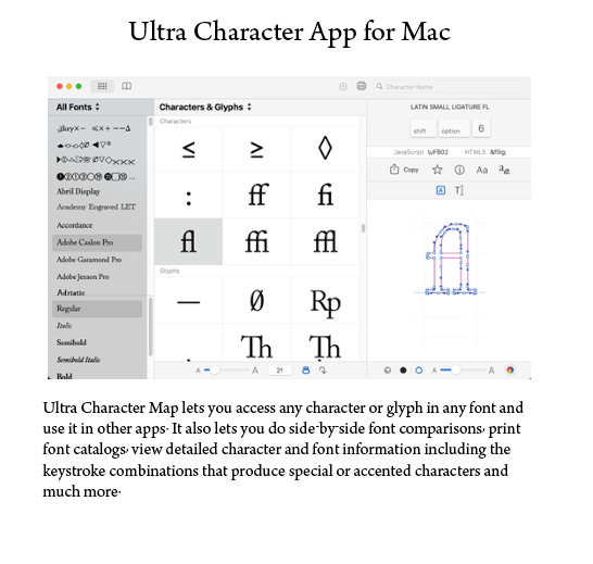
For Mac users, (1) Open the FontBook app; (2) To copy characters, go to Preview / View > Repertoire; (3) Select and copy (CMD + C) the desired character; (4) You can then paste (CMD + V) the character(s) into the text field of your open program (such as Microsoft Word.) Or, you can use an app, like PopChar or Ultra Character Map (https://x04studios.com/ultracharactermap.html $9.99 for Mac)
The point is that Open Type has a myriad range of use and features open to the general and specialized user of open type fonts. Enjoy getting to know and use them in your documents!
(*Much of this article and the back splash for this blog are adapted from the Creative Market blog, https://support.creativemarket.com/hc/en-us/articles/360037478813-Using-Fonts-with-Special-Features-OpenType-#opentype) Swiss Army knife is from SkyVectors.

Successful Layout & Design


