Work or Craft?
Work or Craft?
Is Typography and Printing “Work” or A “Craft”?
I recently read an interesting and provocative chapter in the book by Dorothy Sayers, Letters to a Diminished Church: Passionate Arguments for the Relevance of Christian Doctrine. The chapter, “Why Work?” promotes work “not as a drudgery to be undergone for the purpose of making money, but as a way of life in which the nature of man should find its proper exercise and delight and so fulfill itself to the glory of God.” She goes on to say that “We should ask of an enterprise, not ‘will it pay?’ but ‘is it good?’; of a man, not ‘what does he make?’ but ‘what is his work worth?’; of goods, not ‘can we induce people to buy them?’ but ‘are they useful things well made?’; of employment, not ‘how much a week?’ but ‘will it exercise my faculties to the utmost?’”
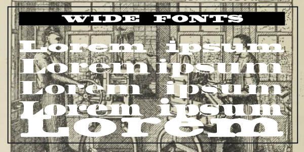
This got me thinking about typography and the printing profession. Are they “work” or, as Roger Bringhurst says, “Typography is the craft of human language with a durable visual form . . . its heartwood is calligraphy — the dance, on a tiny stage, of the living speaking hand — and its roots reach into living soil, though its branches may be hung each year with new machines. So long as the root lives, typography remains a source of true delight, true knowledge, true surprise.” (The Elements of Typographic Style, 11)
Such expressive descriptions of typography and the printing profession defies the historical and tedious work of typesetters and printers throughout the years. In the early years of printing, compositors and presswork became separated and almost at odds with each other. Compositors believed “their reading skills and proficiency in Latin and Greek made them superior to pressmen who presumably had been selected for their physical strength, a necessary requirement in the laborious operation of the hand presses.” (Alexander Lawson, “Thoughts on the Typo Workplace,” Electronic Publishing, 1994)
He notes that “working conditions for compositors so employed approached the horrendous — long hours of work, from five in the morning to eight at night, lighting by candle and noisome lanterns, and the discomfort of 6-point type.” (Lawson) He quotes a letter written to the Typographic Journal in 1894 by the wife of a newspaper comp on the harsh conditions her husband had to labor — “I do believe that the morning newspaper, set by weary, sweating, half-blinded, nerve exhausted humans, who are driven to the saloon to recuperate by temporary exhilaration, and to early graves by soul and body enervating toil in unwholesome, ill-ventilated, stinking, over heated composing rooms is a greater curse to humanity than the much dreaded [Linotype] machine can ever be.” The mortality rate of TB among printers of the period was double that of the community as a whole, with alcoholism an acute problem.
Of course, life itself was hard and harsh in those days with sweat shops and young children employed without adequate safety standards and unbelievably bad working conditions. Yet, Lawson says “we can be thankful to those old-timers who gradually, albeit painfully, brought about a workplace more amenable to health and prosperity.” Such “work” seems a long distance from the “craft” of typesetting and typography in general. Today, our problems are mostly orthopedic problems because of ill-designed seating or unhealthy computer-generated vision issues.
This brings us to the central issue raised by Sayers — Do we work to live or live to work? Have we indeed forgotten that secular work is sacred work, and that quality of work, work worth doing and in which we can take pride has been replaced by consumerism and the unhealthy desire for more and more stuff? From the point of view of both a seminary trained professional minister and an amateur typographer, this is a crucial question for every printer and every typographer.
There are relatively few professionally satisfied typographers and happy printers. I know a few. But I also know the drive to produce, produce, produce and to make more money all the time. The New York Times mantra, “All the news that is fit to print,” can be easily morphed into “All the news that will produce more money and more power.” Indeed, what is “fit to print” becomes “what will the market bear and want.” Mega-print houses can be driven to produce what will sell, instead of printing carefully crafted typographical pieces that will bring few monetary rewards. Do we live to print or print to live? Do I craft and set type to live or live to craft and set type?
The problem is losing the craft of typography and printing to the pressure-driven business world of producing what will sell and make a profit. This is an age-old problem, of course, but I would ask my typography and printing friends for their answer — Do I do what I do to live, or do I live to do what I do? Sayers notes the fruits of living through World War 2 — “We have had to learn the bitter lesson that in all the world there are only two sources of real wealth: the fruit of the earth and the labor of men; and to estimate work not by the money it brings to the producer, but by the worth of the thing that is made.”
Successful Layout & Design