Blog Layout

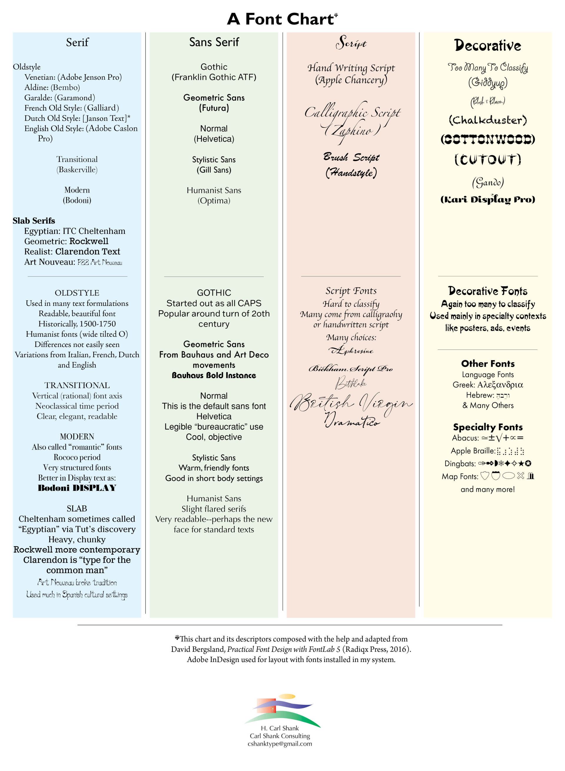
A Helpful Font Chart

Carl Shank • October 5, 2022

There happen to be a number of ways to classify fonts. Some of them make more sense to me than others, though I would hasten to point out I am no professional typographer. Robert Bringhurst in his masterful book, The Elements of Typographic Style, Hartley & Marks, 1992 edition, chooses categories consequent with historical periods of fine art, thus, Scribal or Carolingian, Renaissance, Mannerist, Baroque, Rococo, Neoclassical, Romantic, Realist, Geometric Modernism, Expressionist, Elegiac Post-Modernism, Geometric Post-Modernism.(1) Thomas Phinney's classifications taught in most design schools include: Old Style, Transitional, Modern, Slab Serif (or Egyptian), fat faces, wood type, Art Nouveau, Art Deco, synthesis, and grunge.(2) David Bergsland, from which I adapted the following chart and its descriptors, reduces the families to: Serif, Sans-Serif, Script and Decorative. Again, that is not all there is to the many fonts out there, but it is a good start.


The chart below gives a graphic representation of Bergsland's system of classification, along with some of my additional notes. Enjoy!


(1) Bergsland, David. Practical Font Design With FontLab 5 (pp. 217). Radiqx Press. Kindle Edition. (2) Ibid, p. 219.

Successful Layout & Design

By Carl Shank March 15, 2025
Wide Is Beautiful What makes a typeface beautiful? Aesthetically pleasing fonts or typefaces have differing qualities that make them suitable and beautiful in different contexts and uses. I have chosen six (6) wide or "extended" font faces to highlight the inherent beauty and usability of such type. The samples chosen range from well used Adobe fonts to a specialty antique wide font CARE Typography crafted from an old fashioned type book published by Frederick Nelson Phillips, Inc of New York back in 1945.
By Carl Shank February 22, 2025
Italics . Typography historically received its most valuable improvements from the printers of Italy giving us three text-letters of greatest usefulness : (1) the Roman typeface, first founded by Sweinheym and Pannartz in 1465, and afterward perfected by Jenson at Venice in 147 1 ; (2) Italic and (3) Small Capitals, introduced together by Aldus Manutius at Venice in 1501. The first volume entirely in Greek was printed at Milan in 1476 ; the first book entirely in Hebrew, at Soncino in 1488. The transition from Gothic to Italic typefaces was part of the broader evolution of typography that took place during the Renaissance period, driven by shifts in cultural, aesthetic, and technological factors. Gothic script was primarily used for religious texts, legal documents, and early printed books like the Gutenberg Bible. It symbolized tradition, formality, and authority. Gothic, was characterized by its dense, angular, and ornate letters, often with sharp vertical strokes, tight spacing, and elaborate flourishes. It was designed to mimic the style of manuscript writing at the time.
Show More
Share by: