About Ordinary Type

Carl Shank • October 3, 2022

About Ordinary Type. The type you use everyday is important to your documents. You want legible type that is readable for all kinds of correspondence and reports. We usually give little thought to such type, just trusting our computers to spit out the right look. However, that is often not enough.


Once limited to a few “staples,” users now have thousands of fonts from which to choose. But, who really cares about what typeface is used? You do! Is the type I use “what is pleasing to the eye” (aesthetics/form), or is it simply an issue of “what gets the job done” (mechanics/function)? That’s very often the question.


But, do we care about type? Every time we say, “That’s really nice!” about a wedding invitation, or “This is so clear to read!” about an ad or a flyer, or “That must be really sophisticated!” about a magazine cover, we indicate our care about type. On the other hand, when we squint to read an important announcement, or simply don’t read newspapers or ads due to poor composition, or too many typo’s, we are saying that we care about type. We, consciously or unconsciously, use “bigger” and “bolder” type for signs and directions.


Why? Because we care about legibility. We want the message that our type conveys to get across to those who read it. We want “playful” type for those youth announcements, or children’s functions, or athletic games. While we use either manually paste-in graphics from an art supplier, or computer-generated graphics placed into the text through a page layout program, we show our care about type when we stop to consider what typeface goes with this graphic.


We care about type because we also like to experiment and try a new challenge. So, we spend a few dollars and buy one or two of the many font packs made available to the Mac or Windows user. Then, as many professional typographers quickly point out, we tend to overuse and misuse and do all kinds of “wrong” things with fonts and font combinations. But, we like to experiment with type anyway.


Why should you care about type? Simply because when choosing a typeface, you must consider both character and legibility. Character has to do with the overall personality or mood a typeface projects. Legibility has to do with how easy or difficult it is to recognize each word in a particular typeface. Readability deals with the relative ease with which you can read a printed page. Overall appearance of the page involves how your type is arranged and how the page is designed. Page layout knowledge will help you in the overall “look” of your bulletin or newsletter. Typeface, or font, knowledge will help you better communicate the message you want the reader to receive.


Yes, we want to “get the job done.” We may not want to invest the time or money involved in typographical training. We may not have the slightest inclination to do so. I believe an intelligent and studied use of type choices available to the Macintosh or Windows computer user today can help us achieve that end.


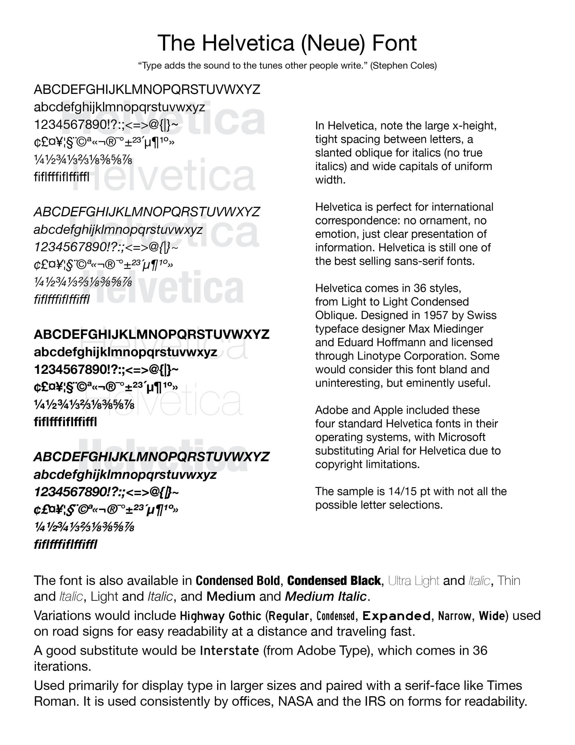
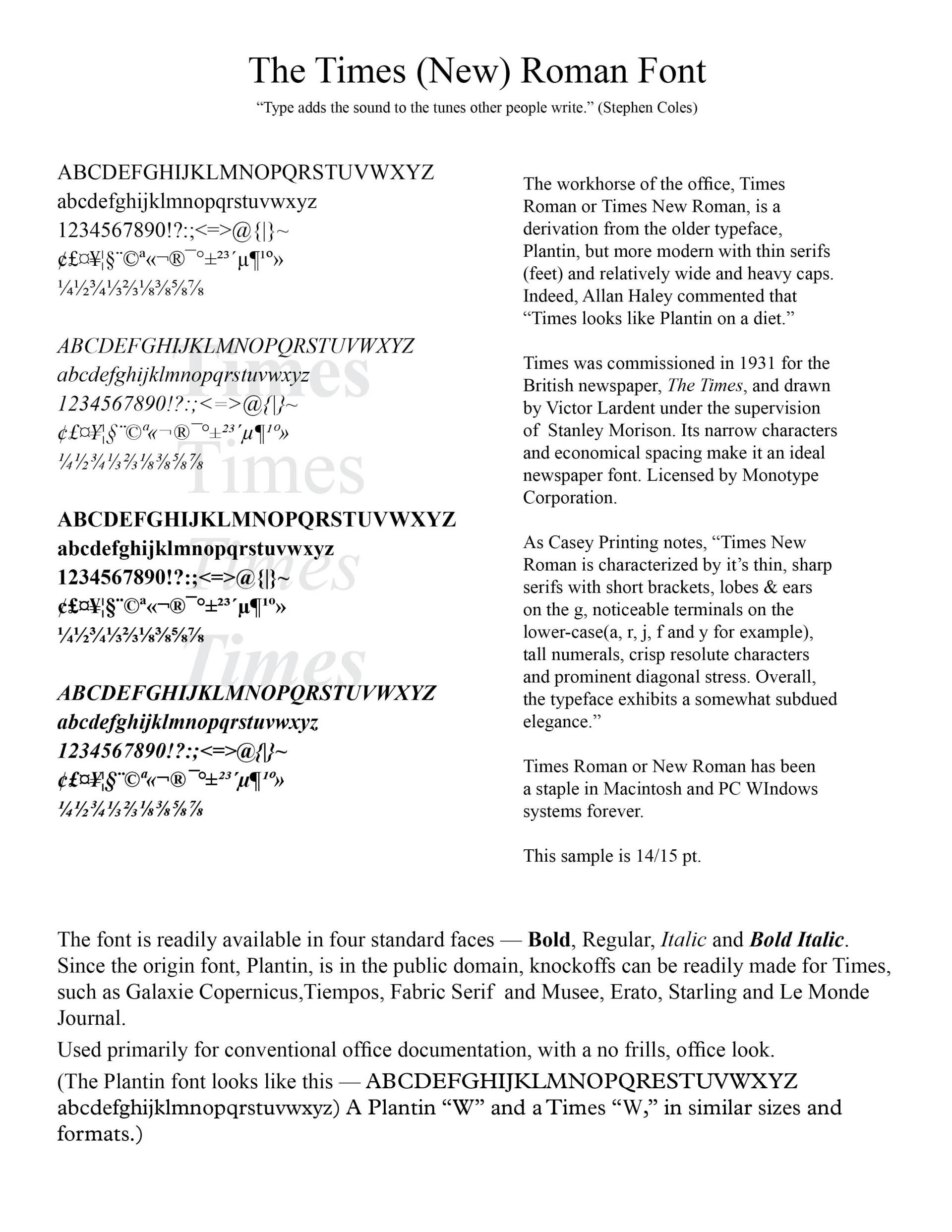
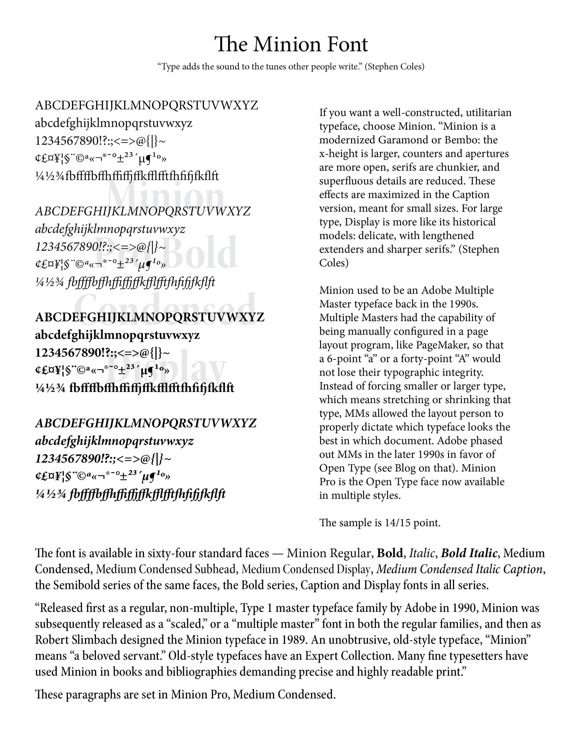
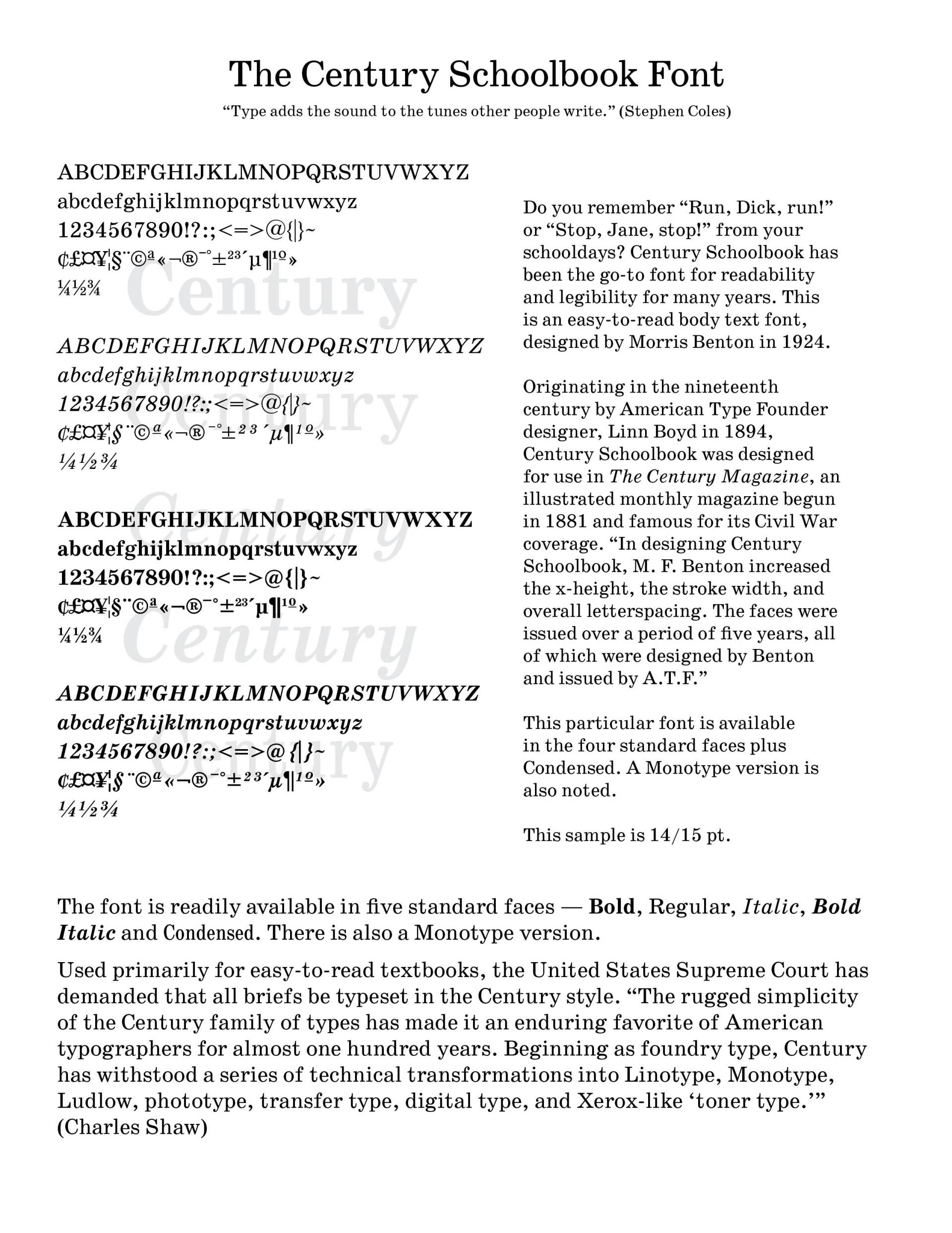
Note the included font sheets below. They will help you understand the type we use everyday and some other type knowledge. I am indebted in these charts to a number of typographers and other articles -- Stephen Coles, The Anatomy of Type: A Graphic Guide to 100 Typefaces, Kindle Edition; Robert Bringhurst, The Elements of Typographic Style (Hartley & Marks, 1992); Philip Brady, Using Type Right: 121 Basic N0-Nonsense Rules for Working With Type (Northlight, 1998); Stephen Moye, Fontographer: Type By Design (MIS Press, 1995); https://en.wikipedia.org/wiki/Helvetica; https://www.caseyprinting.com/blog/2013/typography/times-new-roman-the-newspaper-font; Allan Haley (15 September 1992). Typographic Milestones. John Wiley & Sons. p. 106; https://en.wikipedia.org/wiki/Plantin_(typeface); https://en.wikipedia.org/wiki/Arial)


Successful Layout & Design

By Carl Shank November 18, 2025
Advances in Typography (1500–1900) A Historical Sketch (Part 1) Early Renaissance (1500–1550) We had noted in the Blog “What Happened After Gutenberg: 1460–1640” (November 8, 2025) that movable type spread across Europe beyond its German roots. Gothic Blackletter type, though still used for religious and legal documents, began to give way to Venetian old style humanist faces. Influenced by humanist handwriting and calligraphy, Aldus Manutius and Francesco Griffo developed italic type for compact books. National printing centers became established in Venice, Italy, Paris and Lyon, France, Basel, Germany and Antwerp in the Netherlands The transition from Gothic to Italic typefaces was part of the broader evolution of typography that took place during the Renaissance period, driven by shifts in cultural, aesthetic, and technological factors. The Renaissance, beginning in Italy in the fourteenth century, marked a revival of classical antiquity and a move toward humanism. This brought a renewed interest in the legible, flowing scripts of Roman and Greek antiquity, which were more readable and aesthetically simple compared to Gothic lettering. The development of the printing press (ca. 1440) by Johannes Gutenberg created a need for more versatile and legible typefaces. The emerging humanist values aligned with a preference for typefaces that resembled the clear, round, and graceful writing of ancient Roman scripts.\ The Italic typeface was introduced by Aldus Manutius in Venice around 1501. Italic type is a cursive font based on a stylized form of calligraphic handwriting. Along with Blackletter (See Blog Jan 16, 2025 Blackletter Type and Universities) and roman type, italic has served as one of the major typefaces in the history of Western typography. Italics takes notable influences from hand drawn calligraphy, with italic letters normally slanted slightly to the right. Upper case letters may have typographic swashes, flourishes inspired by ornate calligraphy. The name “italic” comes from their Italian use, to replace documents traditionally written in a hand-written style called chancery hand. Notice also the small “end point bowls” on some of the letters, where the ink pen stopped for a second. While modern italics are often more condensed than roman types, historian Harry Carter describes Manutius' italic as about the same width as roman type. To replicate handwriting, Griffo cut at least sixty-five tied letters (ligatures) in the Aldine Dante and Virgil of 1501. Italic typefaces of the following century used varying but reduced numbers of ligatures. Manutius sought to create more compressed elegant typefaces that could fit more text on a page, catering to the rising demand for smaller, portable books. Italic was based on the handwriting of Niccolò de’ Niccoli, a Renaissance scholar and calligrapher. Italic typefaces are defined by their slanted, cursive-like appearance, with letters that have a flowing, dynamic quality. It allowed for more text to be fitted on the page and mimicked the handwriting style of humanist scholars, like the handwriting of Petrarch. The common italic “slope” was introduced in the sixteenth century — “The first printer known to have used them was Johann or Johannes Singriener in Vienna in 1524, and the practice spread to Germany, France and Belgium. Particularly influential in the switch to sloped capitals as a general practice was Robert Granjon, a prolific and extremely precise French punchcutter particularly renowned for his skill in cutting italics. Vervliet comments that among punchcutters in France "the main name associated with the change is Granjon's.” (Wikipedia on Italic Type) The insertion of an italic typeface alongside a roman face would wait until later to distinguish portions of a book not properly belonging to the work, such as introductions, prefaces, indexes, and notes; the text itself being in Roman. Later, it was used in the text for quotations ; and finally served the double part of emphasizing certain words. Italic type was not only more elegant than the Gothic but also more efficient in terms of space. It became the preferred choice for printed texts that emphasized classical learning, philosophy, poetry, and humanist literature. Italic was initially used for entire texts but later became more common for emphasis alongside Roman type.
By Carl Shank November 8, 2025
What Happened to Type After Gutenberg? A Brief Historical Sketch from 1460-1640 At the end of the 15th century, German printing was at the forefront of a revolutionary transformation in Europe, driven by the invention of the movable-type printing press by Johannes Gutenberg in the mid-15th century. This development had a profound impact on culture, education, and the dissemination of knowledge. By the end of the century, Germany had become one of the key centers of printing in Europe, particularly in cities like Mainz, Nuremberg, and Augsburg. Books printed before 1501 are referred to as incunabula . German printers produced a significant portion of the incunabula, with many focusing on religious texts such as the Bible, liturgical works, and theological treatises. Secular works, including classical texts, legal documents, and scientific works, also gained prominence towards the end of the century. Incunabular typography can be said to have two major sources of inspiration —fifteenth century scribes and German typecutters, the second group of which drew largely on (and sometimes coincided with) the first. Fifteenth-century typography was characterized by both continuity and innovation. Typecutters like Nicolas Jenson and Johan Veldener found themselves highly influential in their regions, designing typefaces for many printers, but scribes also contributed their weight to the design of typography. German printers played a key role in developing early typefaces. However, they were not the only typeface creators and users. There were altogether in the Netherlands twenty-two towns where books were issued before 1500. When printing had once been introduced it spread rapidly, all but three towns starting within the first ten years. Jacob Gibbons notes that types “changed hands” and were sold or rented across Europe, Germany to Italy and France, France and the Rhine valley to England, the Netherlands to England and France to the Netherlands. Type founding and paper making were international businesses. Typography became a vehicle of cultural exchange in late medieval and early modern Europe. Thus typography was as mobile as the printing press itself in fifteenth century Europe, and perhaps a more subtle carrier of cultural, regional, national, and even personal identity. One of the most popular typeface was Blackletter (also called Gothic script or Fraktur), which dominated printed works in Germany during this period. The dense and elaborate script was particularly suited to religious and formal texts. However, that Gothic Blackletter script was developed with nuances across Europe. Gutenberg’s textura quadrata face, used in printing his famous Bible, became Gutenberg textura used in university and legal settings. Albrecht Pfister produced his own typeface, somewhat distinct from Gutenberg, though possibly derived from it. Ulrich Zell used Fust and Schoeffer’s Durandus typeface. Rotunda type became a readable alternative to Gutenberg’s. Zainer’s Cotico Antiqua was used until 1485. The Schwabacher type was a dense but softer face, paving the way until the Fraktur face in the sixteenth century and beyond. By 1500, there were over 1,000 printers operating in various German cities, making Germany a leading hub for the printing industry. Notable printing centers included: Mainz—The birthplace of Gutenberg’s press; Nuremberg — An important center for both printing and intellectual activity; and, Augsburg—A commercial and printing hub. What is often lost in typographical history in the years closely following Gutenberg are the important printers and typographers in Germany, Italy, Switzerland, France, the Netherlands, Spain, England, Austria, Sweden, Holland, Denmark, Scotland, Mexico, Ireland and the United States who furthered the cause of typography and printed works. This Blog serves as a historical sketch of a number of these important people.
Show More