The Finer Points of Typography
Little Known or Observed Typographic Standards*
In his masterful typographic work (The Elements of Typographic Style), Robert Bringhurst talks about typography as an art form with certain rules — "The typographer must analyze and reveal the inner order of the text, as a musician must reveal the inner order of the music he performs. But the reader, like the listener, should in retrospect be able to close her eyes and see what lies inside the words she has been reading. The typographic performance must reveal, not replace, the inner composition. Typographers, like other artists and craftsmen—musicians, composers and authors as well— must as a rule do their work and disappear." (p. 21) Typefaces must be chosen with "sensitivity and intelligence." If there is a rule, it should read — "Give full typographic attention especially to incidental details." (p. 24) Hence, the need for the finer points of typography.
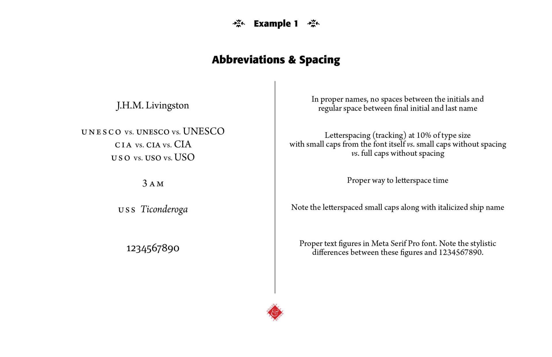
Horizontal and Vertical Space. Horizontal spacing is measured by typographers in ems, with one em a horizontal distance equal to the type size used. What we want on a page of type is an "evenness of color," meaning the density of the page is consistent to the eye. We do not want text squished together, nor do we want large gaps between words in a sentence, especially in justified type. Some page layout programs, like Adobe's InDesign, offer page layout controls that help even out the type we see on a page. Legibility, logical order and evenness of color are the aim. A commonly accepted rule of thumb is that anything from 45 to 75 characters per line is a satisfactory length of line for a single-column page in a serifed text face. Bringhurst says that the "66-character line (counting both letters and spaces) is widely regarded as ideal." (p. 26) A working minimum for justified text is the 40-character line. He says in his colorful way, "justified lines averaging less than 38 or 40 characters will lead to white acne or pig bristles: a rash of erratic and splotchy word spaces or an epidemic of hyphenation." (p. 27) The lead or opening paragraph is usually set flush left, with no tabbed indent. The following paragraphs are set indented one-em in their first line. Use single word space between sentences (not the old typewriter double space!). Little to no space is to be found in strings of initials — H.C. Shank or J.H.M. Wilson —with a normal word space following the last period.
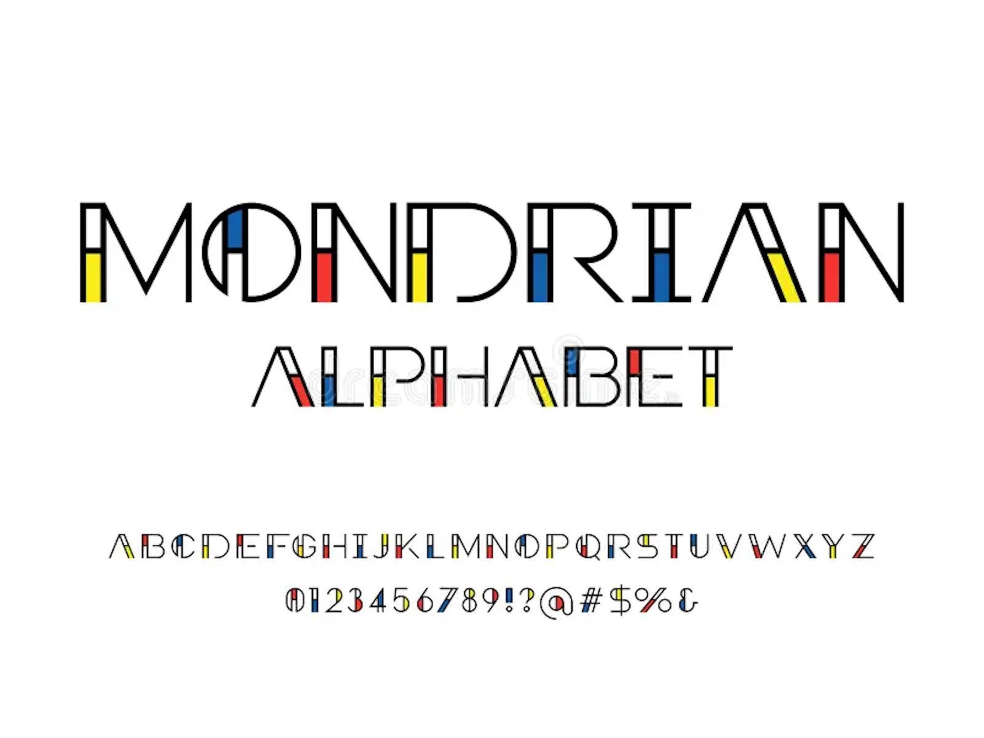
And here's where the finer points of typography enter into the picture. Sequences of capitals and small caps need to be letterspaced, usually five to ten percent of the type size. So, UNESCO and CIA and USO should be in small caps and spaced apart (See Example 1 & Abbreviations below). Digital fonts with a proper layout program, such as Adobe InDesign (and older PageMaker), allow for such adjustments. However, commonly used page programs, such as Microsoft Word, for instance, do not provide such detail of type layout.
Leading is the vertical distance between lines of type. Thus, 10/12 means 10 point type with a leading of two points. That means the distance from the baseline of line one to the baseline of line two is twelve points. No leading would be 10/10 type, for instance, and negative leading, like in some headlines and advertising copy, could be 24/16, as long as the ascenders of the face (like d and l) and the descenders (like j and g) don't collide (See Example 2). Again, the desire is for both legibility and pleasurable reading.
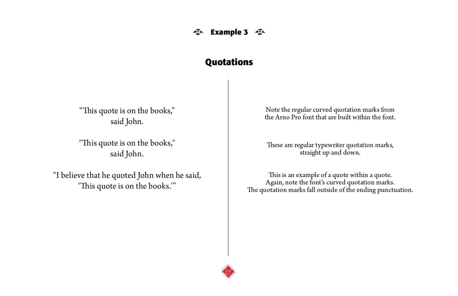
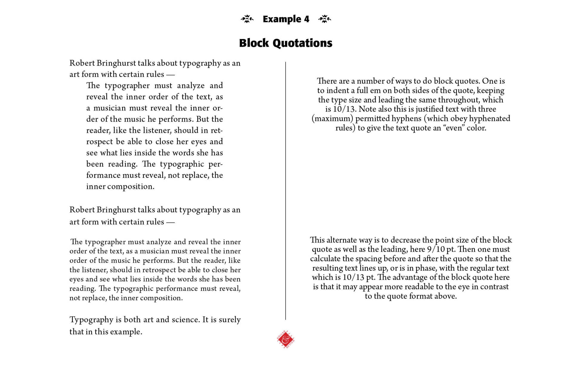
Quotations. Quotations can be either direct or indirect. Direct quotations need "quotation marks." Actually, not the straight marks seen in this blog, but real curved quotation marks from the font used. (See Example 3) If the quotation is a longer one, they may be indented from both the left and right margins to set them apart from the regular text. Or, they can be set in smaller type or a change in typeface, such as italic, for instance. So, block quotations might run 10/12 italic or 9/12 roman, if the main text is set 10/12 roman. Bringhurst and others propose a visible break between the main text and the block quotation, usually a blank line between the text and the quote at the beginning and the end of the quote, with some leading calculations to bring the text back into phase. (See Example 4)
Verse quotations from poetry or songs are usually set indented or centered on the longest line, set flush left and ragged right. (See Example 5)
Hyphenations. Hyphenations are generally unwelcome in running text. However, without some hyphenating, word spaces drift apart and the color of the text block looks splotchy or downright bad. So, here's the well-worn rules of hyphenation — (1) Leave at least two characters of a hyphenated word behind and at least three forward, like sus-tainable but not final-ly; (2) avoid stub ends of hyphenated words as the last line of a paragraph; (3) Don't use more than three consecutive hyphenated lines; (4) Avoid hyphenating proper names, if at all possible; and (5) hyphenate according to the conventions of the language (Bringhurst, p. 40). Use a "hard space" or "no-break space" for numerical or mathematical expressions, like 10.4 cm, where a hard space is used between the 4 and the cm. Too many unnecessary hyphenations mean that the sentence or paragraph needs rewritten. Again, serve the needs of the text in using hyphenations.
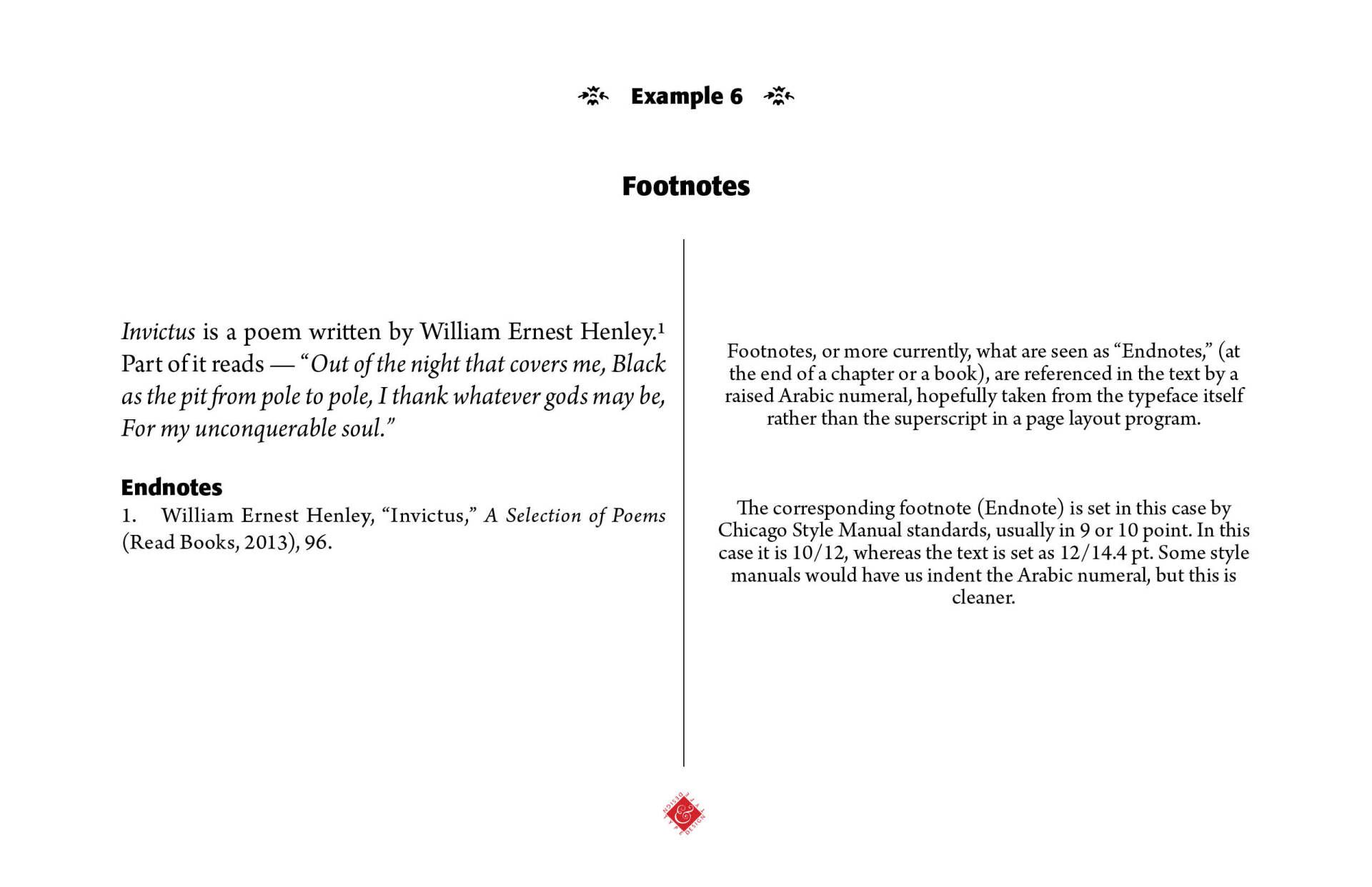
Footnotes. In academic papers and other scientific writings, footnotes are often used. Footnotes are indicated in the text of a document by raised Arabic numerals (superscripts) or by certain common symbols. The traditional order of symbol usage is * † ‡ § but what is recommended and easier to read are numerals. Use full-size numbers in the actual footnotes. The days of footnoting at the bottom of pages, except maybe in doctoral academic theses, have been replaced by putting all footnotes either at the end of the book or the end of the chapter. They are called endnotes.Footnotes are either 9 or 10 point. They can contain information that is more than just a citation if needed to explain in more detail something referenced in the main text, but could be distracting to the main thought. The Chicago Style Manual suggests formats for footnotes. (See Example 6)
Abbreviations. Don't use abbreviations unless used in conjunction with a number — "The board is several feet (not ft) long." "The board is 5 ft." Do not begin a sentence with abbreviations, except for common conventions, like Mr., Mrs. — "Oxygen is used in the operating room." Not, "O2 is used in the operating room." Use a single period when an abbreviation ends a sentence — "They were made in the U.S.A." (not U.S.A..) Avoid the symbolic form of abbreviations in regular text — "I use 20 percent alcohol." Not, "I use 20% alcohol." In the midst of normal text, use spaced small caps for abbreviations. (See Example 1) A good listing of abbreviations can be found in the Franklin Covey Style Guide (Salt Lake City, UT: Franklin Covey Co.), 1994, 1999. (Available on CD disk as well)
*Adapted from Robert Bringhurst, The Elements of Typographic Style (Vancouver: Hartley & Marks Pubishers, 1992 edition and Franklin Covey Style Guide (Salt lake, UT: Franklin Covey Co., 1994, 1999 and Chicago Style Manual online, https://www.chicagomanualofstyle.org/home.html.


Successful Layout & Design