About Well-Defined Fractions

Fractions
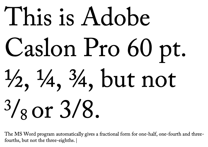
We all use them, especially in texts that reference recipes or construction of some kind. If we don't use the words, like one-half, three-eighths, and so forth, we stick them into all kinds of writings — however they look. So, using a typical program like Microsoft Word, if the fraction we want is contained in the typical 256 character description of the font, Word will usually automatically and successfully put the font in the text so that it looks like it belongs, like the illustration below. But fractions that go outside the bounds of the normal character set of the font we are using create problems in how to type them into our document so that they look good and naturally belong. Workarounds are limited. Some ways to construct and use fractions in documents are given in the insert above. However, these are constructed in layout programs, like Adobe InDesign which are not normally used in typical day to day letters and publications.
Rather than purchasing a subscription to Creative Cloud from Adobe to download and use a program like InDesign (Adobe Creative Cloud) what should we do? We could find a free or minimal cost font that is mostly made up of fractions, like Fraction Free Fonts or settle for a less than suitable word translation in running texts, like five-thirtysixths (instead of 5/36). The fraction Free font will most likely not reflect the typeface you are using. That may be acceptable in a recipe listing where the fraction stands outside the line of text, but it will not look professional at all. Another solution would be to use a font that has plenty of fonts already built-in. And still another (perhaps better) solution would be to contract out a font designer, like CARE Typography, to develop or enhance your preferred typeface with fractions you use. This latter solution is usually costly and takes time to develop.
Successful Layout & Design