Blog Layout

Art Nouveau Layout

Carl Shank • April 27, 2023

Art Nouveau* was an international art movement that emerged at the end of the 19th century and reached its peak between 1890 and 1910. It was a reaction against the traditional academic art of the time, which was seen as too rigid and formulaic, and sought to create a new style that was more organic, expressive, and individualistic.


Art Nouveau took its name from the Maison de l'Art Nouveau, a Parisian gallery that exhibited the works of artists and designers who were associated with the movement. The style was characterized by flowing, curvilinear forms inspired by natural shapes and motifs such as flowers, vines, and insects. It also incorporated elements from other artistic traditions, such as Japanese art and the Arts and Crafts movement.


Art Nouveau was particularly popular in Europe, where it influenced a wide range of artistic disciplines, including architecture, interior design, furniture, jewelry, and graphic design. Some of the most notable Art Nouveau architects included Hector Guimard, Antoni Gaudí, and Victor Horta, while artists such as Alphonse Mucha, Aubrey Beardsley, and Gustav Klimt were celebrated for their decorative and ornamental works.


Art Nouveau declined in popularity after World War I, as artists and designers began to embrace new, more modernist styles. However, its influence can still be seen in many aspects of contemporary design, and it remains an important and influential movement in the history of art and design.


The design crafted below is an example of art nouveau. You either like it or hate it.


*From ChatGPT an AI site.


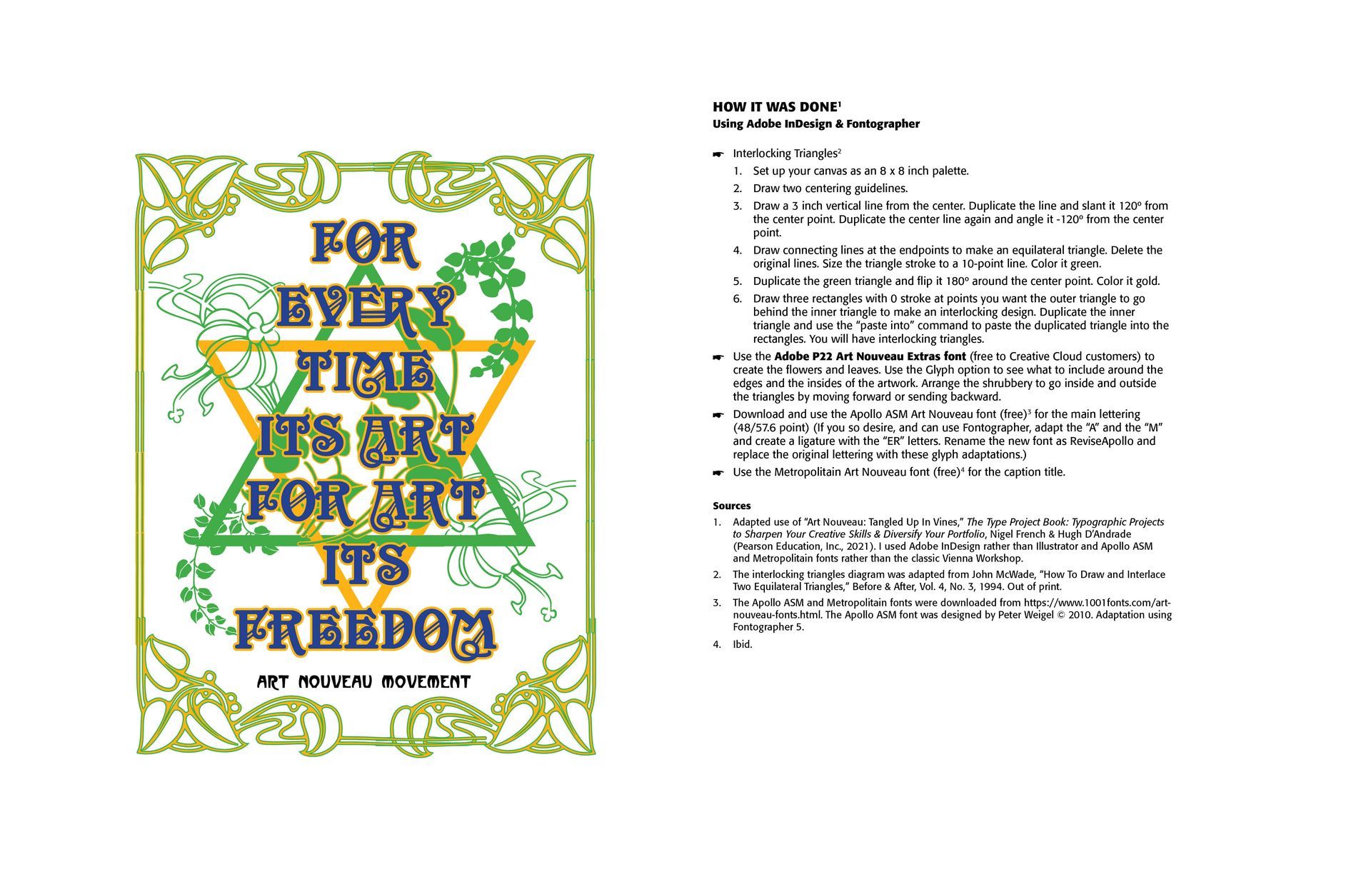
Successful Layout & Design

By Carl Shank January 29, 2025
Sketch & Hand Drawn Lettering. The history of font development includes a wealth of calligraphic fonts and artistically crafted hand drawn typefaces. A number of these lettering fonts have been drawn and submitted by smaller type foundries and entrepreneurs seeking to make their mark in the font world. A casual look at ChatGPT gives some idea as to their source and character. Fonts that mimic pencil drawings often have a hand-sketched, textured, or rough-lined appearance. These fonts are great for artistic projects, children's books, casual branding, or creative typography. The sample fonts below are mostly given for personal use only, use on personal invitations and so forth, but some have been made available for commercial use as well. They demonstrate the wide range of hand drawn fonts available for use and purchase.
By Carl Shank January 20, 2025
Four Old Playful Fancy Fonts . CARE Typography is pleased in its historical search for antique inspired fonts to introduce digitized versions of Harper and Mikado, a Gutenberg typeface and Lacrosse. Unlike their modern counterparts, these fonts are display only fanciful fonts of a bygone era in typography. However, they exude a rich history of font development that should not be forgotten in our search for the new, the sleek, the up-to-date in type. They have been developed from the rich typographic heritage of Phillips Old Fashioned Type Book published in 1945 by Frederick Nelson Phillips, Inc, in New York. This volume has caught my historic typographic eye for its plethora of ancient font styles and formulations. The Harper446 font is especially playful, with its curly capitals, its specialized "Q" capital and, of course, its flavorful and playful small case lettering, with the raised c, e and o letters and the odd looking "g." This is obviously not a text font, but can uses in artful decorative work. The Mikado231 font does not at all look like the variations of the typeface called "Mikado" in typography history. As that history notes, "Mikado was apparently inspired by Gilbert and Sullivan’s comic opera of the same name. The show opened in London in March of 1885 and in New York later that same year. According to Nicolete Gray in her classic book on ornamented typefaces, the English foundry of Sir Charles Reed and Son introduced a metal type called “Japanese” also in 1885. She characterized this typeface and other oriental based typefaces as superficial in their foreign influence. Nonetheless it appears that it was later copied by several of the American Wood-type companies. The 1906 Hamilton wood-type specimen catalog shows four versions of this design; one by Hamilton and three by acquired companies. The versions by Wells, and Morgans & Wilcox are called Mikado. The Hamilton and Page versions use model numbers 204 and 156 respectively. It is difficult to determine the specific dates when this particular wood-type was introduced, but the earliest wood-type catalog I could find showing Mikado is the 1888 Page catalog. Our sample “WINTER” is a 15 line unstamped type most similar to the Hamilton version. Incidentally, another English foundry, Miller and Richard introduced a metal typeface in 1887, also named Mikado. That typeface is totally different than the one presented here." (https://www.printmuseum.org/wood-type-mikado). This Mikado adaptation has straight angular E, F, G, K, T and even raised W, X, Y in the capitals. Note the falling stems of C, L, and lower c, e, h, m and n. Again, this playful font can be used sparingly in advertisement copy and flavorful playbills. The Gutenberg700 font is again from the Phillips book samples. Note the dotted C, U, V, small g and zero. The ampersand is also interesting. Curly serifs are used in A, J, L, S. The numerals are classic old school numerals. This Gutenberg rendering is unlike any classic Gutenberg typeface that has been presented. The LacrossePhillips font has a cute left hanging serif on the capitals. It is a bold faced font, both in the upper and lower case. It is a full font offering upper and lower case lettering, numerals and other marks. These fonts are available from CARE Typography at care typography.com at NO COST. They are free to purchase and use.
Show More
Share by: