Hour Glass Creation
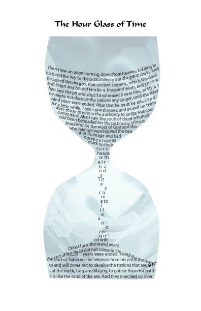
Hour Glass Creation. Have you ever found something that challenged your creativity and skill? In typography such things exist all the time. In leafing through old ad booklets for the now defunct Adobe Minion Multiple Master Font (See Blogs on "More About Fonts" and "The Journey of Digital Type"), I found a challenging hour glass design with type expertly set within the hour glass to look like time slowly draining from top to bottom. That inspired me to see if I could do something similar with Adobe InDesign, which I love to use for all sorts of projects.
The challenge was to create an interior using only type that seems to be trickling down, as time is seen slowly moving down the hour glass. Since I am a Christian typographer, author and pastor, this was also an opportunity to pull from the Bible's perspective of time slowly drawing to a conclusion from the book of Revelation in the Bible. I chose Revelation 20 as the text to use inside the hour glass. I am certain that more professional illustrators and type setters can do a better job. But this is what I created using the tools and training in InDesign over the years.
Enjoy — and dive into your next type challenge!

Successful Layout & Design